
Photography: Floraïku official photography. Images belong to their respective owners.
Floraïku

A shell-illustrated tall cap above a quiet dark flacon
Sand And Skin concentrates its decorative identity on an unusually tall cylindrical cap above a broad dark rectangular bottle. A large illustrated shell occupies the cap’s purple and warm ochre field, framed by gold-coloured top and lower bands. The bottle front is much quieter: a small scent name and concentration sit in the upper half, with a separate producer signature below. This difference between illustrated closure and restrained body is the central design move. The selected scene shows the full-size flacon; the official 50 mL plus 10 mL travel presentation contains additional elements not shown here.
- Perfume
- Light pack
- Retro illustrated
- Luxe monochrome
About this study
Selected Sand And Skin full-size flacon with tall shell-illustrated cap. Official 50 mL + 10 mL travel set context is distinguished from the single visible bottle.
Sources & evidence · Reviewed 2026-10-19Color Palette
Approximate colours interpreted from photography. These are screen references, not official brand colours or print specifications.
Pack body
Near-black bottle
#27271F
Approximate dark glossy body appearance. Warm reflections influence its tone; substrate, opacity method and coating are unverified.
Label
Muted purple cap field
#8E829E
Approximate purple-grey area behind the shell illustration, with dense hatched drawing detail. It is part of the package, unlike the brown photographic background.
Warm ochre illustration
#D5A83F
Approximate shell and lower artwork colour. Several cream, brown and muted red details add depth within the drawing without establishing separate production inks.
Accent
Gold-coloured trim and type
#CDB16B
Approximate top, lower ring, neck and fine bottle lettering. Metal composition, plating and print processes are not specified.
Typography
Suggested visual alternatives, not confirmed brand typefaces. Any scale below is an illustrative estimate.
The scent name appears in small uppercase near the upper centre of the bottle, followed by a very small concentration line. The producer sits lower with a tiny Paris line underneath, leaving a broad dark interval between the two text groups. The cap illustration is far larger than either group and becomes the dominant recognition cue. A small producer inscription appears on the gold-coloured lower cap band. Typography supports the illustrated object rather than attempting to compete with it at the same scale.
Fonts
Scent name alternative
Lato
- Looks like
- Lato
- Type
- Sans serif
- Weight
- Regular 400 / Medium 500
- Case
- Uppercase
- Tracking
- Modestly open
- Fallback
- sans-serif
A proposed restrained voice for an original short fragrance title. Keep enough contrast on the dark body and avoid reducing a longer name to unreadable fine print.
Producer and small signature alternative
Cormorant Garamond
- Looks like
- Cormorant Garamond
- Type
- Serif
- Weight
- Regular 400 / Medium 500
- Case
- Uppercase producer with small supporting line
- Tracking
- Natural to slightly open
- Fallback
- serif
Use for a distinct original house signature on the lower bottle or trim. It is not an attribution of Floraïku’s mark; the limited surface requires careful reproduction tests.
Structure & Proportions
Visual proportions and finish previews are illustrative. Confirmed construction details and uncertainties are distinguished in the study notes.
Proportions
| Purpose | Value | Preview |
|---|---|---|
| Contrasting volumes | A broad low rectangular body supports a narrower vertical cylinder. The cap is tall enough to function as a second major object rather than a small finishing detail. | — |
| Artwork frame | Gold-coloured upper and lower bands bound the illustrated surface, separating it from the dark bottle and neck. | — |
| Bottle typography | The scent name and producer occupy two small separated areas, leaving most of the dark front visually uninterrupted. | — |
Shapes
| Element | Value | Preview |
|---|---|---|
| Flacon | Broad rectangular body with subtly rounded corners. | |
| Tall cap | Narrow cylindrical illustrated volume with a rounded-looking top. | |
| Shell motif | A large irregular spiral shell drawing with fine internal lines. | |
| Trim bands | Narrow horizontal gold-coloured borders at cap top and base. |
Finishes
Dark reflective body
Bottle front and edges; substrate unverified. · gloss
Illustrated cap surface
Shell artwork; visual texture without verified material. · matte
Gold-coloured trim
Cap edges and neck; base material/process unknown. · metallic
Formats and materials
| Formats | A broad rectangular dark flacon topped by a tall narrow cylindrical illustrated cap. The official Signature Bento listing contains 50 mL Eau de Parfum plus a 10 mL format and travel case. |
| Materials | The accessed product information does not specify bottle, cap, trim or illustration substrate. A glossy dark body does not independently establish lacquered glass, and gold-coloured bands do not identify metal or plating., The photograph does not show the Bento box, internal supports or separate travel format, so their materials and construction are outside this visual study. |
| Closures | The illustrated cylinder is fitted over the neck, with a small gold-coloured connector visible above the bottle shoulder. The atomiser, retention mechanism and inner cap construction are hidden. The listing confirms a travel case in the set, but this photograph alone does not demonstrate how it interacts with the tall cap. |
| Decoration | A detailed shell drawing covers the front of the tall cap, with purple, ochre and pale areas. The bottle carries only small gold-coloured textual groups in the visible view. |
Front Panel
Schematic reading order. The diagram’s zone heights do not represent measured artwork proportions.
The main bottle face has no clearly bounded paper label in the selected view. Two small text groups sit directly against the dark field, with the scent above and producer below. The cap becomes the illustrated panel, and its lower trim carries a small additional inscription. This division gives each component a distinct communication role.
| Zone | Content |
|---|---|
| Cap illustration | A large shell fills most of the visible cylinder height, set against purple and ochre graphic fields with fine hatching. |
| Lower cap trim | A narrow gold-coloured band separates drawing from neck and carries a small producer inscription. The exact decoration method is unverified. |
| Upper bottle title | Sand And Skin appears in small uppercase with a smaller Eau de Parfum line below. It identifies the scent without filling the dark face. |
| Lower producer | The house signature and small location line sit near the lower centre, separated from the scent by a broad open dark area. |
Range System
The official page explicitly connects the shell motif to the fragrance’s shore-inspired story and identifies the 50 mL plus 10 mL travel presentation. Only this full-size bottle is visually audited. The artwork is scent-specific in this source, but a full range comparison would be needed to describe every cap motif or travel-case mechanism.
- For an original family, a consistent quiet bottle can support changing illustrated closures, provided scent names remain readable without relying on artwork alone. This is a design interpretation, not a specification for all Floraïku products.
- When documenting a set, list the full-size bottle and travel elements separately. The selected hero image does not make the contents of the whole Bento presentation visible.
Back of Pack & Shelf
The bottle reverse, base, atomiser, cap interior and outer set packaging are unseen. Fine print and any poem, batch or volume placement cannot be reconstructed.
- Use an open-set image to document the 10 mL format and travel case.
- Do not infer a magnetic closure, refill interface or dual-use cap mechanism from the closed hero view.
- Verify rear typography before assigning extra text to the bottle’s quiet face.
On shelf
The tall illustrated cylinder would likely become the silhouette and artwork cue before the small scent name is readable. The quiet dark body provides a visual base for that more detailed top. This is visual interpretation rather than a recognition test. A catalogue should offer a tighter crop for the bottle copy and a separate set view, because this panoramic image explains mood and cap design better than travel components or technical information.
Imagery
The flacon stands in sand between pale stacked stones with upright dark vanilla pods and a piece of irregular driftwood. A warm brown gradient behind creates a sunlit atmosphere. The official fragrance description includes vanilla and a beach association, supporting these broad scene cues. The scenery’s browns and creams should not replace the actual cap’s purple and ochre in a packaging palette. The centred upright bottle contrasts with the organic props, and its tall cap remains the clearest decorative element even within the wide composition.
Guidelines
Editorial principles for an original design brief, not official brand guidelines.
Do
- Keep the actual cap colours distinct from the warm scene palette.
- Document the bottle and listed travel components separately.
- Let a detailed closure coexist with a quiet readable bottle face.
- Qualify textured and metallic appearances when construction is unverified.
Don't
- Do not describe the whole package as brown and cream based on scenery.
- Do not invent cap fabric, gold plating or bottle coating specifications.
- Do not claim the travel component is visibly present in this hero image.
- Do not reproduce the specific shell drawing or original house identity.
Sources & evidence
How this study was built
edition · Sourced fact
Official listing gives 50 mL plus 10 mL with travel case.Sand And Skin — Floraïku Parislabel · Sourced fact
Brand explicitly identifies shell motif on Sand And Skin cap.Sand And Skin — Floraïku Parisstructure · Visual observation
Tall narrow cylinder contrasts with broad dark rectangular bottle.palette · Visual observation
Purple/ochre cap and gold-coloured trim differ from brown scene.typography · Visual observation
Small scent and producer groups are separated on dark front.imagery · Visual observation
Sand, pale stones, vanilla pods and driftwood surround one visible flacon.range · Editorial interpretation
Scent-specific closure artwork can carry identity while bottle stays restrained; broader range not audited.
What remains unverified
- Bottle/cap/trim materials and print processes unspecified.
- Travel components and Bento box not shown in selected image.
- Cap interior, retention mechanism, atomiser and reverse unseen.
- Fonts/colours approximate or proposed; brown scenery is not the cap palette.
Give your AI
packaging taste
Give your design or image tool a packaging study: palette, type, structure, front panel and principles for an original brief.
Export this styleFree with an email. PACK.md works in Claude, ChatGPT, Cursor and image tools.
More like this

Aerangis
a quiet numbered object, an intimate scent memory

Akro
soft pink interrupted by an assertive black signature

Alexander McQueen
An oval flacon crowned with dense black relief
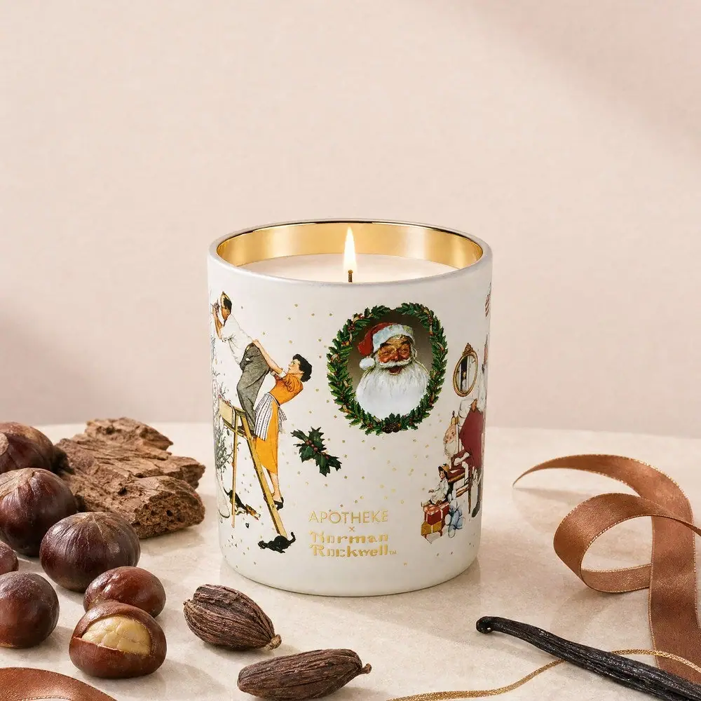
Apotheke
White holiday vignettes with a warm golden interior

Arquiste
blush transparency, white lettering and a stepped gold cap
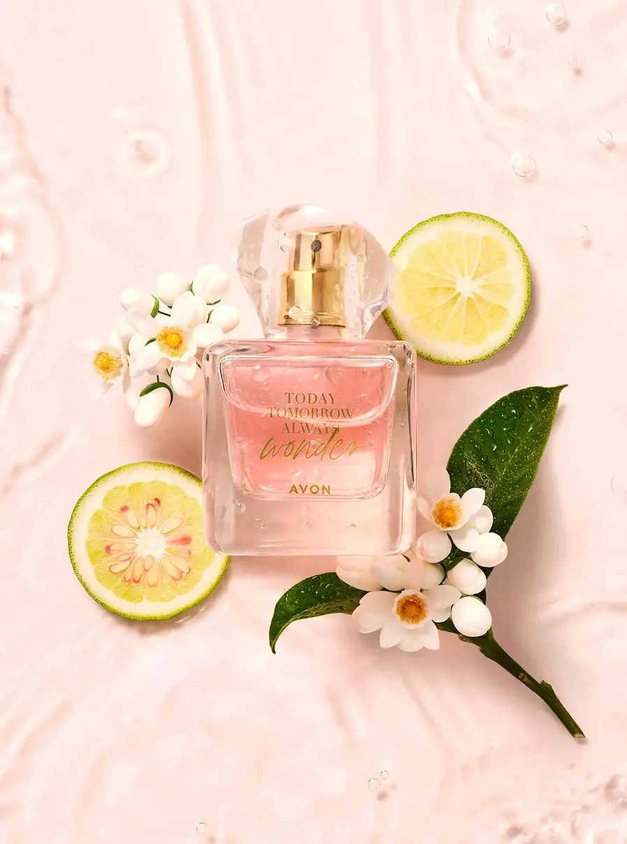
Avon
A clear flacon with a warm handwritten heart
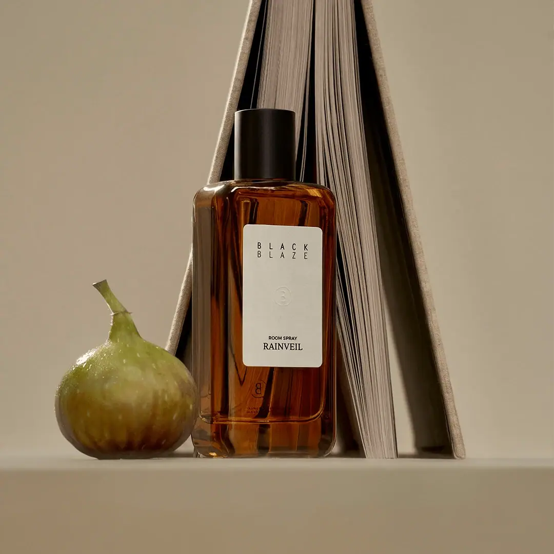
Black Blaze
Warm amber, quiet paper and a deliberate vertical rhythm
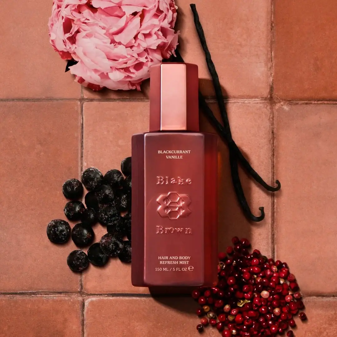
Blake Brown
sculptural rose-brown fragrance with a jewel-like centre