Photography: Gisou official photography. Images belong to their respective owners.
Gisou

Caramel caps and sculpted curves across three beauty formats
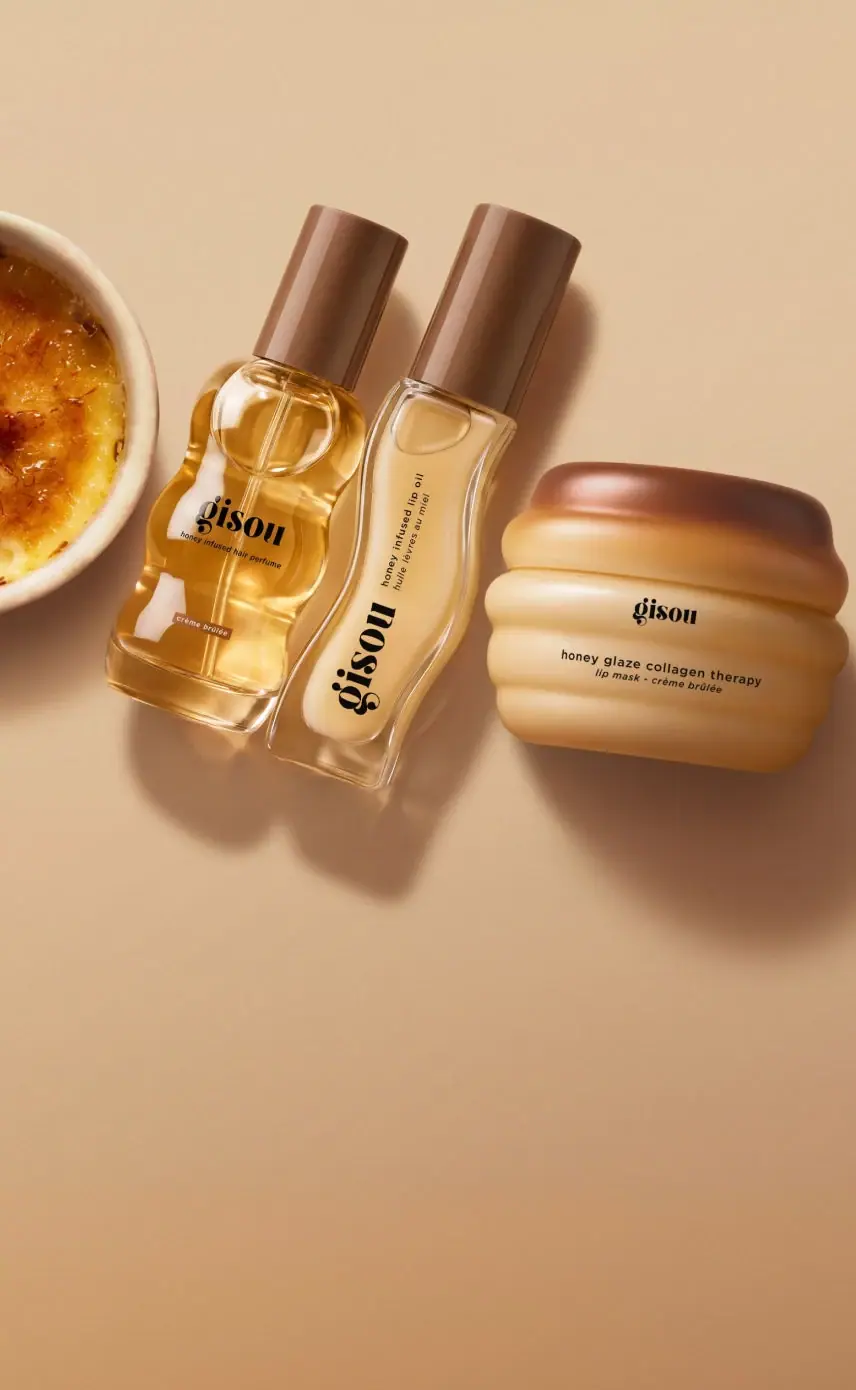
Gisou's photographed Crème Brûlée Collection unites three differently shaped containers through caramel-brown closures, cream-to-honey body colours and black lettering. The hair-perfume bottle has repeated side indentations, the slender lip oil bends in a longer wave, and the lip-mask jar builds its squat silhouette from broad horizontal bulges. The common identity does not require identical label placement: the lip-oil wordmark turns along the container while the perfume and jar read across their fronts. This is a study of a particular cross-category set, whose dessert association emerges from colour and form before any decorative illustration is needed.
- Make-up
- Light pack
- Playful colour
About this study
The approved Crème Brûlée three-container photograph, covering one limited-edition cross-category set rather than all Gisou products or the separate three-mask bundle.
Sources & evidence · Reviewed 2026-10-19Color Palette
Approximate colours interpreted from photography. These are screen references, not official brand colours or print specifications.
Pack body
Caramel closure brown
#805139
Approximate colour of both tall caps and the upper jar area. Their different widths still produce a repeated dark ending to each silhouette.
Custard cream
#E3BC7F
Approximate warm pale appearance of the lip oil and jar under the scene's lighting. It describes what is visible, not a specified resin tint or exact formula colour.
Ink
Deep brown-black
#1E1710
Approximate common wordmark and descriptor colour. Its contrast lets small copy remain present against the warm bodies without adding a second graphic accent.
Accent
Honey gold
#D99B35
Approximate liquid appearance inside the perfume bottle. Transparency makes contents part of the visible colour composition rather than an opaque printed panel.
Typography
Suggested visual alternatives, not confirmed brand typefaces. Any scale below is an illustrative estimate.
The distinctive lowercase serif wordmark leads each front, but changes its scale and orientation with the available space. On the perfume it sits across the central lobe above a short product descriptor. On the lip oil it travels vertically along the lower half, with smaller bilingual functional copy running in the same general direction above. On the wide jar a modest centred signature sits over two lines of product information. The shared letterform character is more consistent than the placement or relative size.
Fonts
Original identity alternative
DM Serif Display
- Looks like
- Expressive high-contrast serif lowercase
- Type
- Display serif
- Weight
- Regular
- Case
- Lowercase or mixed case for a new name
- Tracking
- Close but independently adjusted
- Fallback
- Georgia, serif
Build an original short name with a confident dark rhythm. Do not trace the reference's customised letters or turn this recommendation into an attribution.
Functional-copy alternative
DM Sans
- Looks like
- Compact neutral sans serif
- Type
- Sans serif
- Weight
- Regular, Medium
- Case
- Sentence case for product names and explanatory lines
- Tracking
- Normal to gently open at small sizes
- Fallback
- Arial, sans-serif
Keep product type legible as its reading direction changes between a broad jar and a slender tube. Test the actual line length instead of scaling all copy with the logo.
Structure & Proportions
Visual proportions and finish previews are illustrative. Confirmed construction details and uncertainties are distinguished in the study notes.
Proportions
| Purpose | Value | Preview |
|---|---|---|
| Set silhouette | Two long vertical objects sit beside one broad low object. Their unequal heights and widths identify different uses even when their colour family matches. | — |
| Closure emphasis | The tall caps occupy substantial visual space above the narrow bottle bodies. Their shared colour is a stronger family cue than identical cap dimensions. | — |
| Front allocation | The jar concentrates text in a small central area, leaving its broad bands exposed. The lip oil uses its long axis to accommodate a larger wordmark without covering the whole face. | — |
Shapes
| Element | Value | Preview |
|---|---|---|
| Perfume outline | Repeated rounded indentations along a transparent flattened body, with a comparatively straight base. | |
| Lip-oil outline | Long curved sides create a gentle asymmetric waist around a pale inner field. | |
| Lip-mask jar | A squat rounded volume built from broad horizontal bulges, ending in a darker upper band. | |
| Bottle caps | Long smooth cylindrical silhouettes, without visible grip ribs in the selected photograph. |
Finishes
Clear reflective walls
Perfume and lip-oil exteriors; material and moulding method remain unverified · transparent
Glossy brown closures
Tall bottle caps and the jar's upper region; describes photographed reflections, not a confirmed lacquer · gloss
Rounded cream body
The jar's highlights follow each bulge rather than an applied metallic or foil detail · gloss
Formats and materials
| Formats | Travel hair-perfume bottle with sculpted transparent body, Slender lip-oil container with an asymmetric curved outline, Broad low lip-mask jar with horizontal rounded bands |
| Materials | Transparent bottle walls are visible, but the consulted pages do not establish glass or a specific polymer for this edition., The jar appears opaque or strongly tinted in this image; its component construction is unverified., Brown closures show smooth reflective surfaces; their material and colouring process are not documented here. |
| Closures | Both tall containers carry long brown caps. The perfume's internal dip tube is visible and the official use instructions describe spraying, but the cap conceals the actuator itself. The lip-oil applicator remains enclosed, and the jar is closed. Do not infer a particular thread, cap attachment, liner or refill mechanism from the exterior silhouettes alone. |
| Decoration | Dark wordmarks and compact product descriptors applied to the front-facing surfaces, A small brown variant panel near the perfume bottle's lower front, Body contours provide ornament without a repeated printed pattern; the exact decoration process is not established |
Front Panel
Schematic reading order. The diagram’s zone heights do not represent measured artwork proportions.
There is no single repeated rectangular label grid. Each front adapts the identity to its container: a horizontal central lockup on the perfume, an axial composition on the lip oil and a compact centred stack on the jar. This flexibility keeps the sculpted silhouettes exposed. Fine copy remains secondary to the wordmark, while the small perfume variant panel adds a local colour cue near the bottom.
| Zone | Content |
|---|---|
| Perfume centre | Horizontal lowercase identity and a smaller hair-perfume descriptor, over the visible amber contents. |
| Perfume lower front | Small warm-brown Crème Brûlée panel, separated from the main identity by clear body space. |
| Lip-oil long axis | Large rotated identity in the lower section, with smaller English and French functional wording nearer the cap. |
| Jar centre | Small horizontal identity above a broader product-name line and a shorter lip-mask/variant line. |
Range System
The official collection page identifies one scent-themed set containing a lip mask, lip oil and 15 ml hair perfume. The separate lip-mask trio page establishes other named mask variants, but its bundle is a different commercial offer. The useful principle observed here is coordination across functions through colour and curves; this photograph does not establish a universal Gisou colour chart or identical artwork across every size.
- Observed family cue: brown caps or upper areas recur across all three selected containers.
- Observed format variation: horizontal, vertical and compact stacked text coexist without requiring identical front layouts.
- Interpretation for a new collection: repeat a closure colour while changing the container profile for each use, then adapt text direction deliberately rather than shrinking everything into one template.
Back of Pack & Shelf
No reverse, base, opened neck or retail carton is visible in the approved cover. Ingredient lists on a product website do not reveal their printed placement. The source page includes other imagery, but this study does not reconstruct unseen packaging artwork from image captions.
- Verify each component's rear and underside separately before documenting legal-copy or barcode placement.
- Do not borrow a different bundle's no-gift-box statement for this cross-category set.
- For original development, reserve readable technical information outside the principal sculpted front area.
On shelf
Interpretation: the set can be recognised first through a shared warm colour family and then through individual contours. The rotated lip-oil wordmark encourages a different reading gesture from the centred jar. This may suit close-up beauty imagery, but the smallest descriptors still need practical testing at actual size. A coordinated collection can therefore retain expressive shape without expecting every package to be read in the same orientation.
Imagery
A partial crème brûlée enters from the left while the three closed containers lie on a warm neutral surface. Directional light gives their curves long shadows and bright highlights. The dessert reinforces the collection name; its ceramic ramekin and caramel crust are props, not package components. The tan scene amplifies the warm palette, but should not be mistaken for a fourth container colour. Keeping the jar apart from the two slender objects makes the three distinct silhouettes readable at thumbnail size.
Guidelines
Editorial principles for an original design brief, not official brand guidelines.
Do
- Adapt the front composition to each container's useful reading area.
- Use one repeated closure colour to connect different functions.
- Let contours remain visible instead of covering them with large opaque panels.
- Separate visible exterior bands from claims about the formula inside.
- Evaluate the set as individual products as well as a grouped photograph.
Don't
- Do not flatten all three shapes into generic straight-sided bottles.
- Do not treat the lip-oil lettering as a horizontal copy of the perfume lockup.
- Do not infer glass, resin or print method from reflections.
- Do not present one limited collection as a universal brand rule.
Sources & evidence
- Crème Brûlée Collection — official product listingproduct
- Honey Glaze Lip Mask Trio — official comparison listingproduct
How this study was built
edition · Sourced fact
The collection page identifies the three different products and the travel hair-perfume format.Crème Brûlée Collection — official product listingstructure · Visual observation
All three bodies have distinct sculpted contours; transparent walls do not verify their material.Crème Brûlée Collection — official product listingtypography · Visual observation
Lip-oil lettering follows the long axis, unlike the horizontal perfume and jar fronts.Crème Brûlée Collection — official product listingpalette · Visual observation
Brown upper areas connect cream and honey-coloured bodies; the tan tabletop is excluded from the pack palette.Crème Brûlée Collection — official product listingrange · Sourced fact
The three-mask listing is a distinct bundle and describes formula layers, which must not be conflated with the selected closed jar's exterior bands.Honey Glaze Lip Mask Trio — official comparison listingimagery · Editorial interpretation
The nearby dessert reinforces the sensory theme, while the three different silhouettes remain individually legible.Crème Brûlée Collection — official product listing
What remains unverified
- Exact materials, typefaces, dimensions and decoration processes were not verified.
- The selected image shows closed fronts only; no reverse, base or gift carton is inspected.
- The jar's exterior colour and relief cannot establish the arrangement of its formula.
- Warm scene lighting affects the approximate colour readings.
Give your AI
packaging taste
Give your design or image tool a packaging study: palette, type, structure, front panel and principles for an original brief.
Export this styleFree with an email. PACK.md works in Claude, ChatGPT, Cursor and image tools.
More like this

ACURE
Iridescent spectacle with practical, tightly ordered type

Bask
sunny yellow with a playful turquoise signature
Bathing Culture
Flowing rainbow bands on dark refillable glass

Beame
Orange bubble lettering, pink mascot, clear product badge

Bread Beauty Supply
bubblegum pumps and a fat black wordmark

Byoma
candy-coloured barrier science on a shelf

Cut By Fred
Orange gel, cropped geometry and bold bilingual utility
Dasique
Chocolate-segment powders visible beneath a clear serif-marked lid