Photography: Homecourt official photography. Images belong to their respective owners.
Homecourt

Austere black dispenser with fragrance-led still-life warmth
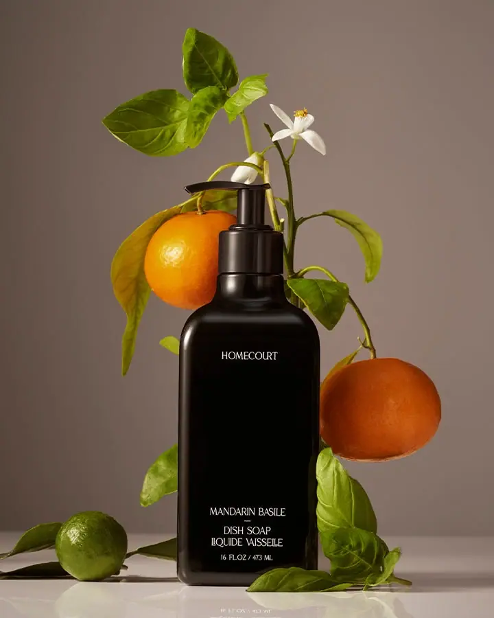
The selected Mandarin Basile Dish Soap uses a broad-shouldered black pump bottle and very little front typography. A small brand name sits high; scent, bilingual product type and volume form a compact lower cluster. The large empty interval is the defining graphic gesture. In the approved image, citrus and green foliage supply the color and fragrance associations that the package deliberately withholds. This study examines that 473 mL bottle and its relationship to the official refill offer, without treating every Homecourt format as identical.
- Cleaning & laundry
- Dark pack
- Luxe monochrome
About this study
Selected Mandarin Basile 473 mL dish-soap bottle in official citrus still-life photography. Analysis concerns the visible front and source-stated bottle/refill relationship, not an exhaustive Homecourt design system.
Sources & evidence · Reviewed 2026-10-19Color Palette
Approximate colours interpreted from photography. These are screen references, not official brand colours or print specifications.
Pack body
Deep bottle black
#11120F
Approximate screen impression of body and pump. Gloss highlights shift toward warm gray under the scene lighting; they are not separate specified colors.
Ink
Soft white lettering
#ECEAE3
Approximate pale type against the black front. Two colors explain the pack; orange fruit, green leaves and taupe ground belong to photography.
Typography
Suggested visual alternatives, not confirmed brand typefaces. Any scale below is an illustrative estimate.
The small uppercase wordmark occupies the upper body, beneath the rounded shoulder. Far below, the fragrance name leads a centered group, followed by a tiny horizontal separator, product type in two languages and net contents. The observed lettering is slender and relatively narrow, not a large bold cleaning-product headline. Its restraint makes the distance between groups as important as the size difference between them.
Fonts
Identity and fragrance
Tenor Sans
- Looks like
- Narrow light display capitals with distinctive terminals
- Type
- Humanist display sans-serif
- Weight
- Regular
- Case
- Uppercase
- Tracking
- Restrained; adjust optically rather than forcing an exact width
- Fallback
- Arial, sans-serif
A proposed alternative for an original name and fragrance line. It offers a refined low-weight voice without reproducing the photographed wordmark. Preserve adequate stroke strength when reversing pale text from black.
Functional information
Barlow Condensed
- Looks like
- Compact narrow sans-serif
- Type
- Condensed sans-serif
- Weight
- Regular, Medium
- Case
- Uppercase
- Tracking
- Normal to slightly open
- Fallback
- Arial Narrow, sans-serif
An alternative for product type and volume in the lower cluster. Keep English and French descriptions visually equal, and make the smallest line legible on a real bottle rather than only in a large render.
Structure & Proportions
Visual proportions and finish previews are illustrative. Confirmed construction details and uncertainties are distinguished in the study notes.
Proportions
| Purpose | Value | Preview |
|---|---|---|
| Front architecture | Tall near-rectangular reading face bounded by rounded shoulders and base corners; exact depth and cross-section cannot be derived from the single front view. | — |
| Negative space | The uninterrupted black interval is much taller than either text group and keeps the face visually quiet. | — |
| Lower naming block | A narrow centered column leaves broad dark margins on both sides. More front width is reserved for the silhouette than for type. | — |
| Pump relation | The dispenser is visually substantial but remains the same dark color, so its stepped construction does not fragment the object into competing accents. | — |
Shapes
| Element | Value | Preview |
|---|---|---|
| Bottle outline | Straight sides, softened base corners and broad curved shoulders moving into a short neck. | |
| Pump | Layered cylindrical collar and upright stem beneath a shallow sideways nozzle. | |
| Separator | A very short horizontal rule between scent and product type, providing hierarchy without a badge or panel. |
Finishes
Smooth reflective black
Body and pump; visible highlights support a glossy-looking appearance, not a specification for varnish or coating. · gloss
Formats and materials
| Formats | Pump bottle, 16 fl oz / 473 mL on the photographed front |
| Materials | The official dish-soap page specifies a 100% post-consumer recycled PET bottle and a reusable pump; these are brand-stated specifications., Individual pump components, decoration materials and bottle-wall thickness are not detailed by the inspected sources. |
| Closures | A black pump with a broad cylindrical collar rises above a short neck. Its curved horizontal nozzle projects to the side while the head and collar continue the body's dark silhouette. The front photograph does not reveal the lock action, dip tube, spring material or dose per stroke. |
| Decoration | Small centered upper wordmark, Low centered fragrance and bilingual product block, Short fine divider between fragrance and functional naming; decoration application process unverified |
Front Panel
Schematic reading order. The diagram’s zone heights do not represent measured artwork proportions.
Two centered islands of pale text occupy one uninterrupted black front. There is no visible border around the copy and no confirmed separate label edge. ‘Label’ here describes content placement; the photograph does not establish direct printing versus a black or transparent applied decoration.
| Zone | Content |
|---|---|
| Upper identity | A single small wordmark just below the shoulder. It gives the object an owner while retaining much more dark surface than printed area. |
| Open middle | Unprinted-looking black space acts as the main graphic field. Its purpose is compositional: it makes the bottle feel calm and lets the product stand with domestic objects without a dense billboard of claims. |
| Fragrance line | Mandarin Basile appears above a very short dash. The fragrance gets first position within the lower group, suggesting a sensory way into an everyday cleaning product. |
| Function and volume | English and French product-type lines explain the use, with net contents beneath. This compact zone prevents the scent-first hierarchy from making the object ambiguous. |
Range System
The official dish-soap page offers multiple named fragrances and the brand also offers a separate refill. This establishes product and refill relationships, not an assertion that every Homecourt category uses this exact bottle. In the selected presentation, scent is communicated through words and campaign props rather than a colored package panel.
- For an original monochrome range, keep function as explicit as scent, especially if a hand wash sits beside dish soap in the same room.
- Adapt the lower copy block to a refill pouch without assuming the rigid bottle's proportions apply to flexible packaging.
- Use distinct fragrance photography for discovery, but ensure the physical pack can still be identified when the photographed ingredients are absent.
Back of Pack & Shelf
The reverse is unseen. Instructions, ingredients, warnings, barcode and recycling marks may exist elsewhere, but their actual order and positions are not documented by this front image.
- Obtain a matching reverse view before converting the study into a production label specification.
- Preserve sufficient space for required functional information when designing an original quiet front.
- Keep bottle recyclability, reusable-pump instructions and refill handling separate until each component's guidance is confirmed.
On shelf
Interpretively, the all-black silhouette can sit visually alongside kitchen hardware and decor while the bright small type supplies recognition at close range. Its weakness is also clear: two similarly shaped black bottles could be hard to distinguish without reading. An original adaptation should test function-name legibility under shadows, wet reflections and ordinary counter distance, not just carefully controlled studio lighting.
Imagery
The official still life surrounds the black bottle with orange citrus, green leaves and a branching stem against a warm gray-brown ground. A pale reflective surface anchors the base. The foliage climbs above and around the pump but leaves the central face readable. The color story lives outside the container: it would be inaccurate to add orange and green as print swatches merely because they dominate parts of the photograph.
Guidelines
Editorial principles for an original design brief, not official brand guidelines.
Do
- Make the bottle silhouette and typography readable without the campaign props.
- Separate high identity and lower function through deliberate space.
- Keep bilingual function naming clear within a scent-led hierarchy.
- Treat the reusable dispenser and refill as connected but distinct formats.
- Test pale narrow lettering on curved black surfaces in ordinary room light.
Don't
- Do not add fragrance colors to the pack palette when they exist only in photography.
- Do not turn a smooth black appearance into an unsupported soft-touch claim.
- Do not infer pump recyclability from the bottle's PCR PET statement.
- Do not copy Homecourt's distinctive wordmark or exact two-zone composition.
- Do not replace a clear product type with poetic scent wording alone.
Sources & evidence
How this study was built
structure · Sourced fact
The Mandarin Basile section identifies 473 mL, PCR PET bottle material and a reusable pump; these are brand statements.Homecourt — Dish Soap, including Mandarin Basile variantlabel · Visual observation
The approved photo shows high identity and a low centered scent/function/volume group separated by broad black space.Homecourt — Dish Soap, including Mandarin Basile varianttypography · Visual observation
Slender pale capitals and a small lower divider define the hierarchy. Suggested fonts are alternatives, not original font identifications.Homecourt — Dish Soap, including Mandarin Basile variantpalette · Visual observation
Only dark body and pale text are necessary pack swatches. Citrus and foliage colors belong to the set.Homecourt — Dish Soap, including Mandarin Basile variantrange · Sourced fact
A dedicated dish-soap refill is offered; its flexible packaging is a separate format from the selected dispenser.Homecourt — Dish Soap Refillimagery · Visual observation
Citrus, leaves and warm neutral surroundings frame the bottle without obstructing its primary front typography.Homecourt — Dish Soap, including Mandarin Basile variantrange · Editorial interpretation
A monochrome range needs explicit functional names because campaign props are absent at the point of physical use.
What remains unverified
- Exact variant URL was inaccessible through the web tool; canonical page contains its Mandarin Basile details.
- Refill page title and body disagree on bottle count; no count or quantified reduction is adopted here.
- Pump component materials, print process, exact fonts and measurements are unverified.
- Back and sides unseen; palette approximates screen colors rather than physical standards.
Give your AI
packaging taste
Give your design or image tool a packaging study: palette, type, structure, front panel and principles for an original brief.
Export this styleFree with an email. PACK.md works in Claude, ChatGPT, Cursor and image tools.
More like this

Aerangis
a quiet numbered object, an intimate scent memory

African Botanics
Technical black label with a low serif signature

Akro
soft pink interrupted by an assertive black signature

al.ive body
warm architectural calm, built as a paired vanity object

Alexander McQueen
An oval flacon crowned with dense black relief
AMASS
A ruled botanical document on a dark rounded bottle

Arquiste
blush transparency, white lettering and a stepped gold cap
Avon
A clear flacon with a warm handwritten heart