Photography: Kopari — official product photography. Images belong to their respective owners.
Kopari

Blush cap, clear shimmering body and gold-looking maker name
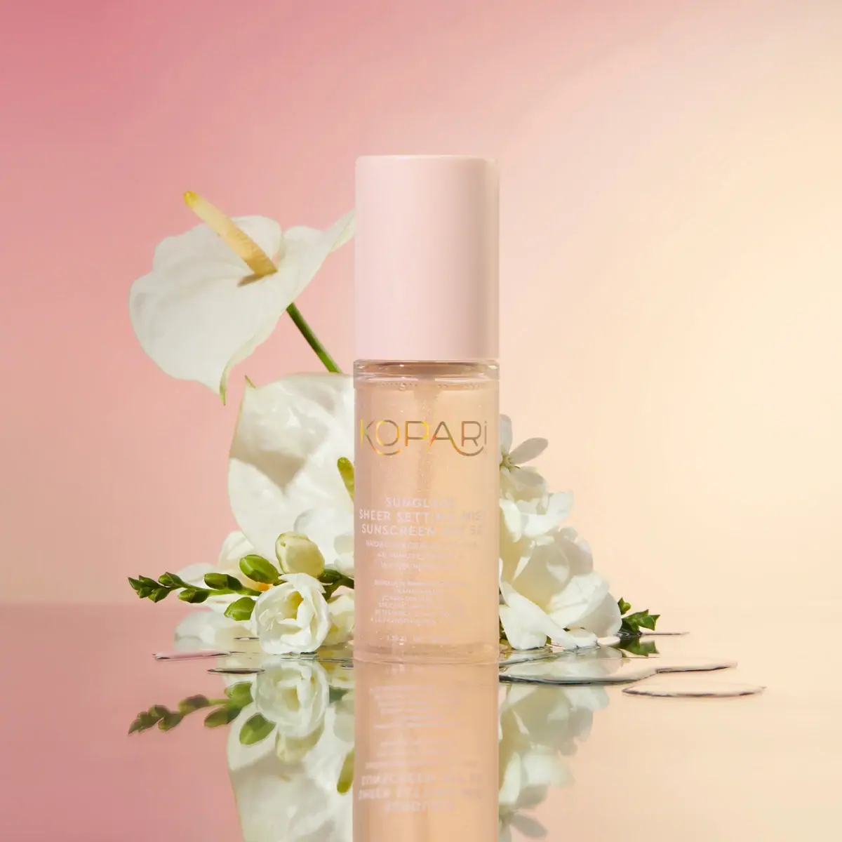
The selected mini Sunglaze bottle combines a tall pale-blush cap with a clear cylindrical body that reveals lightly shimmering contents. A large gold-looking KOPARI wordmark sits above dense white product and SPF information, followed by a smaller secondary-language block and a low quantity line. The visual hierarchy distinguishes maker from practical copy by colour and scale, while the pale contents keep the whole object soft. The study follows the 40 mL mini visible in the approved photograph; full-size proportions and hidden dispensing hardware are not substituted for it.
- Suncare
- Light pack
- Luxe monochrome
- Clinical minimal
About this study
The selected mini 40 mL Sunglaze bottle. The official mini listing confirms product identity; full-size proportions and covered sprayer details are outside this study.
Sources & evidence · Reviewed 2026-10-19Color Palette
Approximate colours interpreted from photography. These are screen references, not official brand colours or print specifications.
Pack body
Pale blush cap
#E8C8BC
Approximate opaque cap colour under warm scene lighting. It provides the largest stable coloured component above the transparent body.
Pale champagne contents
#E3C6A1
Approximate visible liquid appearance, including warm illumination and fine shimmer. It is not a bottle-coating colour standard.
Ink
Gold-looking maker mark
#B9984E
Approximate warm reflective wordmark. The appearance does not identify hot foil, metallic ink or a specific application process.
Soft white product copy
#F1E2D7
Approximate pale lettering. Its contrast against the pale contents varies across the image, making physical readability testing important.
Typography
Suggested visual alternatives, not confirmed brand typefaces. Any scale below is an illustrative estimate.
The thin, broad KOPARI maker name is the largest readable element and uses a gold-looking treatment. Beneath a clear gap, SUNGLAZE, SHEER SETTING MIST and SUNSCREEN SPF 50 form a closely stacked white uppercase block. Smaller supporting lines follow, then another compact language block and the tiny quantity line near the base. This produces a pronounced maker-first hierarchy on a narrow surface. The practical text is much denser than the logo, and some lines lose contrast against the pale liquid and reflections.
Fonts
Original maker-name alternative
Jost
- Looks like
- Light wide geometric sans
- Type
- Geometric sans serif
- Weight
- Light, Regular
- Case
- Uppercase
- Tracking
- Slightly open
- Fallback
- Arial, sans-serif
Use a short original maker name with clear counters on a curved bottle. Avoid expanding it so far around the cylinder that the outer letters disappear from a front view.
Product-information alternative
Barlow
- Looks like
- Compact plain uppercase sans
- Type
- Sans serif
- Weight
- Medium, SemiBold
- Case
- Uppercase for concise product lines
- Tracking
- Modestly open when space permits
- Fallback
- Arial, sans-serif
Separate product type, key identifier and smaller supporting text through spacing and weight. Test contrast against the actual filled bottle instead of judging white type against an empty digital background.
Structure & Proportions
Visual proportions and finish previews are illustrative. Confirmed construction details and uncertainties are distinguished in the study notes.
Proportions
| Purpose | Value | Preview |
|---|---|---|
| Tall covered top | The cap occupies a substantial part of the silhouette, making the closed mini feel like one long cylinder rather than a short bottle with a small lid. | — |
| Maker-to-copy separation | The logo has more open surrounding space than the tightly grouped product text beneath it, reinforcing its first-read role. | — |
| Limited text width | The cylinder's narrow front constrains line length; the smaller copy resolves this through multiple stacked lines rather than a broad panel. | — |
Shapes
| Element | Value | Preview |
|---|---|---|
| Body | Straight clear cylinder with a gently defined lower edge. | |
| Overcap | Tall opaque cylindrical cover with a flat-looking upper end and subtly softened edges. | |
| Information block | Narrow centred column of white text below a wider maker line. |
Finishes
Clear vessel appearance
Main bottle body · transparent
Smooth blush cover
Tall fitted overcap · matte
Warm reflective lettering
Maker wordmark · metallic
Formats and materials
| Formats | Narrow clear cylindrical mini bottle, Tall opaque blush overcap, Photographed and source-confirmed 40 mL / 1.35 fl oz format |
| Materials | The accessible official page does not identify the bottle or cap substrate; transparent appearance alone cannot distinguish glass from a clear polymer., The official formulation lists mica, providing context for the visible fine shimmer without establishing a decorative coating on the container., The maker mark's warm reflectivity and the white text do not reveal their ink, foil or carrier-film construction. |
| Closures | The fitted cap conceals the dispensing assembly and continues the bottle's straight-sided silhouette with a slight change in width. The product is officially described as a mist, but nozzle shape, actuator size and internal mechanism are not visible. No aerosol, pump output or transport-seal specification is inferred from the tall cover. |
| Decoration | Large thin maker wordmark, Dense centred white product and supporting copy, Small low capacity line distinguishing the mini format |
Front Panel
Schematic reading order. The diagram’s zone heights do not represent measured artwork proportions.
The visible front has no large opaque label background. Lettering sits over the clear-looking body, allowing the contents to remain part of the visual field. The maker, main product block, smaller secondary-language details and quantity each occupy a different vertical tier. This preserves a light appearance, but it also makes the text depend on whatever colour and reflection sits behind it. The exact decoration method remains unresolved.
| Zone | Content |
|---|---|
| Upper maker field | Large gold-looking KOPARI name with thin strokes and broad letter spacing. |
| Primary product block | SUNGLAZE, setting-mist naming and SPF 50 wording in smaller white capitals. |
| Supporting information | Closely stacked smaller claim and secondary-language lines; not all are confidently transcribed from this view. |
| Lower quantity | Tiny 1.35 fl oz / 40 mL line identifying the photographed mini. |
Range System
The official page explicitly identifies this product as the mini 40 mL version. The selected image's amount agrees with that listing. This provides a firm size boundary, but it does not establish the exact proportions, decoration or component materials of the full-size product. A useful design principle is to retain recognisable maker and product tiers while independently adjusting the density of practical copy for each size.
- The amount near the bottom distinguishes this small format from a larger bottle with a similar name.
- A hypothetical larger format could provide more breathing room around the supporting information rather than merely enlarging every line.
- A mini should still identify product type clearly when separated from a set or gift presentation.
Back of Pack & Shelf
The rear, underside, open sprayer and any carton are not shown. The source page supplies usage and ingredient information, but their exact printed arrangement is not established.
- Do not reconstruct an unseen sunscreen information panel from the front's small text.
- Keep visible SPF wording as an observed product identifier rather than an independently verified performance finding.
- For a new commercial design, use its actual approved information and test readable text on the filled container, not just a flat artwork proof.
On shelf
As an interpretation, the large warm maker mark and tall blush cap are likely to be the strongest recognition cues. The smaller white copy may require closer reading, especially where the contents and background are similarly pale. This is a real design trade-off in the selected image: transparency communicates lightness, but removes a stable opaque ground behind practical information. A useful review would test the filled mini against light and dark surroundings and at actual hand-held distance, rather than assuming the enlarged photograph proves legibility.
Imagery
The approved official-source photograph places the bottle upright among white blossoms and green stems on a reflective surface. A peach-to-pink background repeats the cap and liquid's warm appearance, while the flowers add brighter shapes behind the clear body. The reflection extends the cylinder below, emphasising its vertical form. Floral props do not establish formula ingredients or included accessories. The fine sparkle belongs visibly to the contents, while larger highlights and the reflection arise from lighting and the set. These distinctions prevent a photographic effect from becoming an unsupported package-material claim.
Guidelines
Editorial principles for an original design brief, not official brand guidelines.
Do
- Make the mini's quantity explicit and accurate.
- Separate maker and product information with clear scale changes.
- Test lettering on the actual filled transparent bottle.
- Distinguish formula shimmer from package surface treatment.
- Keep hidden sprayer specifications unresolved until inspected.
Don't
- Do not assume all white copy has strong contrast.
- Do not call the maker mark hot foil from appearance alone.
- Do not assign full-size dimensions to the mini.
- Do not infer botanical ingredients from the flowers in the photograph.
Sources & evidence
How this study was built
edition · Sourced fact
The official listing identifies the mini as 40 mL, matching the photographed quantity line.Mini Sunglaze Sheer Setting Mist SPF 50 — Koparistructure · Visual observation
A tall opaque blush cap covers the dispensing hardware above a narrow transparent cylinder.typography · Visual observation
Large gold-looking maker lettering leads dense smaller white product and secondary-language copy.palette · Sourced fact
The formulation lists mica, supporting context for visible contents shimmer without identifying a bottle coating.Mini Sunglaze Sheer Setting Mist SPF 50 — Koparilabel · Editorial interpretation
White copy has varying contrast against pale contents, so physical legibility cannot be assumed from the enlarged image.imagery · Visual observation
White blossoms, green stems, warm backdrop and reflection belong to the set rather than the printed package.
What remains unverified
- The original gift-page source URL did not yield accessible content; the official mini product page was accessible.
- Bottle/cap materials, decoration process and sprayer mechanism are not specified.
- The rear, underside and carton are absent.
- Some small front copy is not confidently legible; original fonts and colour standards are unknown.
Give your AI
packaging taste
Give your design or image tool a packaging study: palette, type, structure, front panel and principles for an original brief.
Export this styleFree with an email. PACK.md works in Claude, ChatGPT, Cursor and image tools.
More like this

African Botanics
Technical black label with a low serif signature

bareMinerals
a restrained black compact framing the powder itself

BeautyPWR
Clear square shell, white cream cup, black serif identity

Corpus
sage gloss with whispered gold lettering

Costa Brazil
Pale matching vessels with small, deliberate bilingual labels

Crown Affair
Pale frosted-looking bottle, black pump and small looping emblem

HAKU
Pearly narrow tube with stacked serif identity and clear base

Haus Labs
mirror chrome hardware over frosted shade