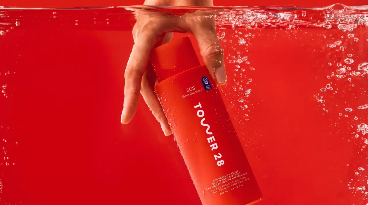
Images from the packaging case study by Verena Michelitsch · Campaign images © Tower 28, from tower28beauty.com
Tower 28

lilac acrylic cubes and wavy w marks
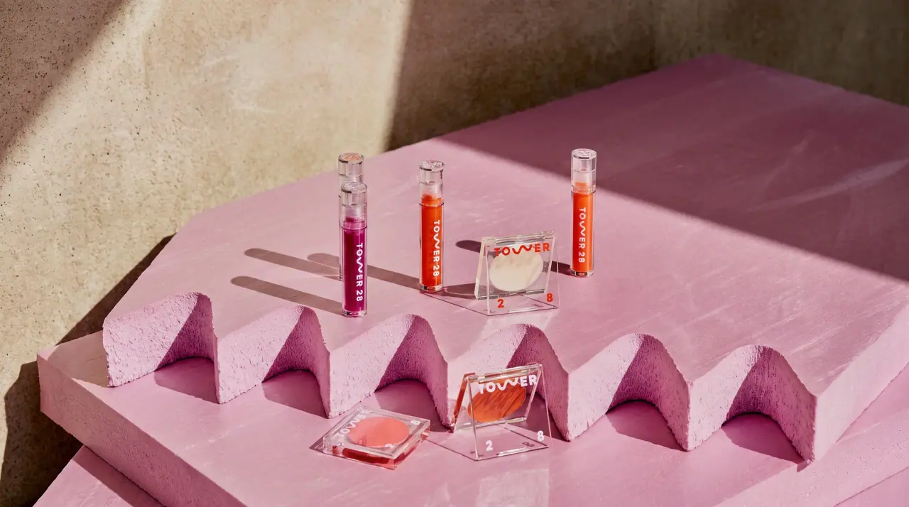
Tower 28 builds its makeup around one soft lilac (#d7c3e8) and a heavy rounded wordmark whose W is drawn as a wave, then lets the product shade colour everything else. Cream products sit in square clear acrylic cubes with the wordmark split around the pan: the word across the full top edge and the two numerals in opposite bottom corners, all in lilac. Powders come in round flip compacts tinted either lilac or the shade itself, with the wave debossed into the pressed powder and the wordmark printed small on the lid. Slim barrels, tubes and pencils carry the wordmark running vertically, and only the mascara breaks the pastel calm with bold orange wave stripes.
- Make-up
- Light pack
- Pastel soft-touch
- Playful colour
Color Palette
Approximate colours interpreted from photography. These are screen references, not official brand colours or print specifications.
Pack body
Lilac Haze
#d7c3e8
Signature colour of compacts, lipstick and mascara barrels
Clear Acrylic
#eef0f3
Square transparent cube compacts that show the cream pan inside
Ink
Wordmark Lilac
#c9a6e6
Printed wordmark and split numerals on clear acrylic cubes
Soft White
#f8f4f6
Wordmark on shade-coloured compacts, tubes, barrels and pencils
Accent
Wave Orange
#ea5427
Bold wave stripes wrapping the lilac mascara tube
Range coding
Beach Cherry
#e0163f
Shade-matched red round compact and cream pan for red blush shades
Petal Pink
#f6cfd3
Pale pink pressed powder seen in the lilac compact
Mauve Tube
#b27a80
Shade-tinted squeeze tube of the lip treatment, with a tonal wave print
Pencil Rose
#b96b63
Lip-liner barrel painted in the lead colour
Contour Tan
#c08a64
Cream contour pan seen through the clear cube
Typography
Suggested visual alternatives, not confirmed brand typefaces. Any scale below is an illustrative estimate.
The wordmark is the only real typography on the front: heavy rounded capitals with a wave for the W, either spread across the top edge of a cube with the numerals split into the bottom corners, or running vertically up a barrel. Product names and shades are kept off the hero face and appear only small on the base or back.
Type scale
Estimated cap size as a share of the panel · Front face of the square cream-blush cube, about 45 mm tall
cube-wordmark
18% · Black · Display
SHORE
cube-numerals
18% · Black · Numeral
4 5
barrel-wordmark
12% · Black · Display
SHORE 45
lid-wordmark
7% · Black · Display
SHORE 45
product-name
3% · SemiBold · Body
SeaSalt Cream Blush
shade-name
2.5% · Regular · Body
Coral Reef
Fonts
Display
Nunito
- Looks like
- Custom heavy rounded geometric with a wave W, close to Gilroy ExtraBold, Nunito Black
- Type
- Heavy rounded geometric sans
- Weight
- Black
- Case
- Uppercase
- Tracking
- Wide, about +8%
- Fallback
- Arial Rounded MT Bold, Helvetica Rounded Bold
The wordmark with the wave W, across cube tops, compact lids and vertically on barrels.
Numeral
Nunito
- Looks like
- Same rounded heavy figures as the wordmark
- Type
- Heavy rounded numerals
- Weight
- Black
- Case
- Figures
- Tracking
- Split to opposite corners
- Fallback
- Arial Rounded MT Bold
The two numerals of the name, separated into the bottom-left and bottom-right corners of cube compacts.
Body
Montserrat
- Looks like
- Gilroy Regular, Montserrat
- Type
- Geometric sans
- Weight
- Regular, SemiBold
- Case
- Title case
- Tracking
- Normal
- Fallback
- Arial, Helvetica
Product name with trademark symbols, shade name and weight on base labels only.
Structure & Proportions
Proportions
| Purpose | Value | Preview |
|---|---|---|
| Cube wordmark width | Full width of the top edge, about 95% | |
| Pan diameter | About 80% of cube width, centred | |
| Barrel wordmark length | About 50% of barrel length, vertical near the base | |
| Lid wordmark | About 45% of compact width, centred near the hinge | |
| Wave stripe | About 30% of mascara barrel width per stripe | |
| Colours per pack | Two: lilac or shade body plus one ink | — |
| Density | Only the wordmark on the front; product data hidden on the base | — |
Shapes
| Element | Value | Preview |
|---|---|---|
| Cream compact | Square clear acrylic cube | |
| Powder compact | Round flip compact | |
| Wave W | Wave replacing the W | |
| Barrel | Slim cylinder bullet | |
| Lip tube | Squeeze tube with rounded applicator tip |
Finishes
Clear high-gloss acrylic
Cube compacts · transparent
Soft matte pastel
Lilac compacts, barrels and mascara · matte
Debossed wave
Pressed powder pans · emboss
Gloss shade-tinted plastic
Red compacts and lip tubes · gloss
Formats and materials
| Formats | Square acrylic cube compact, Round flip compact, Slim lipstick bullet, Mascara tube and wand, Squeeze tube with soft applicator tip, Wood-look pencil, Glass jar, Dropper bottle |
| Materials | Clear acrylic, Tinted plastic, Glass |
| Closures | Lift-off clear cube lids, snap-shut round compact lids, pull-off caps on bullets and wands |
| Decoration | Direct-printed wordmark, Debossed wave motif in powder, Tonal wave pattern on tubes, Bold wave stripes on mascara |
Front Panel
Schematic reading order. The diagram’s zone heights do not represent measured artwork proportions.
No paper labels; the wordmark is printed straight onto the component, wrapping around the product window on cubes and running along the long axis on barrels.
| Zone | Content |
|---|---|
| Top edge | Word across the full width of the cube, or the wordmark on the compact lid |
| Window | The shade itself, seen through clear acrylic or as a debossed wave in powder |
| Bottom corners | The two numerals split left and right of the pan |
Range System
Two families: a lilac family where the component stays lilac whatever the shade, and a shade family where the compact, tube or pencil is tinted to match the product inside; the wave wordmark is constant across both.
- Cream blush and contour = clear cube + lilac wordmark
- Matte powder blush = round compact tinted red
- Pressed powder = lilac round compact
- Lip treatment = mauve shade-tinted tube
- Mascara = lilac tube with orange wave stripes
Back of Pack & Shelf
All product information sits on a small base label or the back of the component: product name with trademark symbols, shade name, net weight, ingredients on the carton, and clean-beauty and recycling marks, in a small geometric sans.
- Product name with trademark symbols and shade name on the base
- Net weight in grams and ounces
- Full ingredient list on the carton
- Sensitive-skin and cruelty-free marks
- Batch code and period-after-opening symbol
- Barcode and maker address on the carton
On shelf
On shelf the lilac family reads as one block of soft purple, while the clear cubes turn into a grid of shade windows framed by lilac type, so both colour and the wave mark identify the brand.
Imagery
No illustration or photography on pack; the only graphic is the wave, used as the W, as a debossed powder relief and as a stripe pattern. Product shots pair packs with swatches and swipes of the shade on white.
Guidelines
Do
- Use one soft lilac (#d7c3e8) as the constant brand colour.
- Draw the W of the wordmark as a wave and set the rest in heavy rounded capitals.
- On cube compacts, run the word across the full top edge and split the numerals into the bottom corners.
- Tint compacts, tubes and pencils to the shade when the product is a colour family.
- Deboss the wave into pressed powders.
- Keep product names and shades off the front, on the base only.
Don't
- Don't print product names large on the front.
- Don't use paper labels, frames or illustration.
- Don't use dark or metallic components.
- Don't set the wordmark in a sharp or serif face.
- Don't use more than one accent pattern; the orange wave belongs to the mascara.
Give your AI
packaging taste
Give your design or image tool a packaging study: palette, type, structure, front panel and principles for an original brief.
Export this styleFree with an email. PACK.md works in Claude, ChatGPT, Cursor and image tools.
More like this

Bread Beauty Supply
bubblegum pumps and a fat black wordmark
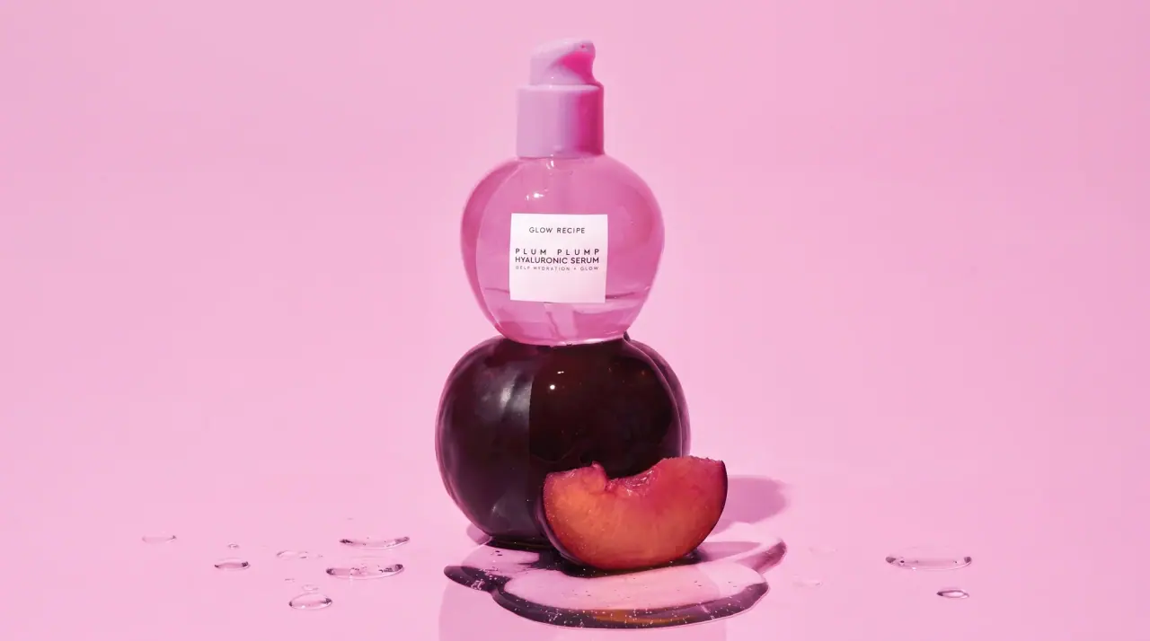
Glow Recipe
juicy fruit candy in tinted glass

Kosas
lavender chrome and candy-pink acrylic

Kylie Cosmetics
baby-pink plastic with a dripping cap
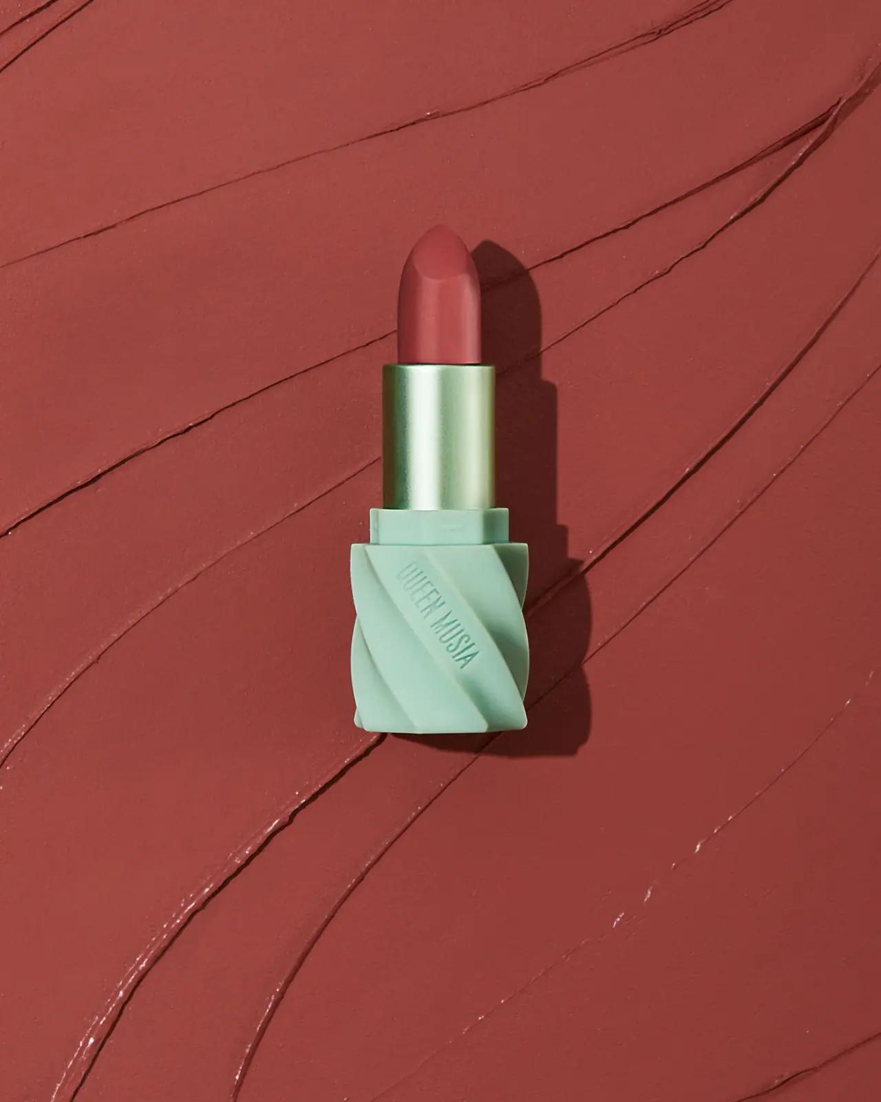
QUEEN MUSIA
Mint diagonal folds with reflective green sleeve and warm lipstick

ACURE
Iridescent spectacle with practical, tightly ordered type

Bask
sunny yellow with a playful turquoise signature
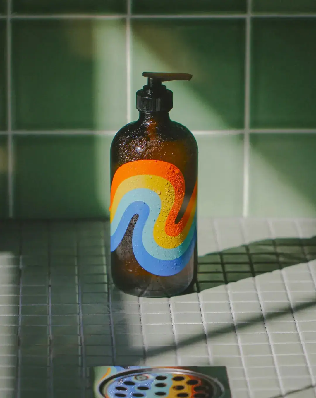
Bathing Culture
Flowing rainbow bands on dark refillable glass