Photography: Derek Drapeau — Coppertone photography. Images belong to their respective owners.
Coppertone

Blue fields, a yellow sun and a clear number
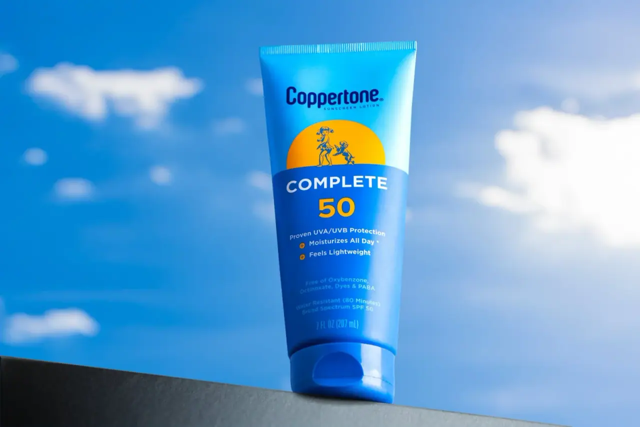
The selected Complete SPF 50 tube combines a bright cyan upper field with a deeper blue lower field, using a yellow semicircle and large yellow numeral to connect brand heritage with functional identification. The small illustrated emblem sits inside the sun-like shape, while the white Complete title establishes the product line below it. A matching blue cap completes a single upright colour block. The design is useful for studying how an illustrated brand cue, a product name and a prominent number can share a narrow tube without becoming equal competitors. This study describes the photographed 7 fl oz / 207 ml front, not a new sunscreen recommendation or a universal Coppertone template.
- Suncare
- Light pack
- Bold typographic
- Heritage label
About this study
Selected blue Complete SPF 50 tube photographed with a 7 fl oz / 207 ml front. Product facts are limited to identifying this specimen; no efficacy advice or broader range audit is provided.
Sources & evidence · Reviewed 2026-10-19Color Palette
Approximate colours interpreted from photography. These are screen references, not official brand colours or print specifications.
Pack body
Bright cyan blue
#10A7DB
Approximate upper tube field. Strong scene reflections create lighter streaks, but the visible base colour remains distinct from the darker information area below.
Label
Deep information blue
#0752A4
Approximate lower front field and cap family. It supplies a stronger ground for the white product title and yellow number than the brighter upper section.
Ink
White title
#F2F6F6
The product-line name and supporting front text use pale contrast against blue. Some lower copy appears lower contrast in the lighting, so readability should not be assumed uniformly across the whole panel.
Dark brand blue
#063571
The upper wordmark and illustration use a darker blue than the surrounding cyan field. These screen values are approximate and do not specify production inks.
Accent
Sun yellow
#F7B400
Links the semicircular emblem field, large 50 and small plus markers. Repetition lets a small amount of warm colour organise several levels of information.
Typography
Suggested visual alternatives, not confirmed brand typefaces. Any scale below is an illustrative estimate.
The house mark is first positioned high on the tube, followed by the illustrated sun field. The broad uppercase Complete name starts the darker lower zone, then the large yellow 50 becomes the strongest numerical anchor. Smaller benefit-style lines, lower qualifiers and quantity continue downward in decreasing prominence. The large number and product name are separate reads: one should not have to parse the smallest text to locate them.
Fonts
Product-line name and numeral
Montserrat
- Looks like
- Montserrat
- Type
- Geometric sans serif
- Weight
- SemiBold 600 / Bold 700
- Case
- Uppercase product name with prominent numerals
- Tracking
- Moderate for the name; natural numeral spacing
- Fallback
- sans-serif
An alternative for a broad, confident line name and a large functional numeral. Preserve the hierarchy while using original wording; any protection value in a real product must come from approved product information rather than visual invention.
Compact supporting copy
Inter
- Looks like
- Inter
- Type
- Sans serif
- Weight
- Medium 500 / SemiBold 600
- Case
- Mixed case for short information lines
- Tracking
- Normal
- Fallback
- sans-serif
Use for concise secondary information with clear line spacing. The selected front contains several small blocks, so a real-size proof on the curved tube is more useful than relying on a large digital mockup.
Fictional house-name alternative
Barlow Condensed
- Looks like
- Barlow Condensed
- Type
- Condensed sans serif
- Weight
- Bold 700
- Case
- Title case for an original producer name
- Tracking
- Natural optical spacing
- Fallback
- sans-serif
A practical narrow alternative for a new house identity. It is not an identification of Coppertone’s custom mark and should not reproduce its exact letter shapes.
Structure & Proportions
Visual proportions and finish previews are illustrative. Confirmed construction details and uncertainties are distinguished in the study notes.
Proportions
| Purpose | Value | Preview |
|---|---|---|
| Tube silhouette | A tall body widens toward its crimp and narrows into the standing cap, giving the front a gently tapered information area. | — |
| Upper and lower fields | The upper brand-and-emblem zone is shorter than the lower product-information zone. The curved boundary helps the transition feel continuous rather than like a pasted rectangular label. | — |
| Numerical emphasis | The large yellow number is visibly stronger than surrounding claims, but remains subordinate to the full tube silhouette. No exact type-size ratio or dimensions are measured. | — |
Shapes
| Element | Value | Preview |
|---|---|---|
| Squeeze tube | Tapered front with a broad straight sealed crimp and rounded lower transition. | |
| Yellow emblem field | A sun-like semicircle with its lower area visually interrupted by the blue information field. | |
| Field boundary | A broad curved division separates the brighter upper area from the darker lower information plane. | |
| Standing closure | Wide rounded base with a visible front thumb recess. |
Finishes
Smooth printed appearance
Blue tube front; exact printing and varnish process unknown. · gloss
Reflective curved cap
Blue closure, particularly the front recess and rounded outer edges. · gloss
Formats and materials
| Formats | An upright squeeze tube standing on its broad blue closure, with a sealed ribbed crimp across the opposite end. The photographed front prints 7 fl oz / 207 ml; the official page lists the corresponding product at 7 oz. |
| Materials | The official product listing does not specify tube laminate, resin, barrier layer or closure material. A flexible-looking tube is visible, but its construction cannot be identified from this photograph. |
| Closures | The curved blue flip-top-style base has a visible front opening recess and a horizontal lid join. The open hinge, dispensing orifice and sealing details are not shown, so their geometry remains outside this study. |
| Decoration | Cyan and deeper blue fields are divided by a broad curved boundary. A yellow semicircle rises behind the small illustrated emblem, and the darker lower field carries the main functional information. |
Front Panel
Schematic reading order. The diagram’s zone heights do not represent measured artwork proportions.
Information is organised by coloured territories rather than a separate paper label. The upper cyan field carries the house identity, the yellow shape contains an illustrated cue, and the lower blue field carries the product name, number and supporting text. This division permits several distinct reading speeds within one compact front.
| Zone | Content |
|---|---|
| Upper house identity | A dark blue producer mark sits above a small category descriptor. It has its own space before the emblem, keeping the upper section from becoming one dense illustration-and-wordmark lockup. |
| Sun-shaped emblem field | The small heritage illustration is isolated against yellow. Its detail can be appreciated close up, while the larger semicircle remains a useful shape at smaller scale. |
| Line name and number | The white Complete name is followed by the large yellow 50. These two elements form the main functional anchor, with strong size and colour separation from the smaller copy below. |
| Supporting front copy | Short lines and small yellow plus markers provide an intermediate reading level. Their presence is analysed as typography; photographed benefit wording is not independently endorsed here. |
| Lower qualifiers and quantity | Small information blocks and the visible 7 fl oz / 207 ml quantity sit above the closure. Curvature, reflections and lower contrast make this area especially important to proof at actual scale. |
Range System
The official source identifies Complete Lotion SPF 50. The selected photo shows this specific front design; other Coppertone product families and SPF variants were not compared visually. The transferable principle is a stable separation between house identity, line name and a clearly designated numerical attribute.
- For an original product family, preserve the main reading order while changing only verified product information. A large numerical field should have an unambiguous label and must not be treated as decorative filler.
- If a second version needs more text, retain the distinction between upper identity and lower function instead of allowing supporting claims to grow into competing headlines. This is design guidance, not a claim about the real range’s implementation.
Back of Pack & Shelf
The reverse is not visible. The official page explicitly notes that website Drug Facts may differ from purchased-pack labelling, so the photographed edition cannot be reconstructed from current web copy alone.
- Obtain the actual edition’s approved back artwork before transcribing directions, warnings or active ingredients.
- Do not use this visual study as a substitute for a market-specific sunscreen label review.
- Tube crimp and curved closure margins should be considered in layout planning, but no unseen text position is asserted here.
On shelf
The blue body and yellow sun-like field offer a broad colour-and-shape read, while the white line name and yellow number carry more specific identification. The illustration is small enough to act as a secondary cue. This is a visual assessment, not a tested claim about shelf scanning. The current photograph also shows how glare can weaken fine lower copy even when the main headline remains clear.
Imagery
The tube stands on a dark diagonal ledge against a blue sky with soft white clouds. A low viewpoint makes the tall tube prominent, while the background repeats the blue package palette. The yellow semicircle and number remain the principal warm accents. Derek Drapeau’s portfolio identifies the matching Coppertone blue-sky product photograph. Sky and clouds are part of the image, not printed illustrations on the tube, and the bright setting is not evidence of product performance.
Guidelines
Editorial principles for an original design brief, not official brand guidelines.
Do
- Separate the producer, product line and numerical attribute into distinct reading levels.
- Use the sun-shaped field as a simple silhouette before adding any small illustration.
- Proof lower copy on the actual curved tube under glare, not only in flat artwork.
- Keep any real protection value and directions tied to approved product-specific information.
Don't
- Do not copy the Coppertone child-and-dog emblem into an original concept.
- Do not invent an SPF number or water-resistance claim for a fictional formulation.
- Do not identify tube resin, barrier structure or recyclability from the blue surface.
- Do not enlarge every supporting claim until the main line name and number lose their prominence.
Sources & evidence
- Complete Sunscreen Lotion SPF 50 — Coppertoneproduct
- Derek Drapeau — Coppertone product photographyphotographer
How this study was built
edition · Sourced fact
Official page identifies Complete Lotion SPF 50 and lists 7 oz; selected front visibly reads 7 fl oz / 207 ml.Complete Sunscreen Lotion SPF 50 — Coppertoneimagery · Sourced fact
Photographer portfolio identifies the matching blue Coppertone tube against a blue sky.Derek Drapeau — Coppertone product photographystructure · Visual observation
Tapered squeeze tube, ribbed sealed crimp and curved blue standing closure are visible.label · Visual observation
Upper cyan identity, yellow semicircle and darker lower functional field divide the front.typography · Visual observation
White line name and large yellow numeral dominate smaller supporting blocks.palette · Visual observation
Blue, yellow and white belong to the package; cloud and sky imagery is the setting.range · Editorial interpretation
Suggested adaptations preserve separate identity and numerical information; other variants were not audited.
What remains unverified
- Tube and closure materials, print process and internal construction are unverified.
- Reverse, hinge interior and orifice are unseen.
- Official web source warns that purchased-pack Drug Facts may differ; no back text is reconstructed.
- Original fonts and print colours are unknown; alternatives and approximate screen values are used.
Give your AI
packaging taste
Give your design or image tool a packaging study: palette, type, structure, front panel and principles for an original brief.
Export this styleFree with an email. PACK.md works in Claude, ChatGPT, Cursor and image tools.
More like this
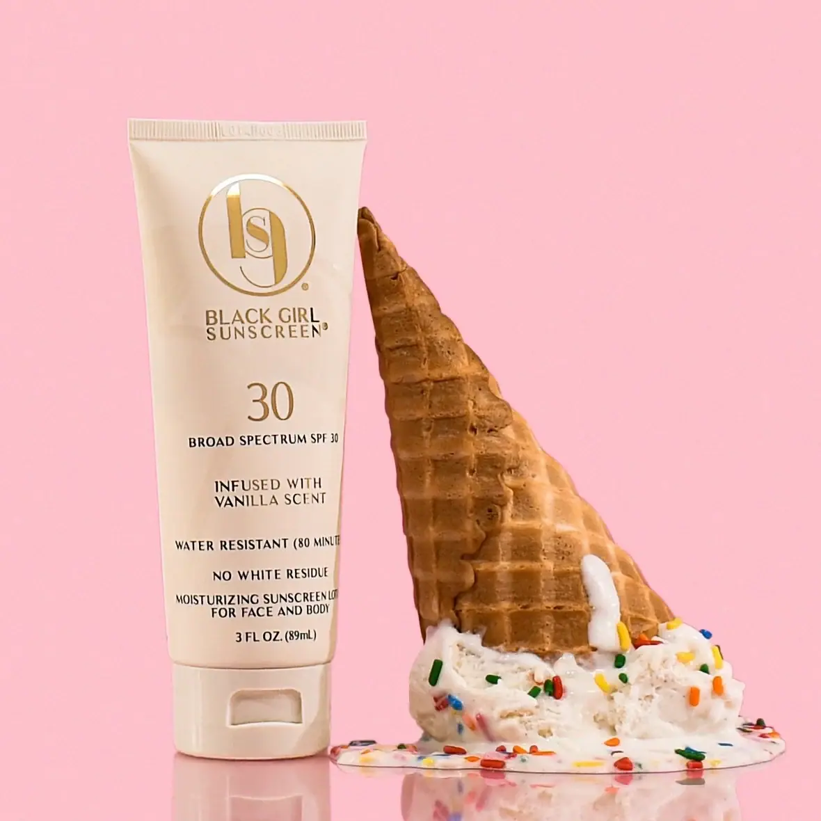
Black Girl Sunscreen
Cream tube with gold crest and an isolated SPF numeral
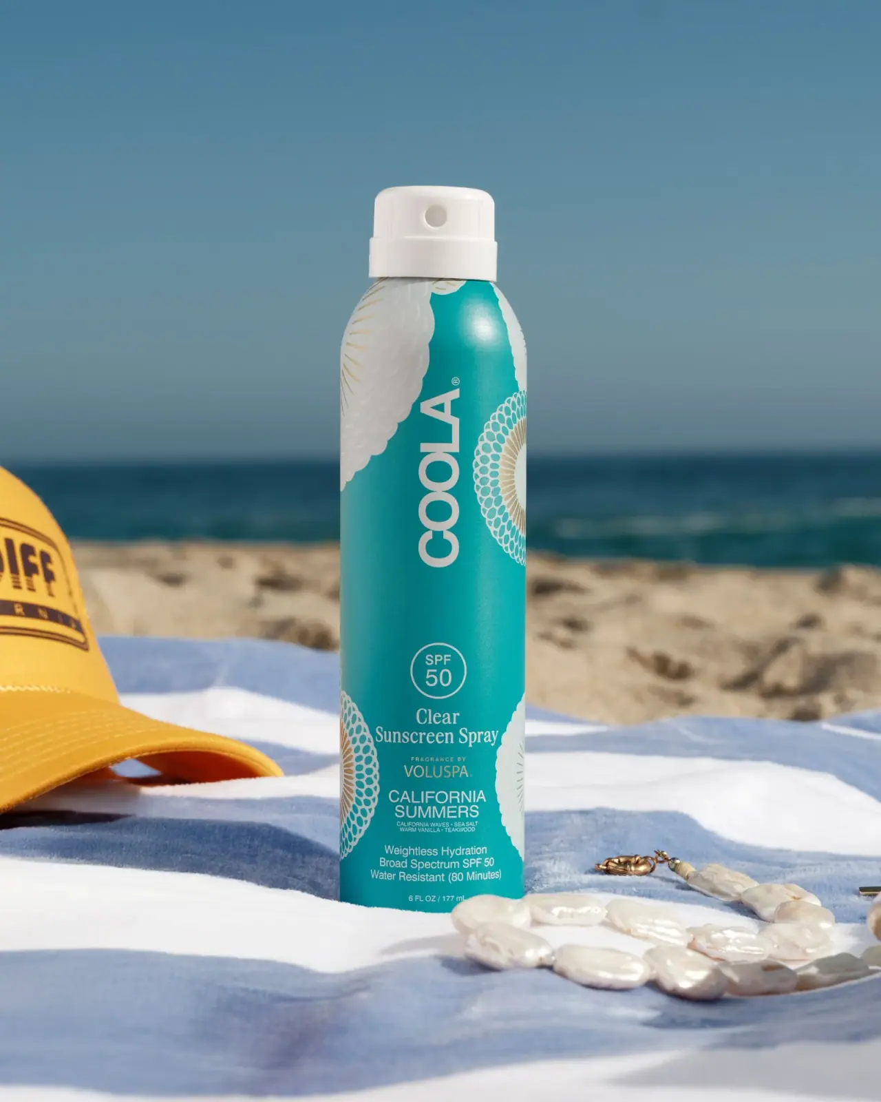
COOLA
Turquoise cylinder, cropped rosettes, vertical brand and fragrance attribution

Dr. Bronner’s
A bright soap wrapper with a densely ordered voice
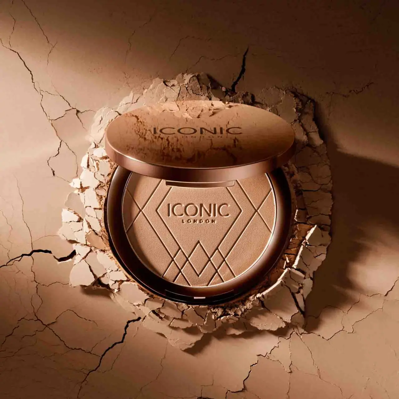
ICONIC London
Geometric powder relief inside a warm reflective round compact
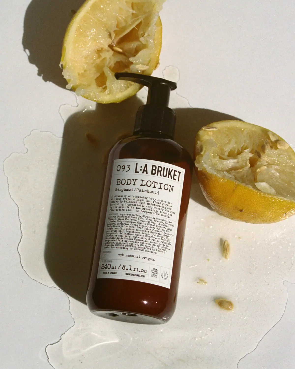
L:A Bruket
Amber pump bottle with a ruled typographic information label
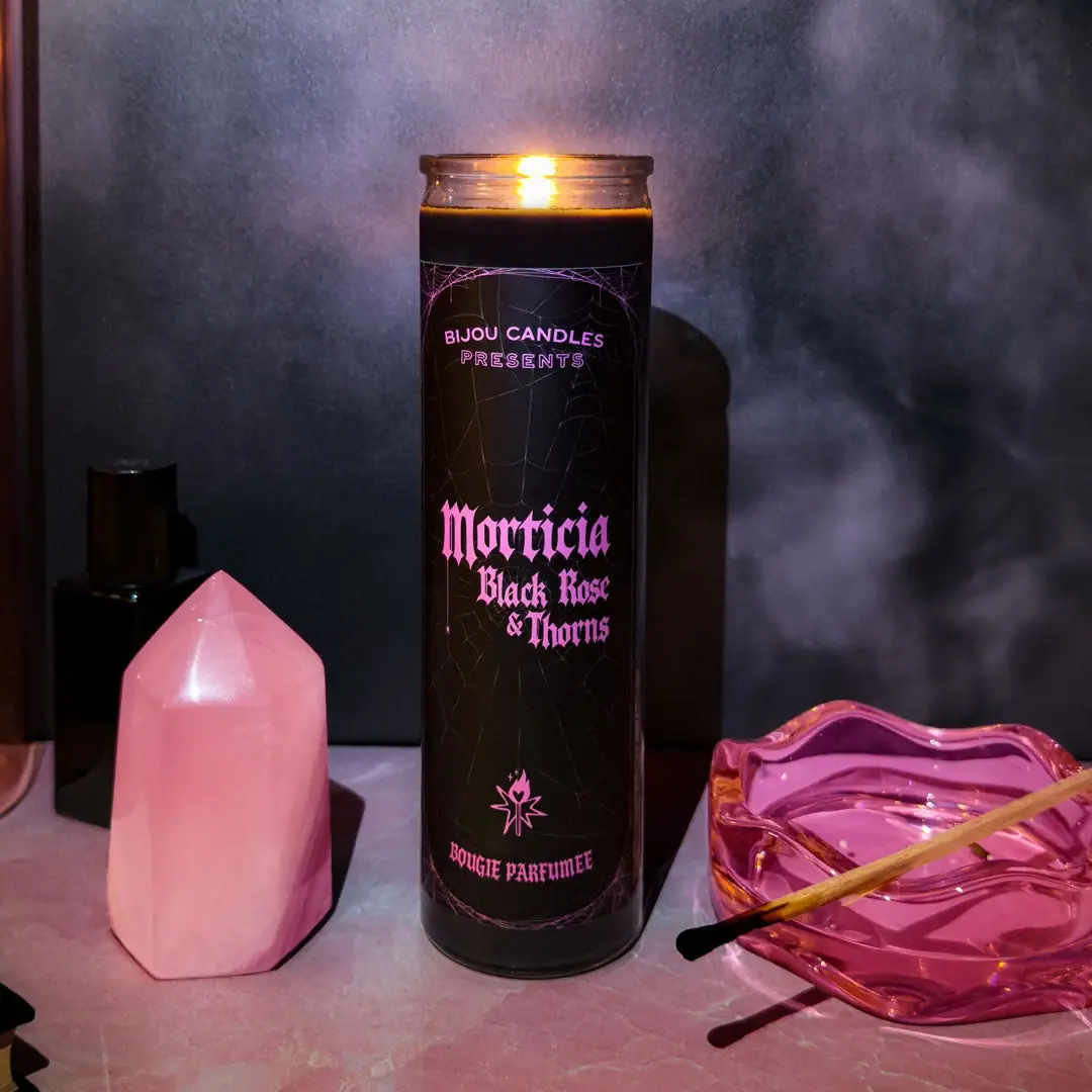
Bijou Candles
Pink blackletter and fine webs on a tall dark candle

Kettle & Fire
farmhouse animal badges on black cartons
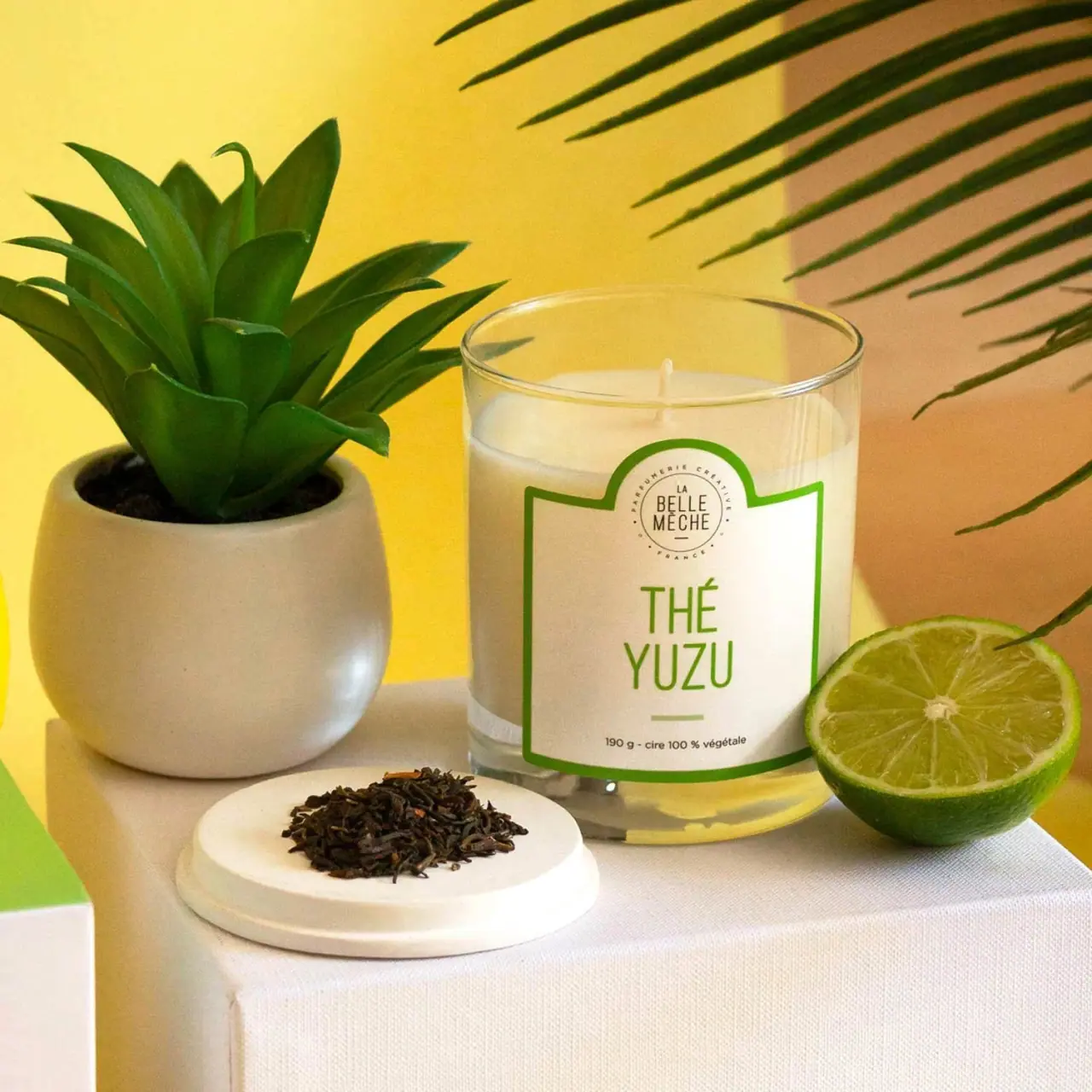
La Belle Mèche
Green scent lettering inside an arched white candle label