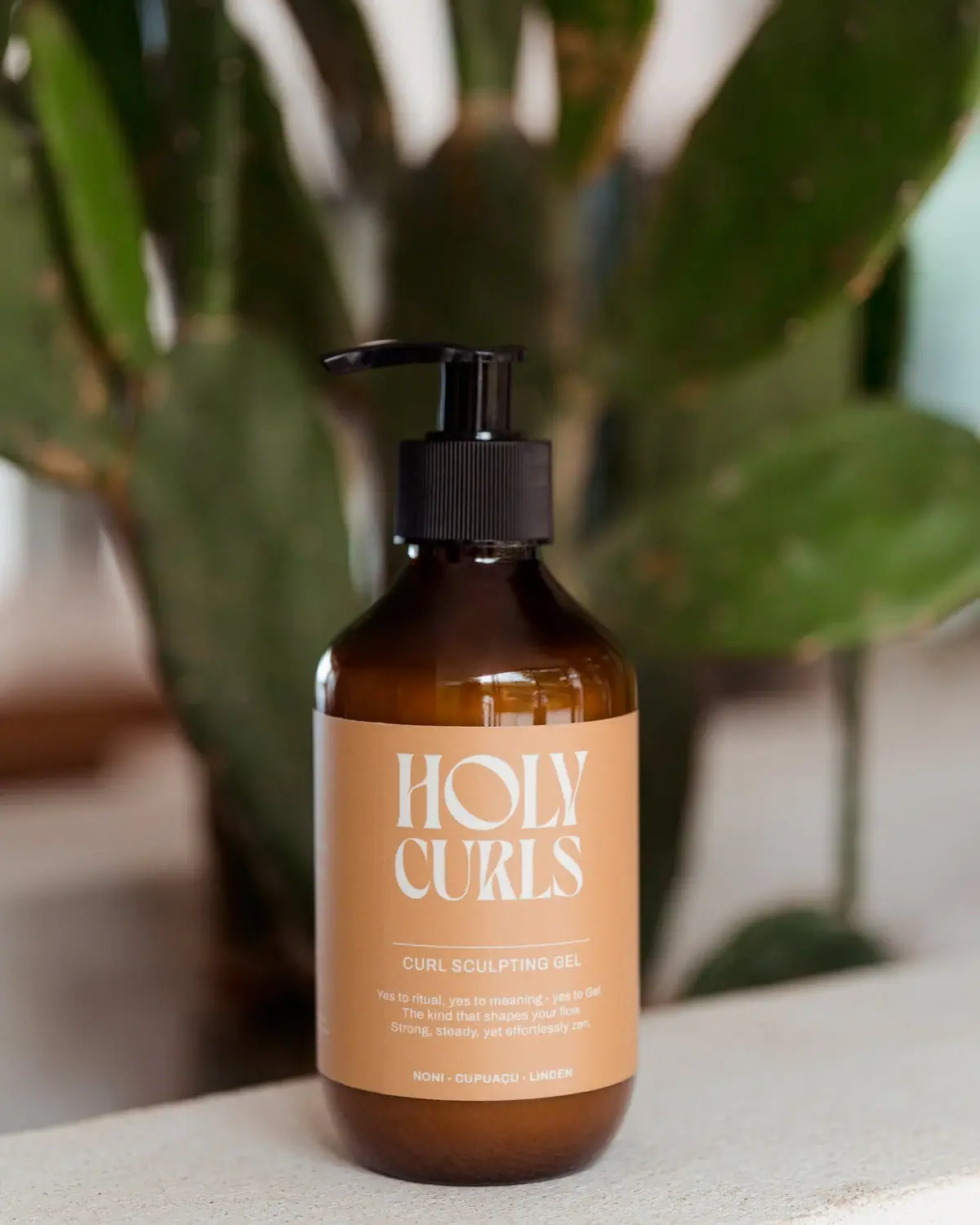
Photography: Holy Curls official photography. Images belong to their respective owners.
Holy Curls

Expressive white serifs on warm ochre with amber shoulders
Holy Curls Curl Sculpting Gel combines an amber-looking round bottle and black pump with a warm ochre-to-apricot label. The large white HOLY CURLS wordmark is the main graphic: two closely stacked lines of expressive high-contrast serif lettering above a fine divider. A much smaller sans-serif product name, centred ritual copy and ingredient-name footer complete the front. The official collection lists 300 mL and 600 mL options, but the selected photograph does not show a readable quantity. Its cactus background supplies botanical context without adding botanical illustration to the actual label.
- Hair
- Light pack
- Bold typographic
- Apothecary
About this study
Selected warm-label Curl Sculpting Gel pump photograph. Official two-size listing provides context; pictured capacity, exact substrate and formula edition remain unassigned.
Sources & evidence · Reviewed 2026-10-19Color Palette
Approximate colours interpreted from photography. These are screen references, not official brand colours or print specifications.
Pack body
Amber appearance
#6C3514
Approximate visible shoulder and base colour. Transparency, contents and light contribute to its appearance; substrate and colour formulation are not confirmed.
Black pump
#171415
Approximate functional top colour, with bright specular highlights on its smoother surfaces.
Label
Warm ochre apricot
#D8A470
Approximate uninterrupted wrap field. It feels warmer than a neutral pharmacy label while leaving the white maker as the main graphic.
Ink
Warm white lettering
#F6F1DF
Maker, divider, product name and supporting copy use a pale light appearance. Small text has lower contrast than the large maker.
Typography
Suggested visual alternatives, not confirmed brand typefaces. Any scale below is an illustrative estimate.
HOLY sits directly above CURLS in a compact central block. Thick and thin strokes, tapered terminals and shaped counters make the maker decorative without needing an adjacent illustration. The diagonal interior of the O and the long sculptural strokes are distinct from the plain sans-serif product line below. A fine white horizontal rule marks the transition. The centred paragraph then offers a conversational rhythm, while the compact ingredient-name footer provides a final baseline. The hierarchy comes from scale, letterform character and spacing rather than switching ink colours for every level.
Fonts
Original expressive maker alternative
Bodoni Moda
- Looks like
- High-contrast display serif
- Type
- Didone serif
- Weight
- Regular, Medium
- Case
- Uppercase
- Tracking
- Close with optical adjustment
- Fallback
- Georgia, serif
Explore a distinct editorial maker with strong thick-thin contrast. Preserve thin strokes at the actual print size and use a different line structure rather than tracing the unusual HOLY CURLS letterforms.
Functional and narrative alternative
DM Sans
- Looks like
- Simple open sans serif
- Type
- Sans serif
- Weight
- Regular, Medium
- Case
- Uppercase role and sentence-case supporting copy
- Tracking
- Normal to slightly open
- Fallback
- Arial, sans-serif
Keep the practical product heading and short narrative easy to scan beneath an expressive identity. Contrast and minimum readable size should drive decisions before matching the light appearance of this reference.
Structure & Proportions
Visual proportions and finish previews are illustrative. Confirmed construction details and uncertainties are distinguished in the study notes.
Proportions
| Purpose | Value | Preview |
|---|---|---|
| Maker-led label | The large wordmark occupies much of the upper label, while a smaller information cluster sits below a deliberate space and fine divider. | — |
| Visible vessel margins | A broad amber shoulder remains above the wrap and a rounded amber base below it, preventing the coloured label from becoming the entire silhouette. | — |
| Asymmetric functional top | The pump spout extends left beyond its central stem, introducing a practical horizontal gesture above an otherwise symmetrical bottle and label. | — |
Shapes
| Element | Value | Preview |
|---|---|---|
| Bottle body | Round cylinder with broad curved shoulder and softened lower edge. | |
| Dispensing head | Raised pump with long left-projecting spout and ribbed collar. | |
| Wrap field | Plain warm rectangle wrapping the body, its edges following the bottle curvature. | |
| Maker block | Two tightly stacked text lines forming a nearly rectangular central graphic. |
Finishes
Reflective amber vessel appearance
Exposed shoulder and base; substrate unspecified · gloss
Quiet warm wrap appearance
Main label field; no tactile coating verified · matte
Glossy dark dispensing top
Black pump spout and stem · gloss
Formats and materials
| Formats | Round amber-looking pump bottle, Broad rounded shoulders narrowing into the neck, Straight cylindrical label-bearing body with rounded lower edge, Official size options: 300 mL and 600 mL; selected size unassigned |
| Materials | The body appears amber and partly translucent where highlights cross its shoulder; this does not alone establish glass or a particular plastic., The official page describes PCR plastic and glass across the brand's packaging, without mapping a substrate or recycled percentage to this selected bottle., The warm wrap appears comparatively low-glare, but paper type, film construction, adhesive and water resistance are unverified. |
| Closures | A long black pump spout projects to the left above a raised stem and broad vertically ribbed collar. Glossy highlights on the stem and spout contrast with the collar's repeated fine ridges. The pump is visible in an extended position, but the photograph does not establish its lock direction, output per stroke, internal spring or refill compatibility. The width of the collar creates a firm dark transition between the dispensing head and rounded amber shoulder. |
| Decoration | Oversized two-line white expressive serif maker, Thin white rule separating maker and product, Centred small sans-serif product heading and narrative, Small ingredient-name footer without botanical illustrations |
Front Panel
Schematic reading order. The diagram’s zone heights do not represent measured artwork proportions.
The front places a distinctive maker above a small, restrained information system. The thin rule is shorter than the visible label width, matching the central reading column rather than forming a full border. Product name sits immediately below it. The short paragraph is set in several centred lines, with enough separation to read as tone of voice rather than another title. The footer lists three named ingredients in compact capitals. No volume, large performance badge or separate emblem is readable on this selected front. The slightly pale text on a warm field is attractive in the photograph but deserves scrutiny at small physical sizes.
| Zone | Content |
|---|---|
| Upper identity | Large white HOLY / CURLS wordmark in two expressive serif lines. |
| Divider and product role | Fine horizontal white rule above CURL SCULPTING GEL in smaller sans-serif capitals. |
| Narrative block | Short centred ritual-oriented copy in sentence case, visually subordinate to the product heading. |
| Ingredient-name footer | Three small uppercase ingredient names separated by dots; not a full ingredient list or proof of the current formula. |
Range System
The official collection lists two sizes for the gel, and its wider catalogue includes other wash and styling products. This supports discussing a routine and size range, but not assuming identical bottle proportions, labels or materials across every variant. The selected photograph demonstrates how a large maker could remain stable while a compact product heading changes. Its photographed capacity remains unassigned because the front provides no readable quantity. A complete range study would need equivalent views of both sizes and neighbouring products, rather than scaling this one image digitally and presenting the result as observed packaging.
- The collection's 300 mL and 600 mL options establish size choices for Curl Sculpting Gel without proving which is pictured.
- The selected role heading is clearly separated from the decorative maker, allowing a product name to vary independently in an original system.
- A larger bottle should be reviewed for hierarchy and handling in its own right; twice the volume does not mean every physical dimension doubles.
Back of Pack & Shelf
Only the front and narrow turning edges of the wrap are visible. Reverse artwork and underside markings are not inspected.
- No complete ingredient declaration, barcode, batch code or quantity position is established.
- The front ingredient-name line is a communication device rather than a reconstructed full formula.
- Current online ingredient narratives are not used to date the image or identify a particular formula revision.
On shelf
The large white maker should remain recognisable sooner than the smaller product details, although this is a visual inference rather than a retail test. The amber vessel and dark pump suggest a familiar functional bottle, while the exaggerated serif lettering gives that format a more editorial identity. The main weakness to test is contrast: pale thin strokes and tiny white copy on warm ochre may become less clear under dim light or at an oblique angle. Product-role recognition should therefore be checked separately from maker recognition, especially among similarly coloured bottles.
Imagery
The bottle stands on a pale rough ledge in front of a softly blurred cactus. Warm light catches its amber shoulder and produces narrow reflections on the pump, while the matte-looking label remains comparatively even. The cactus gives a natural setting and echoes the rounded silhouette at a much larger scale, but its green is outside the package palette. It is neither printed decoration nor evidence that cactus is a formula ingredient. The shallow depth of field makes the ornate white maker the focal point without surrounding it with additional graphic claims.
Guidelines
Editorial principles for an original design brief, not official brand guidelines.
Do
- Let distinctive lettering provide personality on a simple bottle.
- Separate expressive maker and plain product heading.
- Check pale fine strokes at physical print size.
- Keep photographed size and brand-wide materials claims qualified.
- Use a short divider to organise a centred information column.
Don't
- Do not identify glass solely from amber reflections.
- Do not assign the pictured bottle a size without readable evidence.
- Do not interpret cactus props as printed graphics or ingredients.
- Do not claim an exact commercial font for custom-looking lettering.
- Do not assume larger volume means identical proportions or label scaling.
Sources & evidence
- Curl Sculpting Gel — Holy Curlsproduct
- Shop All — Holy Curlsproduct
How this study was built
edition · Sourced fact
Official product page identifies Curl Sculpting Gel.Curl Sculpting Gel — Holy Curlsrange · Sourced fact
Collection lists 300 mL and 600 mL gel options; selected front does not identify which size is pictured.Shop All — Holy Curlsstructure · Sourced fact
The site's packaging statement mentions PCR plastic and glass generally, without assigning this photographed bottle a specific material.Curl Sculpting Gel — Holy Curlstypography · Visual observation
Expressive high-contrast serif maker contrasts with small plain sans product and narrative text.Curl Sculpting Gel — Holy Curlslabel · Visual observation
Short white divider, centred product role, ritual paragraph and ingredient-name footer form the lower hierarchy.Curl Sculpting Gel — Holy Curlsimagery · Editorial interpretation
Blurred cactus supplies scene context without establishing printed botanical artwork or an ingredient claim.Curl Sculpting Gel — Holy Curls
What remains unverified
- No readable selected capacity, reverse label or underside view.
- Brand-wide PCR plastic and glass statement does not identify this bottle's substrate.
- Exact maker font, label stock and production colours are unverified.
- Current page contains several ingredient narratives; no formula revision is assigned to the photograph.
Give your AI
packaging taste
Give your design or image tool a packaging study: palette, type, structure, front panel and principles for an original brief.
Export this styleFree with an email. PACK.md works in Claude, ChatGPT, Cursor and image tools.
More like this
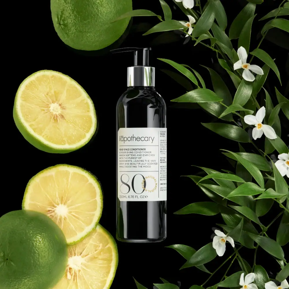
ilapothecary
Dark pump bottle with a ruled label and oversized 80
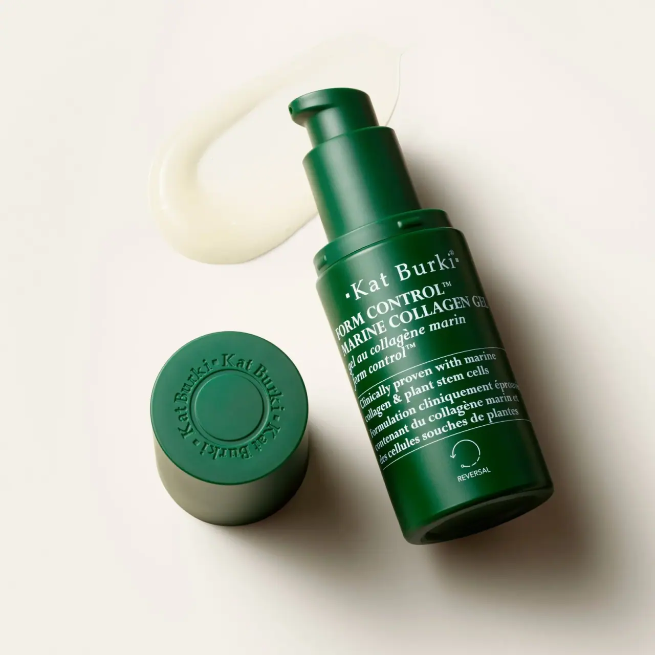
Kat Burki
Forest green, dense white serif text and sculpted cap
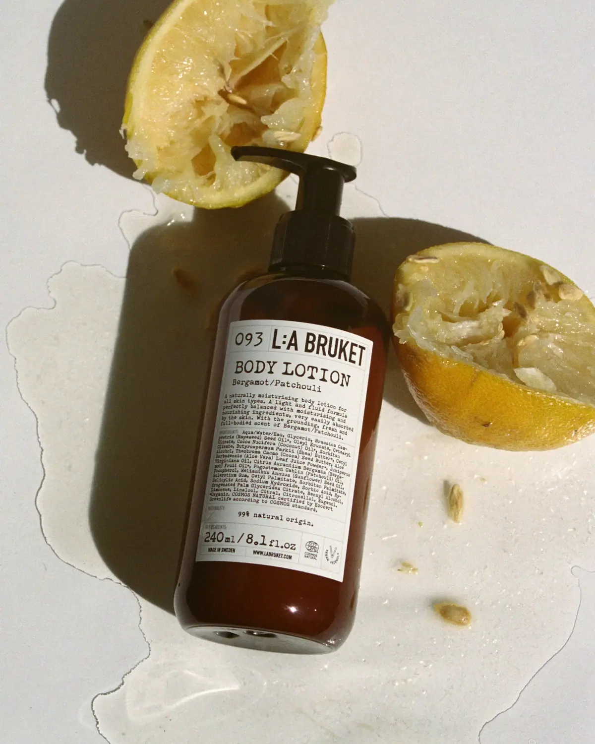
L:A Bruket
Amber pump bottle with a ruled typographic information label
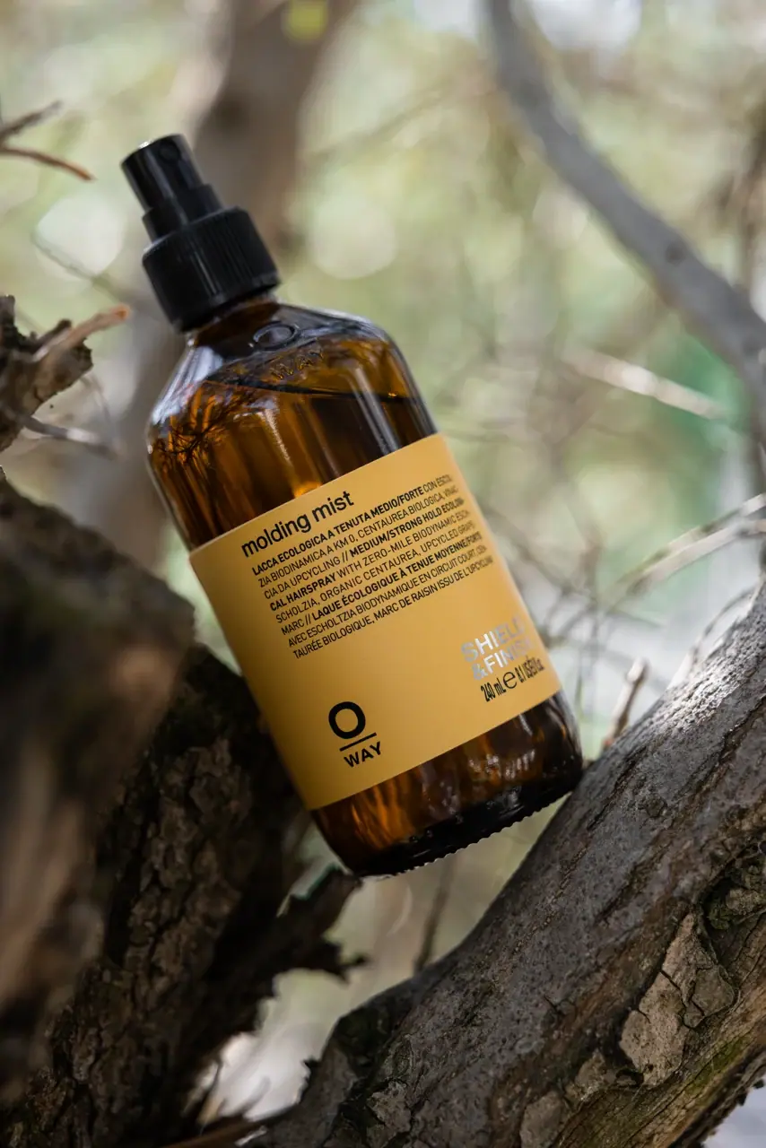
Oway
mustard wrap with split lower anchors on amber spray bottle

D.S. & Durga
deadpan grotesk names on parchment labels

ACURE
Iridescent spectacle with practical, tightly ordered type

Aesop
a botanical still life around a disciplined apothecary label

AKT
Lilac stage directions with a quiet metallic detail