Photography: COOLA official photography. Images belong to their respective owners.
COOLA

Turquoise cylinder, cropped rosettes, vertical brand and fragrance attribution
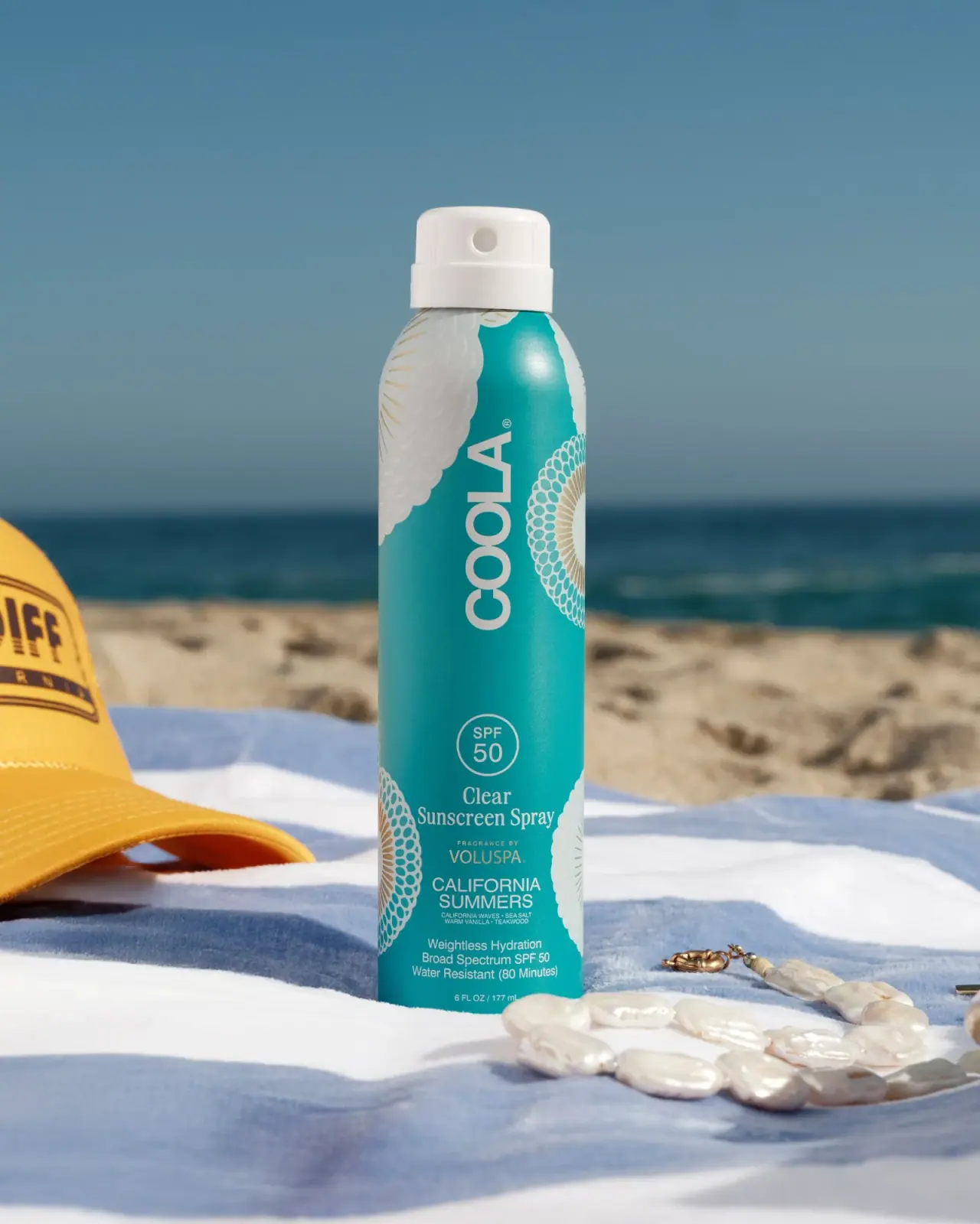
The California Summers spray gives a tall turquoise cylinder two reading modes. An oversized rotated COOLA wordmark occupies the upper field, while the lower section returns to horizontal lines for SPF, product type, fragrance collaborator and scent name. Cropped white rosettes with muted golden details enter from the edges, leaving a central channel for information. The selected 6 fl oz / 177 mL presentation is a Voluspa fragrance collaboration, rather than an unspecified seasonal color variant.
- Suncare
- Light pack
- Bold typographic
- Heritage label
About this study
California Summers fragrance collaboration with Voluspa in the selected 6 fl oz / 177 mL spray image. Other spray sizes and unrelated page recommendations are excluded.
Sources & evidence · Reviewed 2026-10-19Color Palette
Approximate colours interpreted from photography. These are screen references, not official brand colours or print specifications.
Pack body
Turquoise field
#139FA1
Approximate saturated body color, darker at the edges and brighter under the sunlit shoulder highlight.
Actuator white
#F1EEE7
Opaque-looking dispensing head continues the light graphic palette at the top of the object.
Ink
Warm white graphics
#EAE8DA
Large identity, rosette details and lower information share a light tone against turquoise.
Accent
Muted golden ornament
#B8A36C
Small rosette rays and collaboration detail introduce a restrained warm accent; exact ink or foil process unknown.
Typography
Suggested visual alternatives, not confirmed brand typefaces. Any scale below is an illustrative estimate.
Large plain COOLA capitals rotate along the cylinder's height. Below, a small circular SPF 50 badge resets the reading orientation. Clear Sunscreen Spray uses a more traditional serif voice, followed by a tiny fragrance attribution, VOLUSPA, a two-line uppercase California Summers name and smaller supporting detail. This is a layered collaboration hierarchy: maker dominates, product category clarifies function, collaborator adds provenance and scent completes the edition identity. The distinct serif product descriptor deserves attention because the rest of the typography is mostly sans-serif.
Fonts
Original maker and scent
Montserrat
- Looks like
- Plain geometric uppercase sans-serif
- Type
- Geometric sans-serif
- Weight
- Regular, Medium
- Case
- Uppercase
- Tracking
- Optical for large letters; natural for smaller information
- Fallback
- Arial, sans-serif
An alternative for a new tall-format maker name and scent line. Test rotated lettering on the actual cylinder so curvature does not hide critical letters.
Product descriptor
Libre Baskerville
- Looks like
- Compact traditional serif
- Type
- Transitional serif
- Weight
- Regular, Bold
- Case
- Title case
- Tracking
- Natural spacing
- Fallback
- Georgia, serif
Proposed for a short category descriptor that contrasts with the large sans-serif identity. Avoid compressing the letters to imitate the source; use line breaks that preserve readability.
Structure & Proportions
Visual proportions and finish previews are illustrative. Confirmed construction details and uncertainties are distinguished in the study notes.
Proportions
| Purpose | Value | Preview |
|---|---|---|
| Tall-format identity | The upper wordmark uses the cylinder's long dimension, giving a short maker name a large presence without expanding the pack's width. | — |
| Lower information region | The functional and scent details occupy a denser region near the lower half, with the circular badge acting as an entry point. | — |
| Pattern cropping | Large rosettes are cut off at the visible edges rather than displayed as complete centered emblems, preserving a clearer central reading path. | — |
| Shoulder and actuator | A rounded shoulder narrows toward the white top. The dispensing head is short relative to the long body, maintaining the tall silhouette. | — |
Shapes
| Element | Value | Preview |
|---|---|---|
| Body | Tall straight-sided cylinder with rounded shoulders. | |
| Actuator | Short white cylindrical top with a round outlet visible at the front. | |
| SPF badge | Small outlined circle carrying the rating above the category descriptor. | |
| Rosette fragments | Large repeating radial motifs partly hidden by the cylindrical edges. | |
| Information stack | Compact horizontal lines below the rotated maker name. |
Finishes
Luminous body surface
Turquoise cylinder, particularly the shoulder; coating and substrate remain unverified. · gloss
Smooth light actuator
White dispensing head with soft highlights and visible rib detail. · gloss
Golden-looking ornament accent
Fine rosette rays and small attribution details; visual color only, not a foil specification. · metallic
Formats and materials
| Formats | Tall cylindrical continuous-spray sunscreen package marked 6 FL OZ / 177 ml |
| Materials | The official page describes the spray as non-aerosol and continuous, but the accessed product details do not specify the container alloy, polymer components or internal dispensing construction., The turquoise body has a luminous smooth appearance; neither a metallic substrate nor a foil decoration process is established by the photograph alone. |
| Closures | A white actuator with a round front opening sits above a short broad collar. Fine vertical ribs appear on its upper side. No separate overcap is shown. The selected view does not reveal a locking action, internal valve, pressure system or refill interface. |
| Decoration | Large rotated white maker name, Oversized circular rosettes cropped by the cylinder edges, Outlined circular SPF badge, Horizontal serif category and compact collaboration/scent stack |
Front Panel
Schematic reading order. The diagram’s zone heights do not represent measured artwork proportions.
Graphics wrap the cylinder without an obvious separate front-label border. The vertical brand and horizontal lower stack divide the available surface into distinct roles. Large clipped rosettes create a perimeter rhythm, while the product's written identity remains in the middle. The collaboration is a small but specific line in that hierarchy, so it should not disappear from a detailed description of this edition.
| Zone | Content |
|---|---|
| Upper maker field | The large rotated COOLA wordmark occupies the relatively open turquoise area between ornamental fragments. |
| Rating circle | SPF 50 appears inside a light outlined circle. This records the photographed claim and does not independently verify sunscreen performance. |
| Product category | Clear Sunscreen Spray switches to horizontal serif lettering, separating function from the large sans-serif maker. |
| Fragrance attribution | A small fragrance-by line introduces VOLUSPA before the California Summers name, making the collaboration explicit. |
| Scent and supporting details | The two-line scent name, tiny fragrance notes, benefit wording and quantity complete the lower region. The smallest lines require close viewing. |
Range System
The official selected page supports this 6 oz collaboration. It does not establish a 2 oz California Summers size; a smaller-size reference belongs to a different recommended product. Only this edition's graphics are inspected. A useful independent-range principle is to preserve a clear maker/category/collaborator/variant hierarchy while changing the decorative field, rather than assuming every COOLA spray shares these exact motifs.
- When adapting an original collaboration pack, give the collaborator an explicit attribution line rather than relying solely on borrowed visual motifs.
- On a shorter fictional spray, reconsider the rotated wordmark and lower stack together instead of shrinking every element indiscriminately.
- Keep large edge ornament away from the product-type and variant words even when the motif changes between editions.
Back of Pack & Shelf
The full reverse, base and internal dispensing components are not visible. The front's small benefit lines do not reveal the location or organization of complete directions, ingredients and warnings.
- Acquire a reverse view before documenting the complete sunscreen information panel.
- Confirm actual opening and locking behavior before describing the actuator's mechanics.
- Do not infer a smaller edition from unrelated recommended products on the same page.
On shelf
Interpretively, the saturated cylinder and large rotated name can give strong distant recognition, while the lower horizontal section supports closer comparison. The decorative edges add character but may rotate out of view on a curved pack. A new design should be reviewed at several rotations, especially where collaborator and scent lines are smaller than the main maker. Outdoor sunlight is only one readability condition and can exaggerate the body's sheen.
Imagery
The pack stands on a blue-and-white striped beach towel beside a yellow cap and pale jewelry, with sand and sea behind. The turquoise container relates to the water while remaining more saturated and sharply defined. White graphics echo the towel and actuator. The yellow cap, ocean horizon and accessories are campaign props, not package palette entries or evidence of included accessories.
Guidelines
Editorial principles for an original design brief, not official brand guidelines.
Do
- Use orientation changes to allocate narrow cylindrical space.
- Keep collaborator attribution visible in the hierarchy.
- Crop large ornament to preserve the central reading path.
- Separate actual edition sizes from related-product listings.
- Test small horizontal text around the cylinder's curvature.
Don't
- Do not infer an aluminum body from the smooth sheen.
- Do not call gold-colored details verified foil.
- Do not invent a 2 oz California Summers edition from this page.
- Do not copy the rosette pattern or collaborator logos.
- Do not treat photographed SPF wording as independently assessed efficacy.
Sources & evidence
How this study was built
edition · Sourced fact
Official page identifies the Voluspa California Summers collaboration and lists 6 oz.COOLA — California Summers Clear Sunscreen Spraystructure · Sourced fact
Brand describes a non-aerosol continuous spray; exact internal assembly and material are not specified here.COOLA — California Summers Clear Sunscreen Spraytypography · Visual observation
Large rotated sans-serif maker type contrasts with a horizontal serif category and smaller collaboration/scent lines.COOLA — California Summers Clear Sunscreen Spraylabel · Visual observation
An outlined SPF circle precedes the lower information stack; the selected quantity marking is 6 FL OZ / 177 ml.COOLA — California Summers Clear Sunscreen Spraypalette · Visual observation
Turquoise, white and muted gold-colored ornament belong to the pack; beach accessories remain outside its palette.COOLA — California Summers Clear Sunscreen Spraylabel · Visual observation
Large rosettes are cropped at edges and leave a central reading channel rather than filling every area equally.COOLA — California Summers Clear Sunscreen Sprayrange · Editorial interpretation
Preserving maker, category, collaborator and variant roles is a possible independent-range principle, not a universal COOLA specification.
What remains unverified
- Exact vessel and actuator materials unspecified.
- No reverse, base, overcap or internal mechanism shown.
- Fonts and decorative print processes unidentified.
- Photographed benefit wording is documented without independent performance assessment.
- Only this size and edition's graphic layout inspected.
Give your AI
packaging taste
Give your design or image tool a packaging study: palette, type, structure, front panel and principles for an original brief.
Export this styleFree with an email. PACK.md works in Claude, ChatGPT, Cursor and image tools.
More like this
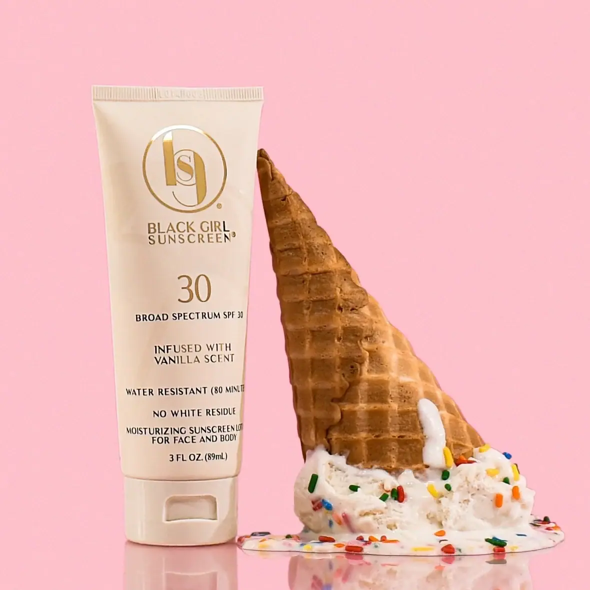
Black Girl Sunscreen
Cream tube with gold crest and an isolated SPF numeral
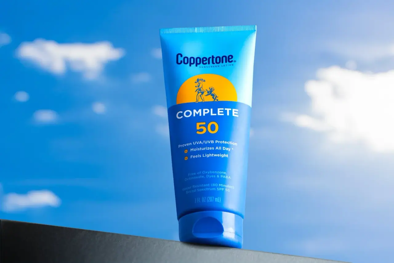
Coppertone
Blue fields, a yellow sun and a clear number

Dr. Bronner’s
A bright soap wrapper with a densely ordered voice
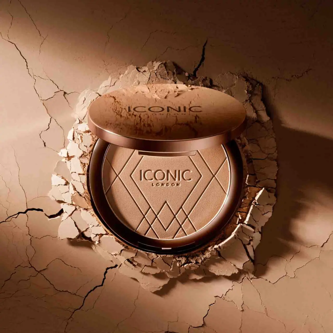
ICONIC London
Geometric powder relief inside a warm reflective round compact
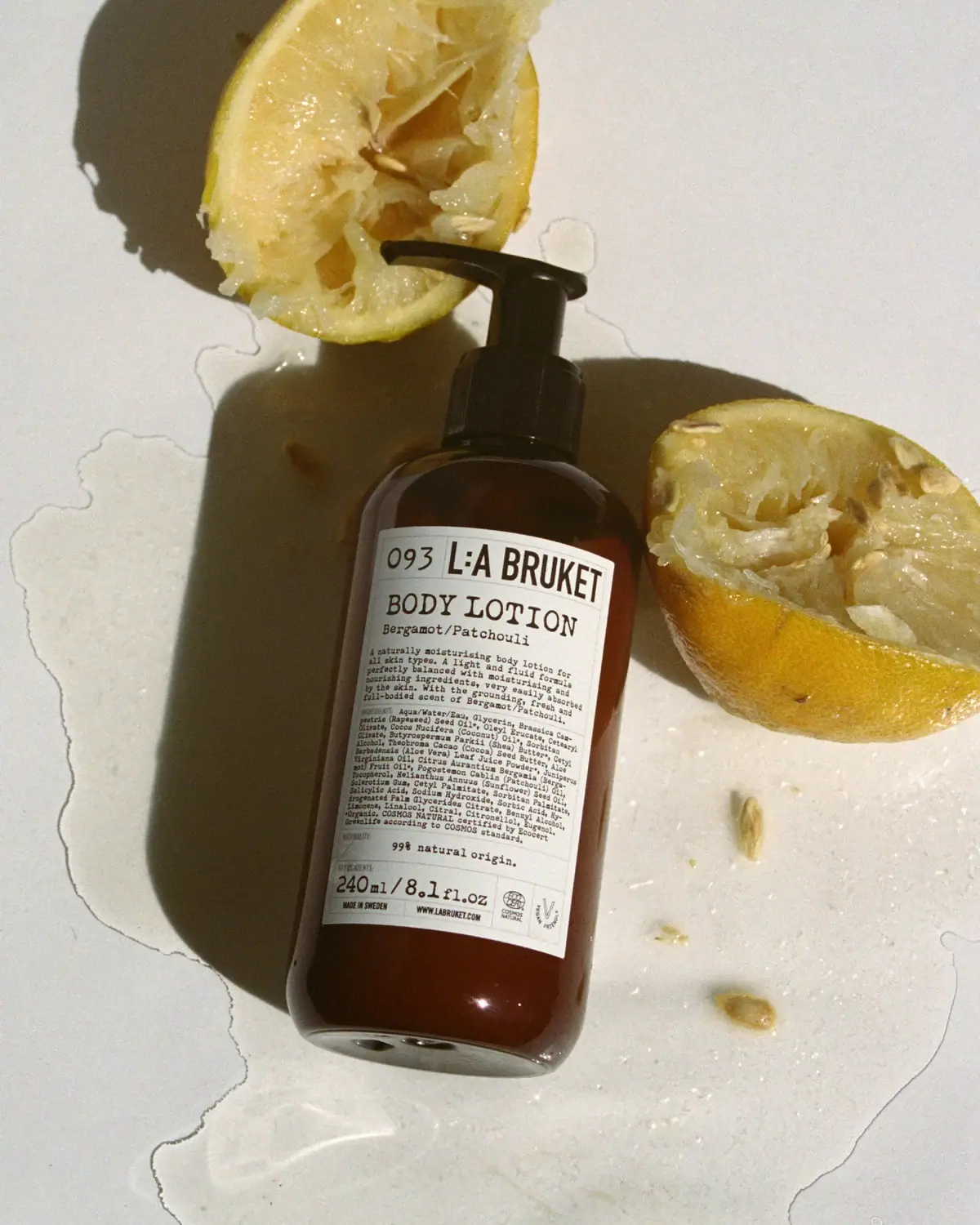
L:A Bruket
Amber pump bottle with a ruled typographic information label
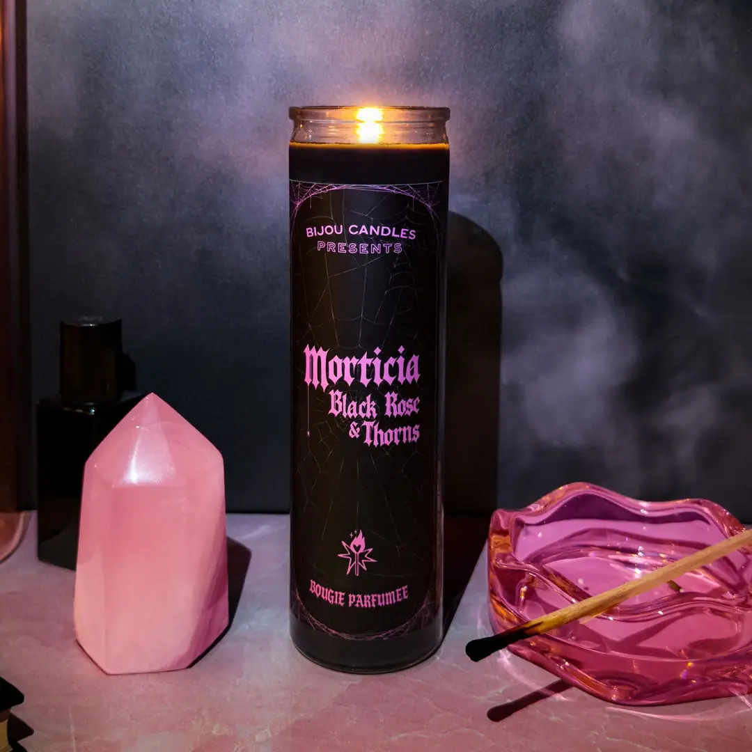
Bijou Candles
Pink blackletter and fine webs on a tall dark candle

Kettle & Fire
farmhouse animal badges on black cartons
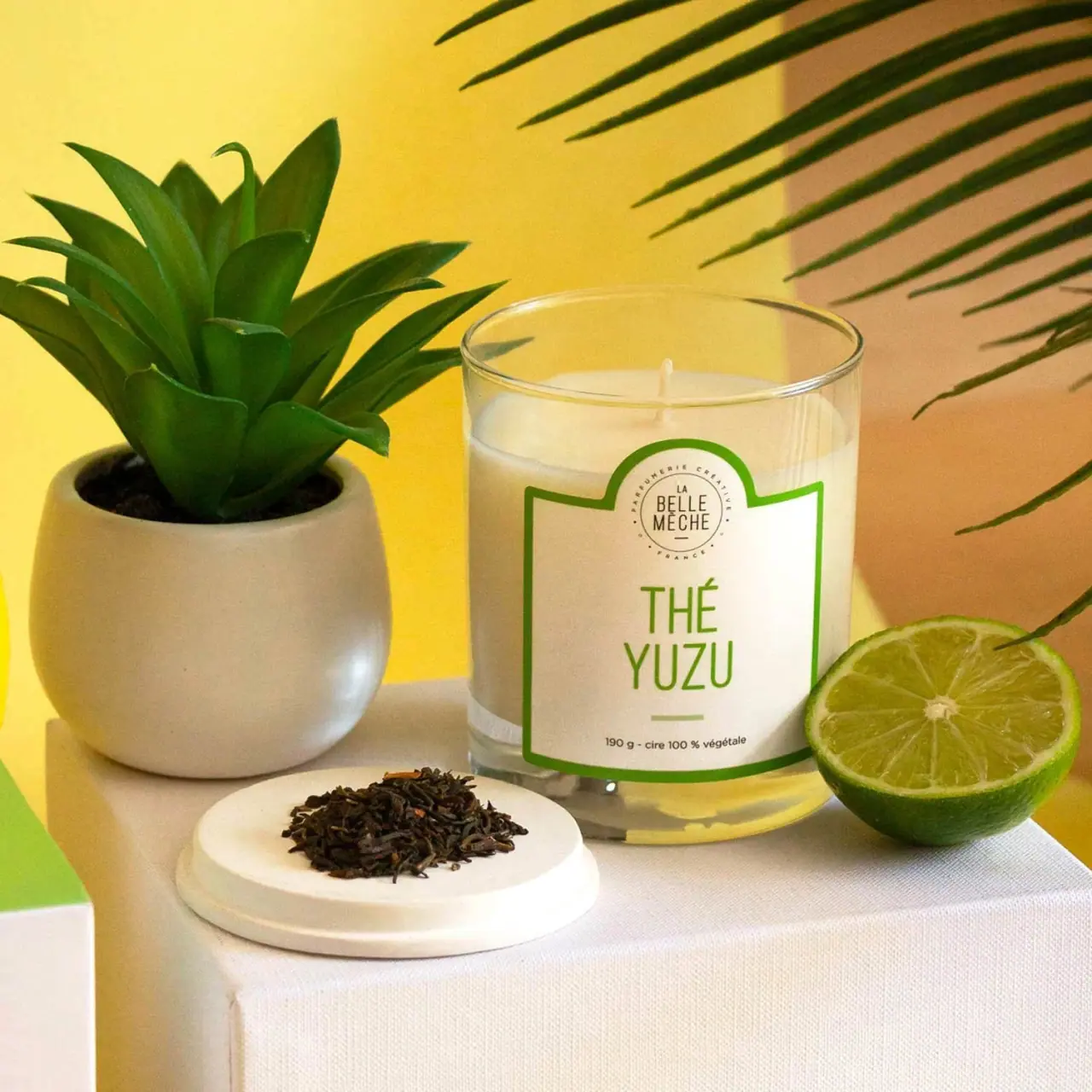
La Belle Mèche
Green scent lettering inside an arched white candle label