Photography: LESSE official photography. Images belong to their respective owners.
LESSE

Quiet grey skincare beneath a mirror-bright silver lid
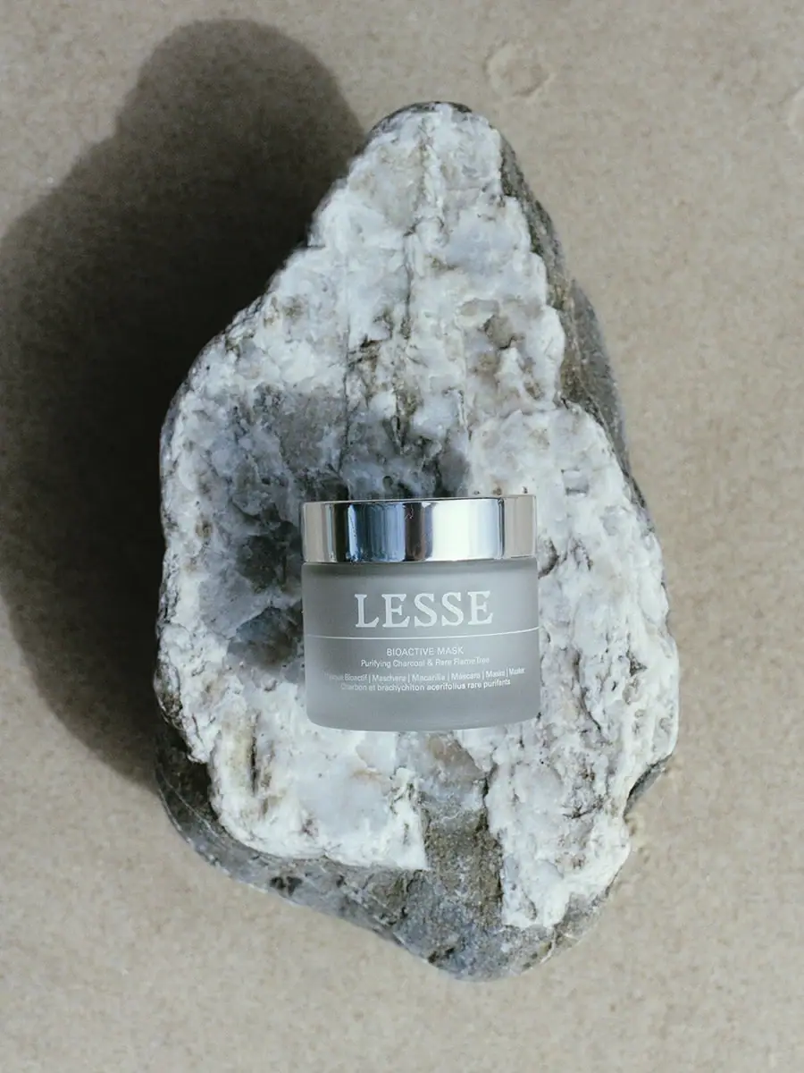
The selected Bioactive Mask jar pairs a muted grey body with a sharply reflective silver-coloured lid. A large white serif LESSE name fills the upper front, separated from compact product information by a fine horizontal rule. Small centred sans-serif lines below identify the mask and its ingredient-led descriptor, with further multilingual wording near the base. The selected image places this restrained object against a pale veined stone. The stone supplies visual texture around the jar, while the package itself remains typographic and almost monochrome.
- Skincare
- Light pack
- Luxe monochrome
- Clinical minimal
About this study
Selected Bioactive Mask jar on pale stone, with diffuse grey body and mirrored-looking silver lid. Hidden components and other LESSE formats are outside scope.
Sources & evidence · Reviewed 2026-10-19Color Palette
Approximate colours interpreted from photography. These are screen references, not official brand colours or print specifications.
Pack body
Soft mineral grey
#929E9D
Approximate body appearance under the selected cool outdoor-looking light. It does not identify jar material, tint process or exact production colour.
Ink
Pale white lettering
#E6EEEA
Approximate producer, horizontal rule and small descriptors. The white contrasts gently with grey rather than creating a stark black-and-white label.
Accent
Silver reflection
#BECED0
Approximate light reflected in the lid. The apparent colour varies with its surroundings and is not a flat ink or proof of solid metal construction.
Typography
Suggested visual alternatives, not confirmed brand typefaces. Any scale below is an illustrative estimate.
The producer is the dominant text, set in large uppercase serif forms near the top of the body. A fine white rule runs almost the full visible width below it, dividing brand from function. Bioactive Mask is much smaller and uses a narrow sans-serif voice, followed by a compact ingredient descriptor. Additional multilingual lines sit lower and are smaller still. All readable front blocks share a central axis, but the large difference in scale means the producer remains legible long after the details become too small to read.
Fonts
Producer serif alternative
Libre Baskerville
- Looks like
- Libre Baskerville
- Type
- Serif
- Weight
- Bold 700
- Case
- Uppercase
- Tracking
- Natural optical spacing
- Fallback
- serif
A proposed strong serif voice for an original short producer name. Preserve the contrast with the small support without reproducing the LESSE wordmark or its exact proportions.
Compact product information
Barlow Condensed
- Looks like
- Barlow Condensed
- Type
- Condensed sans serif
- Weight
- Regular 400 / Medium 500
- Case
- Uppercase product title; mixed-case descriptor
- Tracking
- Neutral
- Fallback
- sans-serif
Use for a clear product title and supporting multilingual lines. Condensed width helps fit the jar, but actual-size readability matters more than maintaining every original line break.
Structure & Proportions
Visual proportions and finish previews are illustrative. Confirmed construction details and uncertainties are distinguished in the study notes.
Proportions
| Purpose | Value | Preview |
|---|---|---|
| Jar and lid | The broad jar body provides a horizontal reading area, while the shallow-looking lid creates a narrow reflective band above it. | — |
| Producer area | The large serif name occupies much of the upper body width, with a small margin before the curved sides. | — |
| Information band | The lower product block is substantially smaller than the producer and sits in the open area beneath the rule. | — |
Shapes
| Element | Value | Preview |
|---|---|---|
| Jar body | Low broad cylinder with softly rounded lower corners. | |
| Lid | Shallow circular cover with straight reflective side wall. | |
| Brand/product divider | Fine horizontal line extending across most of the visible front. | |
| Centred descriptor block | Compact stacked lines below the divider. |
Finishes
Diffuse grey appearance
Body; frosted-looking effect without verified process or substrate. · frosted
Mirror-like silver appearance
Lid exterior; base material and treatment unverified. · metallic
Formats and materials
| Formats | A low cylindrical jar with a broad circular lid. The official product data identifies Bioactive Mask as 60 mL / 2 fl. oz.; quantity is not clearly readable in this selected photograph. |
| Materials | The inspected product and FAQ pages do not provide a component specification for this jar and lid. A frosted-looking body does not establish glass, and a mirrored lid does not establish solid metal., Any liner, inner disc, seal, label substrate, adhesive or external carton is outside the selected view and unverified. |
| Closures | The fitted silver-coloured lid sits above a narrow body lip. Its thread, underside, sealing interface and removal action are not visible. The photograph shows only the closed external relationship between the two parts. |
| Decoration | A large white serif name, one thin rule and several smaller lines form the entire visible graphic system. No botanical or mineral illustration is printed on the front. |
Front Panel
Schematic reading order. The diagram’s zone heights do not represent measured artwork proportions.
The front is divided into a large producer zone above a single fine rule and a small information zone below. The grey background remains continuous across both. The line is an organisational device, not a decorative frame, and its slight curvature follows the vessel surface. No separate label edge is clearly visible, so the study does not assert an applied paper label.
| Zone | Content |
|---|---|
| Large producer | White uppercase serif lettering is the clearest readable element in the lifestyle view and carries most of the recognition. |
| Horizontal rule | A thin pale line separates producer from product information. It extends much farther than the small product title, giving the lower zone a clear top boundary. |
| Product and ingredient descriptor | Bioactive Mask sits above the small charcoal and rare-flame-tree descriptor. These words are supported by the official listing as well as the visible front. |
| Multilingual support | Small additional language lines occupy the lower face. Their presence is visible, but the photograph is not a reliable basis for transcribing every character. |
Range System
The exact product page confirms the mask identity, ingredient-led descriptor and 60 mL size. Only this selected jar is visually audited. The strong producer/rule/product relationship offers a repeatable principle, but neither grey body colour nor mirrored lid is asserted as universal across all LESSE formats.
- For an original jar family, a consistent divider can separate producer from changing product information while leaving the main body colour restrained. Each product title still needs a readable size on the actual curved surface.
- A narrow bottle or tube would require a different balance between the large serif name and lower copy. The broad jar layout should not simply be scaled down without reviewing the reading experience.
Back of Pack & Shelf
The rear, lid top, underside and interior are not visible. No full ingredient panel, quantity position or batch location can be reconstructed from this view.
- Use a closer front image before transcribing multilingual support.
- Obtain underside and reverse views before documenting care or batch markings.
- Do not infer refillability or a removable inner container from the closed silhouette.
On shelf
The reflective lid can draw attention even when the grey body blends with its surroundings. The large white serif name remains the main textual cue, while the product title becomes a closer-range read. This is visual interpretation rather than a measured shelf test. In a catalogue, the selected image conveys atmosphere well, but an additional tightly framed pack view would better explain the fine rule and small information hierarchy.
Imagery
The jar rests against a large pale veined stone on a muted sandy surface. Strong directional light creates a broad dark shadow beside the rock and sharp reflections in the lid. The stone’s irregular crystalline-looking texture contrasts with the smooth regular cylinder, making the restrained jar feel more precise. The rock is a photographic prop, not proof of any mineral concentration, package material or environmental claim. The image devotes much more area to setting than to the product, which means small copy requires a separate close-up for practical reading.
Guidelines
Editorial principles for an original design brief, not official brand guidelines.
Do
- Separate visual finish from unverified material and process.
- Preserve the large producer/small product hierarchy with one clear divider.
- Use close-up imagery to complement a distant atmospheric composition.
- Keep the mineral prop distinct from package and formulation claims.
Don't
- Do not assume frosted glass or a metal lid solely from appearance.
- Do not transcribe illegible small multilingual lines as verified copy.
- Do not infer refill mechanisms or inner seals from the closed jar.
- Do not generalise this grey-and-silver presentation to every LESSE product.
Sources & evidence
- Bioactive Mask — LESSEproduct
How this study was built
edition · Sourced fact
Official product data identifies Bioactive Mask, charcoal/rare-flame-tree descriptor and 60 mL / 2 fl. oz.Bioactive Mask — LESSEimagery · Sourced fact
Exact selected stone photograph appears among official product image assets.Bioactive Mask — LESSEstructure · Visual observation
Closed broad jar pairs diffuse grey body with a mirror-like lid.typography · Visual observation
Large white serif producer dominates compact sans-serif product details.label · Visual observation
One fine rule separates producer from lower multilingual information.palette · Visual observation
Grey, white and silver reflections belong to object; stone and sand remain scene elements.range · Editorial interpretation
Divider hierarchy can transfer to original designs, but other LESSE formats were not audited.
What remains unverified
- Product/FAQ pages inspected do not specify jar or lid components.
- Matte/frosted and metallic previews describe appearance, not verified production methods.
- Small multilingual text is not fully transcribed; quantity supported by official product data.
- Reverse, underside, lid top and interior unseen; fonts are alternatives.
Give your AI
packaging taste
Give your design or image tool a packaging study: palette, type, structure, front panel and principles for an original brief.
Export this styleFree with an email. PACK.md works in Claude, ChatGPT, Cursor and image tools.
More like this

African Botanics
Technical black label with a low serif signature

bareMinerals
a restrained black compact framing the powder itself

BeautyPWR
Clear square shell, white cream cup, black serif identity

Corpus
sage gloss with whispered gold lettering

Costa Brazil
Pale matching vessels with small, deliberate bilingual labels

Crown Affair
Pale frosted-looking bottle, black pump and small looping emblem

HAKU
Pearly narrow tube with stacked serif identity and clear base

Haus Labs
mirror chrome hardware over frosted shade