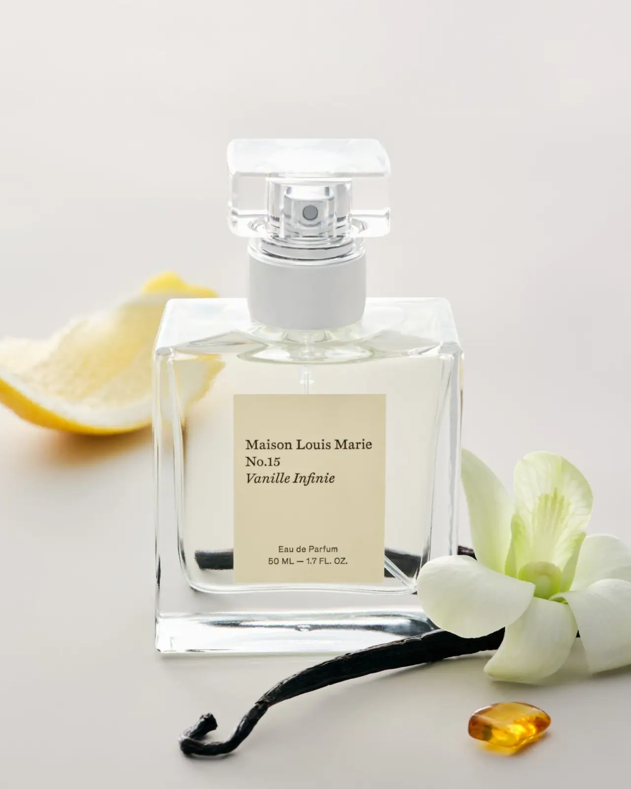
Photography: Maison Louis Marie official photography. Images belong to their respective owners.
Maison Louis Marie

left-aligned serif title card within clear square perfume geometry
No.15 Vanille Infinie is shown in a clear square-fronted 50 mL bottle with a cream rectangular label and a transparent block-like cap. The upper label groups maker, number and italic scent name on a shared left edge; a much smaller centred concentration and quantity footer sits below a generous blank interval. Clear edges, pale contents and a broad light collar keep the object visually quiet. Citrus, flower, pod and amber-like props supply the richer scent story around the restrained package.
- Perfume
- Light pack
- Heritage label
- Clinical minimal
About this study
Selected official 50 mL No.15 Vanille Infinie Eau de Parfum photograph. Travel size, perfume oil and unseen outer packaging are separate contexts.
Sources & evidence · Reviewed 2026-10-19Color Palette
Approximate colours interpreted from photography. These are screen references, not official brand colours or print specifications.
Pack body
Pale collar
#D5D6D1
Approximate opaque-looking cylindrical collar below the transparent cap. Reflection and lighting affect its grey appearance; material is unverified.
Label
Warm cream panel
#D8CEA8
Approximate front-label tone under warm neutral light. Its paper-like appearance does not establish fibre, texture or coating.
Ink
Dark brown-black type
#29271D
Approximate maker, number, italic scent and smaller footer. It supplies the principal graphic contrast within the pale composition.
Accent
Silver-looking actuator
#B8BEBD
Approximate visible spray hardware inside the clear cap, not a claim of silver alloy or plating.
Typography
Suggested visual alternatives, not confirmed brand typefaces. Any scale below is an illustrative estimate.
The upper information is a three-line serif group: maker in upright title case, No.15 beneath, and Vanille Infinie in italics. The lines share a left edge and similar visual scale, so the italic change distinguishes the scent more than a dramatic size jump. Far below, Eau de Parfum and the volume line are smaller, sans-like and centred. The label is centred on the bottle, but its main text is not. That distinction creates an editorial title-card quality without making the whole front mechanically symmetrical.
Fonts
Maker, number and scent alternative
Libre Baskerville
- Looks like
- Libre Baskerville with upright and italic roles
- Type
- Serif
- Weight
- Regular 400 / Italic 400
- Case
- Title case
- Tracking
- Natural optical spacing
- Fallback
- Georgia, serif
Use one new serif family for a compact maker-number-name group, changing to italic for the scent rather than adding a third decorative font. Preserve the shared left edge and enough line spacing for the italic forms. Do not reproduce the original maker name or exact three-line wording.
Concentration and quantity alternative
Inter
- Looks like
- Inter for a restrained technical footer
- Type
- Sans serif
- Weight
- Regular 400
- Case
- Title case concentration, uppercase units
- Tracking
- Natural to slightly open
- Fallback
- Arial, sans-serif
Give the technical footer a separate centred position and smaller scale while retaining adequate contrast. The change from serif narrative to sans-serif specification can clarify roles, but must be checked at actual label size; a beautiful enlarged mockup does not prove small-print readability.
Structure & Proportions
Visual proportions and finish previews are illustrative. Confirmed construction details and uncertainties are distinguished in the study notes.
Proportions
| Purpose | Value | Preview |
|---|---|---|
| Label within clear face | The cream rectangle occupies only the central part of the bottle, leaving substantial transparent-looking margins on each side and a thick clear base below. | — |
| Separated information groups | A broad blank interval divides the upper serif group from the small lower technical footer. | — |
| Repeated rectangular geometry | The cap repeats the bottle's broad straight-sided vocabulary at a smaller scale, while the collar introduces a circular transition. | — |
| Visible hardware | The actuator sits centrally within the cap and remains a small functional detail rather than being concealed by an opaque upper block. | — |
Shapes
| Element | Value | Preview |
|---|---|---|
| Bottle front | Broad near-square exterior with straight side edges and softly rounded internal liquid boundaries. | |
| Label | Portrait cream rectangle with straight unbordered edges. | |
| Cap | Low transparent rectangular block with rounded corners. | |
| Collar | Short pale cylinder connecting bottle neck and visible actuator assembly. |
Finishes
Transparent structural frame
Bottle margins, base and cap; no substrate or physical thickness is inferred solely from appearance. · transparent
Quiet cream reading field
Front label, whose comparatively even appearance stabilises the small dark typography. · matte
Formats and materials
| Formats | Selected clear square-fronted bottle visibly marked 50 mL / 1.7 fl oz, with a substantial clear-looking base, short cylindrical collar and transparent rounded rectangular cap. |
| Materials | Bottle and cap appear transparent and refractive, but exact component substrates are not identified in the accessed product text., The brand identifies the separate box as FSC-certified paper; that statement does not establish the front label stock or the clear cap material. |
| Closures | A low broad transparent cap encloses the silver-looking actuator, making its circular outlet visible. Beneath the clear block, a wider pale cylindrical collar sits above the bottle shoulder. This produces three distinct upper geometries without introducing a dark cap colour. The brand describes the sprayer as clamped on. That source statement does not establish the cap's attachment, internal tolerances or whether any component can be replaced by the user. |
| Decoration | Small left-aligned serif maker-number-scent group., Italic scent name within the otherwise upright upper text., Separated centred sans-like concentration and quantity footer., No printed botanical illustration or surrounding border rule on the selected front label. |
Front Panel
Schematic reading order. The diagram’s zone heights do not represent measured artwork proportions.
The rectangular panel behaves like a small printed card held inside a larger clear object. Its upper text begins well inside the left edge and leaves open cream space above and to the right. Maker, number and italic name remain close together as one unit. The lower concentration and quantity lines are centred independently, with a large intervening blank area. This combination of a centred label, left-aligned title block and centred footer is more specific than simply calling the design minimal. Label-edge appearance does not reveal adhesive, stock weight or application method.
| Zone | Content |
|---|---|
| Maker | Upright Maison Louis Marie serif line at the top of the text group. |
| Number | No.15 on its own line, sharing the maker's left edge. |
| Scent | Italic Vanille Infinie directly below the number. |
| Open interval | Unprinted-looking cream field separating name from technical details. |
| Technical footer | Centred Eau de Parfum and visible 50 ML / 1.7 FL. OZ. information. |
Range System
The official page lists 50 mL and 10 mL options and separates this Eau de Parfum from other product forms. The selected image clearly shows the 50 mL bottle. Numbering and the scent name supply identification here, but one reference does not prove that all numbers share the same label dimensions, cap or bottle proportions. A smaller travel format needs its own layout review rather than a scaled-down copy of this front.
- Selected 50 mL reference: clear square bottle, cream panel and transparent cap.
- Current source context includes a separate 10 mL option; its structural details are outside this study.
Back of Pack & Shelf
The reverse, underside and outer carton are unseen. The current brand guidance distinguishes the clamped-sprayer bottle from its paper box and directs the former towards Pact rather than assuming curbside acceptance. Those source-attributed routes are contextual and depend on the applicable collection system; they do not establish the hidden printed panel layout.
- Inspect the underside before assigning batch or regulatory marking locations.
- Do not apply the box's paper statement to the cream front label.
- Check each component and local route before turning source guidance into disposal instructions.
On shelf
Interpretation: the cream card and clear square geometry create a quiet silhouette, with the serif group requiring closer viewing than a bold display title. The generous blank interval gives the name room, but the small footer may become difficult to read under reflections or at an angle. A new design using this principle should test the label against different liquid colours and backgrounds. Transparent packaging can change dramatically with its surroundings, so the pale hero scene is only one condition.
Imagery
The pale neutral setting contains a citrus segment behind the bottle, a large pale flower at the side, a dark curved pod in front and a small amber-coloured translucent object. These external forms introduce texture and warmer accents without filling the label with illustration. The clear cap reveals hardware while the transparent body picks up nearby objects through refraction. The props are scent cues, not proof of ingredient percentages, natural extraction methods or included accessories; their colours should not all be imported into the permanent packaging palette.
Guidelines
Editorial principles for an original design brief, not official brand guidelines.
Do
- Distinguish panel alignment from text alignment when analysing a label.
- Use italic contrast deliberately within a restrained type system.
- Leave clear margins around a small reading panel when transparency is part of the design.
- Keep component-specific disposal statements attributed and separate from visual observations.
Don't
- Do not identify cap plastic from an unverified customer review.
- Do not assume the front label shares the box's paper certification.
- Do not transfer full-size geometry to the travel format without inspection.
- Do not copy Maison Louis Marie's numbered title-card identity or exact wording.
Sources & evidence
How this study was built
context · Sourced fact
Official page lists 50 mL and 10 mL Eau de Parfum options.Maison Louis Marie — No.15 Vanille Infinie Eau de Parfumstructure · Sourced fact
Brand guidance describes a clamped sprayer and separate paper-box disposal context.Maison Louis Marie — No.15 Vanille Infinie Eau de Parfumtypography · Visual observation
Upper serif maker/number/italic scent group is left aligned; smaller sans-like footer is centred.Maison Louis Marie — No.15 Vanille Infinie Eau de Parfumstructure · Visual observation
Transparent cap reveals actuator above a pale cylindrical collar; thick clear-looking base frames the label.Maison Louis Marie — No.15 Vanille Infinie Eau de Parfumimagery · Visual observation
Citrus, flower, dark pod and amber-like object sit outside the package.Maison Louis Marie — No.15 Vanille Infinie Eau de Parfumshelf · Editorial interpretation
Small type and transparent geometry require tests across backgrounds and reflected light.
What remains unverified
- Bottle/cap substrates, label stock, coating and exact fonts are unverified.
- No physical measurements or closure attachment inspection performed.
- Reverse, underside and outer box are unseen; box material statement does not identify label stock.
- Photo props provide scent context, not formula composition or included accessories.
Give your AI
packaging taste
Give your design or image tool a packaging study: palette, type, structure, front panel and principles for an original brief.
Export this styleFree with an email. PACK.md works in Claude, ChatGPT, Cursor and image tools.
More like this
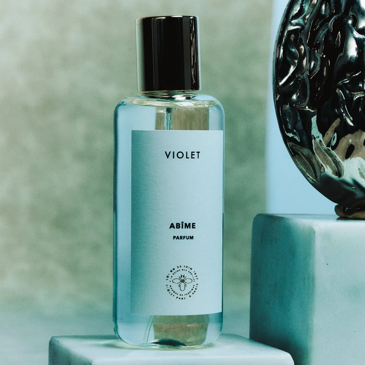
Maison Violet
widely spaced black names on a tall cool label
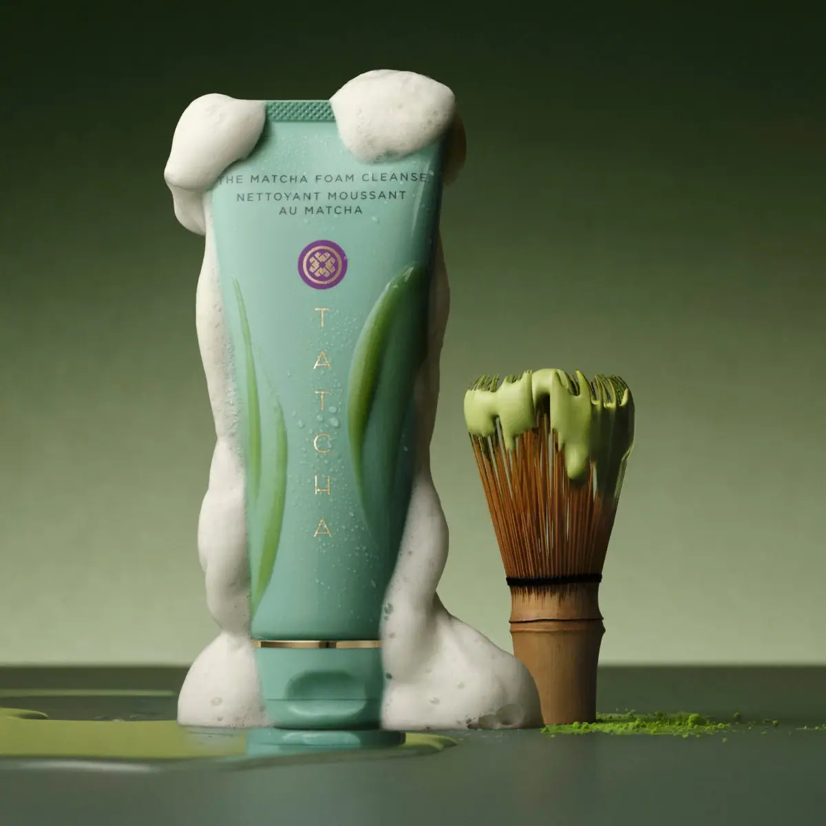
Tatcha
mint tube with a purple crest and stacked gold letters

Aerangis
a quiet numbered object, an intimate scent memory

Alexander McQueen
An oval flacon crowned with dense black relief
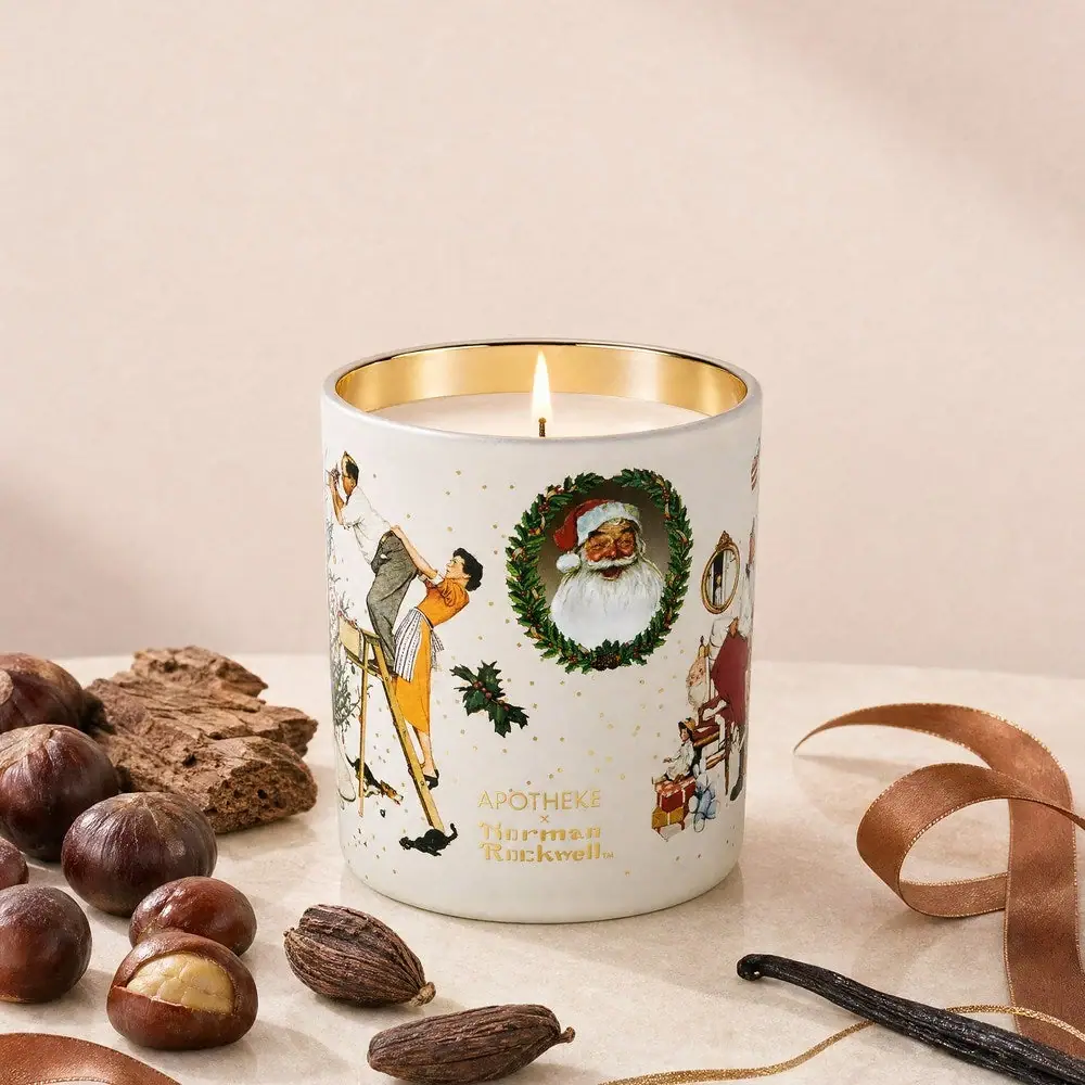
Apotheke
White holiday vignettes with a warm golden interior

Arquiste
blush transparency, white lettering and a stepped gold cap
Atelier des Ors
Golden constellation framing a compact name on amber transparency
Bijou Candles
Pink blackletter and fine webs on a tall dark candle