
Photography: Tatcha official photography. Images belong to their respective owners.
Tatcha

mint tube with a purple crest and stacked gold letters
The Matcha Foam Cleanse uses the long axis of a mint tube to organise two different reading directions. Small horizontal product lines sit near the sealed top; a purple circular emblem introduces a long column of upright gold-looking TATCHA letters below. A mint closure and narrow gold-looking band complete the lower end. Foam, water droplets, green gel and a tea whisk surround the package in the selected official image, connecting the cleansing ritual to matcha while leaving the packaging itself comparatively restrained.
- Skincare
- Light pack
- Clinical minimal
- Heritage label
About this study
The Matcha Foam Cleanse in the approved foam-and-whisk official photograph, associated with the 150 ml product listing. Lower details are partly obscured; this is not a study of every Tatcha cleanser edition.
Sources & evidence · Reviewed 2026-10-19Color Palette
Approximate colours interpreted from photography. These are screen references, not official brand colours or print specifications.
Pack body
Mint body and closure
#8DB9A7
Approximate tube midtone, repeated on the closure. Lighting creates darker side and cap areas; exact resin colour or coating specification is unverified.
Ink
Gold-looking identity
#D4C389
Approximate lettering, emblem detail and narrow closure-boundary accent. Reflective appearance does not identify foil, ink formulation or deposition method.
Dark product copy
#52635A
Approximate small bilingual title appearance near the sealed end. The green surroundings and wet surface affect its photographed colour.
Accent
Purple emblem field
#79477F
Small saturated circular accent beneath the product title. Its limited area makes it distinct from the much larger mint surface.
Typography
Suggested visual alternatives, not confirmed brand typefaces. Any scale below is an illustrative estimate.
The maker name occupies the greatest vertical distance, with each upright capital placed below the previous one. This is stacked lettering, not a single word rotated ninety degrees. Above it, the small product identifier reads conventionally from left to right across three lines: the English name followed by French wording. A circular emblem separates the two systems. The resulting hierarchy alternates compact horizontal information, a small symbol and an extended vertical identity.
Fonts
Stacked maker alternative
Cinzel
- Looks like
- Cinzel for restrained inscription-like capitals
- Type
- Inscriptional serif
- Weight
- Regular 400
- Case
- Uppercase, one upright character per line
- Tracking
- Individual optical alignment within a vertical column
- Fallback
- Georgia, serif
Test a new short name as a sequence of individually upright capitals. Balance each letter optically, since equal bounding boxes do not guarantee a stable visual column. Cinzel proposes a classical tone without identifying the Tatcha letterforms.
Product descriptor alternative
Montserrat
- Looks like
- Montserrat for small open uppercase information
- Type
- Geometric sans serif
- Weight
- Medium 500
- Case
- Uppercase
- Tracking
- Moderately open, subject to actual-size reading tests
- Fallback
- Arial, sans-serif
Use a compact horizontal block for an independent product name and translation. Set line breaks around meaning rather than forcing identical line lengths. Keep enough weight for a wet, curved tube; the photograph cannot establish a physical minimum text size.
Structure & Proportions
Visual proportions and finish previews are illustrative. Confirmed construction details and uncertainties are distinguished in the study notes.
Proportions
| Purpose | Value | Preview |
|---|---|---|
| Long identity column | The stacked maker letters occupy much of the central body height while remaining narrow in width. This leaves lateral open space that the photograph partly covers with gel. | — |
| Compact upper information | The product block is much shorter vertically than the maker column, allowing several descriptive lines without competing for the same direction of reading. | — |
| Small concentrated colour accent | The purple emblem is a compact interruption within the mint field. Its stronger chromatic contrast gives it visual weight without requiring a large area. | — |
| Closure remains subordinate | The short cap continues the body colour, with only a fine contrasting band at the junction. Exact tube-to-cap ratios are not measured. | — |
Shapes
| Element | Value | Preview |
|---|---|---|
| Sealed tube | Broad crimped upper edge and softly tapering sides towards a cap-down base. | |
| Emblem field | Small purple circle containing a complex gold-looking interlaced mark. | |
| Thumb recess | Wide shallow curved depression on the front of the mint closure. |
Finishes
Soft mint appearance
Tube and matching closure; no verified soft-touch coating or resin composition. · matte
Gold-looking accent
Stacked letters, emblem detail and thin boundary band; process unverified. · metallic
Formats and materials
| Formats | Tall flexible-looking squeeze tube displayed cap-down, with a broad sealed upper edge and a squat matching closure. |
| Materials | Tube laminate, closure resin and any barrier layers are not specified in the inspected product text., Gold-looking band and graphics have an unverified composition and application process; no foil or metal component is assumed. |
| Closures | The mint cap has a rounded rectangular front and a broad thumb recess. A thin gold-looking band marks its junction with the tube. These visible cues suggest an accessible opening area, but the closed front does not reveal the hinge, orifice or complete mechanism. The cap supplies a broad base in the photograph, although wet-hand opening force and stability have not been tested. |
| Decoration | Dark small bilingual product block below the upper seal., Purple circular field containing a gold-looking interlaced emblem., Long stack of separate upright gold-looking maker letters., Narrow lower band repeats the warm metallic-looking accent without colouring the whole cap. |
Front Panel
Schematic reading order. The diagram’s zone heights do not represent measured artwork proportions.
No separate paper label edge is evident. Graphics appear on a continuous mint face, beginning with the bilingual product block close to the sealed end. The emblem sits below that block, followed by the vertical sequence of maker letters. This arrangement makes the tube's height useful without rotating the small descriptive text. The lower body is partly obscured by foam and shadow, so the diagram should stop at visible zones rather than inventing capacity or claims near the cap.
| Zone | Content |
|---|---|
| Upper sealed edge | Textured crimp above the information block, partly covered with foam. |
| Bilingual title | Small dark English and French wording in horizontal uppercase lines. |
| Purple emblem | Circular colour accent and intricate warm gold-looking motif. |
| Vertical maker column | Separate upright TATCHA letters descending through the central mint field. |
| Closure boundary | Thin gold-looking band above a matching mint cap and thumb recess. |
Range System
The official page offers a 150 ml full size and a mini. That confirms size alternatives, not identical artwork spacing or construction. This study covers the photographed Matcha Foam Cleanse front only. It does not treat every mint Tatcha product as the same formula or assume the arrangement is unchanged from earlier Matcha Cleanse editions. For an independent family, stacked maker lettering would need separate testing on short jars and compact tubes.
- Selected full-size product context: Matcha Foam Cleanse, mint tube with purple emblem and stacked gold-looking identity.
- Source-listed alternative: mini size, whose detailed layout is not analysed here.
- Original-design exercise: keep a shared small emblem while adapting the maker orientation to each container's usable area.
Back of Pack & Shelf
The reverse and opening are unseen, and foam covers parts of the edges and lower face. The source's online ingredient list is not evidence of its printed position. A complete production layout would require an unobstructed reverse, side and open-cap view, including space around any seam or hinge.
- Inspect the reverse before mapping directions, ingredients or barcode placement.
- Check the actual closure motion and dispensing aperture before drawing an opening sequence.
- For new artwork, preserve the product title's readability when the tube is wet or partly squeezed.
On shelf
Interpretation: the purple emblem and long gold-looking letter column may aid house recognition, while the smaller horizontal title carries the product-specific task. The warm accents could become less legible under glare or low contrast, especially across a wet curved face. Test the title and the maker column separately at actual shelf distance. A successful close-up with controlled foam placement does not show how easily every detail will read during normal use.
Imagery
White foam curls around the tube and partially overlaps its upper edge. Green gel streaks sit on the body; a matcha whisk and loose green powder occupy the scene beside it. These props explain the tea association without becoming printed packaging elements. The brand's instructions describe forming lather in the hands with water, so the whisk should be read as visual storytelling rather than an included accessory or required usage tool. The darker green set also makes the lighter mint container easier to separate from its surroundings.
Guidelines
Editorial principles for an original design brief, not official brand guidelines.
Do
- Distinguish stacked upright letters from a rotated word when documenting layouts.
- Keep small descriptive copy in a conventional reading direction.
- Use a compact accent colour to mark a transition between information groups.
- Separate product deposits and props from permanent packaging decoration.
Don't
- Do not describe the whole closure as gold; the visible cap is mint with a narrow gold-looking band.
- Do not assume the tea whisk is included or required for use.
- Do not infer tube laminate, metallic printing process or tactile coating from this photograph.
- Do not extend one photographed layout to all Tatcha products or earlier editions.
Sources & evidence
How this study was built
context · Sourced fact
Official listing identifies 150 ml / 5 fl oz full size and a mini alternative.Tatcha — The Matcha Foam Cleanse, official product and imageryimagery · Sourced fact
Official instructions describe lathering in the hands with water; the whisk is a visual association, not a required accessory.Tatcha — The Matcha Foam Cleanse, official product and imagerytypography · Visual observation
Maker letters are stacked individually upright, beneath a horizontal bilingual product block.Tatcha — The Matcha Foam Cleanse, official product and imagerypalette · Visual observation
Mint body and cap, purple emblem and gold-looking detail are separate permanent colour roles.Tatcha — The Matcha Foam Cleanse, official product and imagerystructure · Visual observation
Mint closure has a thumb recess and narrow gold-looking junction band; the full mechanism is hidden.Tatcha — The Matcha Foam Cleanse, official product and imageryshelf · Editorial interpretation
The small product title and long maker column should be tested as separate recognition tasks under wet and reflective conditions.
What remains unverified
- Tube laminate, closure resin and gold-looking decoration process are unverified.
- Original fonts, exact spacing and physical dimensions are unidentified.
- Reverse, opening and parts of the lower front are unseen or obscured; capacity comes from listing context.
- Foam, droplets, gel, whisk and powder are photographic styling rather than permanent pack graphics.
Give your AI
packaging taste
Give your design or image tool a packaging study: palette, type, structure, front panel and principles for an original brief.
Export this styleFree with an email. PACK.md works in Claude, ChatGPT, Cursor and image tools.
More like this
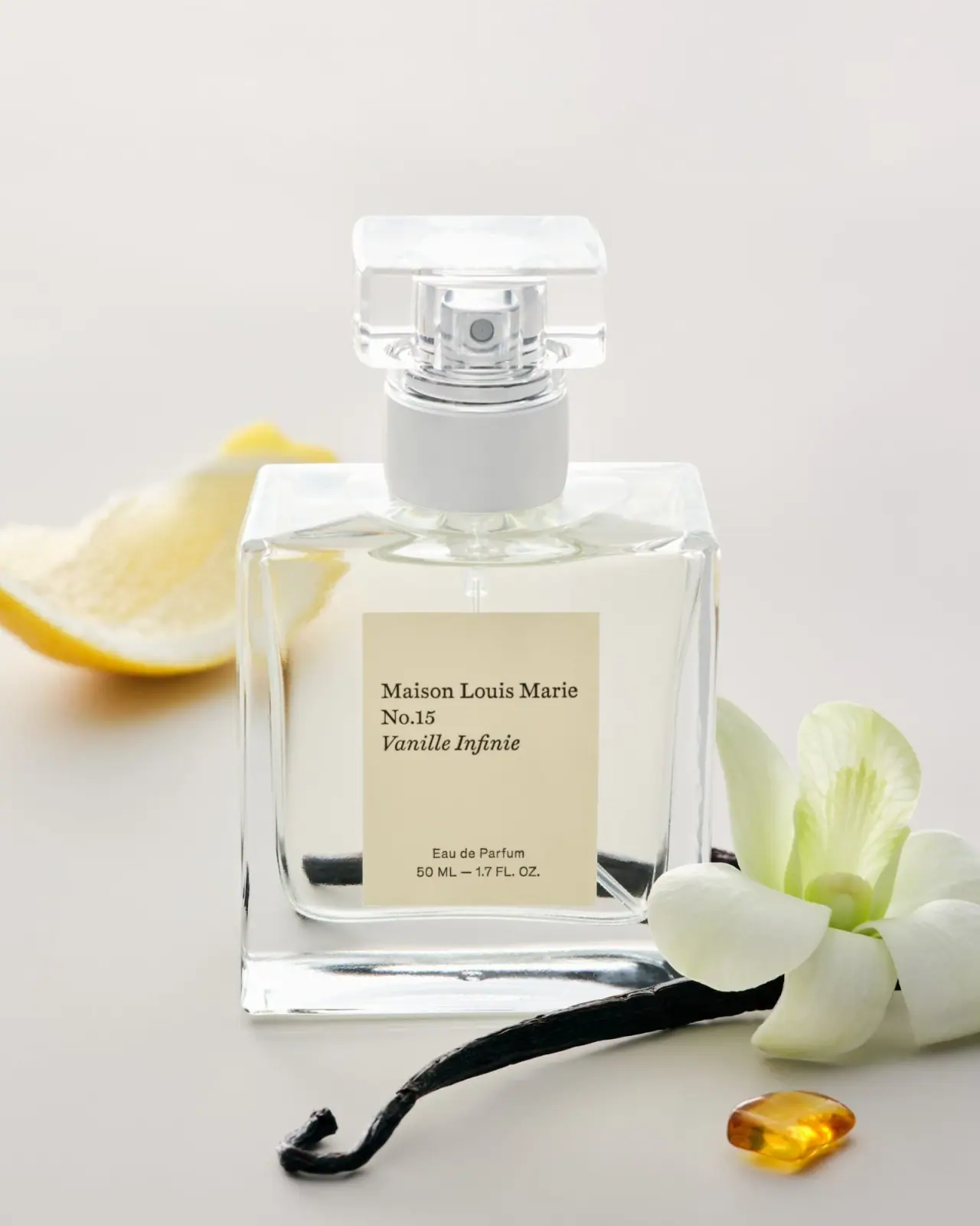
Maison Louis Marie
left-aligned serif title card within clear square perfume geometry
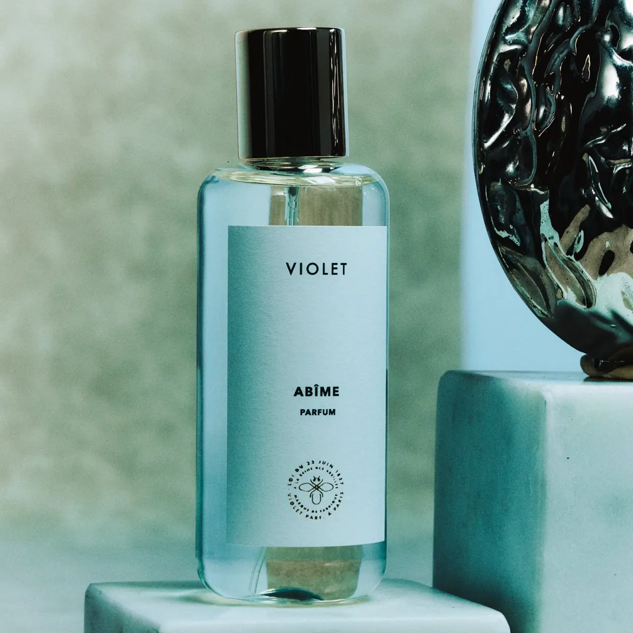
Maison Violet
widely spaced black names on a tall cool label

Aesop
a botanical still life around a disciplined apothecary label

African Botanics
Technical black label with a low serif signature
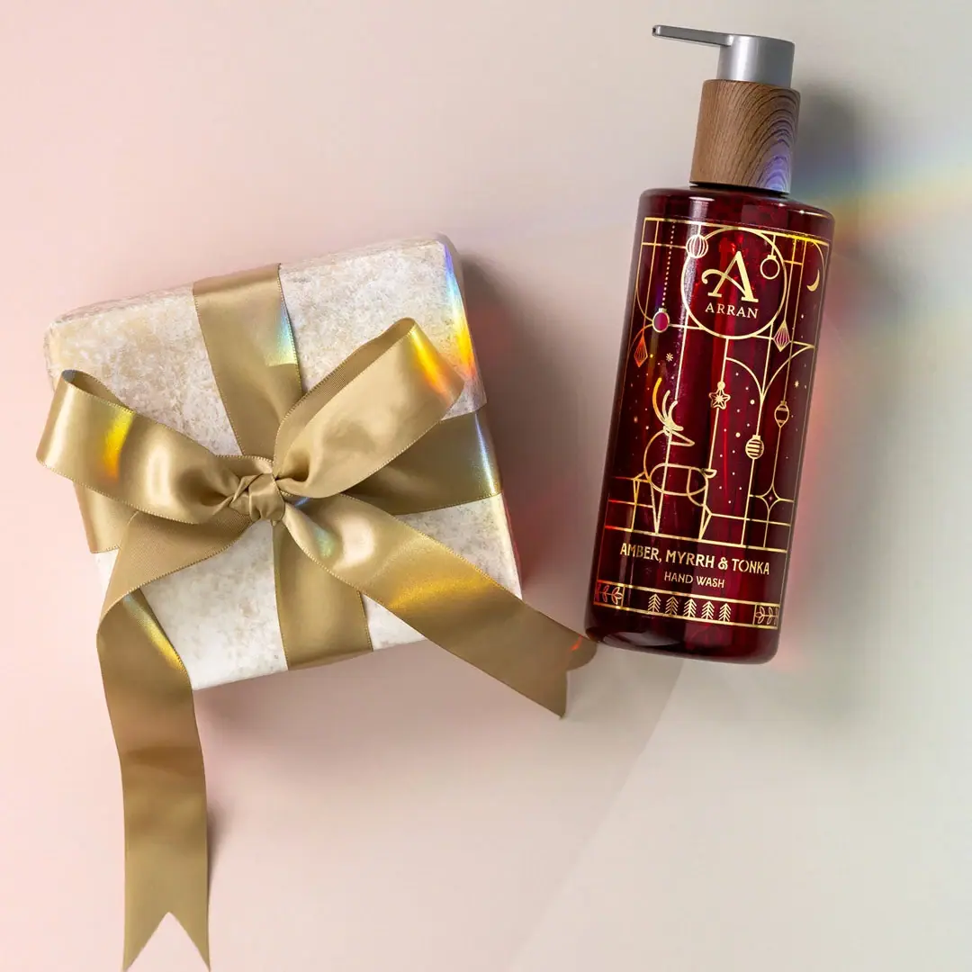
ARRAN
Festive golden linework on garnet with a grain-textured collar

AussieZinc
Sun-yellow numerals on a tall, information-rich white cylinder

bareMinerals
a restrained black compact framing the powder itself

BeautyPWR
Clear square shell, white cream cup, black serif identity