Photography: Julia Chesky — commercial photography. Images belong to their respective owners.
Makeup by Mario

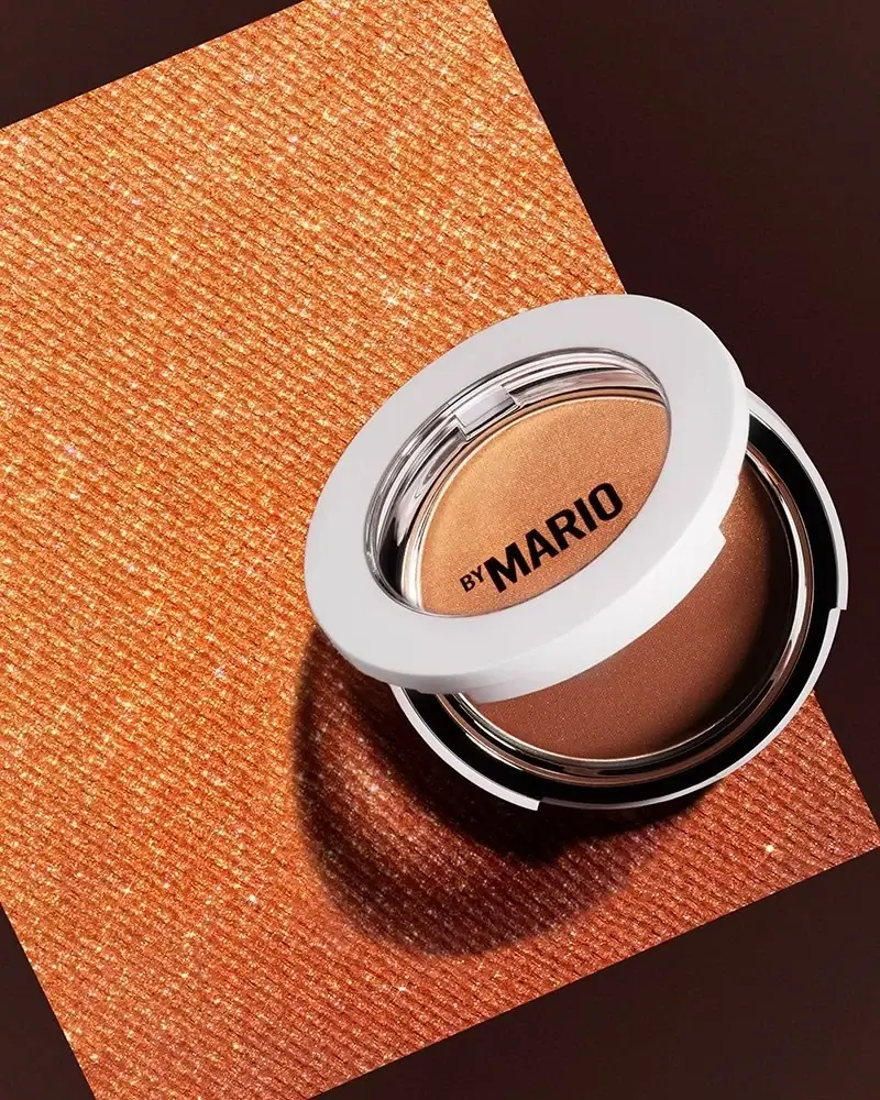
White circular window framing warm powder and black lettering
SoftSculpt Transforming Skin Perfector is photographed as a partially open round compact with a broad white lid rim, a transparent-looking central window and black BY MARIO lettering. One continuous powder surface shifts from pale gold to deeper bronze inside nested reflective and dark rings. The restrained case lets the powder become the main colour field rather than surrounding it with decorative artwork. The brand describes a three-function warming powder in five shades, but the exact photographed shade is not identified. Julia Chesky's bronze-textured set amplifies the powder's warm appearance without forming part of the package.
- Make-up
- Light pack
- Clinical minimal
- Luxe monochrome
About this study
Selected partly open SoftSculpt compact in Julia Chesky's BIG GLOW image. Product-family functions and shade count are sourced; pictured shade and hidden construction remain unassigned.
Sources & evidence · Reviewed 2026-10-19Color Palette
Approximate colours interpreted from photography. These are screen references, not official brand colours or print specifications.
Pack body
Clean white rim
#ECEBEC
Approximate broad lid surround and visible case edge. Subtle grey areas are lighting and shadow rather than a verified separate material colour.
Ink
Black maker
#151110
Compact BY MARIO on the central lid window. Dark inner case regions have a related appearance but are not necessarily the same material or colour specification.
Accent
Pale golden powder
#D7A06C
Approximate lighter region of the visible cosmetic surface. It is contents colour, not case decoration or a confirmed retail shade.
Warm bronze powder
#966342
Approximate deeper region of the same continuous pan, affected by the warm set and directional light.
Typography
Suggested visual alternatives, not confirmed brand typefaces. Any scale below is an illustrative estimate.
The visible maker is a single compact black line, with a small BY followed by a much larger MARIO in bold sans-serif capitals. It sits across the transparent-looking circular lid centre and is visually backed by the warm powder rather than an opaque label rectangle. No product-family title, shade or quantity competes with it in this view. The hierarchy therefore has just two type scales within one short signature. Its strong dark weight is practical against a variable powder background, although the exact contrast changes with shade, lid position and reflected light.
Fonts
Original compact maker alternative
Roboto Condensed
- Looks like
- Bold condensed sans capitals
- Type
- Condensed sans serif
- Weight
- Bold
- Case
- Uppercase
- Tracking
- Compact but clear
- Fallback
- Arial Narrow, sans-serif
Create a different short maker with a small introductory word and a strong main name only if appropriate to its own identity. Preserve open counters when printing against a variable product colour.
Proposed shade-information alternative
Inter
- Looks like
- Neutral small sans serif
- Type
- Sans serif
- Weight
- Regular, Medium
- Case
- Sentence case or short uppercase
- Tracking
- Normal
- Fallback
- Arial, sans-serif
An independent companion for shade and quantity information on an appropriate additional surface. The selected view does not reveal the actual underside system, so this is a design proposal rather than an observed label reconstruction.
Structure & Proportions
Visual proportions and finish previews are illustrative. Confirmed construction details and uncertainties are distinguished in the study notes.
Proportions
| Purpose | Value | Preview |
|---|---|---|
| Broad white framing | The lid's white ring occupies a substantial portion of the visible lid face, making the circular window feel deliberately framed rather than edge-to-edge transparent. | — |
| Single product field | One large powder area occupies the base; tonal changes occur across that field without separate case partitions between them. | — |
| Small signature | The maker takes only a limited strip of the window, leaving most of the visible powder available as the colour signal. | — |
| Angled open view | The raised lid and base overlap as two apparent ellipses in perspective. Their photographic shapes should not be mistaken for an oval compact design. | — |
Shapes
| Element | Value | Preview |
|---|---|---|
| Compact body | Round low-profile case, appearing elliptical only through the camera angle. | |
| Lid surround | Broad white circular ring around the central viewing area. | |
| Powder pan | One continuous circular surface with warm tonal variation. | |
| Maker line | Small horizontal black text block across the lid window. |
Finishes
White smooth surround
Broad lid ring; tactile coating not verified · matte
Clear-looking lid window
Central area carrying maker lettering · transparent
Reflective inner rim
Narrow boundaries around the pan; substrate unverified · metallic
Formats and materials
| Formats | Round hinged compact shown partly open, Broad white lid rim around a transparent-looking central window, Single continuous circular pressed-powder area, Nested clear-looking, reflective and dark inner boundaries |
| Materials | White case and clear-looking window are visible, but their specific polymers or other substrates are unverified., The reflective inner ring does not establish solid metal, chrome plating or a particular coating., Powder belongs to the cosmetic contents, not the permanent case surface; its visible shimmer should not be called a metallic packaging finish., No removable pan, magnet, refill insert or internal material specification is established. |
| Closures | The round lid is raised at an angle, revealing the lower pan and a dark inner rim. A clear-looking hinge area is visible near the back of the raised lid, while a small interruption in the front edge suggests the opening area. The photograph does not establish latch type, magnetic retention, opening force or durability. The lid centre is treated as a transparent-looking window, not an assumed mirror. Branding crosses that window, but the exact side carrying the print cannot be determined from this angle. |
| Decoration | Single restrained BY MARIO mark across the lid window, Unprinted-looking broad white circular surround, Continuous tonal powder field without separate visible compartments, No front floral, geometric or lifestyle illustration |
Front Panel
Schematic reading order. The diagram’s zone heights do not represent measured artwork proportions.
The visible identity is concentrated on the lid's central window rather than inside an opaque paper panel. BY is reduced beside the larger MARIO, creating a maker signature that remains short enough not to cover the entire product field. The white surround gives the lid a stable boundary while the powder supplies a changing backdrop. This placement does not prove that the print is on the inner surface or that it appears only when opened. The selected image shows no readable product name or shade code, so those details remain sourced or unassigned rather than being invented on the lid.
| Zone | Content |
|---|---|
| Outer lid ring | Broad plain white surround with no additional readable wording. |
| Central window | Black BY MARIO signature across a transparent-looking field. |
| Lower product area | One round powder surface transitioning between lighter gold and deeper bronze regions. |
| Inner boundary | Clear-looking and dark reflective rings defining the pan and case edges. |
Range System
The brand's current product page describes five shades and presents the product as a combination of bronzer, highlighter and finishing powder. The selected photograph has no readable shade name, and the page's current default selection does not identify the photographed unit. A continuous tonal pan can communicate multiple powder effects without physically dividing the compact into separate compartments. That is a visual reading of this example, not a full mapping of every shade's colour distribution. The visible-window approach should be evaluated across both lighter and deeper powders because the dark maker may have different contrast against each.
- Five shades are listed for the product family; no exact photographed shade is assigned.
- One continuous pan displays tonal variation instead of several separated circular or rectangular wells.
- An original range using a transparent lid needs readable shade identification elsewhere, since lighting and powder wear can alter visual colour cues.
Back of Pack & Shelf
The underside, fully closed exterior and carton are absent. The selected image provides a partial-open product view rather than all sides of the compact.
- No shade-name location, net weight, batch code or barcode is confirmed.
- No pan-removal slot, replacement insert or refill instruction is established.
- A transparent-looking lid window should not be described as a mirror without independent evidence.
On shelf
The white ring provides a stable recognisable outline while the warm powder supplies variation at the centre. This is a visual inference rather than measured recognition. The transparent-looking window lets product colour participate in the closed-object impression, but the photograph itself is partly open, so the final closed alignment still needs direct inspection. The sparse black maker should be checked against the deepest shade and bright reflections. A real-size review should also separate the attractive studio powder sheen from reliable shade identification under ordinary store lighting.
Imagery
Julia Chesky's portfolio identifies the image within BIG GLOW MAKEUP BY MARIO and credits her creative direction, set, styling, lighting, photography and retouching contributions. The compact sits diagonally on a textured bronze rectangle against a dark brown ground. Directional light creates a strong shadow and brings out the powder's fine sheen, while the white lid ring remains the highest-contrast structural feature. The large bronze texture belongs to the set, not an embossed package sleeve or the powder surface itself. No campaign date or packaging-design authorship is inferred from the file name.
Guidelines
Editorial principles for an original design brief, not official brand guidelines.
Do
- Distinguish permanent case surfaces from consumable powder.
- Keep exact photographed shade unassigned when no evidence identifies it.
- Test window lettering against light and deep product colours.
- Use a simple structural frame around a visually complex powder.
- Preserve photography credits without inventing packaging authorship.
Don't
- Do not call the transparent-looking lid a mirror.
- Do not infer a refill system from a visible pan edge.
- Do not assign the current website's default shade to the photograph.
- Do not turn the bronze set prop into a package material.
- Do not claim the maker print is specifically on the inner lid surface.
Sources & evidence
- SoftSculpt Transforming Skin Perfector — MAKEUP BY MARIOproduct
- BIG GLOW MAKEUP BY MARIO — Julia Cheskyphotographer
How this study was built
range · Sourced fact
Official listing describes a three-function warming powder and five-shade family.SoftSculpt Transforming Skin Perfector — MAKEUP BY MARIOimagery · Sourced fact
Photographer portfolio captions BIG GLOW MAKEUP BY MARIO and lists creative, set, lighting, photography and retouching contributions.BIG GLOW MAKEUP BY MARIO — Julia Cheskystructure · Visual observation
Broad white lid rim surrounds a transparent-looking window above one continuous circular powder area.BIG GLOW MAKEUP BY MARIO — Julia Cheskylabel · Visual observation
Black BY MARIO crosses the lid window; exact printed surface is not established.BIG GLOW MAKEUP BY MARIO — Julia Cheskypalette · Visual observation
Lighter gold and deeper bronze belong to visible powder; textured bronze rectangle belongs to the photographic set.BIG GLOW MAKEUP BY MARIO — Julia Cheskyrange · Editorial interpretation
Current default shade selection does not identify the unlabelled photographed shade.SoftSculpt Transforming Skin Perfector — MAKEUP BY MARIO · BIG GLOW MAKEUP BY MARIO — Julia Chesky
What remains unverified
- Exact pictured shade, case material and decoration process unknown.
- No underside, carton, full closed view or demonstrated refill mechanism.
- Exact printed side of the window and actual typeface are unverified.
- Powder and scene colours are lighting-dependent, not production specifications.
Give your AI
packaging taste
Give your design or image tool a packaging study: palette, type, structure, front panel and principles for an original brief.
Export this styleFree with an email. PACK.md works in Claude, ChatGPT, Cursor and image tools.
More like this

African Botanics
Technical black label with a low serif signature

bareMinerals
a restrained black compact framing the powder itself

BeautyPWR
Clear square shell, white cream cup, black serif identity

Corpus
sage gloss with whispered gold lettering

Costa Brazil
Pale matching vessels with small, deliberate bilingual labels

Crown Affair
Pale frosted-looking bottle, black pump and small looping emblem

HAKU
Pearly narrow tube with stacked serif identity and clear base

Haus Labs
mirror chrome hardware over frosted shade