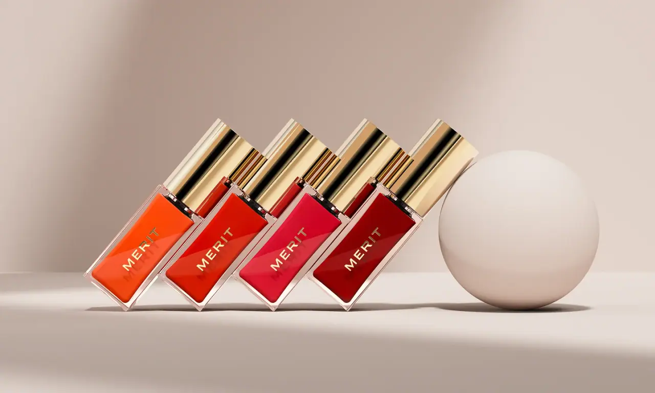
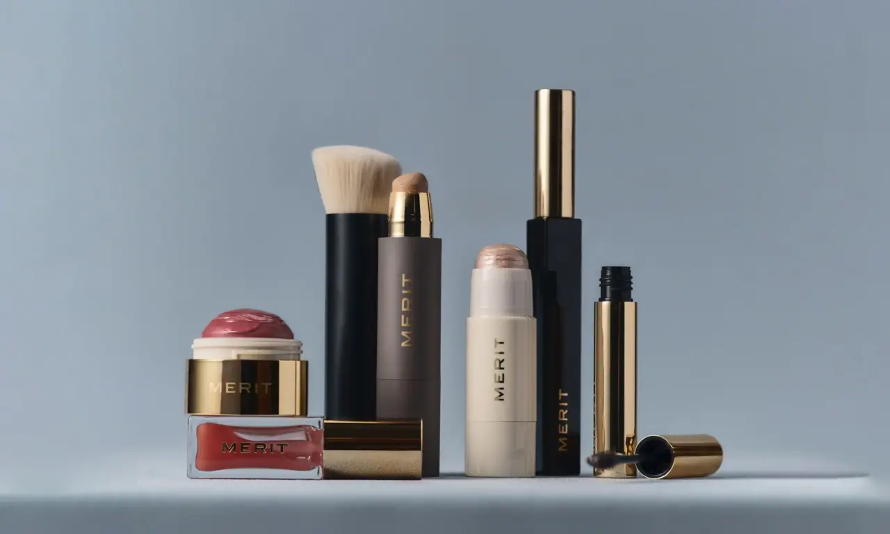
Images from the packaging case study by Aruliden
Merit

polished gold bullets and quiet spaced capitals
Merit builds every pack from a small set of plain straight-walled cylinders finished in one of three surfaces: mirror-polished gold (#c9a25a), gloss black or soft porcelain cream. The only decoration is a small wordmark in widely tracked capitals with tiny serifs, usually running vertically up the side of the component, so the material itself does the talking. Skincare keeps the same tall polished gold caps but moves to frosted glass where the amber-brown formula shows through, adding an italic serif product name, a bold tracked format line and its French translation in italic as the one softer note. Shades are shown only by the product itself: a bronze dome, a pink blush, a red bullet.
- Make-up
- Light pack
- Luxe monochrome
- Clinical minimal
Color Palette
Approximate colours interpreted from photography. These are screen references, not official brand colours or print specifications.
Pack body
Mirror Gold
#c9a25a
Polished metallic finish on lipstick cases, the stick sleeve, blush base, mascara wand cap and every skincare cap
Piano Black
#111010
Gloss black mascara tube and complexion tube bodies
Porcelain Cream
#efeae0
Soft cream stick bodies and their caps on highlighter and bronzer sticks
Frosted Flint
#e9e6e1
Frosted glass upper portion of serum and cleanser bottles
Ink
Engraved Gold
#b8975e
Wordmark printed in gold on black, cream and frosted components
Ivory Print
#f4efe6
Light product name and descriptor printed over the dark formula on skincare
Accent
Formula Umber
#6e3a26
Amber-brown liquid visible through frosted glass, acting as the skincare body colour
Silver Cap
#c4c6c8
Polished silver cap on the complexion tube, the one non-gold metal
Range coding
Shade Bullet
#a8332f
The product itself (lipstick bullet, blush dome, bronze balm) is the only colour coding
Typography
Suggested visual alternatives, not confirmed brand typefaces. Any scale below is an illustrative estimate.
The wordmark is the only element on most makeup, set small and tracked wide, reading vertically along the component. Skincare adds a short italic serif product name, a tiny bold tracked format line in English and an italic French line beneath it, all centred over the visible formula.
Type scale
Estimated cap size as a share of the panel · Front of the 30 ml frosted serum bottle body, about 70 mm tall excluding cap
vertical-wordmark
6% · Regular · Label
VALOR
compact-wordmark
6% · Regular · Label
VALOR
bottle-wordmark
5% · Regular · Label
VALOR
product-name
4.5% · Bold Italic · Headline
Clear Day
format-line
2% · SemiBold · Body
DAILY GLOW SERUM
french-line
2% · Italic · Headline
Sérum Éclat Quotidien
Fonts
Label
Cinzel
- Looks like
- Copperplate Gothic, custom wide capitals with hairline serifs
- Type
- Wide classical capitals with tiny serifs, very open tracking
- Weight
- Regular
- Case
- Uppercase
- Tracking
- Very wide, about +30%
- Fallback
- Copperplate, Optima, serif
The wordmark only: vertical on cylinders, horizontal on compacts and across the frosted shoulder of bottles.
Headline
Libre Caslon Text
- Looks like
- Caslon Italic
- Type
- Transitional serif italic
- Weight
- Italic, Bold Italic
- Case
- Title case
- Tracking
- Normal
- Fallback
- Georgia Italic, Times Italic
Skincare product names ('Great Skin') and the French translation line.
Body
Montserrat
- Looks like
- Futura Medium, Neue Haas Unica
- Type
- Small geometric sans, bold tracked capitals
- Weight
- SemiBold
- Case
- Uppercase
- Tracking
- Wide, about +12%
- Fallback
- Futura, Helvetica
English format line under the product name and the volume at the base.
Structure & Proportions
Proportions
| Purpose | Value | Preview |
|---|---|---|
| Wordmark length on cylinders | About 30% of component height, running vertically | |
| Wordmark position | Lower half of the component, centred on the front face | — |
| Empty surface | About 90% of every makeup component is unprinted material | |
| Skincare cap height | About 40% of total bottle height | |
| Formula fill line | Amber formula fills the lower 65% of the frosted bottle | |
| Colours per component | One or two surfaces plus a single print colour | — |
| Density | Near empty: one small word on a large polished surface | — |
Shapes
| Element | Value | Preview |
|---|---|---|
| Lipstick and stick cases | Straight-walled cylinder with a flush cap | |
| Blush and bronzer | Dome rising out of a short gold cylinder | |
| Skincare cap | Tall polished gold cylinder cap | |
| Serum bottle | Straight frosted glass bottle with dropper | |
| Cleanser | Frosted bottle with pump under a gold overcap |
Finishes
Mirror-polished gold
Lipstick, stick sleeves, compact bases and skincare caps · metallic
Piano gloss black
Mascara and complexion tubes · gloss
Soft matte cream
Stick bodies and caps · matte
Acid-etched glass
Serum and cleanser bottles · frosted
Formats and materials
| Formats | Lipstick bullet, Twist-up stick, Mascara and wand, Domed balm compact, Dropper serum bottle, Pump cleanser bottle, Tube |
| Materials | Metallised plastic, Gloss plastic, Frosted glass |
| Closures | Straight-walled cylinder caps that slide on flush; tall polished gold caps on skincare bottles; a silver cap on the complexion tube |
| Decoration | Single-colour printed wordmark, Vertical wordmark placement, Material contrast between gold and black or cream |
Front Panel
Schematic reading order. The diagram’s zone heights do not represent measured artwork proportions.
No label: decoration is printed directly onto the component in one colour, with generous empty surface around a small wordmark.
| Zone | Content |
|---|---|
| Vertical side | Wordmark running up the cylinder on sticks, tubes and mascaras |
| Bottle upper band | Horizontal wordmark printed over the frosted glass on skincare |
| Bottle lower half | Italic serif product name, bold format line and French italic line printed over the visible formula |
Range System
Material, not colour, separates lines: gold for colour cosmetics, black for mascara and complexion tools, cream for balms and sticks, frosted glass for skincare. Shades are shown only by the product inside or the dome on top.
- Lipstick = all-gold bullet
- Mascara = gloss black tube with gold wand cap
- Stick balm = cream body with coloured dome
- Blush balm = pink dome on a short gold base
- Great Skin = frosted bottle, gold cap, amber formula
Back of Pack & Shelf
Components carry almost nothing on the back; the outer carton repeats the surface colour with the wordmark and puts directions, INCI and legal copy in small tracked capitals on the reverse.
- Shade name and batch on a small base sticker
- Full INCI ingredient list on the carton reverse
- Directions for use in English and French
- Barcode on the carton base
- Period-after-opening symbol, recycling and distributor address
On shelf
Grouped together the range reads as a small set of gold, black and cream cylinders with the same tiny vertical wordmark, so the brand billboards through material and restraint rather than colour.
Imagery
None on pack; the only visual interest is reflection on polished gold and the product colour showing through glass or on top of a stick.
Guidelines
Do
- Limit every component to Mirror Gold (#c9a25a), Piano Black (#111010) or Porcelain Cream (#efeae0).
- Set the wordmark in the widely tracked Label capitals and run it vertically up cylinders at about 30% of their height.
- Print the wordmark in a single contrasting colour: Engraved Gold on black or cream, ivory on gold.
- Let the product be the colour: a pink dome, a red bullet, an amber serum through frosted glass.
- Use tall polished gold caps (about 40% of bottle height) on skincare to tie it back to the makeup.
- Reserve the italic Headline serif for skincare product names and the French line only.
Don't
- Don't add pattern, illustration or a printed label wrap.
- Don't introduce bright brand colours on the pack body.
- Don't set the wordmark large or bold; it should feel engraved and quiet.
- Don't mix more than two surfaces on one component.
- Don't use transparent clear glass; skincare glass is frosted.
- Don't print anything on makeup beyond the wordmark.
Give your AI
packaging taste
Give your design or image tool a packaging study: palette, type, structure, front panel and principles for an original brief.
Export this styleFree with an email. PACK.md works in Claude, ChatGPT, Cursor and image tools.
More like this

African Botanics
Technical black label with a low serif signature

bareMinerals
a restrained black compact framing the powder itself

BeautyPWR
Clear square shell, white cream cup, black serif identity

Corpus
sage gloss with whispered gold lettering

Costa Brazil
Pale matching vessels with small, deliberate bilingual labels

Crown Affair
Pale frosted-looking bottle, black pump and small looping emblem

HAKU
Pearly narrow tube with stacked serif identity and clear base

Haus Labs
mirror chrome hardware over frosted shade