Photography: Gray Malin — NEST collaboration photography. Images belong to their respective owners.
NEST New York

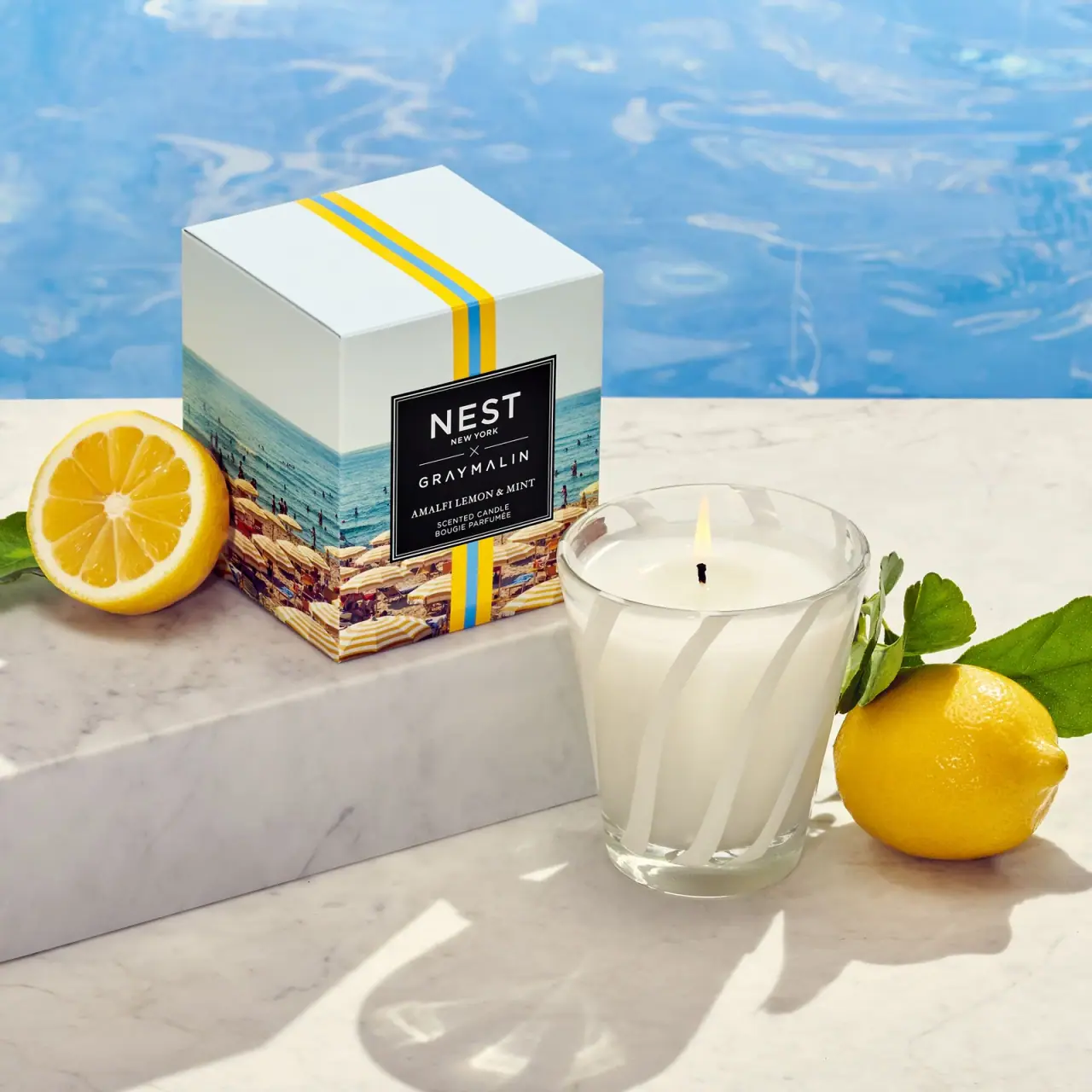
Striped glass candle beside a photographic collaboration carton
This selected Gray Malin limited edition separates two complementary jobs: the candle vessel carries broad white diagonal bands, while the carton carries a coastal photograph, yellow-and-blue striping and a black framed identity panel. The glass remains partly transparent, allowing pale wax and the lit wick to be seen. The carton explains the collaborators and fragrance, leaving the vessel visually lighter. This is a specific collaboration presentation, not a description of NEST’s current standard candle packaging.
- Candles & home scent
- Light pack
- Heritage label
- Playful colour
About this study
Selected Amalfi Lemon & Mint Gray Malin collaboration candle and carton. Current standard collection is not used to specify this earlier edition.
Sources & evidence · Reviewed 2026-10-19Color Palette
Approximate colours interpreted from photography. These are screen references, not official brand colours or print specifications.
Pack body
Stripe white
#F0F0E5
Approximate opaque vessel bands and pale upper carton. The wax contributes a similar creamy tone but is product content, not a printed ink.
Label
Black collaboration panel
#171619
Solid rectangular information field on the carton, bounded by fine pale rules.
Accent
Lemon-yellow carton bands
#EEC719
Two narrow yellow strips flank a blue line across the top and down the front. Actual fruit in the scene is a separate object.
Pool-blue carton stripe
#46A5C8
Central blue line and related blue tones within the printed coastal photograph. The large pool background is not another packaging surface.
Typography
Suggested visual alternatives, not confirmed brand typefaces. Any scale below is an illustrative estimate.
NEST has the largest letters within the black rectangle, with a small NEW YORK line immediately below. An X and fine horizontal rules separate it from the tracked GRAY MALIN name. AMALFI LEMON & MINT appears smaller in a serif, followed by compact bilingual candle-category lines. The entire block is centred inside a double fine border. Authorship therefore precedes scent and format, while the contrasting serif scent line prevents the lower information from becoming one uniform stack of capitals.
Fonts
Collaborator-name alternative
Montserrat
- Looks like
- Montserrat
- Type
- Geometric sans serif
- Weight
- Regular 400 / Medium 500
- Case
- Uppercase
- Tracking
- Moderately open
- Fallback
- sans-serif
A proposed clean uppercase voice for distinct fictional collaborators. Use size and spacing to show the partnership clearly without duplicating either existing wordmark.
Fragrance-name alternative
Libre Baskerville
- Looks like
- Libre Baskerville
- Type
- Serif
- Weight
- Regular 400
- Case
- Uppercase
- Tracking
- Slightly open
- Fallback
- serif
A small serif scent line can contrast with the larger sans serif names. Keep its length compatible with the panel width and test it against the fine border at actual print size.
Structure & Proportions
Visual proportions and finish previews are illustrative. Confirmed construction details and uncertainties are distinguished in the study notes.
Proportions
| Purpose | Value | Preview |
|---|---|---|
| Vessel taper | The open rim is wider than the base, with broad slanting bands following the curved wall. | — |
| Carton image field | The coastal photograph occupies the lower portion and continues around the visible side, while a pale upper area leaves room for the narrow vertical stripe. | — |
| Identity panel | The black rectangle is large enough to hold both collaborators and the fragrance, interrupting the background photograph and stripe at the front centre. | — |
Shapes
| Element | Value | Preview |
|---|---|---|
| Tapered vessel | Round open candle container narrowing towards a thick clear base. | |
| Vessel bands | Broad diagonal opaque stripes alternating with transparent glass. | |
| Outer carton | Rectangular box with closed folded top. | |
| Collaboration panel | Black rectangle with two fine light borders. |
Finishes
Clear glass
Vessel wall and base between opaque bands; hand-blown glass source-confirmed. · transparent
Opaque white striping
Diagonal vessel decoration; application process unknown. · matte
Smooth carton print
Coastal image and framed panel; coating unverified. · matte
Formats and materials
| Formats | An open tapered candle vessel is shown with a rectangular outer carton. A single lit wick is visible in pale wax; no vessel lid appears in the selected photograph. |
| Materials | The collaborator’s announcement explicitly describes the limited-edition vessels as hand-blown glass. The photograph supports a transparent wall and a visibly thicker clear base., Carton board grade, coating, internal support, vessel stripe application and wax composition are not specified in the accessed evidence. The visual study does not infer those processes from appearance. |
| Closures | The vessel is uncovered in use. The carton has a closed top panel with visible folded edges, but the image does not reveal its internal closure tabs or insert. A yellow-and-blue printed stripe crosses the top; it is not evidence of an applied ribbon or security seal. |
| Decoration | Large white diagonal bands wrap the vessel, giving the transparent container a repeating rhythm without readable front text in this view., A coastal image wraps the lower carton, while a narrow yellow-blue-yellow stripe crosses the pale top and front behind the central black panel. |
Front Panel
Schematic reading order. The diagram’s zone heights do not represent measured artwork proportions.
The carton performs the detailed identification work through a black framed rectangle. This panel sits over both the coastal image and the narrow vertical stripe, creating a stable reading surface despite a busy background. The vessel remains largely decorative in the selected angle, with no readable producer or scent label visible. The two objects therefore share a motif while using different information densities.
| Zone | Content |
|---|---|
| Pale top and stripe | Two yellow lines around one blue line travel across the closed top and descend the front. Their graphic continuity links otherwise separate carton faces. |
| Photographic coast | Beach umbrellas, people and sea occupy the lower box and visible side. These are printed photographic details, distinct from the actual pool and lemons around the product. |
| Framed partnership | The black field centres the two collaborator names, an X divider and fine rules. It remains legible independently of the image beneath it. |
| Scent and format | The smaller serif scent line reads Amalfi Lemon & Mint, followed by English and French candle-category copy. The source announcement reverses Lemon and Mint in its heading; the photographed label wording is retained here. |
Range System
Gray Malin’s announcement identifies a limited collaboration with three fragrances and explains that the coordinated vessel stripes refer to umbrella patterns in his aerial beach photographs. It names the Amalfi, Ocean Mist & Sea Salt and Coconut & Palm pairings. This study audits only the selected Amalfi set rather than asserting identical colour or artwork across those other variants.
- A photographic collaboration can keep the identity-panel structure fixed while giving each scent a different licensed image. The common panel makes authorship readable even when the scenes vary substantially.
- A motif can change scale between components: narrow carton bands and broad vessel stripes relate without becoming identical artwork. For an original project, develop a distinct pattern and use photography with appropriate permission.
Back of Pack & Shelf
Only the carton front, one side and top are visible, alongside the open vessel. The carton reverse, underside and vessel base label are unseen; candle care, weight and warning placement cannot be reconstructed.
- Verify a base and reverse image before documenting weight, burn instructions or warning typography.
- Do not import current standard-candle specifications into this earlier collaboration without edition-specific evidence.
- Confirm the internal carton support separately before describing transport protection or board construction.
On shelf
The black framed carton panel should remain the strongest small-scale identifier, with the coastal image supplying destination and mood. Once removed from the box, the vessel communicates through its stripe rhythm rather than the same dense text hierarchy. This is an interpretation of the selected view, not a claim that no information exists anywhere on the vessel. A useful reference set would add a neutral vessel rotation and the carton reverse to explain what remains visible during use.
Imagery
The candle is lit beside its carton on pale stone, with lemons, leaves and a blue swimming-pool background. The scene repeats the yellow and blue already printed on the carton, making the package feel connected to its surroundings. The large pool is a real scene element, while the beach on the box is printed artwork; keeping those layers distinct is essential when extracting a palette or describing decoration. Sunlight casts clear vessel and foliage shadows, and the visible flame explains the candle’s use state.
Guidelines
Editorial principles for an original design brief, not official brand guidelines.
Do
- Separate printed coastal photography from the actual pool scene.
- Keep the black information panel legible over complex artwork.
- Retain the photographed scent-word order when documenting the label.
- Scope glass and edition claims to the collaboration source.
Don't
- Do not describe the top stripe as a physical ribbon or seal.
- Do not invent wax blend, fill weight or burn time.
- Do not assume a hidden lid or identical current presentation.
- Do not copy the artist’s photograph or existing collaborator marks.
Sources & evidence
How this study was built
edition · Sourced fact
Collaborator identifies a limited-edition three-fragrance collection, distinct from standard presentation.Introducing NEST New York x Gray Malinstructure · Sourced fact
Announcement describes hand-blown glass vessels.Introducing NEST New York x Gray Malinrange · Sourced fact
Coordinated stripes are linked by collaborator to umbrella patterns in aerial beach photographs.Introducing NEST New York x Gray Malintypography · Visual observation
Framed black panel prioritises collaborators above serif scent and bilingual format.label · Visual observation
Visible scent wording is Amalfi Lemon & Mint; vessel shows broad diagonal bands.palette · Visual observation
White, black, yellow and blue are actual package colours, with additional photographic detail on carton.imagery · Editorial interpretation
Pool and citrus staging repeats carton colours but must remain separate from printed artwork.
What remains unverified
- Exact fill weight, wax blend, dimensions and burn time unverified for selected edition.
- Carton stock, stripe print process and hidden closure/insert unseen.
- Announcement heading says Amalfi Mint & Lemon; photographed label says Amalfi Lemon & Mint.
- Current collection page supplied little usable text and is not an archival construction source.
- Fonts proposed; colours approximate.
Give your AI
packaging taste
Give your design or image tool a packaging study: palette, type, structure, front panel and principles for an original brief.
Export this styleFree with an email. PACK.md works in Claude, ChatGPT, Cursor and image tools.
More like this

Voluspa
red guitar-string glass with a dark pick-shaped identity
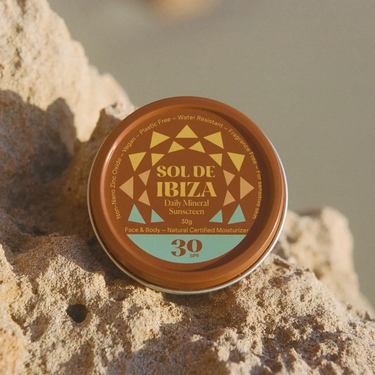
Sol de Ibiza
Terracotta sunscreen tin with triangular rays and turquoise SPF

Aerangis
a quiet numbered object, an intimate scent memory

Alexander McQueen
An oval flacon crowned with dense black relief
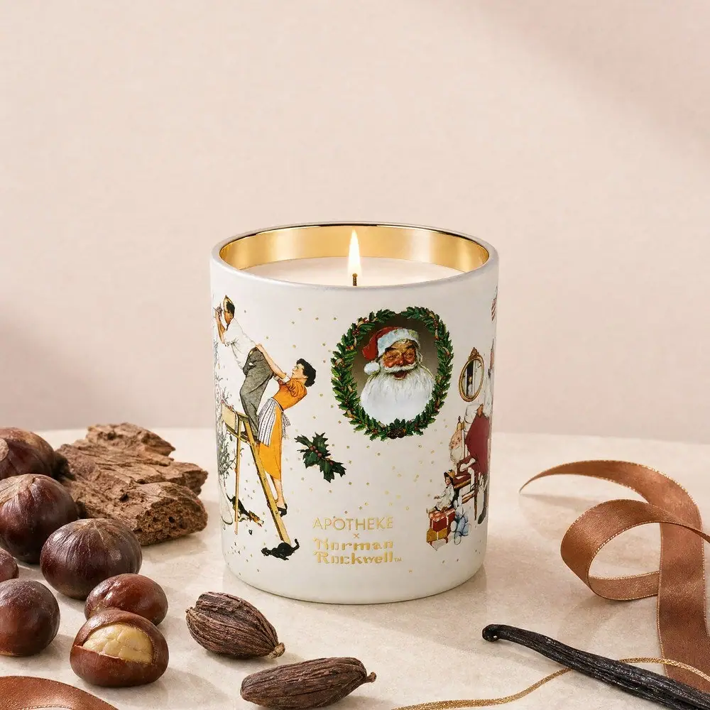
Apotheke
White holiday vignettes with a warm golden interior

Arquiste
blush transparency, white lettering and a stepped gold cap

Atelier des Ors
Golden constellation framing a compact name on amber transparency
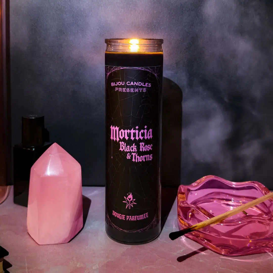
Bijou Candles
Pink blackletter and fine webs on a tall dark candle