Photography: Nopalera official photography. Images belong to their respective owners.
Nopalera

Pale green aluminium beneath a radiant cactus-face identity
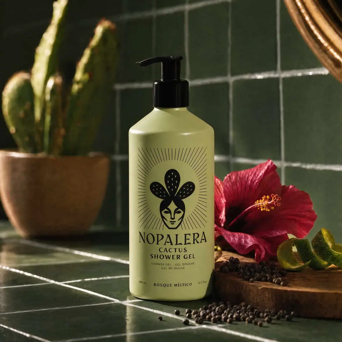
The selected Bosque Místico shower-gel bottle uses a pale yellow-green body and black pump as a simple high-contrast foundation for a large cactus-face emblem. Fine rays surround the emblem above a tall serif producer name. Product type and multilingual support sit immediately below, while the scent name and quantity markings form a separate low band near the base. The emblem communicates the house identity; it does not independently identify the scent. A dark green tiled setting and hibiscus, citrus and pepper props extend the fragrance story outside the printed design.
- Body & bath
- Light pack
- Bold typographic
About this study
Selected pale-green Bosque Místico shower-gel bottle, photographed with 400 mL / 13.5 fl. oz. markings. Current indexed listing mass retained separately.
Sources & evidence · Reviewed 2026-10-19Color Palette
Approximate colours interpreted from photography. These are screen references, not official brand colours or print specifications.
Pack body
Pale yellow-green body
#BFC28A
Approximate bottle colour under directional scene lighting. This belongs to the package, distinct from the much darker green tiles behind it.
Glossy black pump
#101310
Approximate closure colour. It repeats the dark graphic appearance at the top while differing in surface reflection from the body.
Ink
Black illustration and lettering
#151A12
Approximate face, cactus shapes, radiating lines and text colour. One dark graphic family keeps the detailed emblem coherent.
Typography
Suggested visual alternatives, not confirmed brand typefaces. Any scale below is an illustrative estimate.
The cactus-face emblem occupies most of the upper front and leads the composition pictorially. Nopalera then appears in a large narrow serif with distinctive sharp forms. Cactus and Shower Gel follow as two smaller uppercase lines, with still smaller multilingual equivalents below. A large gap separates this central block from the scent name near the base. Quantity appears in small separate positions at the lower left and right. The hierarchy therefore moves from emblem to producer to format, then to variant, rather than using the scent as the central headline.
Fonts
Tall producer alternative
Cormorant Garamond
- Looks like
- Cormorant Garamond
- Type
- Display serif
- Weight
- Medium 500 / SemiBold 600
- Case
- Uppercase
- Tracking
- Natural optical spacing
- Fallback
- serif
A proposed elegant narrow serif direction for an original house name. Develop distinct letterforms rather than copying the Nopalera wordmark’s sharp details.
Product and variant alternative
Lato
- Looks like
- Lato
- Type
- Sans serif
- Weight
- Regular 400 / Bold 700
- Case
- Uppercase
- Tracking
- Moderately open for short identifiers
- Fallback
- sans-serif
Use weight and spacing to distinguish format, small multilingual support and a separate scent line. Test the low variant position in a real hand-held view so it is not routinely obscured.
Structure & Proportions
Visual proportions and finish previews are illustrative. Confirmed construction details and uncertainties are distinguished in the study notes.
Proportions
| Purpose | Value | Preview |
|---|---|---|
| Bottle silhouette | A tall cylindrical-looking body gives the large emblem room above a compact text stack. Sloping shoulders narrow toward the pump collar. | — |
| Emblem scale | The radiating motif occupies much more vertical space than the product wording, making it the primary pictorial identifier. | — |
| Lower variant band | The scent line is separated from the main product block by open body space, with quantity marks near the lower corners. | — |
Shapes
| Element | Value | Preview |
|---|---|---|
| Bottle | Tall straight-sided body with sloping shoulder and rounded lower edge. | |
| Pump | Black cylindrical collar with upright stem and side-facing spout. | |
| Radiating emblem | Fine lines surround a face-and-cactus centre in a tall rounded field. | |
| Product stack | Compact centred lines below the large serif producer. |
Finishes
Smooth pale coating appearance
Aluminium bottle exterior; coating process unknown. · matte
Glossy dark dispenser
Pump collar and actuator; composition unknown. · gloss
Formats and materials
| Formats | A tall straight-sided bottle with sloping shoulders and a black pump. The photographed front reads 400 mL / 13.5 fl. oz.; the indexed current product listing uses 13.5 oz. / 383 g. These markings are retained as different stated units rather than treated as interchangeable. |
| Materials | An indexed excerpt of the official product page identifies an aluminium bottle. Direct page fetches failed during this review, so the material statement is attributed to that official indexed text rather than a fully opened component specification., Pump composition, internal spring, dip tube, bottle liner, coating and decoration process are not itemised in the evidence accessed. Aluminium body does not make the whole assembled package aluminium. |
| Closures | The black pump has a broad cylindrical collar, upright stem and left-facing spout in the selected image. Its attachment, locking action and dose are not visible. No shipping clip, outer cap or refill closure is demonstrated. |
| Decoration | A stylised human face beneath three cactus-like pads is surrounded by thin radiating lines. The large emblem and typography share one black appearance on the pale field. |
Front Panel
Schematic reading order. The diagram’s zone heights do not represent measured artwork proportions.
The upper face is dominated by the radiating illustration, followed immediately by producer and format. Multilingual product equivalents sit in small lines beneath. Near the bottom, a separate horizontal group carries the scent and quantity. No distinct paper-label edge is clearly visible, so the information area is described without asserting an applied label substrate.
| Zone | Content |
|---|---|
| House emblem | A face with cactus-like forms above it is enclosed by many fine rays. It functions as an identity graphic rather than a literal depiction of the full formula or a verified scent code. |
| Producer | The large narrow serif name spans below the illustration, establishing a strong textual anchor. |
| Product type | Cactus Shower Gel occupies two uppercase lines, with smaller language equivalents beneath. These lines explain the category below the expressive identity. |
| Scent and quantity | Bosque Místico sits low at the centre, with 400 mL and 13.5 fl. oz. in smaller separate positions. The photographed volume markings differ from the current listing’s mass-based wording. |
Range System
The official indexed product description identifies Bosque Místico and links it to hibiscus, citrus, soft florals and woods. This study audits one pale-green shower-gel bottle. A stable emblem plus a separate scent line could support a family, but the selected image alone does not prove every colour-to-scent mapping or show all other formats.
- For an original range, treat the emblem as a house identifier and make the changing scent explicit in text. Do not assume a customer can decode the variant from a generic cactus motif.
- The separate lower scent position can preserve the main identity across editions, but it should be checked in cropped ecommerce images and while held. A beautiful front hierarchy still needs practical variant visibility.
Back of Pack & Shelf
Rear text, underside, pump internals and any outer shipping presentation are unseen. Ingredient, batch and disposal details cannot be mapped to exact positions.
- Keep bottle aluminium separate from unknown pump and liner materials.
- Verify a reverse panel before documenting instructions or recycling marks.
- Do not convert the photographed volume and listed mass into an assumed density or equivalent specification.
On shelf
The large emblem and serif producer should remain recognisable before the small scent and multilingual wording. The black pump repeats the graphic contrast above the bottle, giving the tall object a coherent silhouette. This is visual interpretation rather than tested recognition. A catalogue should pair the lifestyle image with a closer product view or visible textual variant title because the low scent line is relatively small.
Imagery
The bottle stands on dark green tiles beside a red hibiscus bloom, curled citrus peel and dark peppercorns, with a potted cactus behind. The official fragrance context supports a broad floral/citrus association, but the scene does not establish ingredient amounts or functional benefits. Warm directional light produces highlights on the shoulder and pump, while the pale body separates strongly from the darker setting. Red flower, green tiles, brown wood and peppercorn colours are photographic elements rather than additional printed package colours.
Guidelines
Editorial principles for an original design brief, not official brand guidelines.
Do
- Distinguish the house emblem from the separate scent identifier.
- Attribute aluminium specifically to the bottle body.
- Preserve photographed volume and current listed mass as separate statements.
- Keep fine rays and small text readable at the intended image size.
Don't
- Do not claim the complete pump package is aluminium.
- Do not treat the cactus-face mark as proof of the scent variant.
- Do not import flower and tile colours into the printed palette.
- Do not infer refillability, pump dose or liner specification from appearance.
Sources & evidence
How this study was built
structure · Sourced fact
Official indexed product excerpt identifies 13.5 oz. / 383 g aluminium bottle.Cactus Shower Gel — Bosque Místico, Nopaleraedition · Visual observation
Selected front independently shows 400 mL / 13.5 fl. oz.label · Visual observation
Large house emblem precedes producer/product; scent sits separately near base.typography · Visual observation
Narrow serif producer contrasts with compact uppercase support.palette · Visual observation
Pale yellow-green body and black graphics/pump form the package palette.imagery · Visual observation
Dark tiles, hibiscus, citrus, pepper and cactus are scene elements.range · Editorial interpretation
Emblem is a house cue; selected image does not establish full colour-to-scent mapping.
What remains unverified
- Direct official URL fetches failed; official search-index excerpt supplied aluminium and current mass wording.
- Pump, liner, coating and decoration method unspecified.
- Photographed volume and listed mass are not treated as interchangeable.
- Reverse/underside unseen; fonts and colours are alternatives/estimates.
Give your AI
packaging taste
Give your design or image tool a packaging study: palette, type, structure, front panel and principles for an original brief.
Export this styleFree with an email. PACK.md works in Claude, ChatGPT, Cursor and image tools.
More like this

ACURE
Iridescent spectacle with practical, tightly ordered type

AKT
Lilac stage directions with a quiet metallic detail

AussieZinc
Sun-yellow numerals on a tall, information-rich white cylinder

Bask
sunny yellow with a playful turquoise signature

Beame
Orange bubble lettering, pink mascot, clear product badge

BioSeivas
Vertical serif identity on a mauve treatment band
Black Girl Sunscreen
Cream tube with gold crest and an isolated SPF numeral

Bomba Curls
tropical foliage gathered around a bold yellow nameplate