Photography: Odacité official photography. Images belong to their respective owners.
Odacité
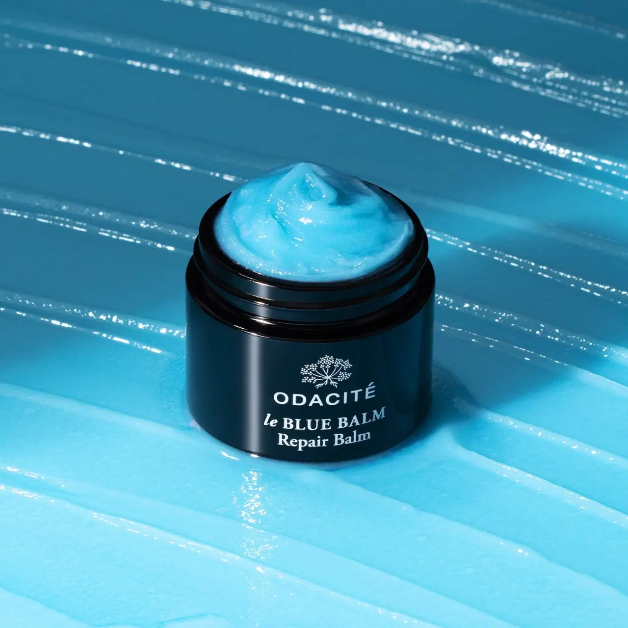
Open dark balm jar with white type and blue contents
The selected earlier Le Blue Balm jar has a glossy near-black body, exposed screw threads and a compact white front identity. A branching botanical emblem sits above ODACITÉ, followed by an italic le, uppercase BLUE BALM and a separate Repair Balm line. Vivid blue balm is heaped above the open rim, and broad blue texture strokes fill the background. The blue belongs primarily to the contents and scene; the container itself remains dark. The current official listing uses updated presentation and a 50 ml size, kept separate from this archival image.
- Skincare
- Light pack
- Luxe monochrome
- Apothecary
About this study
Selected earlier open Le Blue Balm jar with Repair Balm front. Current ingredient-led label and 50 ml listing retained only as edition context.
Sources & evidence · Reviewed 2026-10-19Color Palette
Approximate colours interpreted from photography. These are screen references, not official brand colours or print specifications.
Pack body
Glossy near-black jar
#10232C
Approximate dark container appearance with blue scene reflections. It is not evidence that the jar substrate is uniformly blue.
Ink
White identity
#E9EFF1
Botanical emblem, producer and product naming on the front. One light colour supports several typographic voices.
Accent
Visible blue balm
#65CFE7
Product contents exposed above the rim, explicitly not a printed package colour. The similar background amplifies this content cue but is not part of the container.
Typography
Suggested visual alternatives, not confirmed brand typefaces. Any scale below is an illustrative estimate.
A small branching botanical emblem tops the centred identity stack. ODACITÉ follows in spaced uppercase sans serif and forms the clearest producer line. Beneath it, a smaller italic le introduces the heavier serif BLUE BALM capitals. Repair Balm occupies a further serif line in title case. This combination gives producer, name and format distinct voices without adding another ink colour. There is no readable quantity or ingredient pair on this selected earlier front, even though later official imagery uses more explicit ingredient naming.
Fonts
Producer alternative
Montserrat
- Looks like
- Montserrat
- Type
- Geometric sans serif
- Weight
- Medium 500 / SemiBold 600
- Case
- Uppercase
- Tracking
- Moderately open
- Fallback
- sans-serif
Use a distinct uppercase producer name with enough spacing to read across the curved jar wall. Preserve required accents rather than simplifying the name for visual convenience.
Product-name alternative
Libre Baskerville
- Looks like
- Libre Baskerville
- Type
- Serif
- Weight
- Regular 400 / Bold 700
- Case
- Italic introductory word, uppercase title and title-case format
- Tracking
- Neutral
- Fallback
- serif
A proposed serif family can provide both a small italic introduction and a strong upright product name. Keep those roles deliberate so the stack feels ordered rather than like several unrelated fonts.
Structure & Proportions
Visual proportions and finish previews are illustrative. Confirmed construction details and uncertainties are distinguished in the study notes.
Proportions
| Purpose | Value | Preview |
|---|---|---|
| Broad opening | The mouth spans most of the body width, clearly exposing the blue balm and the threaded neck. | — |
| Short front stack | The emblem and three text levels occupy a compact central region on the broad dark wall. | — |
| Styled product mound | The balm rises above the rim in a peak; this is a photographic presentation rather than a dimensional fill specification. | — |
Shapes
| Element | Value | Preview |
|---|---|---|
| Jar body | Short round cylinder with a softly rounded base edge. | |
| Open mouth | Broad circular opening with exposed external thread ridges. | |
| Botanical emblem | Small branching white mark above the producer; exact species unverified. |
Finishes
Glossy dark container
Jar body and threaded neck; substrate unknown. · gloss
White front decoration
Emblem and text; process unverified. · matte
Formats and materials
| Formats | An open short cylindrical balm jar with a broad mouth and visible external screw threads. No lid, insert or applicator appears in this selected composition. |
| Materials | The current product page does not verify the substrate of this earlier dark jar or the material of its unseen lid. Gloss and apparent thickness are insufficient to assign glass, plastic or a UV-protection specification., The photographed blue mound is product styling above the rim, not a reliable measure of normal fill height, capacity or headspace. The current listing states 1.69 oz / 50 ml, but no legible quantity ties that specification to this exact photographed earlier jar. |
| Closures | Two prominent thread-like ridges are exposed around the neck below the open rim, supporting a screw-lid format. The removed lid is outside the image; its height, grip, liner and seal are not documented. |
| Decoration | A white branching botanical emblem and centred text form the front decoration. The emblem’s precise plant species is not established., No bounded paper-label edge or extra colour field is visible on the jar. The image does not confirm whether the white artwork is printed directly or applied by another process. |
Front Panel
Schematic reading order. The diagram’s zone heights do not represent measured artwork proportions.
The earlier front uses a compact centred stack without a coloured label panel. A small emblem establishes the top, a spaced sans serif producer follows, and two serif product lines complete the lower region. White text contrasts against the dark jar while the exposed blue balm becomes the largest colour feature. The package communicates category through the open format and naming rather than through ingredient illustrations.
| Zone | Content |
|---|---|
| Botanical identity | A fine branching white emblem sits above the name. It should be described as a brand graphic rather than a verified drawing of the ingredient named on the current product page. |
| Producer | ODACITÉ appears in uppercase sans serif with visible accent. This line differs from the serif naming below. |
| Mixed-style product title | A small italic le precedes BLUE BALM in serif capitals, creating a distinctive internal contrast within the title. |
| Format descriptor | Repair Balm sits on its own lower line. It is visible product wording, not an independent assessment of therapeutic effect. |
Range System
The approved cover is catalogued as an earlier jar presentation. The current official gallery includes updated labelling with Blue Chamomile + Shea Butter wording and lists 50 ml. The study retains the earlier visible Repair Balm front rather than merging current ingredient lines or capacity into it. One archived jar does not establish all historic Odacité label rules.
- An original product can keep a strong colour association in the contents while using restrained monochrome packaging. The content colour should remain clearly distinguished from printed identity colours in production documentation.
- When a label evolves, preserve dated images of each hierarchy. Adding current ingredient language to an older front description would erase the design change that makes the reference useful.
Back of Pack & Shelf
The rear, underside, lid and any carton are unseen. No quantity, ingredient list, batch marking or care instructions can be reconstructed from the visible front.
- Verify a dated base or reverse before assigning the earlier jar a capacity.
- Obtain the matching lid image before documenting closure height, texture or liner.
- Keep current product copy separate from the archived front’s exact visible wording.
On shelf
At small scale, the dark cylinder against vivid blue should remain more recognisable than the fine botanical emblem. The white producer and serif title provide a second layer of identification once the image is larger. This is visual interpretation rather than measured shelf performance. Pairing this open texture hero with a closed neutral archival view would explain the complete package and make it easier to distinguish actual container colour from blue reflections.
Imagery
The jar stands on broad vivid blue balm-like strokes, with a mound of matching blue contents lifted above the mouth. Strong directional light creates bright texture ridges and glossy jar highlights. The background extends the product colour into a full scene, but it is not printed on the package. The open view clearly communicates access and texture, while its styled overflow should not be treated as a normal sealed fill condition or evidence of how the product is shipped.
Guidelines
Editorial principles for an original design brief, not official brand guidelines.
Do
- Keep earlier and updated front wording separate.
- Distinguish blue contents from blue scene reflections on the jar.
- Document the exposed threads without inventing the removed lid.
- Use a neutral closed image to complement the texture hero.
Don't
- Do not infer glass or UV protection from a dark glossy body.
- Do not treat the styled mound as normal fill height.
- Do not assign current 50 ml to an unreadable earlier label automatically.
- Do not identify the emblem as a specific ingredient plant without evidence.
Sources & evidence
How this study was built
edition · Sourced fact
Current official page lists 50 ml and includes updated ingredient-led labelling; earlier front remains separately described.Le Blue Balm Repair Balm — Odacitéstructure · Visual observation
Open broad mouth and external thread ridges visible; no lid shown.typography · Visual observation
Uppercase sans serif producer contrasts with italic le and serif BLUE BALM/Repair Balm.label · Visual observation
Fine branching emblem tops compact white front stack without a readable quantity.palette · Visual observation
Dark jar and white decoration are separate from vivid blue contents and background.imagery · Visual observation
Blue mound and broad texture strokes communicate the balm in an open styled presentation.range · Editorial interpretation
Archival front must not absorb current label copy or unverified component specifications.
What remains unverified
- Earlier jar substrate and unseen lid construction unverified.
- Current 50 ml is not a readable archival front quantity.
- Original fonts, print method and emblem species unverified.
- Styled blue mound does not establish ordinary fill level.
- Blue reflections affect apparent jar colour.
Give your AI
packaging taste
Give your design or image tool a packaging study: palette, type, structure, front panel and principles for an original brief.
Export this styleFree with an email. PACK.md works in Claude, ChatGPT, Cursor and image tools.
More like this
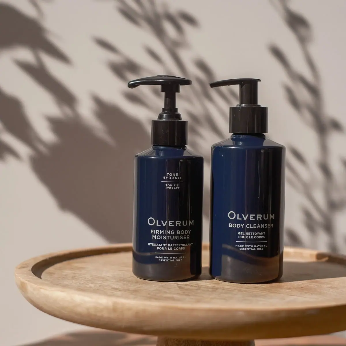
Olverum
Navy bodycare pair with pale centered copy and black pumps
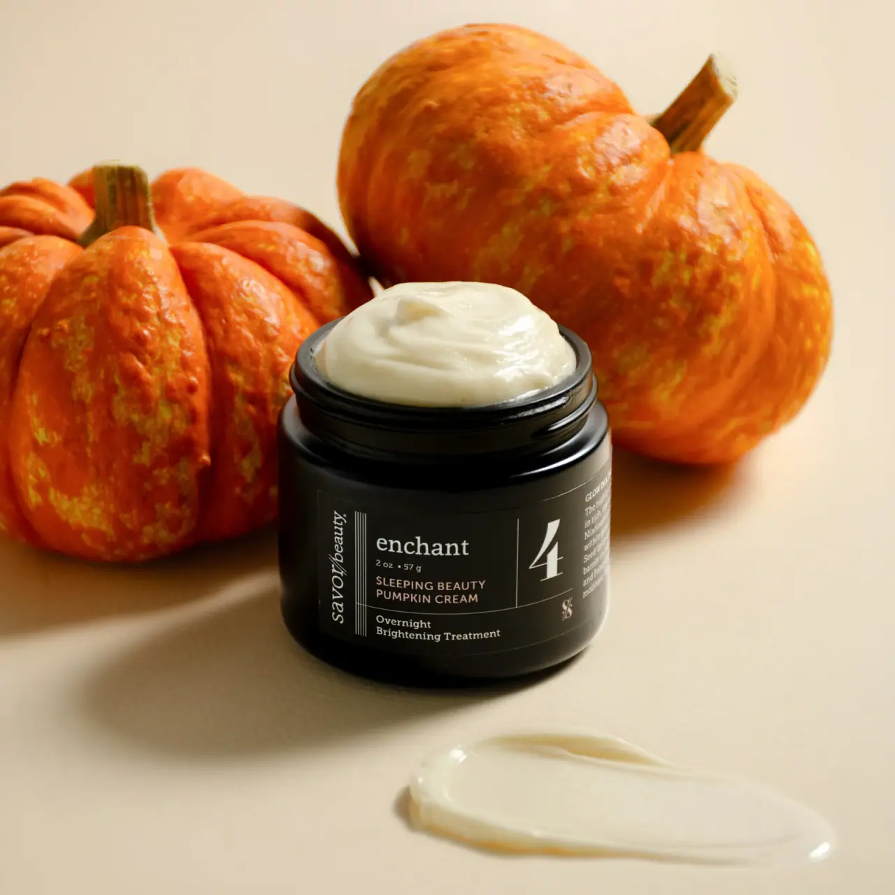
Savor Beauty
Black ruled jar label with vertical maker and routine numeral
Verden
Bold serif identity on a quiet white spray label
AMASS
A ruled botanical document on a dark rounded bottle
Black Blaze
Warm amber, quiet paper and a deliberate vertical rhythm

Aesop
a botanical still life around a disciplined apothecary label

African Botanics
Technical black label with a low serif signature

al.ive body
warm architectural calm, built as a paired vanity object