Photography: Olverum official photography. Images belong to their respective owners.
Olverum

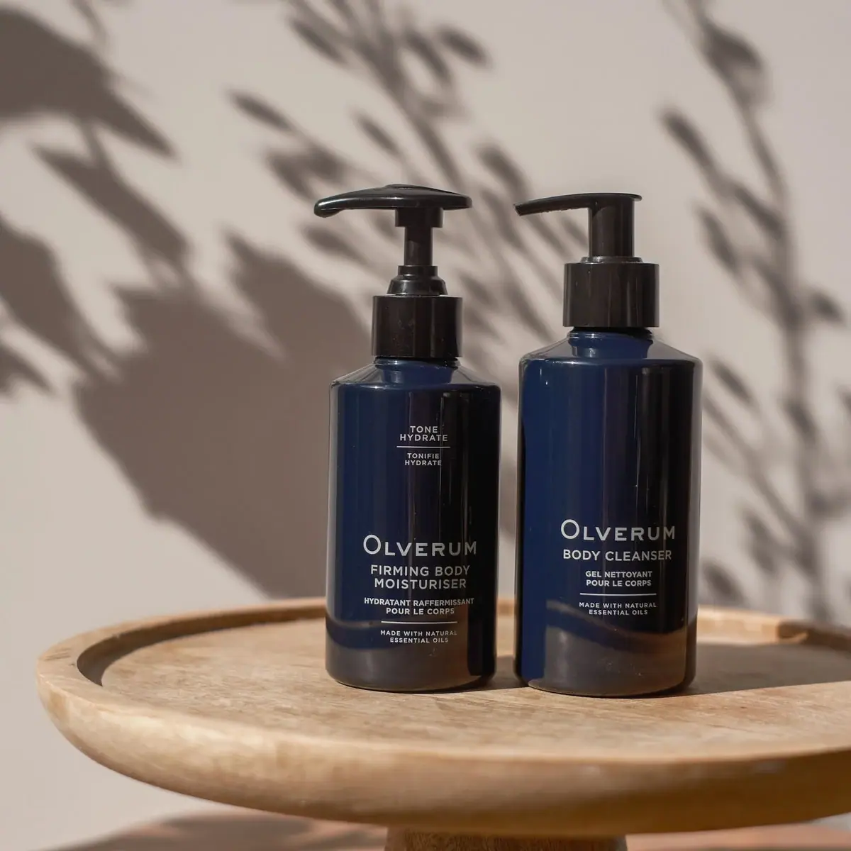
Navy bodycare pair with pale centered copy and black pumps
The Repair and Restore image pairs a shorter Firming Body Moisturiser with a taller Body Cleanser in deep navy cylindrical bottles. Both use black pumps and pale centered typography, but their upper fronts and dispensing heads differ. The moisturiser adds a small bilingual Tone / Hydrate block near the shoulder, while the cleanser leaves a larger uninterrupted navy field above its maker. The shared color and lower information pattern make the pair coherent without erasing those product-specific distinctions.
- Body & bath
- Dark pack
- Apothecary
- Luxe monochrome
About this study
Selected Body Cleanser and Firming Body Moisturiser pair on a wooden tray. Exact set identity is sourced; quantities and component materials are not inferred.
Sources & evidence · Reviewed 2026-10-19Color Palette
Approximate colours interpreted from photography. These are screen references, not official brand colours or print specifications.
Pack body
Deep navy
#14243C
Approximate body color, shifting toward near-black in shadow and lighter blue along reflected edges.
Ink
Warm pale lettering
#D8D8CF
Maker, bilingual product names, small claims and thin rules appear pale against the glossy navy field; exact ink composition unknown.
Accent
Pump black
#161719
Both collars, stems and dispensing heads remain dark, continuing the silhouette without a metallic contrast band.
Typography
Suggested visual alternatives, not confirmed brand typefaces. Any scale below is an illustrative estimate.
The lower maker uses a noticeably enlarged initial O followed by smaller uppercase letters. Product naming follows in firm sans capitals, with the moisturiser occupying two lines and the cleanser one. Smaller French wording sits below, followed by a thin rule and a compact essential-oils statement. The moisturiser's separate upper Tone / Hydrate block repeats the bilingual pattern at a much smaller scale. This distinction matters: the pair shares a lower grid, but the full front compositions are not identical.
Fonts
Independent maker
Montserrat
- Looks like
- Geometric sans with open round forms
- Type
- Geometric sans-serif
- Weight
- Medium, SemiBold
- Case
- Uppercase with optional larger initial
- Tracking
- Moderately open optical spacing
- Fallback
- Arial, sans-serif
Use for an original maker name, letting a clear round form provide identity without copying Olverum's exact enlarged-initial construction.
Product and small functional text
Archivo
- Looks like
- Compact neutral sans
- Type
- Grotesque sans-serif
- Weight
- Regular, Medium
- Case
- Uppercase
- Tracking
- Slightly open small text
- Fallback
- Arial, sans-serif
Alternative for bilingual product names and short utility lines. Maintain visible separation between languages and avoid shrinking longer translations merely to force a matching line count.
Structure & Proportions
Visual proportions and finish previews are illustrative. Confirmed construction details and uncertainties are distinguished in the study notes.
Proportions
| Purpose | Value | Preview |
|---|---|---|
| Different body heights | The cleanser's shoulder and body rise higher than the moisturiser's, while the bases sit on the same tray. | — |
| Near-aligned pump tops | A taller exposed stem and broad head on the shorter bottle reduce the overall height difference at the actuator level. | — |
| Lower information concentration | Most of the readable maker and product text sits in the lower portion of each body, preserving a substantial dark field above. | — |
| Small upper exception | The moisturiser's benefit block occupies a compact area near its shoulder, clearly separated from the main lower identity. | — |
Shapes
| Element | Value | Preview |
|---|---|---|
| Cylindrical bottles | Straight dark sides, rounded lower edges and sloping shoulders leading to narrow necks. | |
| Moisturiser pump | Broad rounded head on a relatively tall exposed stem. | |
| Cleanser pump | Flatter narrow projecting head above a black cylindrical collar. | |
| Centered label groups | Compact text blocks divided by thin horizontal rules rather than a visible panel border. |
Finishes
Reflective navy body
Long highlights and warm tray reflections run across the dark curved surfaces; separate gloss coating not verified. · gloss
Smooth black hardware
Pump heads and collars show narrow highlights against dark components; material identity remains unknown. · gloss
Formats and materials
| Formats | Two dark cylindrical pump bottles: Firming Body Moisturiser on the left and Body Cleanser on the right; selected front quantities are not readable |
| Materials | Both bodies appear opaque dark blue with smooth reflective surfaces. The accessed set page does not specify bottle resin, glass composition, recycled content or label construction., Black pumps have visible stems, collars and different head profiles. Their exact plastics, springs, liners and recyclability are not established by the photograph. The wooden tray is a separate display prop, not a component of either bottle. |
| Closures | Both pumps are raised. The moisturiser's actuator is broad and softly rounded, extending left from a taller exposed stem. The cleanser's head is flatter and narrower, also pointing left above a substantial black collar. These differences bring the two upper silhouettes close in height despite the shorter moisturiser body. The photo does not demonstrate locking direction, dose size, refill access or internal pump construction. |
| Decoration | Lower maker with enlarged initial O, English and French product-name blocks, Small essential-oils wording below a fine rule, Additional upper Tone / Hydrate block on the moisturiser only in this view |
Front Panel
Schematic reading order. The diagram’s zone heights do not represent measured artwork proportions.
The shared lower front begins with the maker, then English function, French description and a separated essential-oils line. Small rules organize these short groups without a frame around the whole composition. The maker appears at a comparable lower-body position on each bottle, but the different English line counts and the moisturiser's upper benefit block prevent a mechanically identical layout. No visible large paper edge establishes whether the copy is direct printing, a transparent label or another decoration method.
| Zone | Content |
|---|---|
| Moisturiser upper cue | Tone / Hydrate and its French counterpart form a small centered block divided by a short rule. |
| Maker | Pale OLVERUM lettering with a larger initial O anchors the lower front of both bottles. |
| English function | Firming Body Moisturiser uses two lines, while Body Cleanser fits in one. |
| French description | Smaller French category text follows the English name on each bottle. |
| Shared ingredient positioning | A fine rule separates small wording about natural essential oils near the bottom of the visible text. |
Range System
The exact official set page confirms these two products together, and both are visible in the approved photograph. Shared dark color, pump hardware color, maker treatment and lower hierarchy establish a specific family resemblance. Differences in vessel height, actuator profile, product-line count and upper information distinguish the pair. This does not prove that all Olverum products use identical materials or that a refill option applies to these exact photographed components.
- Firming Body Moisturiser adds a small upper benefit block while retaining the shared lower maker and bilingual pattern.
- Body Cleanser uses a taller body and a quieter upper field with a shorter functional title.
- An original routine can preserve color and information order while allowing hardware and text length to follow each product's needs.
Back of Pack & Shelf
The reverse labels, undersides and pump interiors are unseen. Front claims and set-page descriptions do not reveal the placement of complete ingredients, quantities or disposal marks.
- Check each reverse separately rather than assuming a shared back layout.
- Do not infer a bottle capacity from unrelated product recommendations on the page.
- Confirm refill compatibility and pump locking through product-specific evidence before documenting them.
On shelf
Interpretively, the near-monochrome dark bodies create a calm paired presence, with pale functional names doing the work of selection. The similarity also means users need to read the product words rather than rely on color alone. Distinct actuator profiles and the moisturiser's upper cue add secondary signals. A new system should be checked under dim bathroom light because glossy dark surfaces can create reflected bands across small lettering, even when contrast appears strong in a studio image.
Imagery
The duo stands on a round raised wooden tray against a warm pale wall. Soft-edged plant shadows cross the background while direct light catches the bottle shoulders and pump heads. The wood reflects brown warmth into the lower navy surfaces, but it is not a printed gradient or brown bottle base. The scene suggests a domestic ritual without placing ingredient drawings on the fronts. No particular botanical identity can be established from the shadow shapes alone.
Guidelines
Editorial principles for an original design brief, not official brand guidelines.
Do
- Compare the actual two fronts rather than assuming identical labels.
- Preserve bilingual grouping and clear functional names.
- Describe pump profiles separately from body heights.
- Keep warm prop reflections outside material claims.
- Test pale small text against glossy dark surfaces.
Don't
- Do not assign glass or recycled plastic without evidence.
- Do not infer capacities from a related-product card.
- Do not transfer site-wide refill navigation to this exact pair.
- Do not call the leaf shadows printed botanicals.
- Do not assume identical pump internals from shared color.
Sources & evidence
- Olverum — Repair and Restoreproduct
How this study was built
edition · Sourced fact
Official set page identifies Body Cleanser with Firming Body Moisturiser.Olverum — Repair and Restorestructure · Visual observation
Different bottle heights combine with different exposed stem/head profiles, bringing pump tops close in height.Olverum — Repair and Restoretypography · Visual observation
Enlarged maker initial leads centered bilingual product blocks and small essential-oils wording.Olverum — Repair and Restorelabel · Visual observation
Only the moisturiser shows a separate upper Tone / Hydrate bilingual block in this image.Olverum — Repair and Restorepalette · Visual observation
Navy bodies, black pumps and pale copy form the package palette; brown lower reflections come from the scene.Olverum — Repair and Restoreimagery · Visual observation
Wooden tray and plant shadows provide context outside the package surfaces.Olverum — Repair and Restorerange · Editorial interpretation
This visible pair supports a shared lower hierarchy with product-specific exceptions, not universal construction rules.
What remains unverified
- Bottle and pump composition, label application and capacities unverified.
- Reverse, underside, locking and internal pump mechanisms unseen.
- Original fonts and measured dimensions unknown.
- Shared site refill navigation does not verify this photographed pair's refill compatibility.
Give your AI
packaging taste
Give your design or image tool a packaging study: palette, type, structure, front panel and principles for an original brief.
Export this styleFree with an email. PACK.md works in Claude, ChatGPT, Cursor and image tools.
More like this
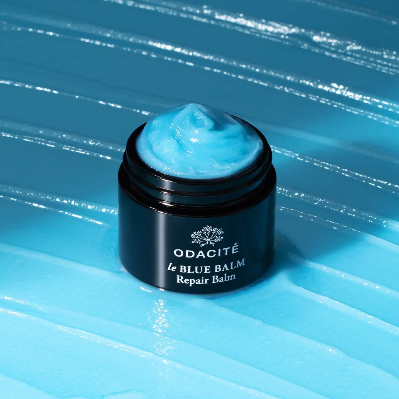
Odacité
Open dark balm jar with white type and blue contents
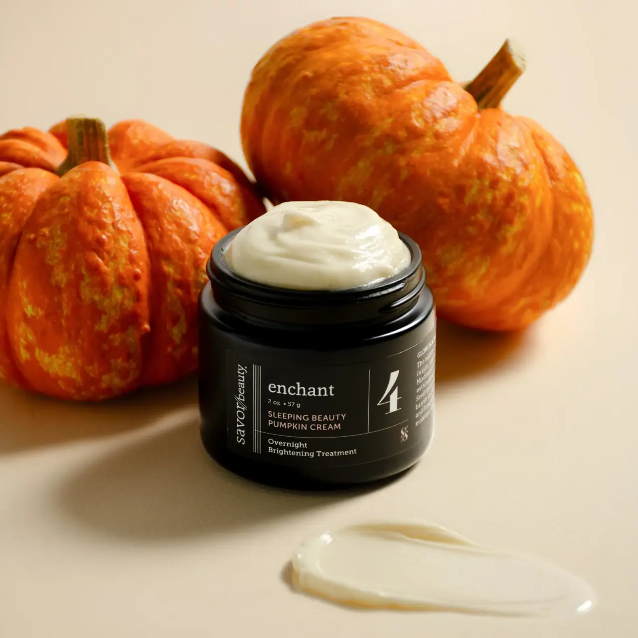
Savor Beauty
Black ruled jar label with vertical maker and routine numeral
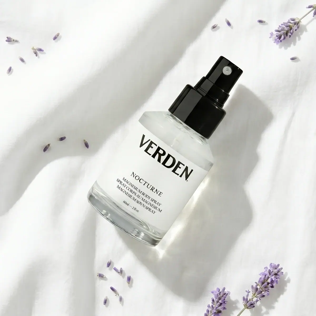
Verden
Bold serif identity on a quiet white spray label
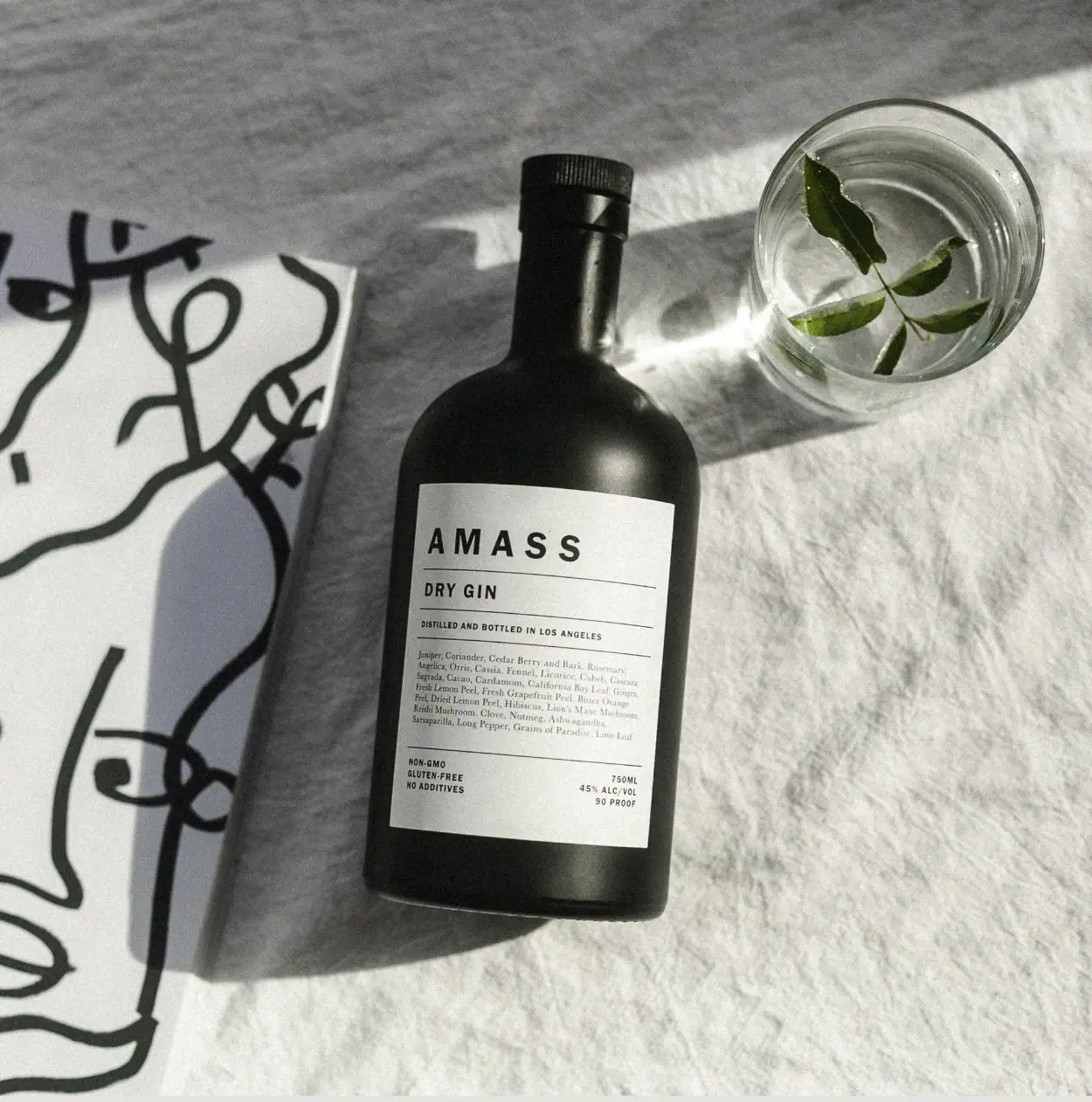
AMASS
A ruled botanical document on a dark rounded bottle
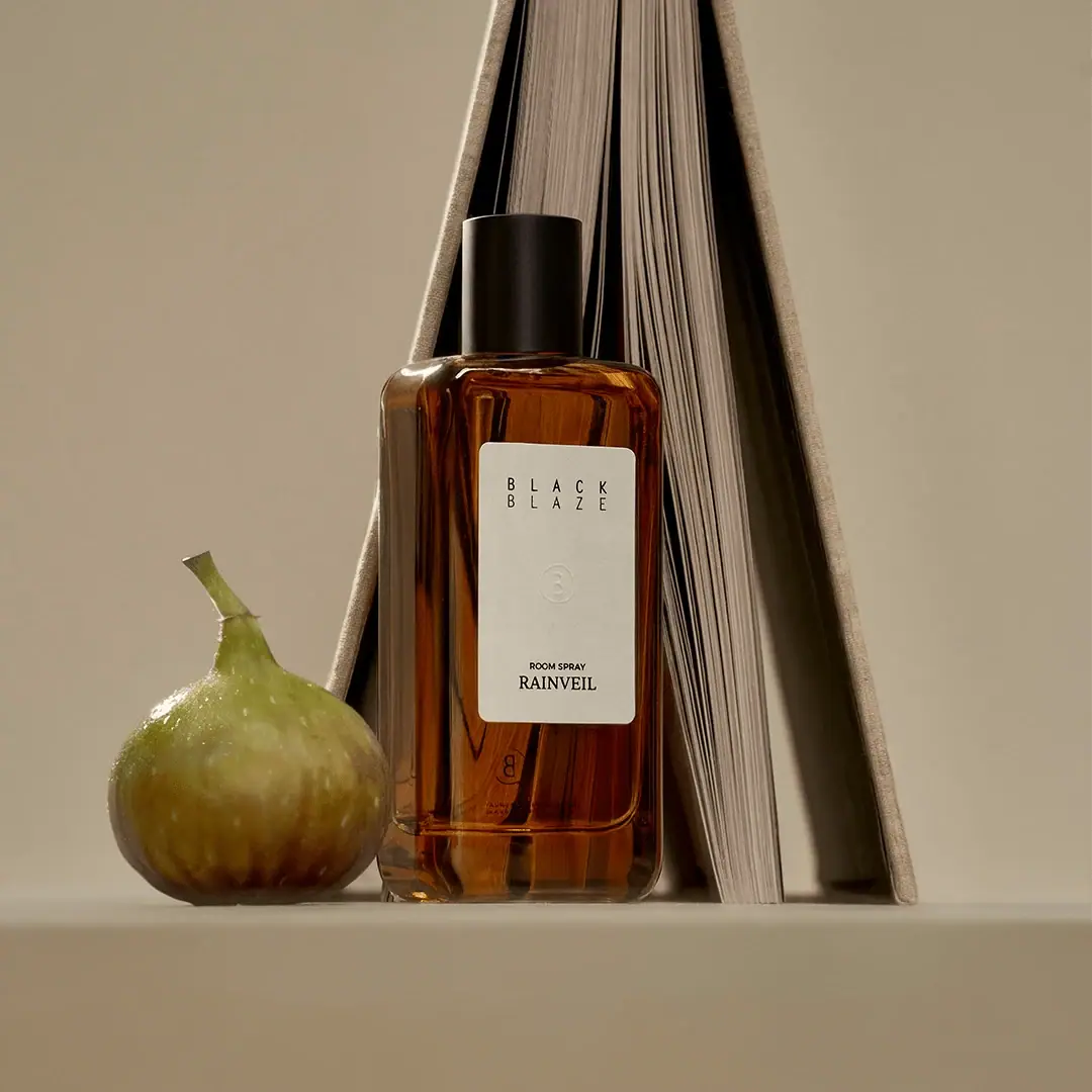
Black Blaze
Warm amber, quiet paper and a deliberate vertical rhythm

Aesop
a botanical still life around a disciplined apothecary label

African Botanics
Technical black label with a low serif signature

al.ive body
warm architectural calm, built as a paired vanity object