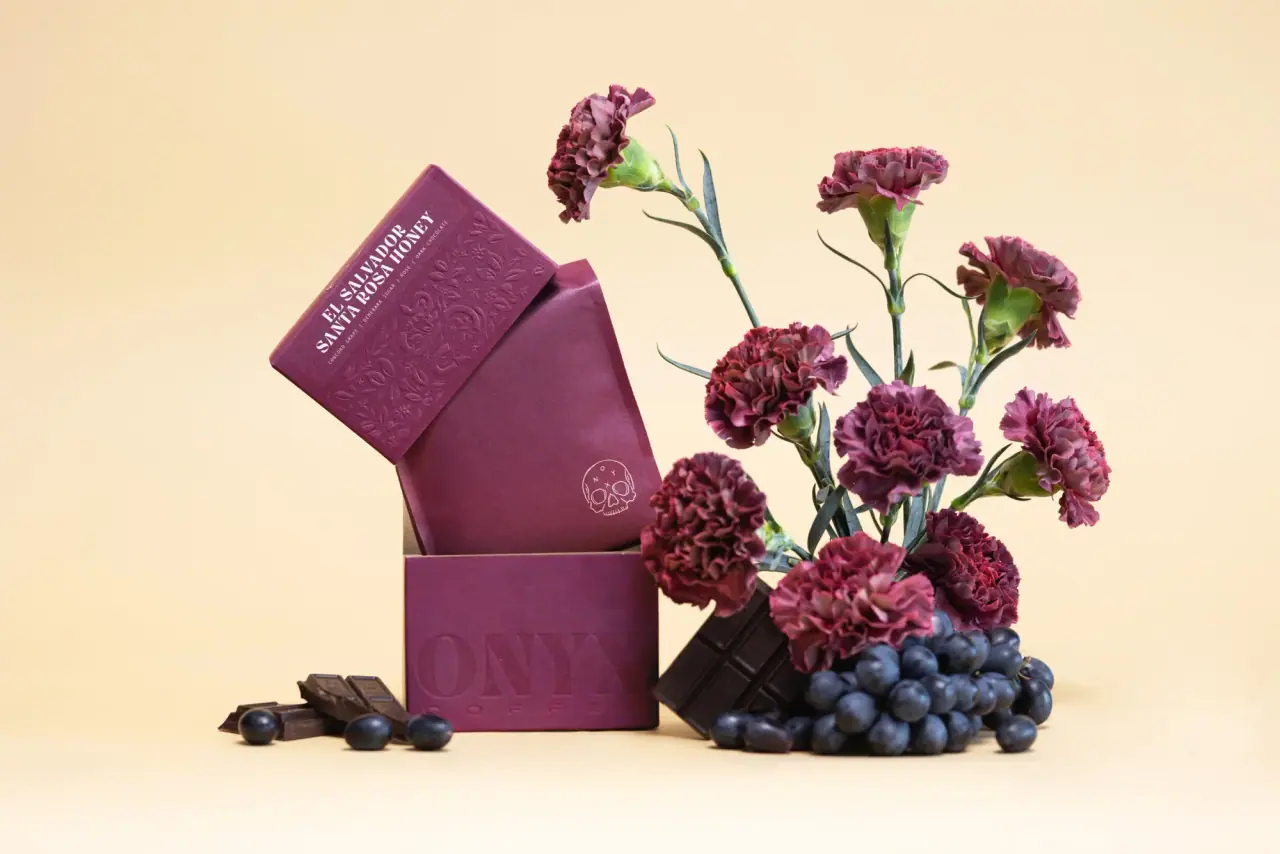
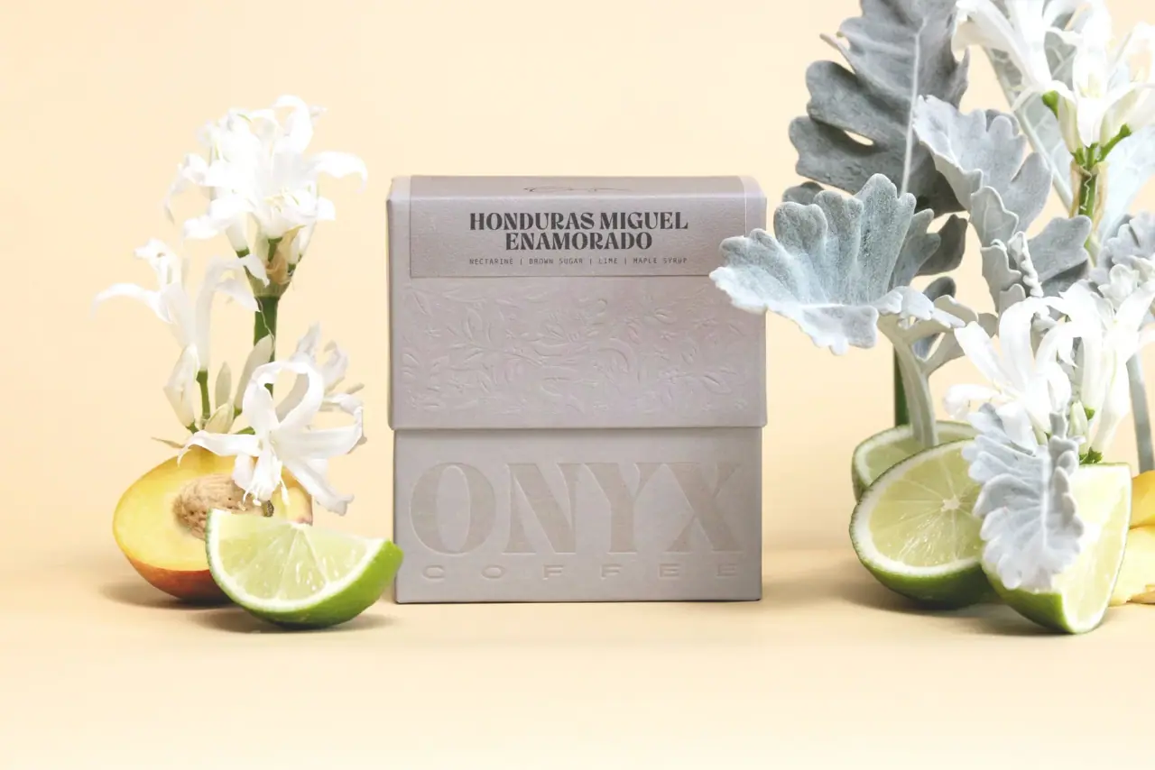
Images from the packaging case study by Jon Allen and Jeremy Teff (Hickory Design Co.)
Onyx Coffee Lab
roaster bags that each wear their own artwork
Onyx treats each coffee series as its own small art direction rather than forcing one label across the range. The Doyenne series uses a stand-up pouch whose upper half is a dense tile pattern in one deep colour per origin (cobalt #1b3f9a, teal #12b6ad, apricot #d9a679), a white monoline script series name and a small hexagonal ONYX badge, over a frosted window that shows the beans; café bags are plain kraft (#c9a273) printed only with a fine-line skull, a small blackletter blend name and vertical spaced lettering; limited releases get a white bag with a column of moon phases or a matte black box with a chrome logo. Type around the art stays restrained: tracked small capitals for notes and origins, stencil-like condensed capitals for coffee names, and a high-contrast serif ONYX wordmark only where the brand speaks directly.
- Coffee & tea
- Light pack
- Kraft & natural
- Maximalist pattern
- Luxe monochrome
Color Palette
Approximate colours interpreted from photography. These are screen references, not official brand colours or print specifications.
Pack body
Cafe Kraft
#c9a273
Plain brown kraft block-bottom bags for café sizes
Frosted Window
#e7ebeb
Translucent lower half of Doyenne pouches and clear sample sachets
Circadian White
#f2f2f0
Matte white bag carrying a column of black moon phases
Gallery Black
#1c1a1b
Matte black presentation and producer boxes
Ink
Fine-line Black
#1d1a18
Skull line drawing, blackletter blend name, vertical lettering on kraft and moon phases on the white bag
Script White
#f7f7f5
Doyenne script name, tile linework and hexagon badge reversed on the coloured half
Window Slate
#4a4f55
Origin, 'female owned' box and tasting notes printed on the frosted window
Accent
Chrome Silver
#b9bdc1
Metallic logo on black boxes and the sample-sachet wordmark
Range coding
Doyenne Cobalt
#1b3f9a
Tile-patterned upper half of a Doyenne pouch for one Colombian origin
Doyenne Teal
#12b6ad
Tile-patterned upper half of a Doyenne Ethiopian origin
Doyenne Apricot
#d9a679
Tile-patterned upper half of the Doyenne espresso blend
Typography
Suggested visual alternatives, not confirmed brand typefaces. Any scale below is an illustrative estimate.
The series artwork or series name leads (white script on Doyenne, broken spaced capitals on the white bag, a skull on kraft). Coffee name and origin sit lower in stencil-like condensed capitals, and tasting notes, process and weight are tiny tracked capitals separated by pipes. The ONYX wordmark is a small badge on series bags and only becomes large on boxes and sachets.
Type scale
Estimated cap size as a share of the panel · Front of the 10 oz Doyenne stand-up pouch, about 230 mm tall
series-script
9% · Regular · Script
Madrina
white-bag-name
4% · Bold · Headline
NOC TUR NE
coffee-name
3.5% · Bold · Headline
COLOMBIA LA ESPERANZA
box-wordmark
3% · Regular · Display
ROAST
badge-wordmark
1.6% · Regular · Display
ROAST
tasting-notes
1.2% · Medium · Label
CACAO | APRICOT | BROWN SUGAR
Fonts
Display
DM Serif Display
- Looks like
- Ogg Bold, Canela Bold
- Type
- High-contrast display serif
- Weight
- Regular (heavy display cut)
- Case
- Uppercase
- Tracking
- Slightly wide, about +4%
- Fallback
- Didot, Bodoni 72, Georgia, serif
The ONYX wordmark on boxes, sachets and the hexagon badge, with 'coffee lab' spaced far apart beneath.
Script
Sacramento
- Looks like
- Hand-lettered monoline script, Bristol
- Type
- Monoline connecting script
- Weight
- Regular, drawn heavier
- Case
- Title case
- Tracking
- Normal
- Fallback
- Brush Script MT, cursive
Series name across the patterned half of Doyenne pouches, white and about 60% of bag width.
Headline
Big Shoulders Stencil
- Looks like
- Druk Text Condensed, Futura Condensed with stencil cuts
- Type
- Condensed stencil-like grotesque
- Weight
- Bold
- Case
- Uppercase
- Tracking
- Wide, about +6%
- Fallback
- Impact, Arial Narrow Bold, sans-serif
Coffee name and origin on the Doyenne window ('COLOMBIA EL TAMBO') and the broken spaced name on the white bag.
Label
Inter
- Looks like
- Akzidenz-Grotesk, Neue Haas Unica
- Type
- Small tracked grotesque
- Weight
- Regular, Medium
- Case
- Uppercase
- Tracking
- Very wide, about +15%
- Fallback
- Helvetica, Arial, sans-serif
Tasting notes separated by pipes, process, roast level, weight and the vertical lines on kraft bags.
Structure & Proportions
Proportions
| Purpose | Value | Preview |
|---|---|---|
| Pattern coverage on Doyenne | About 55% of the pouch front, upper part | |
| Bean window | About 45% of the pouch front, lower part, frosted | |
| Script width | About 60% of pouch width | |
| Kraft left bare | About 90% of a café bag front is unprinted kraft | |
| Skull icon | About 12% of café bag width, centred in the upper half | |
| Colours per bag | One colourway plus white on Doyenne; one black ink on kraft and white bags | — |
| Density | Either dense pattern or almost empty paper; never a mid-density label | — |
Shapes
| Element | Value | Preview |
|---|---|---|
| Doyenne pouch | Stand-up pouch with a gusseted base | |
| Brand badge | Small hexagon-like roundel holding the stacked wordmark | |
| Origin box | Thin outlined rectangle reading 'female owned / female made' | |
| Moon phases | Vertical column of black discs and crescents | |
| Tile pattern | Interlocking square tiles with floral line motifs |
Finishes
Matte film
Doyenne and white bags · matte
Frosted window
Lower half of Doyenne pouches · frosted
Uncoated kraft
Café bags · kraft
Chrome print
Logos on black boxes and sachets · metallic
Formats and materials
| Formats | Stand-up pouch, Block-bottom bag, Large café bag, Flat sample sachet, Presentation box with sleeve |
| Materials | Flexible film, Kraft paper, Paperboard |
| Closures | Heat-sealed tops with zip reclose and one-way degassing valve, roll-down kraft tops on café bags, lift-off box lids and sleeves |
| Decoration | Tile repeat pattern, Fine-line skull icon, Moon-phase column, Spaced vertical lettering, Chrome logo |
Front Panel
Schematic reading order. The diagram’s zone heights do not represent measured artwork proportions.
Printed directly on the bag, no stuck-on label; artwork and text are centred on the vertical axis, with large areas left empty on kraft and white formats.
| Zone | Content |
|---|---|
| Upper half | Series pattern or icon (tile pattern, moon phases, skull) |
| Centre | Series name in script or spaced capitals; small ONYX badge |
| Lower half | Coffee name, origin, tasting notes and weight; on Doyenne, a frosted window showing the beans |
Range System
Range is organised by series rather than by colour alone: each series has its own artwork and format, and within the Doyenne series each origin gets one colourway of the same tile pattern.
- Doyenne = tile-pattern pouch, colour per origin, frosted bean window
- Café bags = plain kraft with fine-line skull and blackletter blend name
- Circadian = white bag with black moon phases and broken spaced name
- Producer box = matte black box with chrome wordmark and tasting chips
- Samples = clear sachet with silver wordmark
Back of Pack & Shelf
The back repeats the front ground (pattern, white or kraft) with a centred block of tracked capitals: producer and farm, region, elevation, variety and process, roast date box, brewing ratio, then a small recycling and roaster address line.
- Producer, farm, region and elevation in tracked capitals
- Variety and process in a two-column spec block
- Roast date box or sticker area
- Suggested brew ratio and grind
- Roaster address, website and packaging disposal note
On shelf
On a café shelf the series sort into blocks (a run of blue, teal and apricot Doyenne pouches, a row of quiet kraft bags, a single white Circadian bag), so the brand reads as a curated set rather than one repeated label.
Imagery
Graphic rather than pictorial: interlocking tile patterns, a delicate line-drawn skull, moon-phase circles and chrome metal lettering; the beans themselves are shown through windows and clear film.
Guidelines
Do
- Give each coffee series its own artwork and keep that artwork consistent across its bags.
- Fill the top 55% of a pouch with a one-colour tile pattern and let a frosted window below show the beans.
- Print café-size bags on plain kraft (#c9a273) with only a fine black line icon and small spaced lettering.
- Set tasting notes and origins in tiny tracked capitals separated by pipes.
- Keep the house wordmark to a small badge on series bags; let it grow only on boxes and sachets.
- Use matte black (#1c1a1b) boards with chrome metallic print for limited editions.
- Set coffee names in condensed stencil-like capitals.
Don't
- Don't apply one template label across every coffee.
- Don't use glossy photographic labels or coffee-cup imagery.
- Don't fill kraft bags edge to edge with print; leave about 90% bare.
- Don't make the wordmark the biggest element on series bags.
- Don't use more than one colour per Doyenne colourway besides white.
- Don't put stickers or stuck-on labels on the front.
Give your AI
packaging taste
Give your design or image tool a packaging study: palette, type, structure, front panel and principles for an original brief.
Export this styleFree with an email. PACK.md works in Claude, ChatGPT, Cursor and image tools.
More like this
Raaka
torn-paper strata under a white window
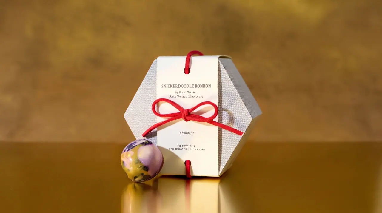
Dandelion Chocolate
ribboned gift boxes and letterpress tags
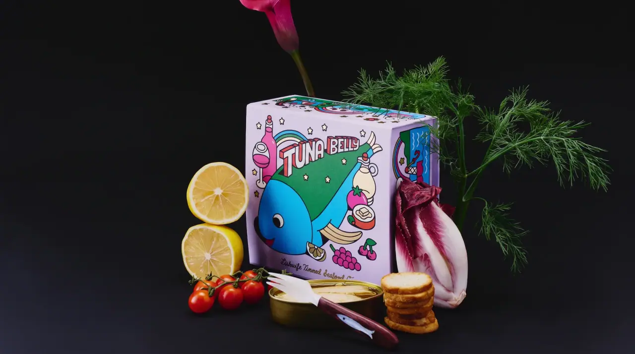
Fishwife
carnival folk art on a tin
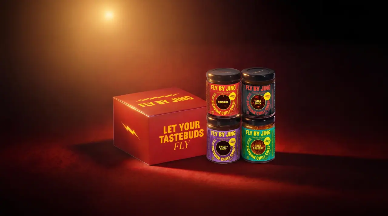
Fly By Jing
sichuan street poster, turned up loud

Aerangis
a quiet numbered object, an intimate scent memory

African Botanics
Technical black label with a low serif signature

Akro
soft pink interrupted by an assertive black signature

al.ive body
warm architectural calm, built as a paired vanity object