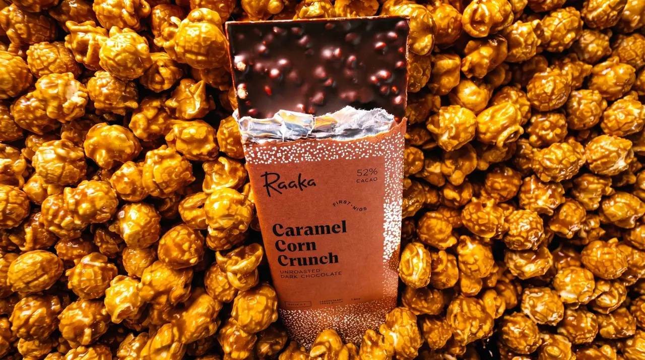
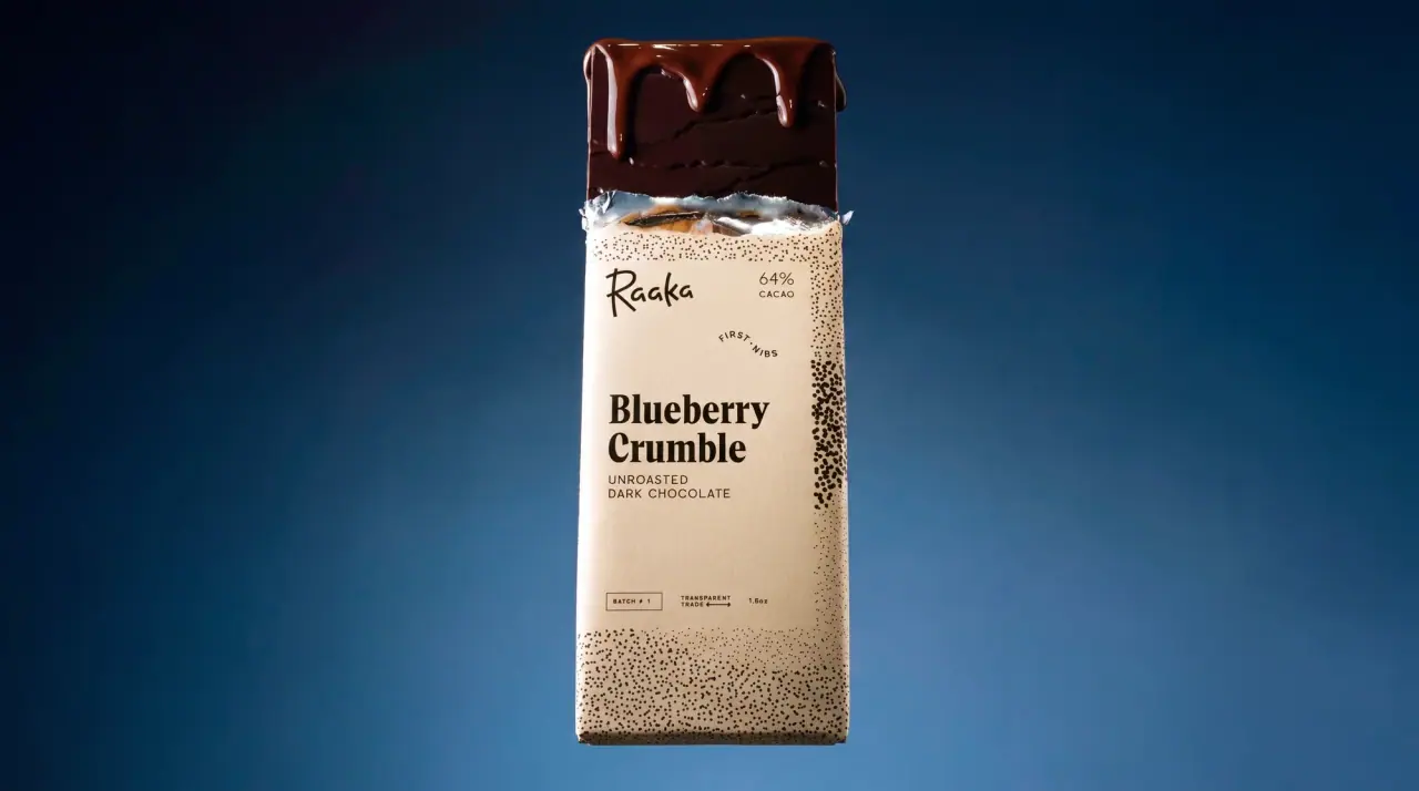
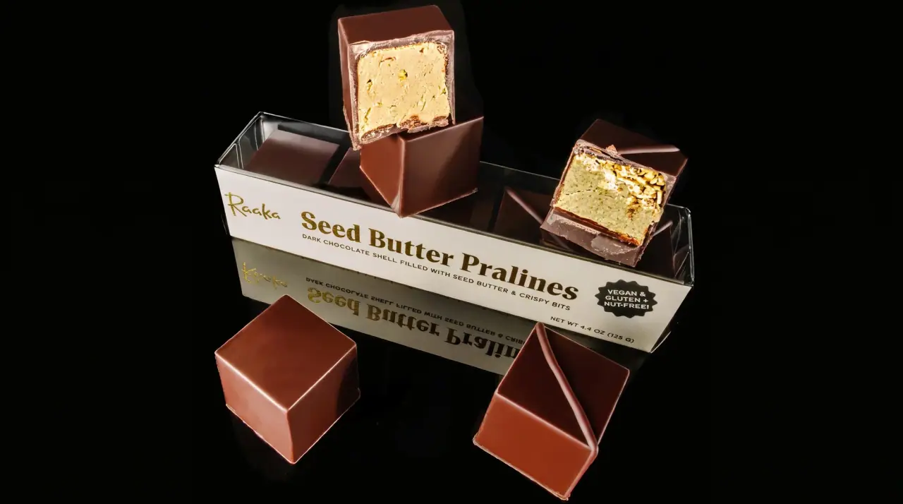
Raaka wraps each chocolate bar in a flavour-specific pattern of layered, torn-edged colour bands that read like landscape strata or collaged paper, then lays one white portrait panel (#f6f4ef) over the middle. The panel layout never changes: a small brush-script wordmark top left, the cacao percentage top right, a big bold soft serif flavour name over two or three lines, a small tracked capitals line ('Unroasted dark chocolate') and a row of round black certification badges at the base. Milk bars swap the strata for a dense stipple texture, functional pouches use sunset gradients with a coloured ingredient sticker, and truffle and gift boxes reuse the strata on lids or repeat outline bar icons.
Approximate colours interpreted from photography. These are screen references, not official brand colours or print specifications.
Label
Panel White
#f6f4ef
Central portrait panel on every bar wrapper and pouch
Ink
Cacao Black
#221c1a
Wordmark, flavour name, descriptor, percentage and certification badges inside the panel
Accent
Stipple Black
#1a1a1a
Dense black dot texture on the Buckwheat Milk Crunch wrapper
Sticky Note Yellow
#f2e48a
Ingredient list panel on the functional Day Break pouch
Range coding
Amaranth Berry
#8a1d3a
Deep berry strata on Amaranth Vanilla and the truffle box lid
Petal Pink
#e9a3a6
Pale pink bands between the berry strata on Amaranth Vanilla
Orchard Rust
#c5553c
Rust and terracotta bands on Apple Crisp
Apple Green
#9cc65a
Fresh green top band on Apple Crisp and the matcha wrapper
Harvest Yellow
#e8b832
Golden lowest strata on Apple Crisp and pumpkin bars
Truffle Clay
#d97a56
Peach and terracotta tray interior of the truffle box
Dulse Copper
#a4553a
Copper ground under white stipple on the puffed millet bar
Typography
Suggested visual alternatives, not confirmed brand typefaces. Any scale below is an illustrative estimate.
The flavour name is the hero, set big in a bold soft serif across two or three lines in the white panel. The script wordmark and the cacao percentage are small and sit in the panel's top corners, a small tracked capitals line names the chocolate type under the flavour, and a row of black badges closes the panel.
Type scale
Estimated cap size as a share of the panel · Front of the 1.8 oz bar wrapper, about 155 mm tall
flavour-name
8% · Bold · Headline
Fig Crumble
box-title
7% · Bold · Headline
Night Garden
wordmark
4% · Regular · Display
Bloom
cacao-percent
2.4% · Medium · Label
70%
chocolate-type
1.8% · Regular · Label
UNROASTED DARK CHOCOLATE
back-copy
1.2% · Regular · Body
We make chocolate in small batches from unroasted beans.
Fonts
Display
Caveat Brush
Looks like
Hand-lettered brush script, Kaufmann
Type
Casual brush script
Weight
Regular
Case
Title case
Tracking
Normal
Fallback
Brush Script MT, cursive
The wordmark only, small in the panel's top-left corner; reversed white on boxes and pouches.
Headline
Fraunces
Looks like
Recoleta Bold, Clarendon Bold
Type
Bold soft old-style serif
Weight
Bold
Case
Title case
Tracking
Tight, about -1%
Fallback
Cooper, Georgia Bold, serif
Flavour name stacked over two or three lines, filling about 75% of the panel width.
Label
Jost
Looks like
Futura Book, Avenir Medium
Type
Geometric sans
Weight
Regular, Medium
Case
Uppercase
Tracking
Wide, about +10%
Fallback
Futura, Helvetica, sans-serif
Chocolate type line, cacao percentage, badge text and the 'First Nibs' or batch tags.
Body
Work Sans
Looks like
Brandon Text, Work Sans
Type
Friendly grotesque
Weight
Regular, Bold
Case
Sentence case
Tracking
Normal
Fallback
Helvetica, Arial, sans-serif
Back-panel story, ingredient list, nutrition facts and the transparent-trade report line.
Structure & Proportions
Proportions
Purpose
Value
Preview
Panel coverage
About 55% of the wrapper front is the white panel
Panel width
About 80% of wrapper width, centred
Pattern visible
About 45% of the front, mostly above and below the panel
Flavour name width
About 75% of panel width
Panel margin
About 8% of panel width on the left edge of type
Colours per wrapper
Three to five pattern colours plus black and white
—
Density
Busy patterned frame around a calm, left-aligned panel
—
Shapes
Element
Value
Preview
Bar wrapper
Tall paper sleeve over foil
Panel
White portrait rectangle with square corners
Strata
Torn, wavy horizontal colour bands like hills
Badges
Row of small black roundels
Ingredient sticker
Tall coloured note panel on functional pouches
Finishes
Uncoated paper
Bar wrappers · uncoated
Inner foil
Under the paper sleeve · metallic
Matte film
Functional pouches · matte
Formats and materials
Formats
Bar wrapper, Truffle box, Snack pouch, Gift carton, Window box
Materials
Paper, Foil inner wrap, Paperboard, Flexible film
Closures
Folded paper sleeve over foil, lift-off lid on truffle box, sealed crimped pouch
Schematic reading order. The diagram’s zone heights do not represent measured artwork proportions.
Panel top
Panel centre
Panel base
Around panel
A portrait white rectangle centred over a full-bleed patterned wrapper, leaving pattern visible top and bottom like a landscape.
Zone
Content
Panel top
Script wordmark left, cacao percentage right
Panel centre
Bold serif flavour name, chocolate type in small capitals
Panel base
Row of black round certification badges and weight
Around panel
Flavour-specific torn-paper strata or texture
Range System
Each flavour gets its own pattern and colour set around a fixed white panel; sub-lines change the pattern logic (stipple texture for milk bars, sunset gradients and coloured ingredient stickers for functional pouches).
Amaranth Vanilla = berry and pink strata
Apple Crisp = green, rust and yellow strata
Buckwheat Milk Crunch = black stipple on white
Puffed Millet & Red Dulse = copper ground with white stipple
Day Break / Mellow Moon = sunset gradient pouches with yellow or pink ingredient note
Truffle box = berry and terracotta strata lid
Back of Pack & Shelf
The back of the sleeve carries a white panel framed by the same pattern: a short story paragraph about unroasted cacao, a QR code to the transparent-trade report, then nutrition facts, ingredients, cacao origin with a small map strip, and barcode.
Short story paragraph in the body sans
QR code and transparent-trade report line
US nutrition facts panel in black
Ingredient list and allergen note
Cacao origin line, barcode and maker address
On shelf
A row of bars reads as a sequence of different landscapes cut by the same white window, so the brand billboards through the repeated panel while each flavour stays distinct by its colours.
Imagery
Abstract collage: layered torn-paper bands evoking hills and soil, stipple noise textures and simple outline icons; no photography on pack except windows showing the chocolate.
Guidelines
Do
Wrap each bar in a full-bleed pattern of three to five torn-edge colour bands unique to the flavour.
Lay one white (#f6f4ef) portrait panel about 80% of wrapper width over the centre and keep its layout fixed.
Put a small brush-script wordmark top left and the cacao percentage top right in the panel.
Set the flavour name big in a bold soft serif across two or three lines, left-aligned.
Line up small black round certification badges along the bottom of the panel.
Switch milk bars to a dense stipple texture instead of strata.
Use outline icon repeats or the strata for gift and truffle boxes.
Don't
Don't print food photography on the wrapper.
Don't let the pattern run behind the text; keep the panel solid white.
Don't use straight ruled stripes; edges should look torn or hand-cut.
Don't set the flavour name in sans-serif.
Don't reuse one flavour's colour set for another.
Don't centre the panel type; it is left-aligned.
Give your AI packaging taste
Give your design or image tool a packaging study: palette, type, structure, front panel and principles for an original brief.