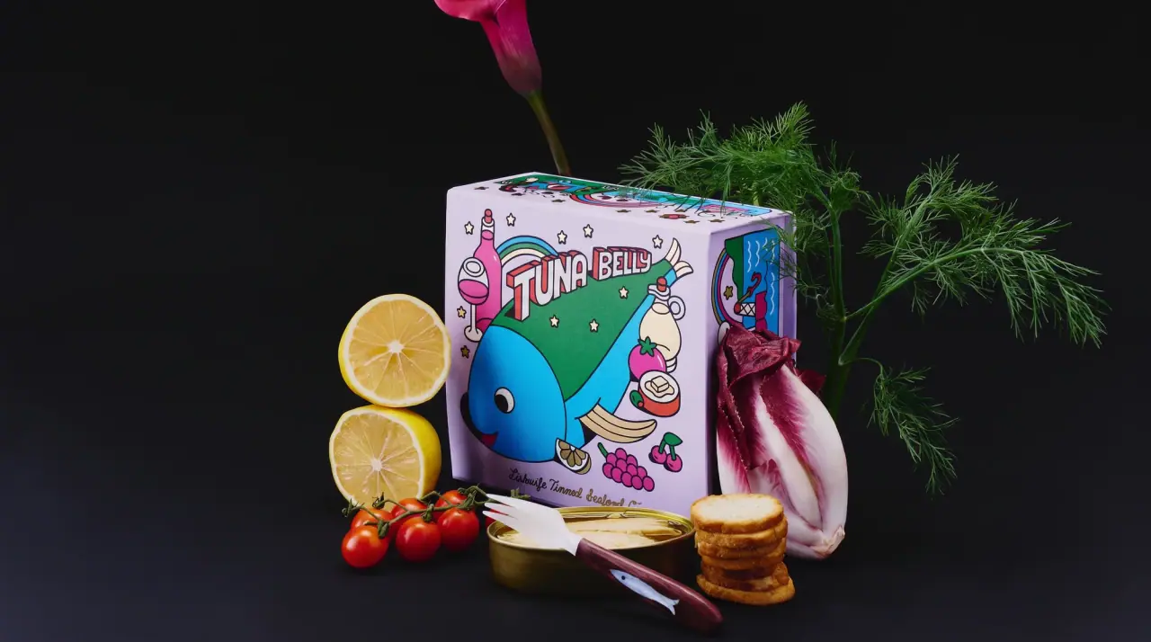
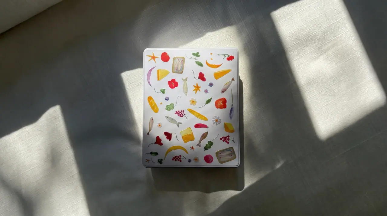
Campaign images © Fishwife, from eatfishwife.com
Fishwife

carnival folk art on a tin
Fishwife wraps tinned fish in cartons that read like souvenir posters: every face is filled with dense, hand-drawn illustration of fish, flowers, moons, boats and characters in thick Tin Black (#151515) outline and flat fills, with no empty space left. A bouncing outlined script wordmark with a smaller script 'tinned seafood co.' beneath anchors the lower front, while the product name runs across the top in chunky condensed capitals inside a ribbon, with tiny script connectors ('with', 'in'), and is repeated on each side so stacked 3-packs still read. Each product owns a dominant ground colour (Sardine Yellow #f2c61b, purple, mint, black with gold line), turning the range into a colour-coded set of collectible boxes; merchandise tins and gift boxes carry the same drawing style.
- Tinned food
- Light pack
- Maximalist pattern
- Retro illustrated
- Colour-coded range
Color Palette
Approximate colours interpreted from photography. These are screen references, not official brand colours or print specifications.
Pack body
Sardine Yellow
#f2c61b
Ground colour of the smoked salmon, mussels and tuna cartons and the side panels of 3-pack stacks
Label
Script Cream
#f6edd2
Banner ribbons and small panels carrying product names and the sourcing note
Ink
Tin Black
#151515
Outline ink for all illustration, the script wordmark and the product-name capitals
Accent
Poster Red
#e23b2e
Chillies, roundel centres, ribbon shadows and the hair-clip tin body
Harbour Blue
#3d8fd0
Water, side-panel bands on mussel cartons and the ground of the advent calendar
Pesto Green
#4b9a3c
Basil leaves, ribbon ends and plant motifs on the mussels carton
Range coding
Trout Mint
#4fbf8a
Carton ground for smoked rainbow trout, drawn in white line
Ginger Plum
#7a2d6a
Purple central panel of the albacore with soy ginger carton
Gold Line
#c9a14a
Gold-on-black line pattern for the premium smoked salmon tower box
Typography
Suggested visual alternatives, not confirmed brand typefaces. Any scale below is an illustrative estimate.
The script wordmark sits large in the lower centre of the front face with a smaller script 'tinned seafood co.' beneath; the product name runs across the top in a cream ribbon or in tall chunky capitals with tiny script connectors, and is repeated on every side panel. Net weight and sourcing notes sit in small capitals in the bottom corners.
Type scale
Estimated cap size as a share of the panel · Front face of the 3-pack carton sleeve, about 70 mm tall
wordmark
18% · Regular · Script
Harbourlass
side-panel-name
14% · Regular · Headline
SMOKED TROUT
ribbon-name
7% · Regular · Headline
SARDINES
gift-title
7% · Regular · Display
The Merry Tin Box
sub-wordmark
5% · Regular · Script
Tinned Seafood Co.
connector
3% · Regular · Script
with
Fonts
Script
Lobster
- Looks like
- Sign-painter brush script, close to Lobster or Pacifico
- Type
- Bouncy connected brush script with swash tails
- Weight
- Regular
- Case
- Title case
- Tracking
- Normal
- Fallback
- Brush Script MT, cursive
Wordmark (outlined with a cream or yellow inline), the 'tinned seafood co.' line and tiny connectors such as 'with' and 'in'.
Headline
Bowlby One
- Looks like
- Chunky condensed woodtype capitals, close to Cooper Black Condensed
- Type
- Ultra-heavy condensed display sans with soft corners
- Weight
- Regular (heavy)
- Case
- Uppercase
- Tracking
- Tight, about -1%
- Fallback
- Impact, Arial Black
Product names across the top ribbon and stretched along each side panel.
Display
Rye
- Looks like
- Victorian circus woodtype
- Type
- Ornamental western display serif
- Weight
- Regular
- Case
- Title case and uppercase
- Tracking
- Normal
- Fallback
- Clarendon, Georgia
Gift and advent box titles and occasional badge headings.
Label
Barlow Condensed
- Looks like
- Franklin Gothic Condensed
- Type
- Condensed grotesque
- Weight
- SemiBold, Bold
- Case
- Uppercase
- Tracking
- Open, about +4%
- Fallback
- Arial Narrow
Net weight, sourcing callouts in roundels and side-panel small print.
Structure & Proportions
Proportions
| Purpose | Value | Preview |
|---|---|---|
| Illustration coverage | About 100% of every face, edge to edge | |
| Wordmark width | About 75% of front face width, lower centre | |
| Ribbon width | About 90% of face width across the top | |
| Central roundel | About 40% of face height, holding a character or scene | |
| Side-panel name | Product name fills about 80% of the side panel length | |
| Colours per carton | Five to six flat colours plus black outline | — |
| Density | Maximal: no empty ground anywhere | — |
Shapes
| Element | Value | Preview |
|---|---|---|
| Name ribbon | Banner with folded ends across the top | |
| Central scene | Roundel framing a character | |
| Sourcing badge | Small roundel or scalloped seal | |
| Carton | Flat rectangular sleeve, stacked in threes | |
| Merch tin | Rounded-corner hinged or slide tin |
Finishes
Matte printed board
All carton sleeves and gift boxes · matte
Gold ink on black
Premium smoked salmon tower box · metallic
Embossed tinplate
Merchandise tin lids · emboss
Formats and materials
| Formats | Folding carton sleeve for tins, Stacked 3-pack sleeves, Cube gift box, Advent calendar box, Hinged and slide tins |
| Materials | Paperboard, Tinplate |
| Closures | Tuck-end cartons around rectangular tins; slide and hinged lids on merchandise tins; die-cut windows on gift boxes |
| Decoration | All-over illustration, Banner ribbons, Die-cut windows, Repeated side-panel lettering |
Front Panel
Schematic reading order. The diagram’s zone heights do not represent measured artwork proportions.
Full-bleed illustrated wrap with a framed central scene; product name at the top, wordmark at the bottom centre, border of small motifs around every edge.
| Zone | Content |
|---|---|
| Top | Product name in a ribbon or chunky capitals, with flavour connector in script |
| Centre | Illustrated character or scene in a roundel, flanked by fish, flowers and food |
| Bottom | Script wordmark, script tagline, net weight and sourcing roundel |
| Sides | Product name repeated large so stacked packs read in a column |
Range System
One dominant ground colour and one central illustration per product, with the script wordmark, ribbon titles and dense folk-art border kept constant across all cartons.
- Smoked salmon with chili crisp = yellow with red and black
- Albacore with soy ginger = yellow frame + purple centre
- Mussels with basil pesto = yellow with green and blue side bands
- Smoked rainbow trout = mint green with white line art
- Premium smoked salmon = black with gold line
- Caviar = black box with rainbow-coloured tins
Back of Pack & Shelf
The back stays fully illustrated, with a cream panel cut into the drawing that holds the story, nutrition facts, ingredients and barcode in black condensed type.
- Short story paragraph about the fish and where it comes from
- Nutrition facts table inside a cream panel
- Ingredients and allergen line (fish, soy, sesame as relevant)
- Barcode on a small cream rectangle
- Country of origin, packer address and recycling note
On shelf
Stacked in threes, the repeated side-panel names form a column of bold capitals on yellow, so a shelf of cartons reads as one big poster wall, with purple, mint and black boxes breaking it by product.
Imagery
Dense hand-drawn folk and tattoo-flash style illustration with thick black outlines and flat fills: fish, moons, stars, flowers, boats and cheerful characters, filling every surface; no photography.
Guidelines
Do
- Fill every face of the carton edge to edge with illustration; leave no plain areas.
- Outline all drawings in Tin Black (#151515) at one thick weight and fill with flat colours.
- Anchor the lower front with the Script wordmark at about 75% of face width and a smaller script tagline beneath.
- Put the product name in a Script Cream (#f6edd2) ribbon at the top in chunky Headline capitals with a tiny script connector.
- Give each product one dominant ground colour such as Sardine Yellow (#f2c61b), mint or plum.
- Repeat the product name on the side panels at about 80% of panel length so stacked 3-packs still read.
Don't
- Don't leave large empty areas or use minimal layouts.
- Don't use photography of the fish.
- Don't use thin modern sans-serifs for headlines.
- Don't use gradients or soft shading; colour is flat.
- Don't use muted earth tones as the main ground.
- Don't vary the line weight; one thick outline everywhere.
Give your AI
packaging taste
Give your design or image tool a packaging study: palette, type, structure, front panel and principles for an original brief.
Export this styleFree with an email. PACK.md works in Claude, ChatGPT, Cursor and image tools.
More like this

Bachan's
octopus mascot on a red-capped squeeze
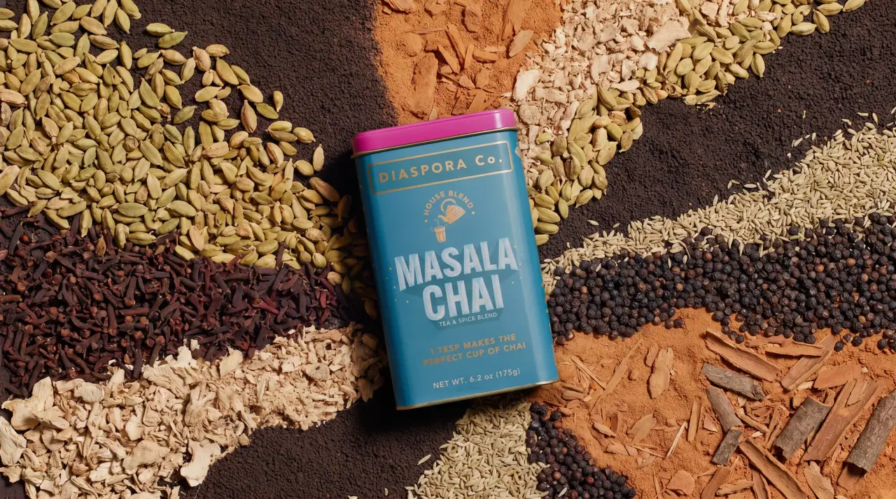
Diaspora Co.
marigold tins with a tiger crest
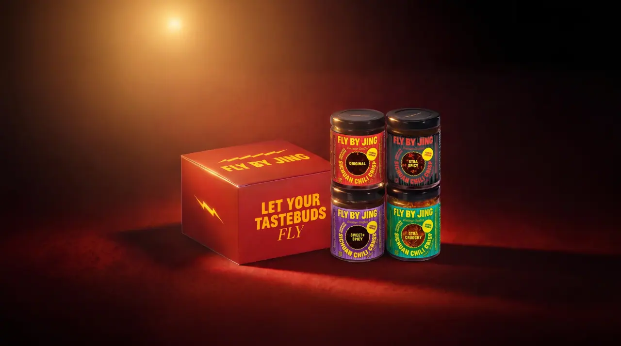
Fly By Jing
sichuan street poster, turned up loud
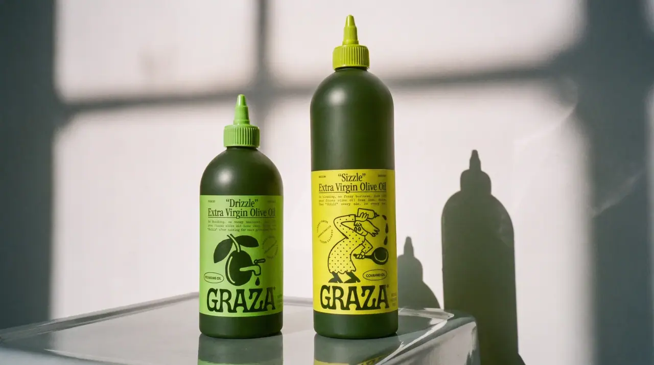
Graza
deli counter comic on bottle green
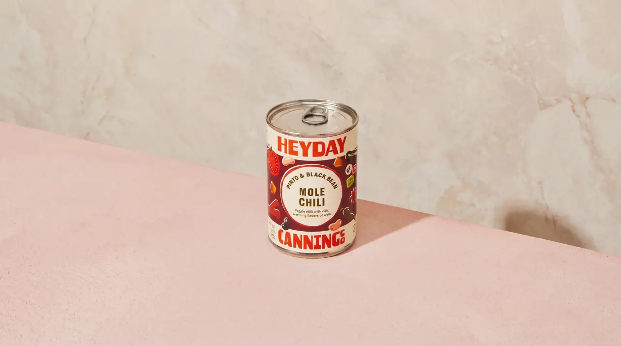
Heyday Canning Co.
saucy pantry tins with a cream band
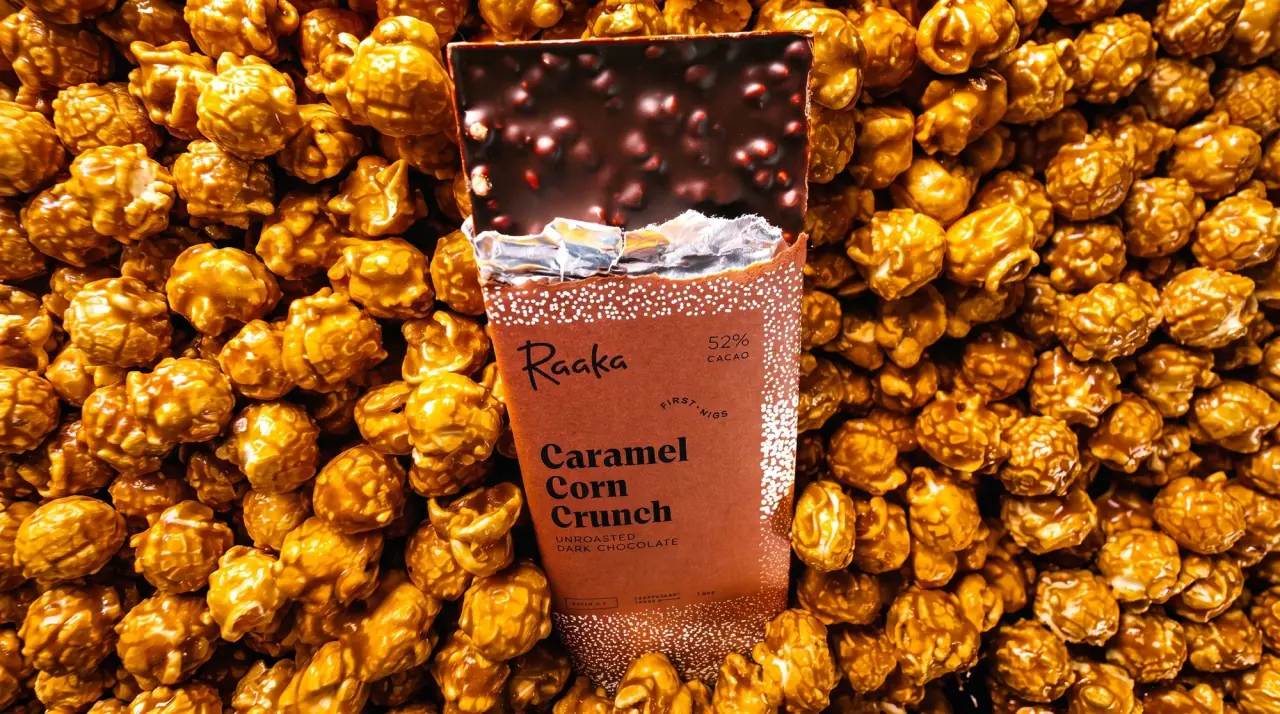
Raaka
torn-paper strata under a white window
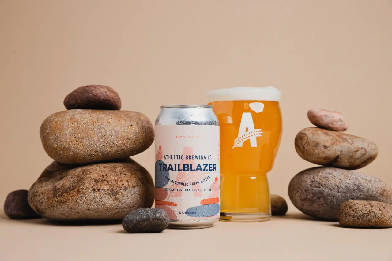
Athletic Brewing
trailhead poster cans under a wheat-stalk monogram

Culture Pop
fruit-for-an-o wordmark on dewy cans