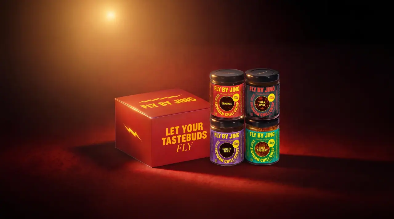
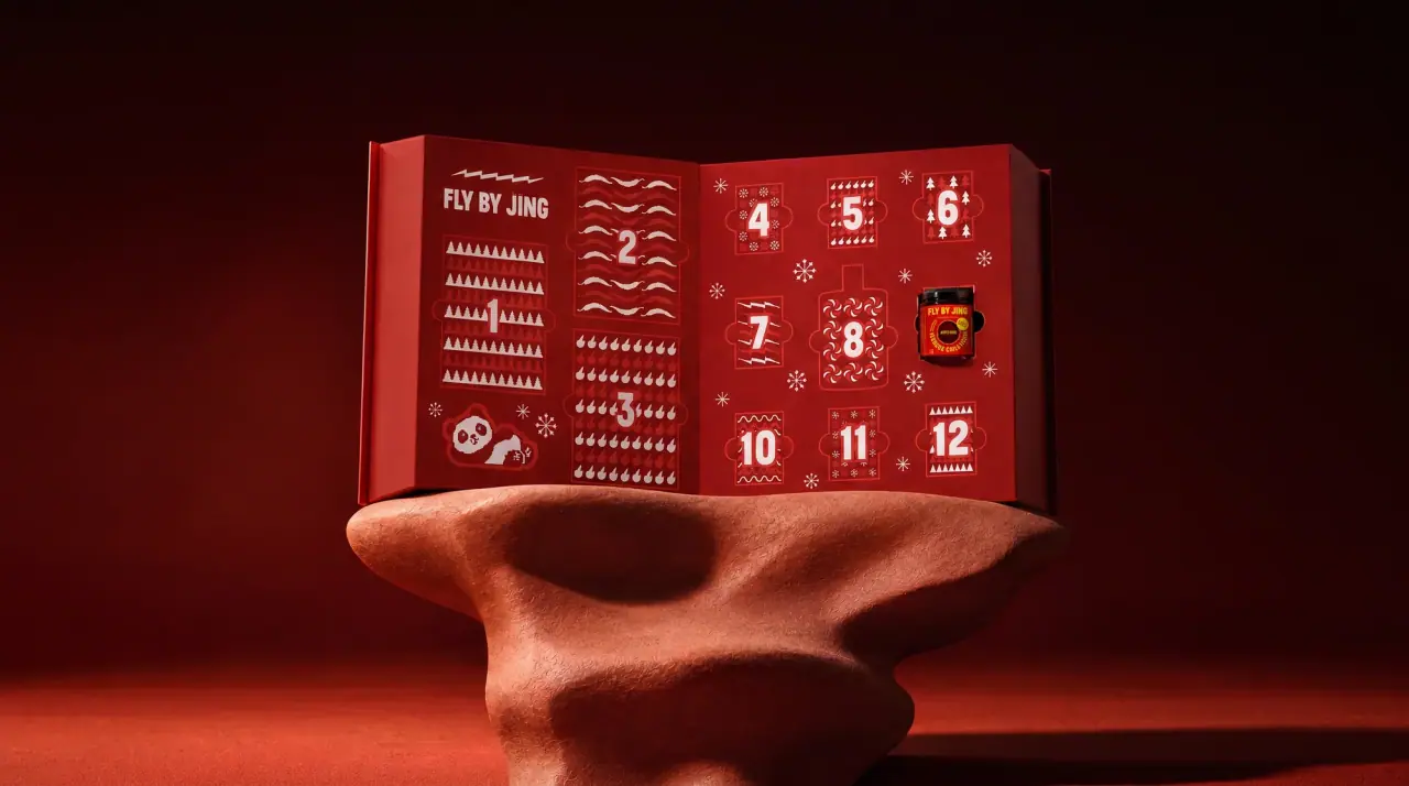
Fly By Jing packs Sichuan pantry food like a loud gig poster. Each pack is flooded with one saturated colour broken up by fine vertical pinstripes, then covered in bright yellow (#f2e22e) condensed capitals that arc, curve and wrap around a central food photo or a saw-tooth burst badge. Jars get a wide wrap label over the visible red chili crisp with a black screw cap, noodles use pillow pouches with a cut-out bowl of noodles lifted on chopsticks, and spices and hot pot base sit in black pouches with neon type. The flavour colour changes while the yellow ink, curved product name and crowded layout stay fixed.
Approximate colours interpreted from photography. These are screen references, not official brand colours or print specifications.
Pack body
Chili Oil Red
#7a1a0e
The chili crisp itself, seen above and below the jar label through clear glass
Ink
Chili Yellow
#f2e22e
Wordmark, curved product names, slogans and almost every line of text on every pack
Accent
Lacquer Black
#141213
Jar caps and the ground of the Hot Pot and spice pouches
Neon Magenta
#e0389a
Wordmark and line art on the black Hot Pot pouch, and the second colour in burst badges
Range coding
Firecracker Red
#d8302c
Original chili crisp label and Chili Crisp Noodles pouch
Jade Teal
#16958f
Classic Soy Noodles pouch and Xtra Crunchy label
Sesame Orange
#e46f2c
Creamy Sesame Noodles pouch
Garlic Blue
#2a78c0
Roasted Garlic Noodles pouch and Mild chili crisp label
Erjingtiao Purple
#5a1f95
Erjingtiao Chilis pouch and Sweet + Spicy items
Pepper Green
#0f8a3e
Neon pinstripes on the black Tribute Peppers pouch and claim burst fills
Typography
Suggested visual alternatives, not confirmed brand typefaces. Any scale below is an illustrative estimate.
The condensed caps wordmark sits high and centred; the product name is the most energetic element, set on a curve that hugs the food photo or badge. Small paired claims sit either side of the wordmark, a long origin story runs in tiny caps around the edges, and on jars an italic display serif adds a 'Heritage Crafted' line and a script slogan curls up a side panel.
Type scale
Estimated cap size as a share of the panel · Front of the noodle pillow pouch, about 200 mm tall
product-name
9% · Regular · Display
CHILI NOODLES
wordmark
7% · Regular · Display
TIGER LANE
jar-heritage
3.5% · Bold Italic · Headline
Heritage Crafted
paired-claim
3.2% · Bold · Label
SUN DRIED
burst-text
2.2% · SemiBold · Label
READY IN 5 MIN
flavour-line
2% · Bold · Body
BOUNCY NOODLES IN A TINGLY SAUCE
Fonts
Display
Anton
Looks like
Druk Condensed Bold, Knockout
Type
Condensed heavy grotesque
Weight
Regular (heavy by design)
Case
Uppercase
Tracking
Tight, about -1%
Fallback
Impact, Bebas Neue, Arial Narrow
Wordmark with a macron over one letter, and the product name set on an arc or wave around the central image, always in Chili Yellow.
Headline
Fraunces
Looks like
Cooper Italic, Recoleta Italic
Type
Soft italic display serif
Weight
Bold Italic
Case
Title case
Tracking
Normal
Fallback
Cooper Black, Georgia Italic
'Heritage Crafted', 'Rich + Layered' and the vertical side slogan on jar labels.
Label
Oswald
Looks like
Bebas Neue, Oswald Bold
Type
Condensed bold sans
Weight
SemiBold, Bold
Case
Uppercase
Tracking
Normal
Fallback
Arial Narrow, sans-serif
Paired claims ('Sun dried', 'Artisan crafted'), text inside burst badges, spice-level labels and net weight.
Body
Roboto Condensed
Looks like
Roboto Condensed, Oswald Light
Type
Condensed sans, text size
Weight
Bold
Case
Uppercase
Tracking
Slightly open, about +2%
Fallback
Arial Narrow, sans-serif
Founder-story paragraph running around the top and sides of pouches, flavour description line, back-of-pack copy.
Structure & Proportions
Proportions
Purpose
Value
Preview
Print coverage
100% full-bleed colour on pouches
Jar label height
About 60% of jar height, leaving chili crisp visible above and below
Food photo
About 45% of pouch height, lower centre
Wordmark width
About 70% of pouch width
Text coverage
About 35% of the front face carries type
Colours per pack
Two main (ground plus Chili Yellow) plus food photo and one badge colour
Wide black screw caps on jars; heat-sealed tops with tear notch on pouches
Decoration
Vertical pinstripe pattern, Text on curved paths, Saw-tooth burst badges, Cut-out food photography, Chilli heat icons
Front Panel
Schematic reading order. The diagram’s zone heights do not represent measured artwork proportions.
Top
Upper centre
Centre
Lower centre
Edges
Full-bleed colour field with fine vertical pinstripes; on jars a wide wrap band covers the middle and leaves chili crisp visible at top and bottom, on pouches the colour fills the whole front.
Zone
Content
Top
One-line flavour description in small caps, or the founder-story paragraph
Upper centre
Wordmark, with paired claims set left and right
Centre
Cut-out photo of noodles in a bowl, or a burst badge holding the variant name
Lower centre
Product name curving around the image
Edges
Spice-level chilli icons, net weight, script slogans running vertically
Range System
Colour coding with a fixed ink: each flavour or product owns one saturated pinstriped ground, while Chili Yellow type, curved names and badge structure repeat everywhere.
Original chili crisp = red label
Mild = blue label
Xtra Crunchy = teal label
Chili Crisp Noodles = red pouch
Classic Soy = teal pouch
Creamy Sesame = orange pouch
Erjingtiao Chilis = purple pouch
Hot Pot = black pouch with magenta and teal type
Tribute Peppers = black with green pinstripes
Back of Pack & Shelf
The pinstriped colour and yellow type continue round the back: a short founder note and cooking ideas in condensed caps, then nutrition, ingredients and barcode in a yellow-keylined block.
Founder note and origin of the chilies in condensed capitals
Cooking steps or serving ideas (noodles, eggs, dumplings)
Nutrition facts panel on a solid box
Ingredients list with allergens
Spice-level scale, barcode and recycling note
On shelf
In a row the packs read as a run of saturated pinstriped blocks with the same yellow type on every one, so the brand billboards as yellow-on-colour while each flavour holds its own hue.
Imagery
Cut-out, high-saturation food photography of noodles lifted on chopsticks above a white bowl, plus small dried-chilli and garlic spot photos; on jars the product inside acts as its own image. Black pouches swap photography for neon line drawings of a hot pot, chillies and lightning bolts.
Guidelines
Do
Flood the pack with one saturated colour and overlay fine vertical pinstripes a shade darker.
Set nearly all text in one bright yellow ink (#f2e22e).
Curve the product name along an arc around the central photo or badge.
Use condensed heavy Display caps for wordmark and names, about 70% of pack width for the wordmark.
Add a saw-tooth burst badge for the variant or a short claim.
Fill the edges with small running copy so the pack feels crowded and energetic.
On jars, keep a band of the product visible above and below a label about 60% of jar height.
Give black specialty packs neon line art instead of photography.
Don't
Don't leave large empty areas or use a minimal layout.
Don't use muted, pastel or earthy colours.
Don't set text in straight lines only; at least the product name should curve.
Don't introduce a second main ink colour for type on coloured packs.
Don't use kraft paper or natural textures.
Don't use clichéd red-and-gold Chinese ornament borders.
Give your AI packaging taste
Give your design or image tool a packaging study: palette, type, structure, front panel and principles for an original brief.