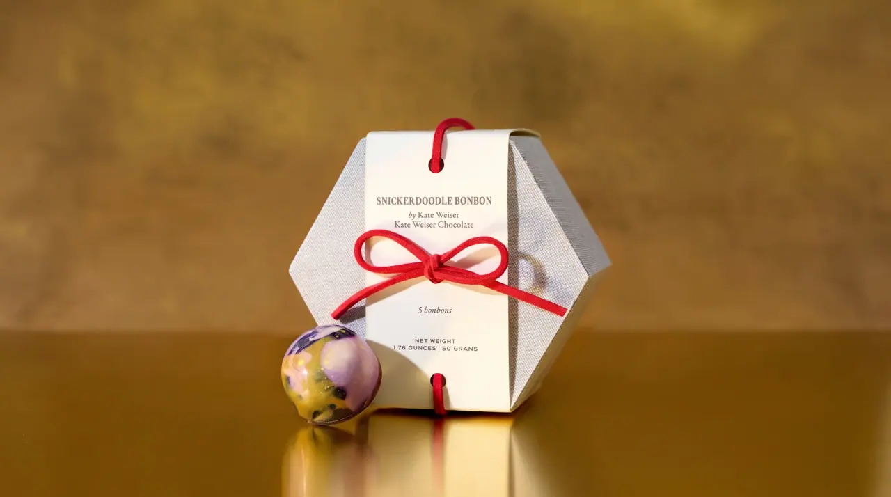
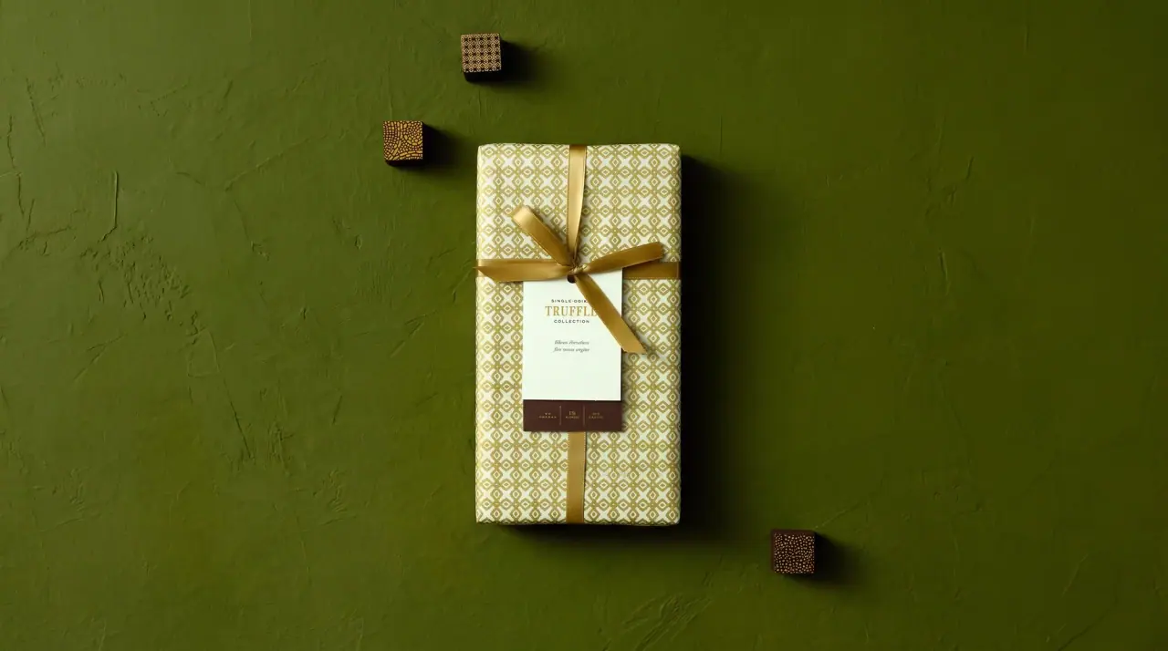
Dandelion Chocolate dresses its boxes like a stationer's gift: pale paulownia wood, warm grey (#dcdcd6) or off-white paperboard, tied with a striped grosgrain or grey satin ribbon and finished with a small paper tag or a single rectangular belly label. The wordmark is a compact three-line lockup of small classical serif capitals (name, a tiny 'small-batch' line, 'chocolate') printed in cacao brown, reversed out of a charcoal header, or blind-debossed into the board, and it is never large. Product names sit one size up in old-style serif capitals on the label, over a small italic or sans descriptor and the net weight. Range coding is confined to that one label or header band, which changes colour per flavour while the box, ribbon and lockup stay quiet and constant; bar wrappers add a fine gold filigree pattern on white.
Approximate colours interpreted from photography. These are screen references, not official brand colours or print specifications.
Pack body
Pale Paulownia
#e6c9a3
Light wood boxes for cocoa nibs and gâteau, printed directly with the lockup or a paper band
Mist Board
#dcdcd6
Warm light grey paperboard on truffle and kinu boxes, often blind-debossed with the lockup
Gift White
#efece6
Off-white rigid boxes, hexagonal gift boxes and bar wrapper grounds
Label
Tag White
#f8f6f1
Belly labels, hanging tags and paper bands carrying the product name
Ink
Cacao Brown
#5a3329
Wordmark lockup, product names, tag text and net weight
Accent
Ribbon Stripe Tan
#b08a63
Striped grosgrain ribbon tied around gift boxes and egg boxes
Satin Slate
#7f8184
Grey satin bow on the round cake box and the cord on hanging tags
Filigree Gold
#c8a560
Fine metallic diamond or filigree pattern on bar wrappers and the round cake box
Range coding
Iyokan Yellow
#f4d84e
Belly label colour for the citrus kinu chocolate
Hojicha Charcoal
#4b4a48
Dark header label with reversed white type on hojicha products
Origin Rust
#9a4b32
Small origin mark and product name on single-origin truffle labels
Typography
Suggested visual alternatives, not confirmed brand typefaces. Any scale below is an illustrative estimate.
The small brand lockup sits centred or offset with wide margins and is never the biggest thing on the pack. On the label, the product name in serif capitals is the loudest element, above a lowercase italic descriptor or a tiny tracked sans line for format and origin, with the net weight at the base in small spaced capitals.
Type scale
Estimated cap size as a share of the panel · Front of the belly label on the 56 g cocoa nib box, about 80 mm tall
product-name
9% · Regular · Headline
COCOA NIBS
wordmark-name
6% · SemiBold · Display
MEADOW
wordmark-category
6% · SemiBold · Display
CHOCOLATE
descriptor
4.5% · Italic · Body
chocolate-covered roasted cocoa beans
format-line
3% · Medium · Label
MADE IN KYOTO
origin-line
2.5% · Regular · Label
SINGLE-ORIGIN · TANZANIA
Fonts
Display
Cinzel
Looks like
Trajan, Cormorant SC
Type
Classical inscriptional roman capitals
Weight
Regular, SemiBold
Case
Uppercase
Tracking
Wide, about +10%
Fallback
Trajan Pro, Times New Roman
The three-line wordmark lockup only, printed in brown, reversed white or blind-debossed.
Headline
Libre Caslon Text
Looks like
Adobe Caslon, Libre Caslon
Type
Old-style serif
Weight
Regular
Case
Uppercase
Tracking
Wide, about +4%
Fallback
Caslon, Georgia
Product and flavour names stacked on belly labels, tags and header bands.
Body
Libre Caslon Text
Looks like
Adobe Caslon Italic
Type
Old-style serif italic and roman text
Weight
Regular, Italic
Case
Lowercase
Tracking
Normal
Fallback
Georgia Italic
Lowercase descriptor under the product name and back-of-box story text.
Label
Archivo Narrow
Looks like
Trade Gothic Condensed
Type
Condensed grotesque
Weight
Regular, Medium
Case
Uppercase
Tracking
Very wide, about +15%
Fallback
Arial Narrow
Format and origin lines ('made in Japan', 'single-origin'), net weight and the 'small-batch' line.
Structure & Proportions
Proportions
Purpose
Value
Preview
Label size
About 25% of the box face, a small portrait rectangle
Lockup width
About 20% of the box width
Empty board
About 70% of the box face left blank
Label margin
About 10% of label width on all sides
Ribbon width
About 6% of box width, crossing the lid once each way
Colours per pack
Two or three: board, brown ink, one label or ribbon colour
—
Density
Very sparse: one small label or lockup on a large quiet surface
—
Shapes
Element
Value
Preview
Belly label
Small portrait rectangle, square corners
Hanging tag
Narrow rectangular tag on a cord
Gift box
Hexagonal rigid box
Cake box
Round drum box with satin bow
Header band
Short dark strip across the top of the label
Finishes
Uncoated textured board
Box lids and walls · uncoated
Aa
Blind deboss
Brand lockup on grey truffle boxes · emboss
Raw paulownia wood
Sliding wooden boxes · kraft
Metallic filigree print
Bar wrappers and round cake box · metallic
Formats and materials
Formats
Rigid gift box, Hexagonal gift box, Round cake box, Sliding wooden box, Bar wrapper, Truffle box
Materials
Paperboard, Light paulownia wood, Paper, Ribbon
Closures
Lift-off lids held by tied ribbon; sliding wooden lids with a paper band; paper wrappers folded and sealed around bars
Decoration
Tied ribbon and bow, Hanging paper tag, Single belly label, Brand lockup stamped direct
Front Panel
Schematic reading order. The diagram’s zone heights do not represent measured artwork proportions.
Box face
Header band
Belly label or tag
Label base
One small rectangular label or tag on an otherwise blank box; on wooden boxes the label is printed straight onto the wood or onto a paper band across it.
Zone
Content
Box face
Brand lockup printed, reversed or debossed, with large empty margins
Header band
On some boxes a dark strip carries the product name in reversed white
Belly label or tag
Format line, stacked serif product name, italic descriptor or origin
Label base
Net weight in ounces and grams
Range System
Board, ribbon and lockup are constant; flavour or origin is coded only by the colour of the small belly label or header band.
Classic kinu = white label with brown type
Japanese citrus kinu = yellow label
Hojicha = charcoal header with white type
Single-origin truffles = white label with rust name and origin mark
Holiday cake = gold-patterned round box with grey satin bow
Back of Pack & Shelf
The base or back carries a small printed sticker or a panel on the wrapper inside: a short paragraph on the beans and the maker, the origin farm and harvest, ingredients, allergen line, best-by and net weight, all in brown serif and tracked sans.
Short story paragraph on the origin and the batch
Origin farm, region and country with harvest year
Ingredients (cocoa beans, cane sugar) and allergen statement
Best-by date and storage line
Net weight in ounces and grams
Barcode and maker address in small type
On shelf
On shelf the boxes read as a calm gift table of pale wood, grey and off-white blocks tied with ribbon, where the small coloured labels are the only accents and the brand is recognised by restraint rather than logo size.
Imagery
No photography or illustration on the boxes; texture comes from wood grain, ribbon stripes and fine metallic filigree on wrappers.
Guidelines
Do
Leave about 70% of the box face empty: one small label or lockup only.
Set the brand lockup in small classical serif capitals at about 20% of box width, in Cacao Brown (#5a3329), reversed, or debossed.
Put all product text on one small portrait label or a hanging tag.
Code flavours only through the label or header band colour.
Tie gift boxes with a striped grosgrain or grey satin ribbon and an off-centre bow.
Use real materials (pale wood, uncoated board) instead of printed texture.
Don't
Don't print the wordmark large or across the whole box.
Don't use photography of chocolate or cocoa on the pack.
Don't use glossy laminate or bright full-colour boxes.
Don't set product names in sans-serif or script.
Don't add more than one accent colour per box.
Give your AI packaging taste
Give your design or image tool a packaging study: palette, type, structure, front panel and principles for an original brief.