Photography: Philip B official photography. Images belong to their respective owners.
Philip B

gold rules and a crest on a black foamer
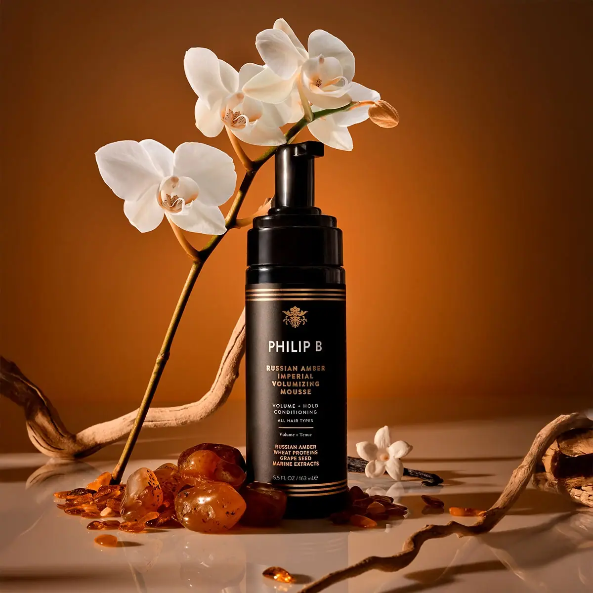
Russian Amber Imperial Volumizing Mousse presents a tall black cylinder with an exposed black pump and a formal centred information stack. Three fine gold-coloured lines bracket the label at top and bottom, while a small ornamental crest introduces the maker. White and warm gold-looking type divide identity, function and ingredient cues. The official non-aerosol format is important: the visible pump should not be mistaken for a conventional aerosol mousse can.
- Hair
- Dark pack
- Heritage label
- Luxe monochrome
About this study
Selected Russian Amber Imperial Volumizing Mousse 163 mL front with exposed pump; no other collection formats or rear panels are analysed.
Sources & evidence · Reviewed 2026-10-19Color Palette
Approximate colours interpreted from photography. These are screen references, not official brand colours or print specifications.
Pack body
Black cylinder and pump
#15120F
Approximate dark body and hardware under warm scene lighting.
Ink
Pale maker and information
#F0E8D7
Approximate light typography, most prominent in the PHILIP B line.
Accent
Warm gold-looking rules
#BC8C58
Approximate crest, rules and selected product wording; no foil or metallic ink process is confirmed.
Typography
Suggested visual alternatives, not confirmed brand typefaces. Any scale below is an illustrative estimate.
A small ornamental crest sits above a larger white PHILIP B line. The product title follows in four compact gold-looking uppercase lines, separating RUSSIAN AMBER, IMPERIAL, VOLUMIZING and MOUSSE. Smaller white benefit wording and ALL HAIR TYPES sit below, followed by a fine rule and a tiny mixed-case French line. A lower gold-looking ingredient-cue group precedes the white capacity footer. The maker is the clearest single headline; product function requires reading several shorter lines in sequence.
Fonts
Maker and product alternative
Barlow Condensed
- Looks like
- Barlow Condensed as an independent visual alternative
- Type
- Sans serif
- Weight
- Medium 500 / Bold 700
- Case
- Uppercase
- Tracking
- Moderately open
- Fallback
- Arial, sans-serif
Use a condensed sans-serif to accommodate a long product name without making every line equally small. Keep the maker distinct through size and colour. Test the narrowest counters and the four-line name at actual bottle scale.
Secondary information alternative
Libre Baskerville
- Looks like
- Libre Baskerville as an independent visual alternative
- Type
- Serif
- Weight
- Regular 400
- Case
- Mixed case
- Tracking
- Natural
- Fallback
- Arial, sans-serif
A restrained serif can give a small secondary phrase a different voice, but should not become decorative microtype. Use it only where the words remain readable; the original tiny French line is not enough evidence to identify its exact font.
Structure & Proportions
Visual proportions and finish previews are illustrative. Confirmed construction details and uncertainties are distinguished in the study notes.
Proportions
| Purpose | Value | Preview |
|---|---|---|
| Tall reading column | The label occupies most of the straight body and arranges many short lines along one centred axis. | — |
| Bracketed field | Repeated rule groups establish upper and lower limits without a visible full rectangular side border. | — |
| Stepped dispensing top | The wide collar narrows to an upright actuator, preserving the vertical direction of the body. | — |
Shapes
| Element | Value | Preview |
|---|---|---|
| Bottle | Tall cylinder with modestly rounded shoulder. | |
| Pump | Broad stepped collar and narrower vertical actuator with short outlet. | |
| Label rules | Parallel horizontal lines wrapping across the curved front. |
Finishes
Glossy hardware
Black pump collar and actuator catch strong highlights. · gloss
Gold-looking decoration
Fine rules, crest and product wording; visual appearance only. · metallic
Formats and materials
| Formats | Selected 5.5 fl oz / 163 mL tall cylindrical mousse bottle with an exposed black dispensing pump. |
| Materials | Official product description confirms non-aerosol format, not a complete bottle or pump material specification., Bottle polymer, pump components, label stock and gold-coloured decoration process are unverified. Black appearance alone does not identify substrate or recycled content. |
| Closures | The visible pump has a broad stepped collar over the bottle shoulder, a narrower upright stem and a short projecting outlet at the top. Its glossy highlights separate these levels even though all are dark. The upper actuator is relatively tall compared with the collar, so describing the whole closure as only a compact flat top would miss its silhouette. No protective overcap, lock position or internal foaming mesh is visible. The non-aerosol claim comes from the brand, while the precise operating travel and delivered dose remain unknown. |
| Decoration | Three thin horizontal gold-looking rules at both upper and lower label edges., Small central ornamental crest above the maker., Alternation of white and gold-looking text groups on black. |
Front Panel
Schematic reading order. The diagram’s zone heights do not represent measured artwork proportions.
The centred stack is organised through changes in colour, weight and spacing rather than multiple boxes. The crest is a compact decorative introduction, followed by the maker and product title. White functional copy creates a quieter middle section. A small dividing rule separates this from a very short French phrase, while a denser gold-looking block of ingredient cues gathers near the base. Capacity remains on its own final line just above the lower triple rules. The rules do not enclose every text group and should not be redrawn as a continuous rectangular frame.
| Zone | Content |
|---|---|
| Upper bracket | Three fine gold-coloured rules followed by a small ornamental crest. |
| Identity | White PHILIP B above a compact four-line product title. |
| Function | Smaller benefit wording, hair-type line, fine rule and short French phrase. |
| Lower information | Gold-looking ingredient cues, pale 5.5 FL OZ / 163 mL quantity and lower triple rules. |
Range System
The source identifies this mousse as part of Russian Amber Imperial and confirms 163 mL. Other products in that collection are not visually analysed here, so the study does not establish universal closure, colour or label dimensions across the range. The design lesson is local: a long product identity can fit a narrow cylinder when hierarchy uses short centred lines and a limited colour contrast. Any new size would need spacing and legibility reassessed rather than uniformly shrinking the artwork.
- Selected non-aerosol 163 mL mousse with exposed black pump and gold-looking ruled label.
- Other Russian Amber Imperial products are source context, not additional approved visual comparisons.
Back of Pack & Shelf
The reverse, base and pump internals are unseen. The front ingredient cues are not a complete ingredient declaration, and the current online ingredients cannot be assigned a physical rear layout without another image. No recycling mark, resin code or batch location can be confirmed.
- Review rear artwork before mapping ingredients and directions.
- Verify pump locking and transport protection on the physical pack.
- Confirm metallic-looking decoration through supplier specifications rather than colour alone.
On shelf
Interpretation: the pale maker and repeated gold-looking rules should register first, while the multi-line product title takes longer to read. The dense lower information may become texture at distance. The black pump creates a continuous silhouette with the bottle but may disappear against dark shelving. A new design should test short product-name recognition, the visibility of the dispensing outlet and the contrast of small warm-toned type under ordinary store lighting.
Imagery
White orchids, amber-coloured translucent pieces and twisting brown branches surround the dark upright bottle. Warm directional light produces a golden background and a bright reflection on the surface below. These props echo the product name and botanical presentation, but do not constitute a packaging material specification or prove the provenance of every depicted object. The pale flowers also help reveal the black pump outline. The package palette remains black, pale text and warm gold-looking decoration rather than adopting the full orange backdrop.
Guidelines
Editorial principles for an original design brief, not official brand guidelines.
Do
- Keep non-aerosol format distinct from aerosol assumptions.
- Use short lines to organise a long product title.
- Test gold-looking text against dark fields at actual size.
- Separate ingredient cues from complete ingredient information.
Don't
- Do not infer foil from gold colour.
- Do not describe the pump as a flat compact cap.
- Do not turn upper and lower rules into an invented full border.
- Do not copy the crest or exact product-name stack.
Sources & evidence
How this study was built
structure · Sourced fact
Brand explicitly identifies non-aerosol mousse and 163 mL capacity.Philip B — Russian Amber Imperial Volumizing Moussetypography · Visual observation
White maker precedes compact gold-looking product lines and smaller functional copy.Philip B — Russian Amber Imperial Volumizing Mousselabel · Visual observation
Triple horizontal rules bracket the label; no full side frame is visible.Philip B — Russian Amber Imperial Volumizing Moussestructure · Visual observation
Wide stepped collar supports a narrower upright actuator and short outlet.Philip B — Russian Amber Imperial Volumizing Mousseimagery · Visual observation
Orchids and amber-coloured pieces surround the bottle but are not components.Philip B — Russian Amber Imperial Volumizing Mousseshelf · Editorial interpretation
Dark hardware and small gold-looking text need realistic lighting tests.
What remains unverified
- Bottle and pump materials, label stock and metallic decoration process unverified.
- Original typography, physical dimensions and dispensing dose unknown.
- Rear, base and closure internals not visible.
Give your AI
packaging taste
Give your design or image tool a packaging study: palette, type, structure, front panel and principles for an original brief.
Export this styleFree with an email. PACK.md works in Claude, ChatGPT, Cursor and image tools.
More like this
Ezmio Beauty
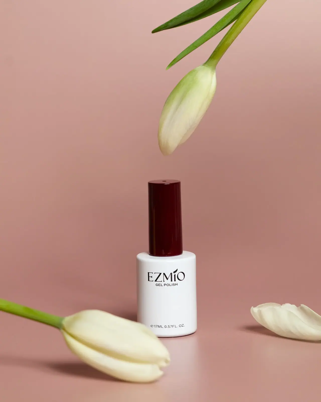
White polish bottle, tall burgundy cap, spare serif identity
Furtuna Skin
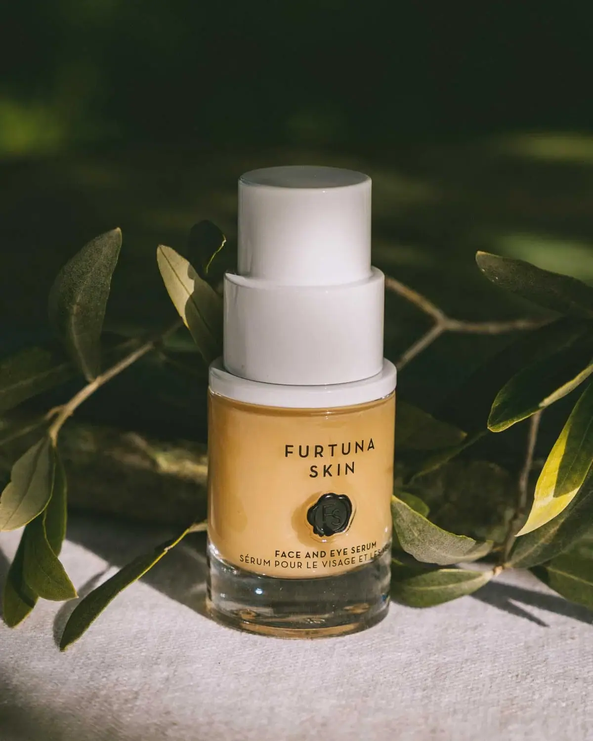
A tiered white top above a warm sealed identity
Omorovicza
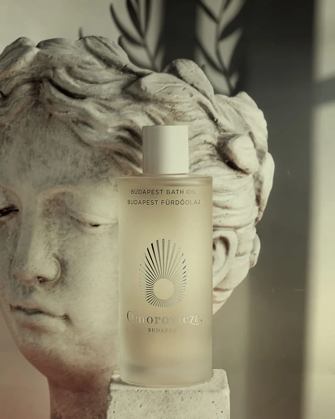
Frosted bath-oil cylinder with a reflective radiating emblem
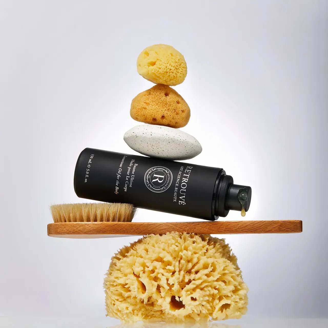
Retrouvé
White serif seal on a black airless body-oil cylinder

Aerangis
a quiet numbered object, an intimate scent memory

Alexander McQueen
An oval flacon crowned with dense black relief

Arquiste
blush transparency, white lettering and a stepped gold cap

Chabaud
A framed perfume label beneath a clear architectural cap