Photography: RMS Beauty official photography. Images belong to their respective owners.
RMS Beauty

Pale four-pan grid with gemlike relief and quiet branding
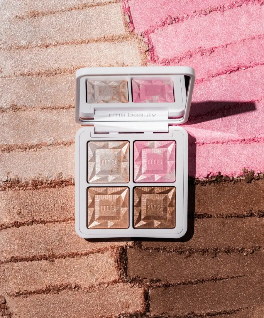
The open ReDimension Daily Glow palette lets the product surfaces do most of the visual work. Four square pans sit in a pale rounded-square compact, each carrying angular relief around a small central RMS mark. A mirror in the raised lid reflects the upper pair of shades, while a discreet maker appears near the hinge. The photographed powder-like background echoes the four-color arrangement at a much larger scale, reinforcing the grid without becoming part of the package.
- Make-up
- Light pack
- Clinical minimal
- Luxe monochrome
About this study
Selected open ReDimension Daily Glow palette; four actual pans, with two repeated in the mirror. Closed exterior and component specifications remain outside scope.
Sources & evidence · Reviewed 2026-10-19Color Palette
Approximate colours interpreted from photography. These are screen references, not official brand colours or print specifications.
Pack body
Pale cool case
#DADBDD
Approximate light gray-white case and dividers; the neutral frame gives the contents room to carry color.
Ink
Dark pan boundaries
#2C2525
Fine dark rims or gaps around each square sharpen separation; these are not confidently identified as printed outlines.
Accent
Champagne highlight
#D7C2B2
Upper-left product pan appearance, not a verified shade name or universal swatch.
Rose pink
#D78EAA
Upper-right product pan creates the strongest pink contrast within the pale frame.
Warm peach-gold
#C99A7F
Lower-left product pan appearance under directional light.
Deep bronze
#9C6D51
Lower-right product pan provides the deepest visual weight; screen color is not an application result.
Typography
Suggested visual alternatives, not confirmed brand typefaces. Any scale below is an illustrative estimate.
The open view contains very little conventional copy. Small lowercase rms marks repeat in the center of each pan, while a light rms beauty name appears along the lower lid area near the hinge. The product title and shade names are not printed prominently around the visible grid. Recognition therefore relies on repeated tiny marks, consistent relief and the pale case rather than a headline. The letters are subtle and partly defined by shadows within the product surface.
Fonts
Independent small maker
Manrope
- Looks like
- Quiet rounded lowercase sans
- Type
- Geometric sans-serif
- Weight
- Regular, Medium
- Case
- Lowercase
- Tracking
- Natural restrained spacing
- Fallback
- Arial, sans-serif
Use a small original maker where the frame meets the mirror or product grid. Keep it subordinate to shade comparison and do not reconstruct the RMS logo from a general font.
Supporting product information
Inter
- Looks like
- Neutral compact sans
- Type
- Grotesque sans-serif
- Weight
- Regular, Medium
- Case
- Mixed case
- Tracking
- Natural readable spacing
- Fallback
- Arial, sans-serif
A proposed companion for an original palette's underside or carton information, which is not visible here. Use clear shade labels where required instead of forcing small explanatory text into the narrow pan dividers.
Structure & Proportions
Visual proportions and finish previews are illustrative. Confirmed construction details and uncertainties are distinguished in the study notes.
Proportions
| Purpose | Value | Preview |
|---|---|---|
| Equal pan grid | Four similarly sized squares occupy the base with narrow cross-shaped pale spacing; no shade receives a larger pan in this view. | — |
| Rounded outer frame | The case rounds the corners around a more angular internal grid, giving the compact a softer perimeter. | — |
| Central relief mark | Each pan has a smaller central square surrounded by triangular-looking facet regions, with the tiny maker inside the center. | — |
| Mirror area | The raised lid provides a broad reflective field above the grid; its two reflected upper pans do not represent additional product compartments. | — |
Shapes
| Element | Value | Preview |
|---|---|---|
| Compact perimeter | Pale rounded square with a hinged upper lid. | |
| Pan grid | Four square wells arranged evenly in two rows and two columns. | |
| Faceted product surface | Angular triangular relief regions surround a central square mark area. | |
| Mirror | Broad rounded-rectangle reflective panel occupying most of the visible lid. |
Finishes
Reflective lid panel
Mirror repeats the upper shades and case details; material specification not supplied. · gloss
Luminous product surface
Directional highlights emphasize the four pans' relief; not a promise of identical skin appearance. · pearlescent
Formats and materials
| Formats | Hinged four-pan highlighter compact; official net weight 8.8 g / 0.31 oz |
| Materials | The pale case, reflective lid panel and four product pans are visible. The accessed product details do not establish case resin, recycled content, pan metal, mirror substrate or exact hinge construction., The brand describes a powder highlighter palette using Gel2Powder technology. That product description does not prove the pans are removable, replaceable or refillable. The faceted appearance belongs to the product surface, not actual cut stones or metal inserts. |
| Closures | The lid is raised above the base on a wide rear hinge area. It contains a large reflective panel within a pale frame. The selected angle shows the open relationship between mirror and pans but not the maximum opening angle, closing sound, magnetic retention or latch design. The exterior of the closed lid is unseen, so its finish and main branding cannot be reconstructed from this interior view. |
| Decoration | Two-by-two square pan grid, Repeated gemlike product relief, Small central rms marks, Discreet lower-lid maker, Neutral narrow dividers |
Front Panel
Schematic reading order. The diagram’s zone heights do not represent measured artwork proportions.
The interior replaces a traditional label hierarchy with a spatial one. The four equal pans are the primary content, the pale frame separates them, and tiny repeated marks provide identity. The lower-lid maker is secondary to both mirror and shades. There are no prominent shade names around the wells in this selected view, so color comparison is immediate but exact naming requires accompanying product information.
| Zone | Content |
|---|---|
| Raised mirror | Reflects the upper row and part of the pale frame; reflection is separated from the actual four-pan inventory. |
| Lower lid | A discreet light rms beauty mark sits near the hinge area. |
| Upper row | A pale champagne-looking pan sits left of a pink-looking pan, each with the same relief geometry. |
| Lower row | A warm peach-gold-looking pan sits left of a deeper bronze-looking pan. |
| Pan centers | Small lowercase rms marks sit within textured-looking central squares, surrounded by angular relief. |
Range System
The selected object is one four-shade palette, not four separately packaged products. The official page confirms the product category and total weight, while the photograph establishes its internal arrangement. An original palette family could retain equal wells and a consistent product-surface motif while changing the shade selection. This does not establish that other RMS compacts share materials, refill systems or identical case dimensions.
- Keep equal visual space for shades intended to be compared together.
- Use a restrained case color so the contents remain the strongest color information.
- Provide exact shade identifiers outside the image when the visible interior does not name them.
Back of Pack & Shelf
The underside, closed lid exterior and outer carton are not visible. The image therefore does not locate the full product name, shade names, ingredients or quantity text on the physical packaging.
- Inspect the underside and carton before documenting complete information layout.
- Verify pan removability and case material independently.
- Do not infer an exact opening angle or magnetic closure from the open pose.
On shelf
Interpretively, the closed object cannot be assessed from this photograph, but the open view is highly informative for shade comparison. The regular grid reduces visual searching, while repeated relief makes the four pans feel related despite color differences. A product page should preserve this interior view and add a closed view for recognition. The mirror can add attractive repetition, but captions and layout should keep reflected pans from confusing the actual count.
Imagery
The compact rests on four large powder-like color fields arranged in the same spatial order as the pans: pale at upper left, pink at upper right, warm light bronze below left and deeper bronze below right. Horizontal dragged lines introduce texture into those fields. Strong side light creates a dark cast shadow and emphasizes the facets. The background makes color and texture readable at scale, but it is a staged surface rather than extra pan capacity or a standardized skin swatch.
Guidelines
Editorial principles for an original design brief, not official brand guidelines.
Do
- Show the open layout for shade comparison.
- Keep reflection distinct from actual pan count.
- Document product relief separately from case decoration.
- Use a quiet frame around multiple colors.
- Add exact shade names through verified accompanying information.
Don't
- Do not call the pans gemstones or metal facets.
- Do not infer refillability from visible seams.
- Do not assign case resin from color.
- Do not treat studio swatches as skin results.
- Do not invent the closed lid's design.
Sources & evidence
How this study was built
edition · Sourced fact
Official page identifies four-shade highlighter palette and total 8.8 g / 0.31 oz weight.RMS Beauty — ReDimension Daily Glow Sheer Highlighter Palettestructure · Visual observation
Pale hinged compact holds four equal square pans and a broad mirror.typography · Visual observation
Small lowercase marks repeat within pans, with a discreet maker near the hinge.label · Visual observation
Interior hierarchy is spatial; faceted product surfaces dominate over printed copy.palette · Visual observation
Pale case frames champagne, pink, warm peach-gold and bronze appearances.imagery · Visual observation
Four large powder-like background fields echo pan order; mirror adds reflection, not extra inventory.range · Editorial interpretation
Consistent pan geometry can organize an original multi-shade family without assuming shared brand materials.
What remains unverified
- Case, pan and mirror materials unspecified in accessed product details.
- Refillability, latch and full opening angle unverified.
- Closed lid, underside and carton unseen.
- Shade hex values are approximate product appearance, not skin swatches or verified shade names.
Give your AI
packaging taste
Give your design or image tool a packaging study: palette, type, structure, front panel and principles for an original brief.
Export this styleFree with an email. PACK.md works in Claude, ChatGPT, Cursor and image tools.
More like this

African Botanics
Technical black label with a low serif signature

bareMinerals
a restrained black compact framing the powder itself

BeautyPWR
Clear square shell, white cream cup, black serif identity

Corpus
sage gloss with whispered gold lettering

Costa Brazil
Pale matching vessels with small, deliberate bilingual labels

Crown Affair
Pale frosted-looking bottle, black pump and small looping emblem

HAKU
Pearly narrow tube with stacked serif identity and clear base

Haus Labs
mirror chrome hardware over frosted shade