Photography: Suntribe official photography. Images belong to their respective owners.
Suntribe

Tan cylinder with white surf curves and fine brown hierarchy
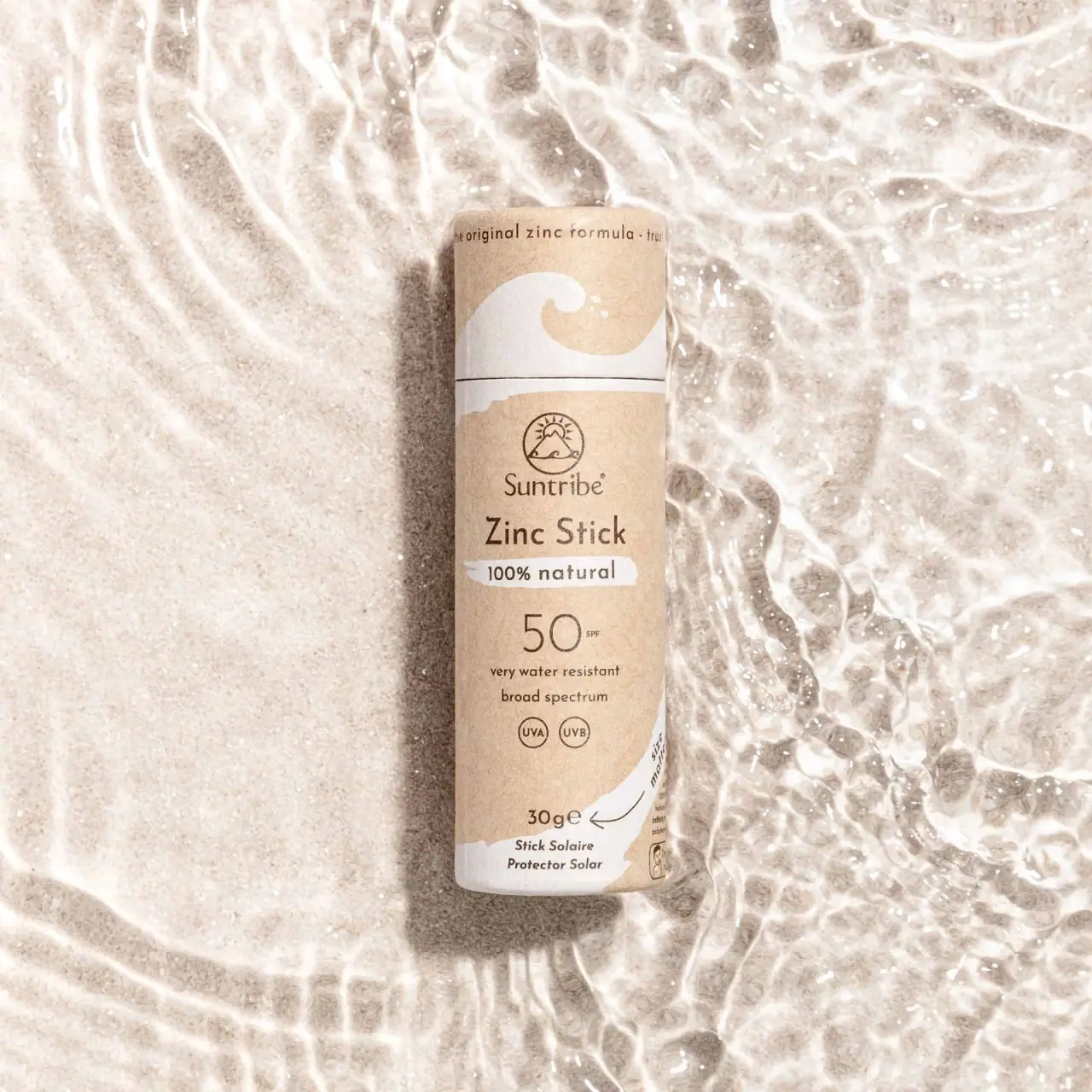
The selected Original White Zinc Stick uses a tan cylindrical exterior, dark brown information and broad white wave-like areas. Its cap carries the most literal curling wave, while the body stacks a small circular emblem, maker, product type and a large thin-stroke 50. The closed tube is photographed on pale sand beside rippling water. The scene reinforces an outdoor association, but it does not demonstrate the package's water durability or reveal the internal dispensing construction.
- Suncare
- Light pack
- Kraft & natural
- Bold typographic
About this study
Selected closed Original White Zinc Stick on sand and water. Current localized source verifies identity, quantity and plastic-free wording; exact internal construction is not demonstrated.
Sources & evidence · Reviewed 2026-10-19Color Palette
Approximate colours interpreted from photography. These are screen references, not official brand colours or print specifications.
Pack body
Warm tan exterior
#D6BE9F
Approximate fibrous-looking cylinder color; lighting and texture vary across the curved surface.
Ink
Dark brown information
#5D422D
Emblem, maker, product type, protection notation and small details use a softer contrast than stark black.
Accent
Warm white surf
#EEECE5
Curling wave, irregular claim strip and lower sweeping area connect cap and body graphically.
Typography
Suggested visual alternatives, not confirmed brand typefaces. Any scale below is an illustrative estimate.
Zinc Stick is the strongest compact word line, while the thin 50 is the largest individual numeric element. The small SPF notation sits beside the number rather than forming an equally weighted heading. Above, Suntribe has a more serif-like, slightly organic character beneath a circular emblem. Lower supporting lines and paired UVA/UVB circles are compact and centered. A narrow text line follows the upper cap circumference, showing how secondary copy can wrap around the object without joining the main body stack.
Fonts
Independent warm maker
Lora
- Looks like
- Restrained humanist serif
- Type
- Serif
- Weight
- Regular, Medium
- Case
- Title case
- Tracking
- Natural optical spacing
- Fallback
- Georgia, serif
Use for an original short maker beneath a separately designed emblem. Keep it smaller than the product type so the practical format remains easy to identify.
Product and numeric hierarchy
Raleway
- Looks like
- Open geometric sans
- Type
- Geometric sans-serif
- Weight
- Light, Medium, Bold
- Case
- Title case and numerals
- Tracking
- Open small details; natural numerals
- Fallback
- Arial, sans-serif
A light numeral can become prominent through scale while medium or bold product text remains compact. Essential supporting text should not inherit the numeral's thin weight at very small sizes.
Structure & Proportions
Visual proportions and finish previews are illustrative. Confirmed construction details and uncertainties are distinguished in the study notes.
Proportions
| Purpose | Value | Preview |
|---|---|---|
| Tall narrow body | The long cylinder requires a vertically ordered front rather than wide text lines. | — |
| Graphic cap | The upper cap devotes substantial space to one curling white wave and keeps its small circumferential copy close to the top. | — |
| Large fine numeral | The 50 occupies a broad central area but uses light strokes, balancing the heavier product-name line above. | — |
| Compact lower information | Paired small circles, quantity and translations fit into the lower region without expanding the emblem or maker. | — |
Shapes
| Element | Value | Preview |
|---|---|---|
| Closed cylinder | Long straight-sided tan tube with a fitted upper cap and softly rounded edges. | |
| Cap wave | One broad white curling crest with two small splash-like dots. | |
| Brand emblem | Thin circular outline containing mountain, sun and small wave forms. | |
| Claim strip | Short irregular white brush-like field behind a small natural-claim line. | |
| Paired protection symbols | Two small outlined circles containing UVA and UVB lettering below supporting copy. |
Finishes
Kraft-like appearance
Tan exterior shows fine visible fibers and diffuse shading; coating is not identified. · kraft
Formats and materials
| Formats | Closed cylindrical sun stick; photographed front states 30 g, while current official listing also supplies 33 ml |
| Materials | The current localized official page describes a plastic-free stick. The photographed exterior has a tan fibrous paper-like appearance. Earlier shared research recorded cardboard and biodegradability, but those exact specifications were not independently recovered in this localized retrieval and are not treated here as newly verified disposal claims., The cap seam is visible, but the internal liner, base disc, adhesives and any barrier treatment are not shown. The natural-looking exterior is therefore not sufficient evidence for a complete material bill, home-compostability or resistance to prolonged wetting. |
| Closures | A separate cap section is defined by a thin horizontal seam near the upper part of the cylinder. It remains fitted in the selected image; neither the product tip nor the bottom is exposed. The study documents the closed silhouette and seam rather than demonstrating push-up movement, twist action or the internal mechanism. A curved arrow appears near lower side copy, but its full context is not clear enough to reconstruct operating instructions. |
| Decoration | Large curling white wave on cap, Small circular mountain/sun/wave emblem, Irregular white claim strip, Large fine-stroke protection number, Lower white sweep and paired small circles |
Front Panel
Schematic reading order. The diagram’s zone heights do not represent measured artwork proportions.
The cap and body have different jobs. The cap supplies an immediate surf graphic, while the body provides a centered sequence of emblem, maker, format, claim strip, protection notation and supporting details. White areas recur at the cap, upper-body edge and bottom, connecting the pieces without a continuous dense illustration. The fine brown copy keeps the natural-looking field visible, while the large numeral gives the narrow front a clear focal point.
| Zone | Content |
|---|---|
| Cap | Small wraparound copy sits above a large white curling wave; the cap remains closed. |
| Maker | Circular mountain/sun/wave emblem sits above the Suntribe name. |
| Format and claim | Zinc Stick appears above a short white strip carrying natural-claim wording, recorded as packaging copy rather than independent certification. |
| Protection notation | Large thin 50 and small SPF sit above water-resistance and broad-spectrum wording and paired UVA/UVB circles. |
| Quantity and translations | 30 g is visible above small French and Spanish product-type lines; a white sweep and partly visible side copy continue around the cylinder. |
Range System
The source selector identifies Original White alongside other named color options. This study visually analyzes only the selected white-wave presentation and does not establish the full packaging color code for those alternatives. The white graphic may help identify this photographed version, but the hidden product color is supported by the source identity rather than visible contents. An original family should keep format and quantity consistent while verifying every variant cue against its actual SKU.
- Separate cap recognition graphics from the body information stack.
- Use a large clear numeric element without reducing the readability of nearby explanatory text.
- Keep product color options distinct from packaging substrate and scene colors.
Back of Pack & Shelf
The reverse, underside and opened stick are not visible. A small portion of side copy appears around the right curve, but not enough to document full instructions.
- Inspect the bottom and opened format before describing the dispensing mechanism.
- Verify complete component specifications before making disposal claims.
- Do not reconstruct small side text or directions from a partially hidden arrow.
On shelf
Interpretively, the large 50 and short product-type line provide practical recognition on a narrow form, while the wave and tan surface establish an outdoor character. The finer brown copy could become difficult to read in a small thumbnail or on a textured background. A detailed product page should include a dry neutral front and an opened view to clarify the physical format. The useful principle is a compact information hierarchy supported by a simple contextual graphic.
Imagery
The tube lies on pale granular sand with bright rippling water around it. Refraction creates irregular highlights and makes the white printed wave feel connected to the setting. The water and sand are external context, not parts of a protective sleeve. This photograph presents an outdoor mood rather than a controlled test of package durability. The tan body remains distinguishable from the lighter sand because of its cylindrical shadow, brown typography and white graphic areas.
Guidelines
Editorial principles for an original design brief, not official brand guidelines.
Do
- Record exact closed-view limitations.
- Keep numeric information readable.
- Separate source claims from disposal certification.
- Use a simple graphic suited to a curved narrow surface.
- Distinguish sand and water from package materials.
Don't
- Do not describe a detached cap in this closed image.
- Do not claim waterproof packaging from wet staging.
- Do not infer complete materials from a kraft-like texture.
- Do not use current source claims as independent testing.
- Do not copy the surf emblem or claim strip.
Sources & evidence
How this study was built
edition · Sourced fact
Official selector includes Original White and lists 30 g / 33 ml for the stick.Suntribe — Organic Mineral Zinc Sun Stick SPF 50structure · Sourced fact
Current page describes plastic-free format; internal layers and mechanism remain unverified.Suntribe — Organic Mineral Zinc Sun Stick SPF 50typography · Visual observation
Compact product name and large thin 50 organize the narrow centered stack.label · Visual observation
Cap wave, circular emblem, white claim strip and lower sweep create distinct zones.palette · Visual observation
Tan exterior, brown lettering and white graphics define package appearance.imagery · Visual observation
Closed tube lies in sand and rippling water; scene is not a durability demonstration.range · Editorial interpretation
Cap recognition and body information could extend to an original family; other variants not visually audited.
What remains unverified
- Localized source did not independently recover earlier cardboard/biodegradability wording.
- Opened tip, underside and internal mechanism unseen.
- Exact fonts, coating, dimensions and full side copy unverified.
- Wet campaign scene does not establish package durability.
Give your AI
packaging taste
Give your design or image tool a packaging study: palette, type, structure, front panel and principles for an original brief.
Export this styleFree with an email. PACK.md works in Claude, ChatGPT, Cursor and image tools.
More like this
Sun Bum
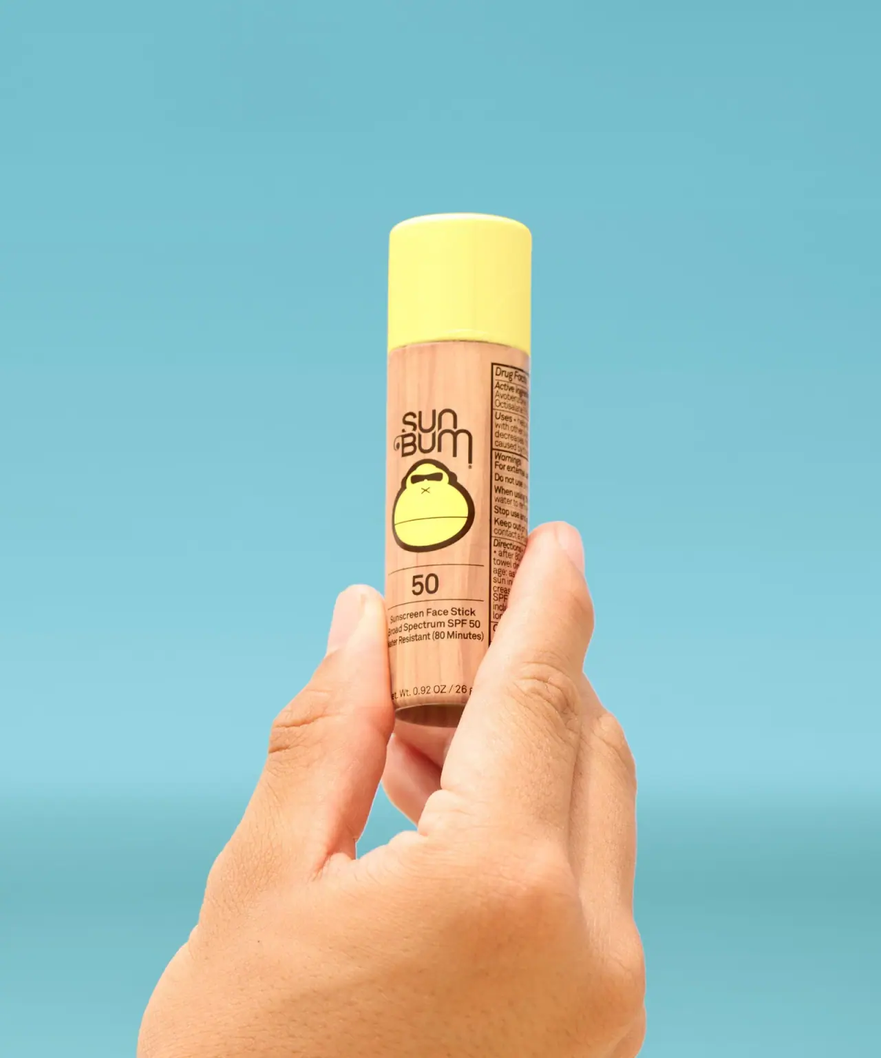
Yellow-capped paper stick with printed grain and mascot

ACURE
Iridescent spectacle with practical, tightly ordered type

AKT
Lilac stage directions with a quiet metallic detail

AussieZinc
Sun-yellow numerals on a tall, information-rich white cylinder

Bask
sunny yellow with a playful turquoise signature

Beame
Orange bubble lettering, pink mascot, clear product badge

BioSeivas
Vertical serif identity on a mauve treatment band
Black Girl Sunscreen
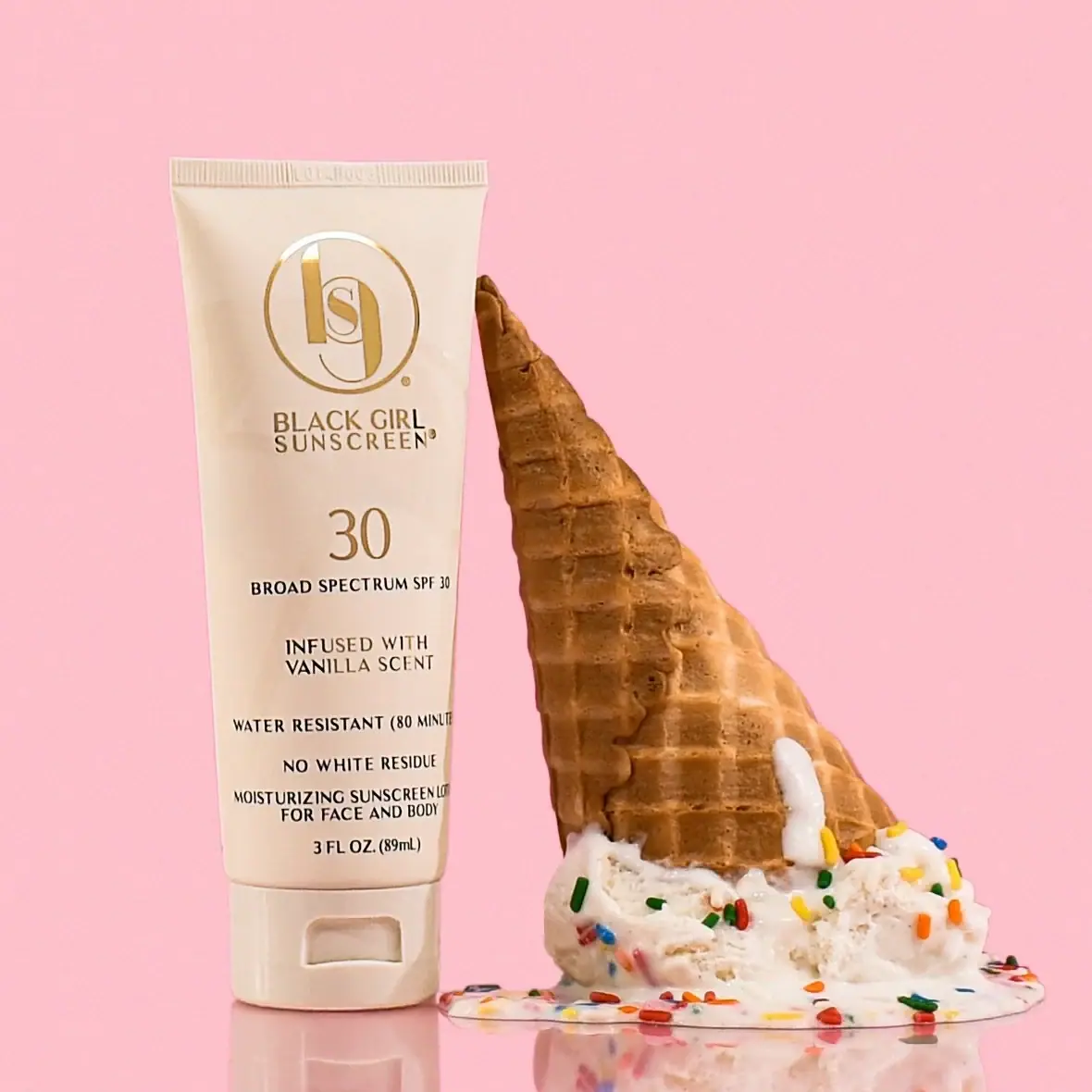
Cream tube with gold crest and an isolated SPF numeral