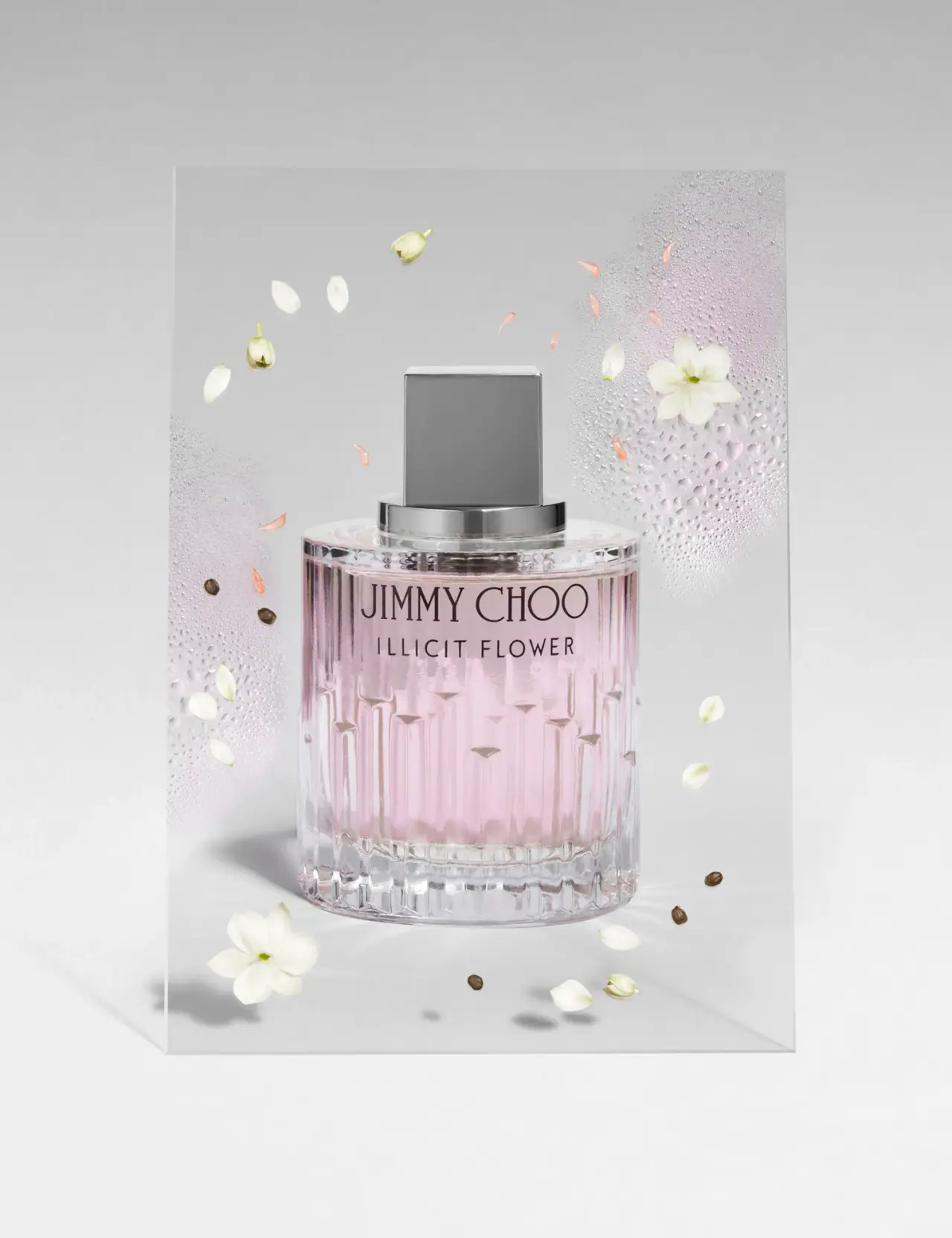
Photography: Josh Caudwell — fragrance still-life photography. Images belong to their respective owners.
Jimmy Choo

Blush transparency, staggered flutes and a silver square cap
The selected Illicit Flower bottle uses transparent vertical relief and a stepped closure assembly as its principal graphics. A pale pink interior sits behind dark upper-front naming, while the lower body breaks light into staggered vertical facets. The cap presents a square gray face above a wide circular reflective collar. The photograph surrounds this compact geometric object with a clear panel, droplets and scattered petals; these floral cues belong to the scene, not a printed decoration on the bottle.
- Perfume
- Light pack
- Luxe monochrome
- Heritage label
About this study
Selected archival Illicit Flower still life by Josh Caudwell; visual packaging study without independently verified capacity, concentration or component specifications.
Sources & evidence · Reviewed 2026-10-19Color Palette
Approximate colours interpreted from photography. These are screen references, not official brand colours or print specifications.
Pack body
Clear reflected gray
#D9D8D7
Approximate transparent vessel appearance against a gray set; not a solid gray body color.
Reflective silver-gray cap
#8E8D8C
Broad flat cap face and mirrored collar shift from dark gray to white with reflection; exact coating and metal composition are unknown.
Ink
Dark plum-black naming
#2A2026
Fine upper-front maker and scent name provide the only strong printed-looking contrast.
Accent
Pale blush interior
#DDBFCB
Pink visible through the bottle. The image does not independently separate liquid color from any vessel tint or lighting contribution.
Typography
Suggested visual alternatives, not confirmed brand typefaces. Any scale below is an illustrative estimate.
JIMMY CHOO occupies the leading line in tall fine uppercase serif forms, with comparatively narrow strokes and an open, elegant rhythm. ILLICIT FLOWER sits below in a smaller uppercase sans with more obvious letter spacing. The maker line is wider and taller; the scent line remains legible through tracking and separation rather than bold weight. No decorative border or opaque label field surrounds either, leaving the vessel's relief and pink interior as the main background.
Fonts
Independent fashion maker
Bodoni Moda
- Looks like
- Fine tall display serif
- Type
- Display serif
- Weight
- Regular, Medium
- Case
- Uppercase
- Tracking
- Careful optical spacing
- Fallback
- Georgia, serif
Use for an original short maker with slender elegance. Test the finest strokes against the actual transparent material and background rather than assuming a white-screen specimen predicts legibility.
Scent identifier
Montserrat
- Looks like
- Widely tracked light sans
- Type
- Geometric sans-serif
- Weight
- Regular, Medium
- Case
- Uppercase
- Tracking
- Open letter spacing
- Fallback
- Arial, sans-serif
A smaller scent line can remain distinct through spacing and a clear baseline gap. Avoid using extremely light weight where liquid color or reflections reduce contrast.
Structure & Proportions
Visual proportions and finish previews are illustrative. Confirmed construction details and uncertainties are distinguished in the study notes.
Proportions
| Purpose | Value | Preview |
|---|---|---|
| Short broad cylinder | The body is relatively wide and compact, giving the vertical relief room to repeat across the visible front. | — |
| Upper naming zone | Two centered name lines occupy the upper body where the background appears visually quieter than the strongly faceted lower region. | — |
| Stepped closure | The square-front cap is narrower than the circular collar, which is narrower than the bottle shoulder. | — |
| Heavy clear base | A substantial transparent lower band anchors the pink interior and produces an additional horizontal reflection beneath the vertical relief. | — |
Shapes
| Element | Value | Preview |
|---|---|---|
| Bottle body | Broad cylinder with a flat-looking shoulder and repeated vertical facets. | |
| Cap face | Near-square gray front with subtly beveled-looking edges; depth cannot be measured here. | |
| Reflective collar | Wide low circular band connecting the square cap to the shoulder. | |
| Staggered relief | Long vertical flutes terminate at different heights in pointed or angled transitions. |
Finishes
Transparent relief
Body and base refract the pale pink interior and gray surroundings. · transparent
Reflective closure appearance
Silver-gray cap and brighter collar; finish process is not verified. · metallic
Formats and materials
| Formats | Closed fragrance bottle with cylindrical transparent body and square-front cap; photographed capacity not legible |
| Materials | The vessel is transparent and glass-like, with a thick clear-looking base and strong refractive details. The accessed photographer source is visual provenance, not a technical material specification, so glass formulation and manufacturing process remain unverified., The cap and collar have silver-gray reflective surfaces. The image does not establish solid metal, plated plastic, metallization or a named coating. No outer carton, refill component or separate closure mechanism is shown. |
| Closures | The top changes geometry in three steps: a broad round shoulder, a low reflective circular collar and a narrower square-front cap. The cap's flat face is darker than its bright top edge, while the collar reflects the scene as a horizontal band. The atomizer remains hidden. This view supports the stepped silhouette but does not demonstrate a magnetic closure, screw neck, refill access or cap weight. |
| Decoration | Tall maker line above spaced scent line, Staggered vertical flutes/facets on lower body, Thick clear-looking base, Square and circular closure geometry, No visible printed floral illustration |
Front Panel
Schematic reading order. The diagram’s zone heights do not represent measured artwork proportions.
The visible identity consists of two centered lines directly over the transparent upper body. Their different typographic styles establish hierarchy without changes of ink color. Below them, the relief becomes more prominent and gradually replaces text as the visual subject. There is no separate front paper rectangle to interrupt the material. This depends on selecting a comparatively calm area for lettering, because the lower facets distort light too strongly for dense small copy.
| Zone | Content |
|---|---|
| Maker | A tall fine serif JIMMY CHOO line sits near the top of the visible body. |
| Scent name | Smaller tracked sans ILLICIT FLOWER appears below on a separate centered baseline. |
| Relief field | Lower vertical facets and staggered transitions supply decoration without added illustration. |
| Clear base | A thick-looking transparent lower band contains no confidently readable front quantity in this view. |
Range System
This is one archival Illicit Flower presentation, documented through the approved image and the photographer's portfolio. The study does not establish current availability, the full bottle family or a specific capacity. A transferable principle is to retain a strong structural rhythm while keeping naming restrained. Any original range using different liquid colors or cap finishes would need independent specifications and legibility tests; this single photograph does not prove such a code for Jimmy Choo.
- Reserve a quieter upper area for naming when the lower vessel carries strong relief.
- Use contrasting round and square geometry to create a clear closure silhouette.
- Document edition and size before comparing color or proportions across fragrance variants.
Back of Pack & Shelf
The back, underside, exposed spray head and carton are unseen. No concentration, net volume or batch identifier is confidently readable on the selected front.
- Inspect the base and rear before describing mandatory details.
- Verify actual bottle material and cap construction through a component source.
- Do not assign a commonly sold capacity or concentration merely from the fragrance name.
On shelf
Interpretively, the closure geometry and faceted body would remain recognizable before the fine maker is readable. The small amount of text keeps the vessel dominant, but transparent packaging can lose contrast against a busy background. A product page should therefore pair the staged still life with a clean front view if exact identification is important. The useful lesson is to coordinate structural relief with a protected text zone rather than decorate every surface equally.
Imagery
The bottle appears before a large clear rectangular panel with areas of condensation-like droplets. White flowers, pale buds, small peach petals and several dark seed-like pieces surround it in a suspended arrangement. The panel and botanical elements create a light floral setting, but their exact species and relation to formula notes are not established here. Their softness contrasts with the rigid cap and vertical vessel facets. The gray background makes the pink interior more visible without turning the entire pack into a pink opaque object.
Guidelines
Editorial principles for an original design brief, not official brand guidelines.
Do
- Analyze the exact photographed edition.
- Keep text in a calmer material zone.
- Distinguish visual relief from a confirmed production method.
- Use cap and collar geometry deliberately.
- Separate botanical props from printed packaging.
Don't
- Do not assign a capacity from bottle appearance.
- Do not call the cap solid silver.
- Do not infer a refill or magnetic mechanism.
- Do not turn the clear scene panel into an outer case.
- Do not claim exact botanical ingredients from props.
Sources & evidence
- Josh Caudwell — fragrance still-life portfoliophotographer
How this study was built
edition · Sourced fact
Photographer portfolio includes the selected Jimmy Choo fragrance still life and supports its visual provenance.Josh Caudwell — fragrance still-life portfoliostructure · Visual observation
Transparent cylindrical body has a thick-looking base and square-front cap above a circular collar.Josh Caudwell — fragrance still-life portfoliotypography · Visual observation
Tall fine serif maker contrasts with a smaller widely spaced sans scent line.Josh Caudwell — fragrance still-life portfoliolabel · Visual observation
Two upper-front lines leave lower staggered facets as the principal decoration.Josh Caudwell — fragrance still-life portfoliopalette · Visual observation
Pale pink interior, clear body and gray reflective closure define the pack appearance.Josh Caudwell — fragrance still-life portfolioimagery · Visual observation
Droplet-covered clear panel and scattered botanical pieces are external scene elements.Josh Caudwell — fragrance still-life portfoliorange · Editorial interpretation
A protected naming zone can complement strong relief; no full brand range system established.
What remains unverified
- Annual-report PDF could not be read because of size; release date not independently repeated here.
- Bottle and cap specifications, original fonts and dimensions unverified.
- Reverse, base, atomizer and carton unseen.
- Pink appearance may combine contents, vessel and scene effects.
Give your AI
packaging taste
Give your design or image tool a packaging study: palette, type, structure, front panel and principles for an original brief.
Export this styleFree with an email. PACK.md works in Claude, ChatGPT, Cursor and image tools.
More like this

Aerangis
a quiet numbered object, an intimate scent memory

Alexander McQueen
An oval flacon crowned with dense black relief

Arquiste
blush transparency, white lettering and a stepped gold cap

Chabaud
A framed perfume label beneath a clear architectural cap
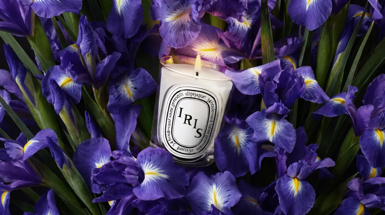
Diptyque
engraved oval labels on clear glass
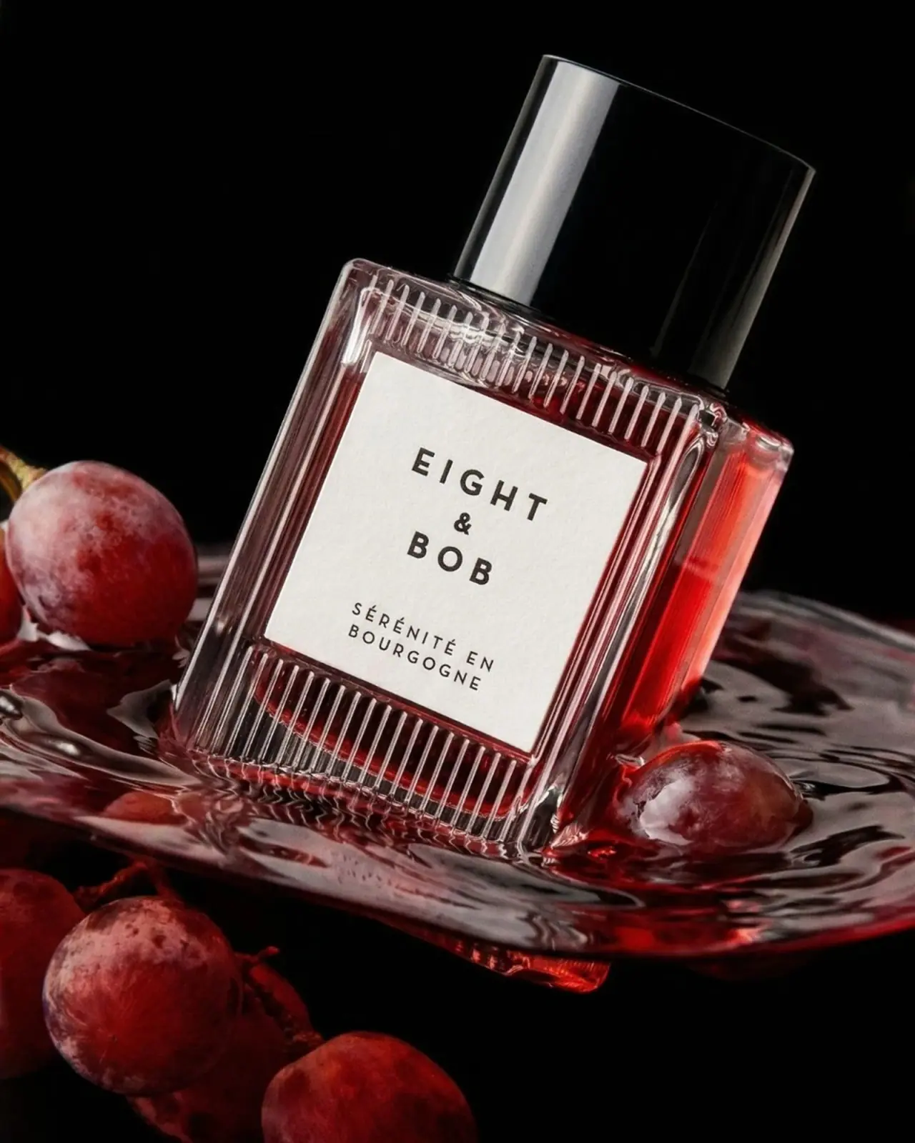
Eight & Bob
Ribbed red flacon, pale label and polished black cap
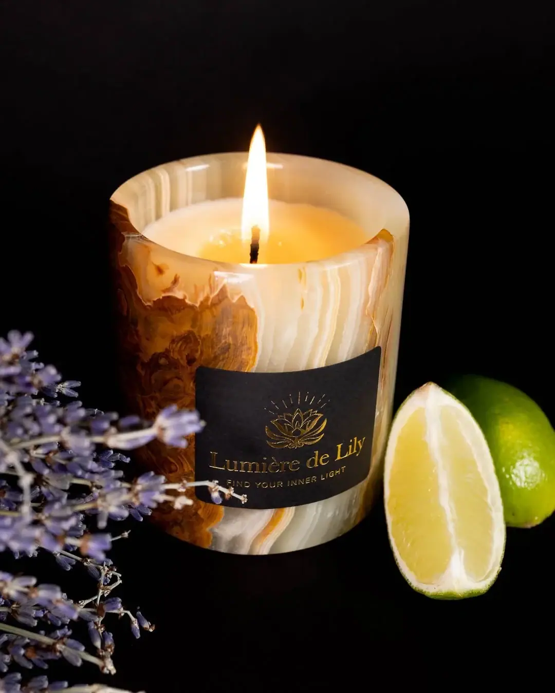
Lumière de Lily
Banded onyx framed by a black label and golden emblem
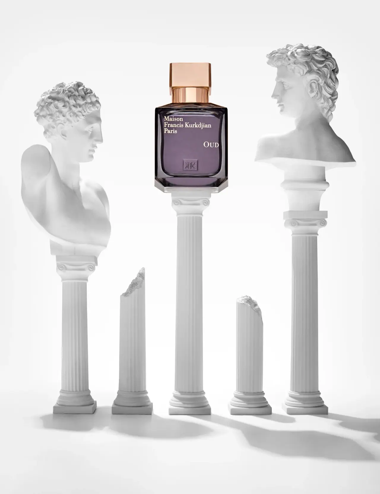
Maison Francis Kurkdjian
offset ivory serif names on plum flacon beneath warm cap