Photography: Eight & Bob official photography. Images belong to their respective owners.
Eight & Bob

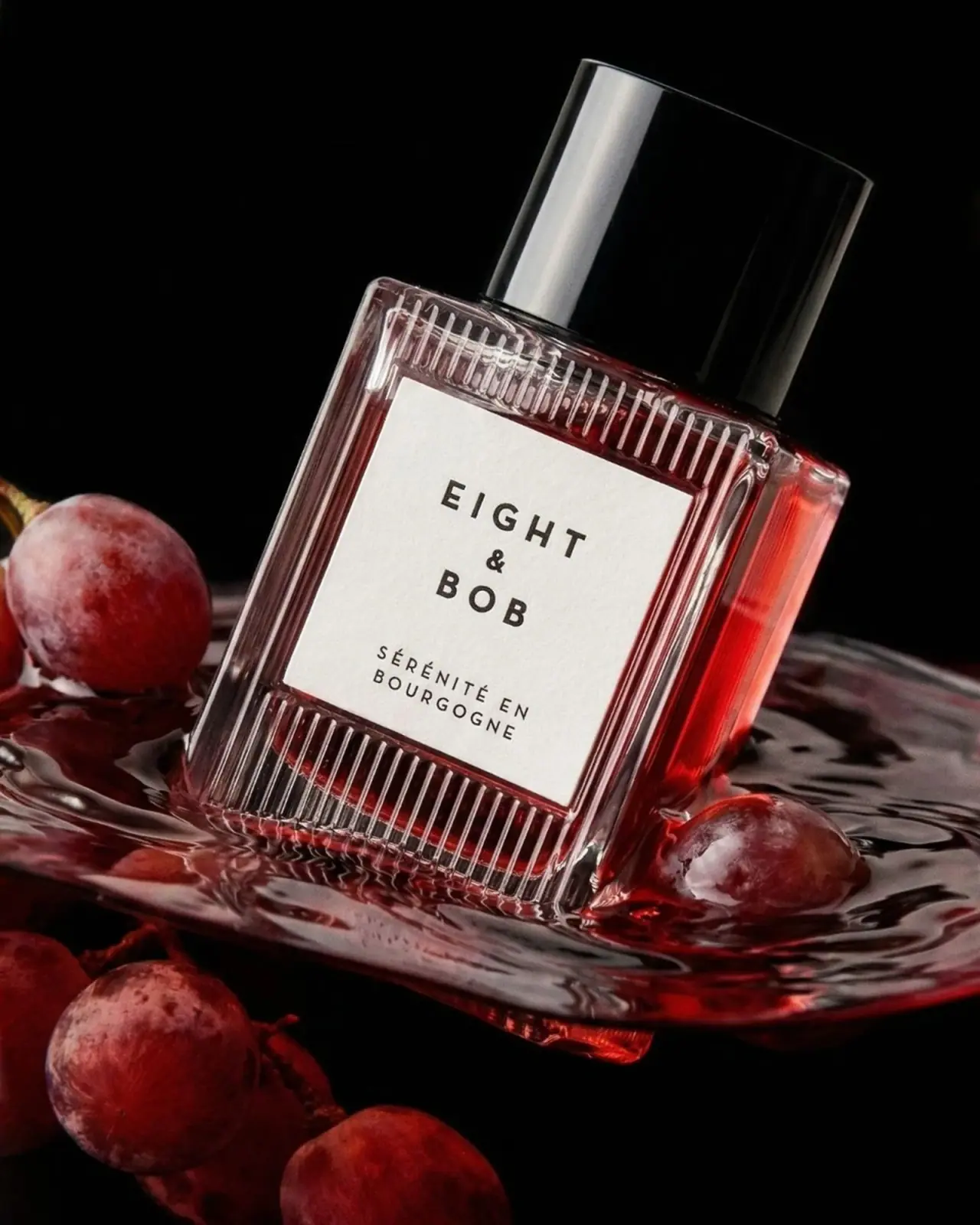
Ribbed red flacon, pale label and polished black cap
Sérénité en Bourgogne pairs a richly textured transparent flacon with a very quiet label. Close vertical ribs frame a broad pale rectangle, where the widely spaced EIGHT & BOB identity sits above the smaller French fragrance name. A tall black cylindrical cap adds a smooth solid mass over the light-catching body. The selected official photograph intensifies the red appearance with grapes and a dark liquid setting. This study concerns the selected 100 mL Eau de Parfum presentation and keeps the brand's Burgundy narrative separate from verified construction details.
- Perfume
- Dark pack
- Luxe monochrome
- Heritage label
About this study
The selected 100 mL Sérénité en Bourgogne Eau de Parfum presentation in official dramatic still-life photography. Current product context is sourced; other sizes and unseen packaging are not analysed.
Sources & evidence · Reviewed 2026-10-19Color Palette
Approximate colours interpreted from photography. These are screen references, not official brand colours or print specifications.
Pack body
Glossy black cap
#090909
Approximate cap base colour, excluding the strong white reflection that reveals its curvature.
Label
Pale ivory rectangle
#EEECE4
Approximate label tone, creating a stable opaque reading area over the richly coloured transparent bottle.
Ink
Charcoal lettering
#302D29
Approximate maker and fragrance-name lettering. The image does not establish a separate specialty ink or foil.
Accent
Ruby through the flacon
#A52C31
Approximate visible red contents and transmitted-light appearance. This is not a specification for red paint or a calibrated liquid colour; the surrounding scene reinforces it.
Typography
Suggested visual alternatives, not confirmed brand typefaces. Any scale below is an illustrative estimate.
The maker identity occupies three centred lines: EIGHT, a smaller ampersand, then BOB. Wide spacing gives the short words a measured rhythm, while their relatively heavy sans-serif strokes remain legible against the pale field. A generous gap separates this identity from SÉRÉNITÉ EN and BOURGOGNE in two much smaller uppercase lines. The two text groups share a centre axis but differ substantially in weight and scale. There is no decorative script competing with the ribs, and the long fragrance name stays intact through controlled line breaking.
Fonts
Original maker alternative
Montserrat
- Looks like
- Spaced geometric sans
- Type
- Geometric sans serif
- Weight
- SemiBold, Bold
- Case
- Uppercase
- Tracking
- Wide, optically adjusted
- Fallback
- Arial, sans-serif
Explore a different original maker arrangement while retaining strong contrast with a smaller product name. Do not reconstruct the EIGHT, ampersand and BOB stack or its exact letter spacing.
Fragrance-name alternative
Work Sans
- Looks like
- Restrained uppercase sans
- Type
- Sans serif
- Weight
- Regular, Medium
- Case
- Uppercase
- Tracking
- Open
- Fallback
- Arial, sans-serif
Set a long original place-based title in balanced lines with clear accents. Check spacing around short connecting words so the title reads as a phrase rather than unrelated fragments.
Structure & Proportions
Visual proportions and finish previews are illustrative. Confirmed construction details and uncertainties are distinguished in the study notes.
Proportions
| Purpose | Value | Preview |
|---|---|---|
| Large reading window | The label occupies much of the visible front, leaving textured transparent bands above and below and narrower margins at the sides. | — |
| Tall smooth cap | The black closure is a substantial upper part of the silhouette. Its clean surface contrasts with the dense rhythm of the flacon rather than repeating that texture. | — |
| Unequal type groups | The maker group occupies the upper label area and carries greater typographic weight; the smaller fragrance title sits well below it. These are visual relationships rather than measured layout specifications. | — |
Shapes
| Element | Value | Preview |
|---|---|---|
| Flacon body | Broad rectangular volume with softened corners and a fairly flat front reading plane. | |
| Front label | Simple pale rectangle, aligned to the main bottle face. | |
| Cap | Tall smooth cylinder with a dark glossy surface. | |
| Rib rhythm | Closely repeated vertical strokes across the exposed upper and lower body bands. |
Finishes
Clear ribbed light-catching appearance
Exposed flacon margins and bands · transparent
Polished black appearance
Fitted cylindrical cap · gloss
Quiet pale label appearance
Central front rectangle; stock unverified · matte
Formats and materials
| Formats | Rectangular transparent flacon with softened corners and vertical surface ribs, Broad pale rectangular front label, Tall black cylindrical cap, Selected reference identifies the 100 mL Eau de Parfum presentation |
| Materials | The transparent body has a glass-like appearance, but the inspected product page does not provide a component material specification, glass composition or manufacturing method., The black cap's glossy surface does not establish whether it is resin, coated metal or another construction., Label stock, adhesive and printing process are unverified. Visible slight surface texture is not enough to identify a paper grade or coating. |
| Closures | The cap remains fitted, completely hiding the dispensing assembly. Its cylindrical side creates a broad reflective face and its diameter is narrower than the bottle body. There is no inspected atomiser, attachment mechanism or neck opening. Magnetism, screw fit, refillability and spray dose therefore remain unestablished. The strong reflected stripe on the cap describes lighting and curvature, not a silver component. |
| Decoration | Repeated vertical ribs above and below the central label, Long vertical channels along the side margins, Spaced dark maker lettering on an opaque pale field, Smaller two-line fragrance name with accents preserved |
Front Panel
Schematic reading order. The diagram’s zone heights do not represent measured artwork proportions.
The front label provides a calm rectangle inside a more complex optical frame. Neither ornamental borders nor ingredient pictures are needed because the vessel itself supplies the pattern. Two separated text groups establish maker first and fragrance second. The text remains horizontal relative to the bottle even though the photograph tilts the entire object. No concentration or volume line is confidently readable on this selected front; those details are confirmed by the product listing, not invented as additional label zones.
| Zone | Content |
|---|---|
| Upper identity | EIGHT above a smaller ampersand and BOB, with broad letter spacing and a shared centre axis. |
| Middle breathing space | Unprinted pale area separating the maker from the much smaller fragrance title. |
| Lower fragrance name | SÉRÉNITÉ EN above BOURGOGNE, set in small spaced uppercase letters. |
| Outside the label | Visible transparent ribs and red appearance form the optical frame; these are structural and lighting effects rather than printed illustrations. |
Range System
The official product page offers 100 mL and 30 mL options, but only the selected larger presentation is analysed here. The smaller option's dimensions, label proportions and cap construction are not inferred. This front suggests a useful identity-versus-title hierarchy for a fragrance collection: maintain a recognisable maker while allowing a longer specific name below. Whether all Eight & Bob collections share this flacon or colour treatment is outside the evidence. The red presentation should not be treated as a universal brand palette.
- The selected reference pairs a large maker group with a small two-line place-based fragrance title.
- The product listing confirms a second size without proving identical physical proportions.
- An original range could preserve a calm reading window while varying the fragrance name, but any colour coding would need its own deliberate system and testing.
Back of Pack & Shelf
The reverse, underside, uncapped neck and actual supplied outer packaging are absent. The product page's general gift-packaging sketch does not establish the construction of this bottle's box.
- No barcode, batch marking or ingredient-panel position is visible.
- Do not transfer a generic website packaging illustration into the selected product's physical study.
- For an original design, place necessary secondary information without relying on the decorative ribs as a readable text surface.
On shelf
As a visual interpretation, the broad light label and tall black cap create a recognisable large-scale silhouette, while the ribs become more rewarding at close range. Maker recognition is prioritised over immediate reading of the long fragrance title. The contrast depends partly on context: the black cap is strongly defined by a studio highlight here and could recede against an unlit dark shelf. A useful physical assessment would inspect both straight-on reading and oblique reflections, because the ribbed frame can either enrich the object or compete with small text through glare.
Imagery
The bottle leans diagonally through a dark red liquid-like scene, surrounded by red-purple grapes against a nearly black background. A bright vertical reflection makes the cap cylinder visible while narrow highlights pick out the flacon's ribs. The pale label remains the most stable reading area. The official brand story links the fragrance to Burgundy's harvest, explaining the narrative role of grapes without establishing that grapes are an ingredient. The photograph alone also cannot identify the surrounding liquid as wine or perfume. Its redness intensifies the contents' appearance, so neutral-light colour would need separate evaluation.
Guidelines
Editorial principles for an original design brief, not official brand guidelines.
Do
- Let a complex vessel frame a simple reading area.
- Balance a long fragrance title with deliberate line breaks.
- Inspect ribbed surfaces under several light directions.
- Keep narrative props separate from ingredient claims.
- Distinguish source-confirmed size from visible front copy.
Don't
- Do not copy the three-line maker identity.
- Do not infer refillability or magnetic closure from the cap.
- Do not call the reflected white cap stripe a metal insert.
- Do not assume the surrounding red liquid is wine.
- Do not transfer 100 mL proportions to the uninspected 30 mL option.
Sources & evidence
How this study was built
edition · Sourced fact
Official listing identifies Eau de Parfum 100 mL and also offers a 30 mL option.Sérénité en Bourgogne Eau de Parfum 100 mL — Eight & Bobstructure · Visual observation
The selected flacon has vertical ribbed bands framing a large pale label and a tall fitted black cylindrical cap.Sérénité en Bourgogne Eau de Parfum 100 mL — Eight & Bobtypography · Visual observation
Large spaced maker lettering occupies three lines, with a separate smaller two-line fragrance name below.Sérénité en Bourgogne Eau de Parfum 100 mL — Eight & Bobpalette · Visual observation
Red appearance is seen through the transparent body and reinforced by surrounding scene colour; it is not proof of a red-painted vessel.Sérénité en Bourgogne Eau de Parfum 100 mL — Eight & Bobimagery · Sourced fact
The brand's product narrative links the fragrance to Burgundy grape harvest, providing context for grapes in the photograph.Sérénité en Bourgogne Eau de Parfum 100 mL — Eight & Bobrange · Editorial interpretation
The maker/title separation offers a potential collection principle, but a single inspected presentation cannot establish universal brand rules.
What remains unverified
- Exact component materials, manufacturing and label printing processes are unverified.
- No uncapped dispenser, reverse, base or supplied box is inspected.
- Fonts, physical colour standards and measured proportions are unknown.
- The 30 mL option is listed but its packaging is not independently studied.
Give your AI
packaging taste
Give your design or image tool a packaging study: palette, type, structure, front panel and principles for an original brief.
Export this styleFree with an email. PACK.md works in Claude, ChatGPT, Cursor and image tools.
More like this

Aerangis
a quiet numbered object, an intimate scent memory

Alexander McQueen
An oval flacon crowned with dense black relief

Arquiste
blush transparency, white lettering and a stepped gold cap

Chabaud
A framed perfume label beneath a clear architectural cap
Diptyque
engraved oval labels on clear glass
Jimmy Choo
Blush transparency, staggered flutes and a silver square cap
Lumière de Lily
Banded onyx framed by a black label and golden emblem
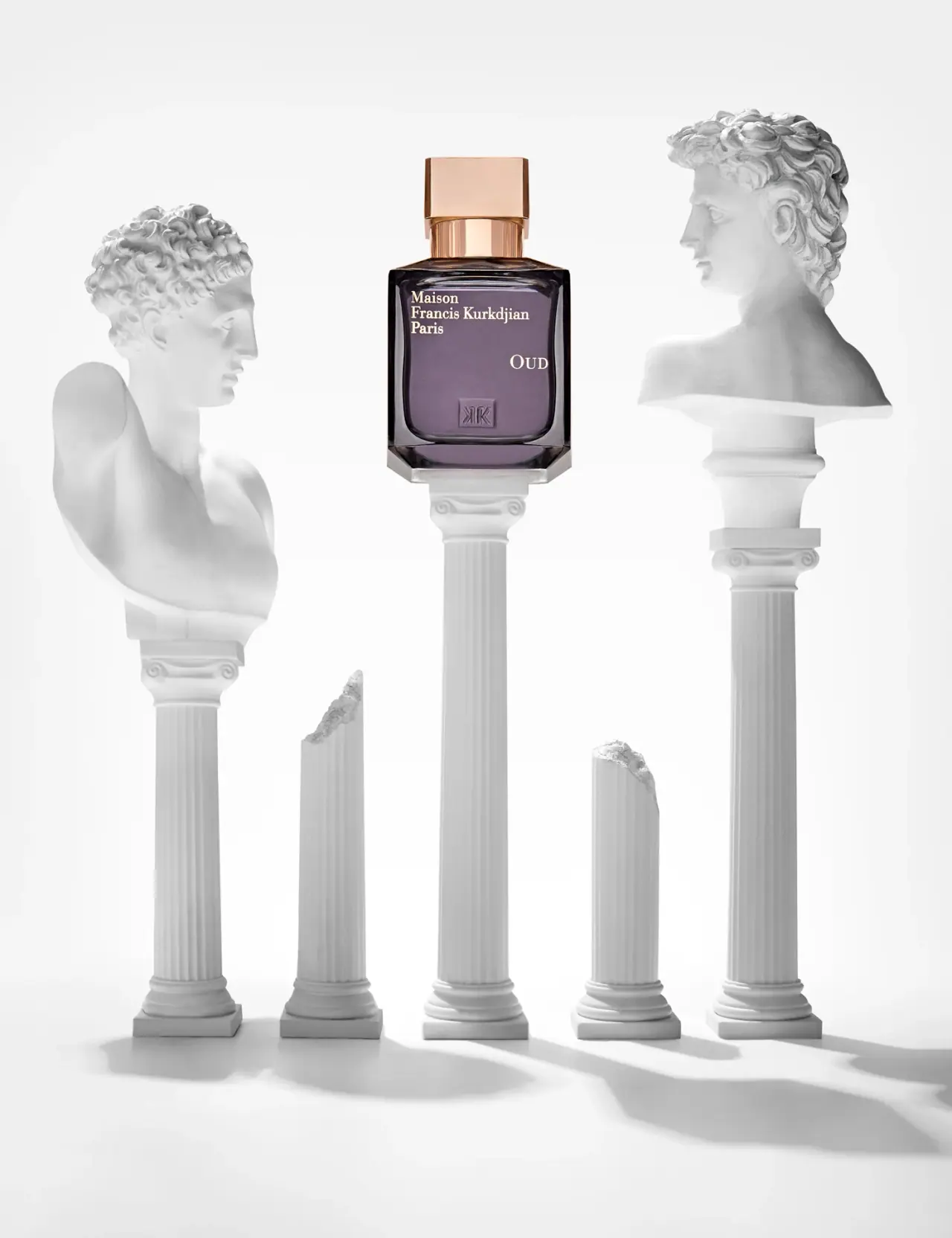
Maison Francis Kurkdjian
offset ivory serif names on plum flacon beneath warm cap