Photography: ELEVEN Australia official photography. Images belong to their respective owners.
ELEVEN Australia

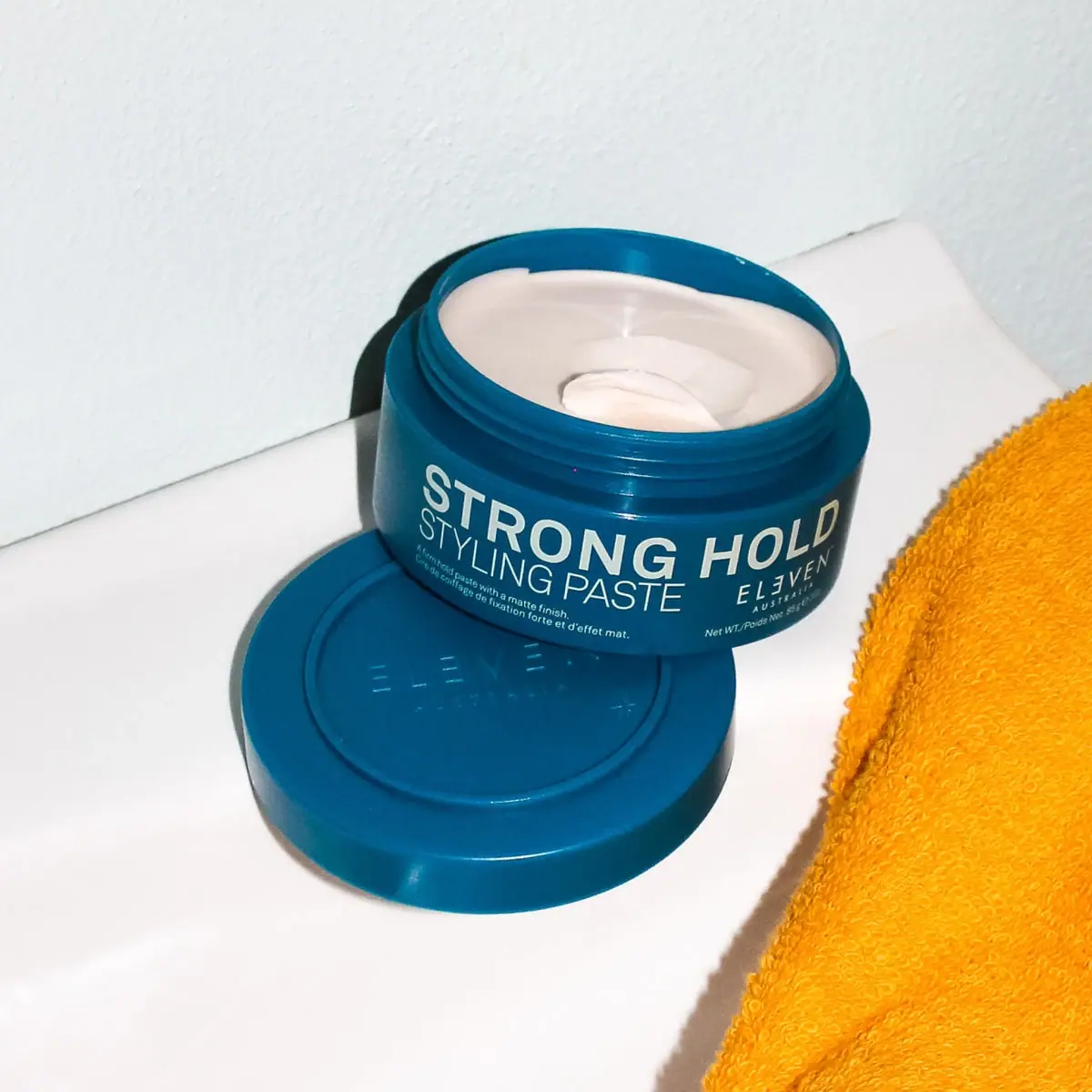
Deep blue open jar with emphatic hold-first typography
Strong Hold Styling Paste puts the performance name ahead of the maker on a low deep-blue jar. Large cream STRONG HOLD capitals run across the front wall, with a thinner STYLING PASTE line beneath and a small ELEVEN Australia signature toward the right. The selected image shows the jar open on its detached matching lid, exposing a pale paste swirl and the threaded neck. Bright direct light reveals the smooth container while a yellow-orange towel supplies an external contrast color. The pack itself stays largely blue and cream.
- Hair
- Light pack
- Bold typographic
- Clinical minimal
About this study
Selected open blue Strong Hold Styling Paste jar and detached lid; official 3 oz context. No complete range or component-material system inferred.
Sources & evidence · Reviewed 2026-10-19Color Palette
Approximate colours interpreted from photography. These are screen references, not official brand colours or print specifications.
Pack body
Deep teal blue
#075D78
Approximate jar and lid color, ranging from bright teal edges to dark blue shadows under the strong directional light.
Ink
Pale cream lettering
#DCDCC9
Shared title, descriptor, maker and supporting copy tone. The visible paste is also pale, but is contents rather than a second printed graphic layer.
Typography
Suggested visual alternatives, not confirmed brand typefaces. Any scale below is an illustrative estimate.
STRONG HOLD is the largest and heaviest reading line, followed immediately by STYLING PASTE in a lighter uppercase sans. The title spans the jar's curved wall, so letters at the edges recede in perspective. A tiny bilingual explanation occupies the lower left, while the small maker mark and quantity sit toward the lower right. The emphasis is practical: hold level and product form lead; maker identification signs the system. This is not a title-case display or a decorative script treatment.
Fonts
Hold and category hierarchy
Inter
- Looks like
- Neutral uppercase grotesque with broad weight range
- Type
- Neo-grotesque sans-serif
- Weight
- Light, Regular, SemiBold
- Case
- Uppercase
- Tracking
- Natural headline spacing; slightly open lighter category
- Fallback
- Arial, sans-serif
Use a firmer weight for an original hold descriptor and a lighter weight for product form. Compare their stroke density at the actual jar height rather than reducing the category to excessively thin lettering.
Fine supporting copy
Roboto
- Looks like
- Compact practical sans
- Type
- Neo-grotesque sans-serif
- Weight
- Regular, Medium
- Case
- Sentence case and small uppercase details
- Tracking
- Natural spacing
- Fallback
- Arial, sans-serif
An alternative for bilingual explanation, quantity and a separate original maker signature. Keep small type distinct from the much larger title without reproducing the source's stylized ELEVEN letter treatment.
Structure & Proportions
Visual proportions and finish previews are illustrative. Confirmed construction details and uncertainties are distinguished in the study notes.
Proportions
| Purpose | Value | Preview |
|---|---|---|
| Broad short reading surface | The jar provides width for a long horizontal title but little vertical depth, favoring tightly organized successive text rows. | — |
| Wide access opening | The open mouth occupies most of the vessel's width, with the blue threaded rim forming a narrow border around the pale contents. | — |
| Lid relationship | The detached lid is broad and shallow, repeating the body's circular footprint. Its apparent size is affected by placement closer to the camera. | — |
| Type-weight division | The hold line is visually dense, while the category line below is thinner and more open; this contrast matters as much as nominal size. | — |
Shapes
| Element | Value | Preview |
|---|---|---|
| Jar body | Low cylindrical body with rounded shoulder transition into a threaded neck. | |
| Open mouth | Broad circular opening seen as an ellipse in the angled photograph. | |
| Detached lid | Shallow round cover with a concentric inset/ridge and faint central maker detail. | |
| Text system | Horizontal rows following the curved jar wall with separate small lower-left and lower-right groups. |
Finishes
Reflective blue components
Jar side, threaded rim and lid edge catch hard highlights; exact finish specification unknown. · gloss
Subtle lid relief
Same-color maker detail on top of the detached lid; precise forming process not verified. · emboss
Formats and materials
| Formats | Low wide styling-paste jar; official US product page identifies the product as 3 oz |
| Materials | Jar and matching lid appear as smooth opaque blue components. Exact resin, recycled content and barrier construction are not specified in the accessed product details., The pale paste is visible through the open mouth, but neither its photographed scoop nor the apparent fill line establishes net weight or a physical consistency measurement. |
| Closures | The lid is detached and lies beneath the jar. Threads are clearly visible around the open neck, supporting a screw-closure reading rather than merely guessing from a closed silhouette. The lid's top has a circular inset or ridge and subtle same-color maker relief. Its underside, liner and seal are not visible, so leak resistance and internal construction remain unknown. |
| Decoration | Large uppercase hold descriptor, Lighter uppercase product-form line, Small bilingual explanation on lower left, Compact maker and net-weight information toward lower right, Subtle same-color maker mark on detached lid |
Front Panel
Schematic reading order. The diagram’s zone heights do not represent measured artwork proportions.
The front uses the jar's width for a large practical message, then organizes smaller information beneath it. Hold and product form sit together on the left-to-middle reading area, while the maker occupies the lower-right region rather than replacing the main title. There is no separate contrasting paper-colored label panel visible. Whether the cream copy is directly printed or carried on a matching transparent/colored label is not established. Curvature limits the amount readable from any one angle, so the photograph should not be treated as a full wrap map.
| Zone | Content |
|---|---|
| Hold descriptor | STRONG HOLD is the dominant cream line and the first product differentiation cue. |
| Product form | STYLING PASTE follows in thin uppercase lettering, explaining the physical styling format without another graphic device. |
| Small explanation | Short English and French lines sit low on the left. The mentioned matte result concerns the styling product's intended finish, not the jar's surface. |
| Maker signature | Compact ELEVEN Australia lettering sits toward the right under the title area, with smaller quantity information below. |
| Lid identity | A subtle same-blue maker detail appears on the lid top, adding a secondary identity surface when the sidewall is not facing the viewer. |
Range System
The official page confirms Strong Hold Styling Paste, but only this blue open jar is visually examined. No complete hold-level color code or universal jar construction is established. An original styling family could use a stable maker position and clear performance-led naming, provided each product remains identifiable in words rather than through color alone.
- Keep hold level and product form distinct so a shopper can distinguish a strong paste from another format with the same hold.
- Retain a small maker signature in a predictable place when performance naming leads.
- For additional jar sizes, adjust the typography to the available circumference instead of forcing a long title into a narrow front view.
Back of Pack & Shelf
The photograph reveals the lid top and threaded neck, but not the reverse wrap, lid underside or jar base. The visible front is not enough to locate complete directions, ingredients or batch information.
- Inspect the reverse and underside before mapping the entire information system.
- Keep net weight separate from volume terminology when transcribing the official 3 oz size.
- Verify the liner and tamper-evident arrangement through an appropriate opened reference rather than the lid's outer appearance.
On shelf
Interpretively, the broad blue-and-cream name can give a low jar useful visibility among taller hair products. The large hold term may be read before the maker, which suits performance-based selection. On a shelf viewed from above, however, the subdued same-color lid identity may be less legible than the front. An independent design should therefore consider both top and side views, and test whether the lighter category line survives smaller display sizes and curved-wall reflections.
Imagery
The open jar is propped above its detached lid against a pale wall and surface. A yellow-orange terry towel enters at right, adding a warm complementary accent and a bathroom context. Hard directional light produces crisp shadows and small bright reflections on the blue container. The pale paste swirl supplies a tactile product cue, but the image does not establish an exact scoop amount or dispensing ritual. The towel's orange is deliberately excluded from the on-pack palette.
Guidelines
Editorial principles for an original design brief, not official brand guidelines.
Do
- Distinguish hold level from product form.
- Use type weight as a hierarchy tool on a shallow jar.
- Study top and side visibility together.
- Describe visible screw threads as evidence while qualifying hidden seals.
- Separate product finish wording from container finish.
Don't
- Do not add the towel's orange to the printed palette.
- Do not describe net-weight ounces as fluid volume.
- Do not claim a specific resin from opaque blue appearance.
- Do not assume text is readable around the entire jar from one angle.
- Do not copy the source maker signature and exact type arrangement.
Sources & evidence
How this study was built
edition · Sourced fact
Official listing identifies Strong Hold Styling Paste in 3 oz format.ELEVEN Australia — Strong Hold Styling Paste 3 ozstructure · Visual observation
Open jar exposes threads and pale contents; detached matching lid lies underneath.ELEVEN Australia — Strong Hold Styling Paste 3 oztypography · Visual observation
Heavy uppercase hold line contrasts with a thinner uppercase category and small lower-right maker.ELEVEN Australia — Strong Hold Styling Paste 3 ozlabel · Visual observation
Small bilingual explanation occupies lower left; subtle same-color maker relief appears on lid top.ELEVEN Australia — Strong Hold Styling Paste 3 ozpalette · Visual observation
Blue and cream define the pack; yellow-orange towel is outside the packaging.ELEVEN Australia — Strong Hold Styling Paste 3 ozimagery · Visual observation
Hard light and open product swirl add tactile context without measuring consistency or dose.ELEVEN Australia — Strong Hold Styling Paste 3 ozrange · Editorial interpretation
Hold-first hierarchy is an adaptable product-selection principle, not a verified whole-brand color system.
What remains unverified
- Exact resin, recycled content and decoration process unknown.
- Lid relief process, liner and seal not established.
- Original typefaces and dimensions unverified.
- Reverse and underside unseen; scoop amount and performance not assessed.
Give your AI
packaging taste
Give your design or image tool a packaging study: palette, type, structure, front panel and principles for an original brief.
Export this styleFree with an email. PACK.md works in Claude, ChatGPT, Cursor and image tools.
More like this

AussieZinc
Sun-yellow numerals on a tall, information-rich white cylinder

BioSeivas
Vertical serif identity on a mauve treatment band
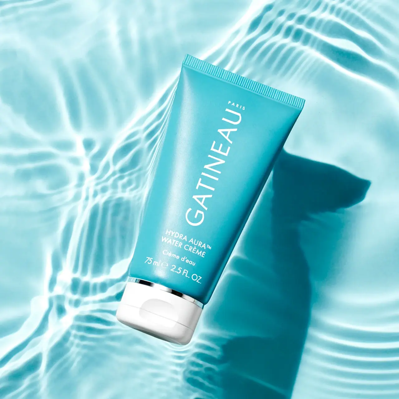
Gatineau
Turquoise tube with lengthwise white name and silver accent

Malin+Goetz
pharmacy label set in bracketed helvetica
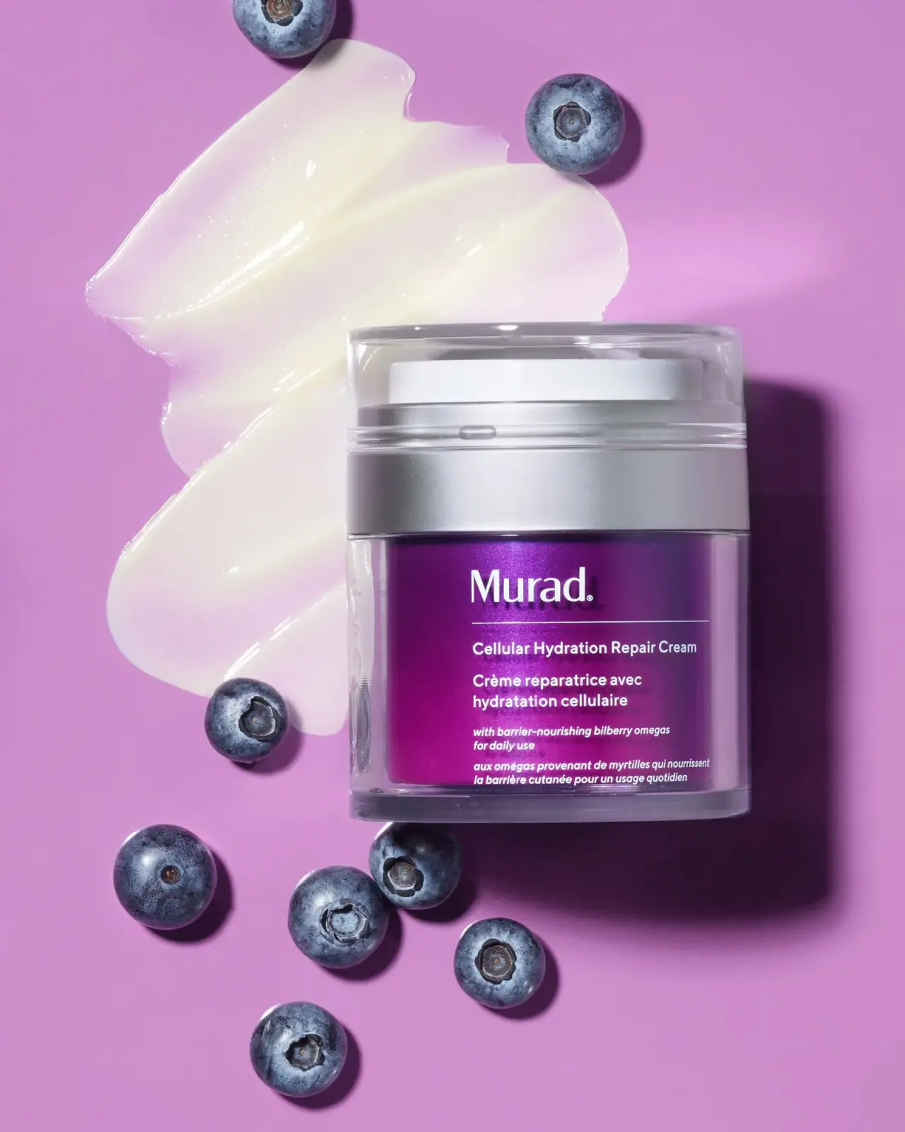
Murad
Purple inner field framed by clear walls and silver

Native
white drugstore bottles, scent-tinted vertical caps
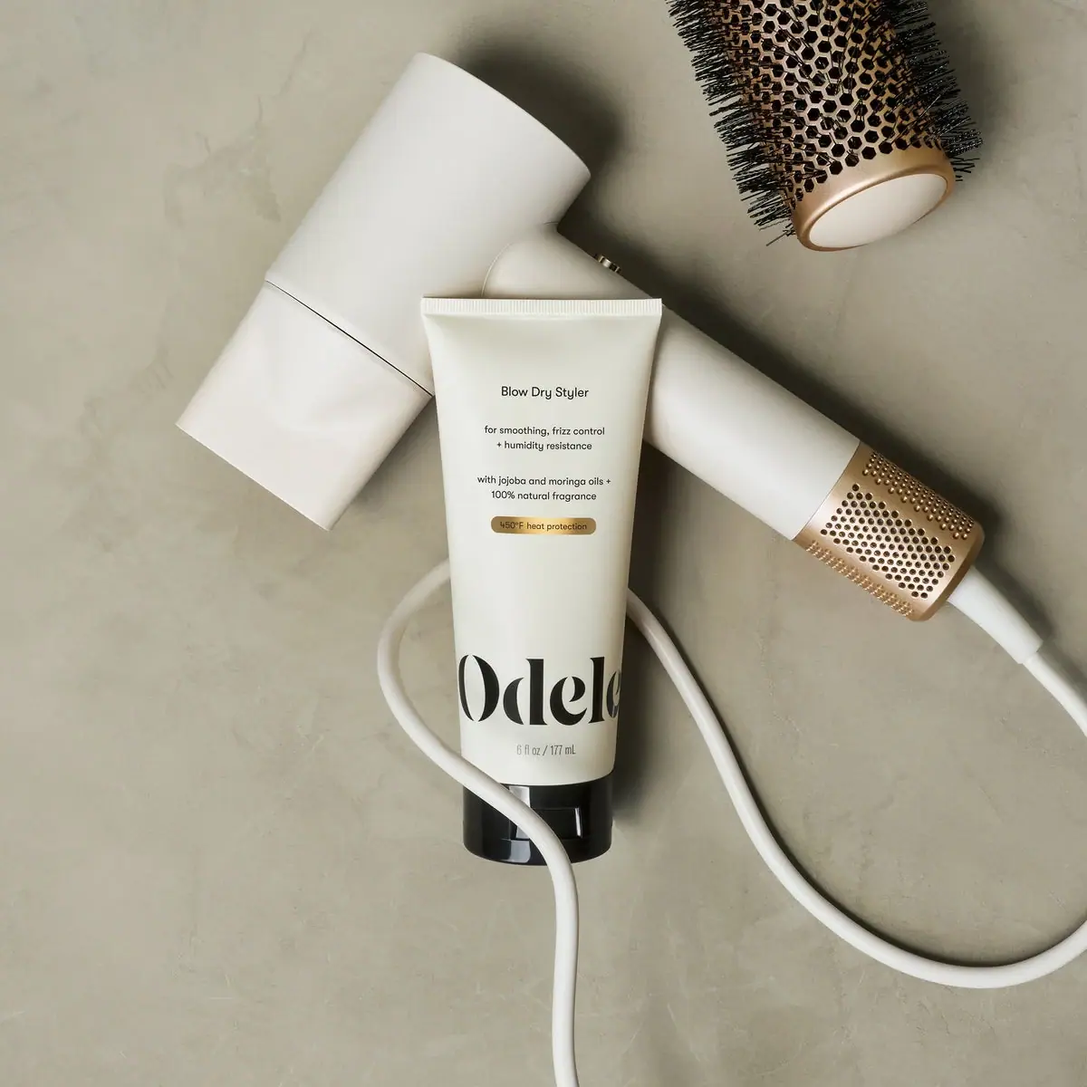
Odele
Cream tube with tiny utility copy and oversized lower serif
Olaplex
Clear compact bottle with golden oil and precise black type