
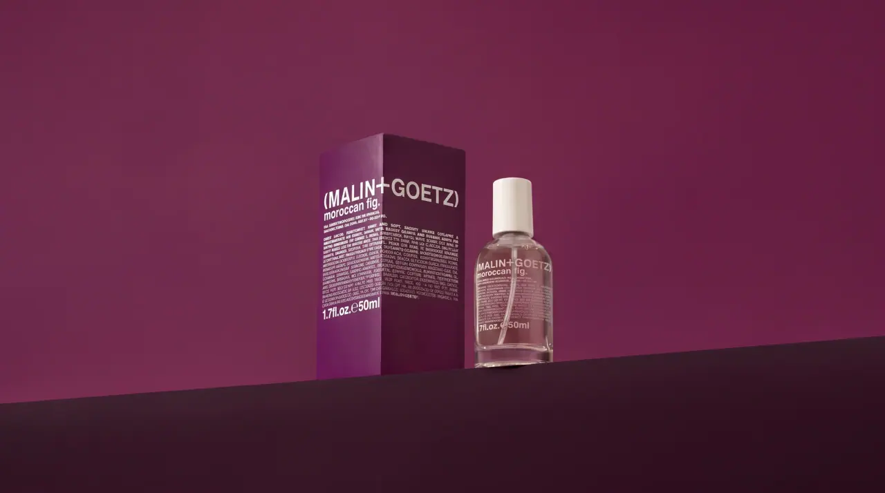
Campaign images © Malin+Goetz, from malinandgoetz.com
Malin+Goetz

pharmacy label set in bracketed helvetica
Malin+Goetz packages grooming and home products like a modern pharmacy: plain white tubes, sticks, pumps and jars (#f2f2f0) carry nothing but a flush-left block of bold condensed grotesque type, printed in one ink. The bracketed wordmark, two names joined by a plus inside parentheses, runs edge to edge at the top of the block; the product name follows in lowercase with a full stop at about half the size, then a dense micro paragraph of bilingual directions, an ingredient code joined by em dashes and a bold volume line using the estimated-sign 'e'. Each product gets one ink colour drawn from its scent or ingredient (olive for eucalyptus, cobalt for chamomile, red for cilantro), and the same type block reverses out in white on coloured cartons and wrappers. On tubes the whole block rotates 90 degrees and reads up the side.
- Body & bath
- Skincare
- Light pack
- Clinical minimal
- Bold typographic
- Colour-coded range
Color Palette
Approximate colours interpreted from photography. These are screen references, not official brand colours or print specifications.
Pack body
Dispensary White
#f2f2f0
Tubes, sticks, pump bottles and jar lids; the default ground of nearly every pack
Ink
Eucalyptus Olive
#6b6a3a
Whole type block on eucalyptus and bergamot products
Gel Olive
#9a9a2a
Lighter olive type block on the eucalyptus body gel tube
Chemist Cobalt
#1f22a8
Type block on shave cream and sulfur products; also the round 'new.' badge
Cilantro Red
#c8202a
Type block on the cilantro hair conditioner
Reverse White
#ffffff
Type block reversed out of coloured cartons and wrappers
Range coding
Strawberry Rose
#c96d72
Vitamin B5 bar wrapper and strawberry products, type reversed in white
Otto Pink
#e8aed6
Otto home-spray carton with white type
Leather Orange
#d0681e
Leather candle carton with white type
Candle Aqua
#6fd1c9
Tinted glass of the collaboration leather candle, with black type
Sage Green
#6b9f86
Sage home-spray carton and bottle
Typography
Suggested visual alternatives, not confirmed brand typefaces. Any scale below is an illustrative estimate.
The bracketed wordmark is the largest element and runs edge to edge at the top of the type block; the lowercase product name with its full stop sits directly under it at about half the size, followed by a dense micro paragraph and finally a bold volume line. On tubes the whole block rotates 90 degrees and reads up the side; on sticks and bottles it stays horizontal.
Type scale
Estimated cap size as a share of the panel · Front of the 73 g deodorant stick, about 110 mm tall
wordmark
7% · Bold · Display
(CEDAR+MOSS)
tube-wordmark
9% · Bold · Display
(CEDAR+MOSS)
product-name
3.6% · Bold · Headline
vetiver deodorant.
volume
3% · Bold · Numeral
2.6oz.e73g
french-name
1.6% · Bold · Body
DÉODORANT AU VÉTIVER
code-line
1.4% · Bold · Body
10% VETIVER LEAF OIL—VT-204-72.
Fonts
Display
Archivo Narrow
- Looks like
- Helvetica Neue Bold Condensed, Neue Haas Grotesk Bold
- Type
- Bold condensed neo-grotesque
- Weight
- Bold
- Case
- Uppercase
- Tracking
- Tight, about -1%
- Fallback
- Helvetica Condensed Bold, Arial Narrow Bold
The wordmark, two names joined by a plus inside parentheses, at the full width of the type block.
Headline
Archivo
- Looks like
- Helvetica Neue Bold
- Type
- Bold neo-grotesque
- Weight
- Bold
- Case
- Lowercase ending with a full stop
- Tracking
- Tight, about -1%
- Fallback
- Helvetica Bold, Arial Bold
Ingredient plus product type, e.g. a scent then 'deodorant.', under the wordmark.
Body
Roboto Condensed
- Looks like
- Helvetica Neue Medium Condensed
- Type
- Condensed grotesque at micro size
- Weight
- Regular, Bold
- Case
- Uppercase
- Tracking
- Normal, set solid
- Fallback
- Arial Narrow
French name, active percentage and product code joined by em dashes, then a dense justified paragraph of directions and cautions in two languages.
Numeral
Archivo
- Looks like
- Helvetica Neue Bold
- Type
- Bold neo-grotesque figures
- Weight
- Bold
- Case
- Lowercase units
- Tracking
- Tight
- Fallback
- Helvetica Bold
Volume line closing the block: fl.oz, the estimated sign 'e' and the metric quantity.
Structure & Proportions
Proportions
| Purpose | Value | Preview |
|---|---|---|
| Type block width | About 90% of the front width, flush left | |
| Wordmark width | Full block width, edge to edge | |
| Type block height | About 45% of front height on sticks and bottles | |
| Left margin | About 5% of front width | |
| White space | About 50% of the front left white, mostly above and below the block | |
| Colours per pack | Two: white body and one ink (or one board colour and white type) | — |
| Density | Very dense type block on an otherwise empty pack | — |
Shapes
| Element | Value | Preview |
|---|---|---|
| Type block | Flush-left rectangle of text, no frame | |
| New badge | Solid cobalt circle with lowercase 'new.' | |
| Tube | Tall white crimped tube with flip cap | |
| Pump | White lotion pump | |
| Jar lid | White domed screw lid |
Finishes
Matte white plastic
Tubes, sticks, pumps and lids · matte
Clear and tinted glass
Jars, perfume oil and candle vessels · transparent
Uncoated coloured board
Candle and home-spray cartons · uncoated
Debossed wordmark
Bar soap · emboss
Formats and materials
| Formats | Squeeze tube, Deodorant stick, Pump bottle, Jar, Spray bottle, Candle vessel, Bar wrapper, Perfume flacon |
| Materials | White plastic, Clear glass, Tinted glass, Paperboard, Paper wrapper, Flexible film |
| Closures | White flip and screw caps, white pump heads, white cylindrical spray caps, white domed jar lids |
| Decoration | Direct single-colour screen print, Reversed-out white type on colour, No graphics or imagery |
Front Panel
Schematic reading order. The diagram’s zone heights do not represent measured artwork proportions.
A single flush-left type block printed straight onto a white pack, rotated vertically on tubes and horizontal on bottles and sticks; no frame or panel.
| Zone | Content |
|---|---|
| Top line | Bracketed wordmark at full block width |
| Second line | Lowercase product name with full stop |
| Middle | French name, active percentage, product code, then dense bilingual directions |
| Bottom | Bold volume line in fl.oz and metric with the estimated sign |
Range System
One ink colour per product chosen from its ingredient or scent, on a constant white body and an identical type block; secondary packs flip to a solid coloured board with white type.
- Eucalyptus = olive ink
- Chamomile shave cream = cobalt ink
- Cilantro conditioner = red ink
- Strawberry bar = rose wrapper, white type
- Otto home spray = pink carton
- Leather candle = orange carton + aqua glass
Back of Pack & Shelf
The back repeats the type block in the same ink and adds the full ingredient list, maker and address lines, barcode and recycling marks, all in the same condensed grotesque at micro size, so the pack reads as continuous text all the way round.
- Full INCI ingredient list in uppercase micro type
- Directions and cautions in English and French
- Product code and batch number
- Maker name, city address and website
- Barcode printed in the product ink
- Recycling marks and period-after-opening symbol
On shelf
On shelf the range reads as a white pharmacy wall of dense text blocks whose single ink colour sorts products, and the bracketed wordmark at full width makes every pack recognisable at a glance.
Imagery
None; the type block is the entire graphic system, with only a debossed wordmark on bar soap and a round 'new.' badge.
Guidelines
Do
- Print one flush-left type block on a white body (#f2f2f0), nothing else.
- Run the bracketed wordmark at the full width of the block, about 90% of the front.
- Set the product name in bold lowercase with a full stop directly under the wordmark.
- Fill the middle with a dense justified micro paragraph of bilingual directions and a product code.
- Close every block with a bold volume line using the estimated sign 'e'.
- Choose one ink per product from its scent or ingredient, and reverse to white on coloured cartons.
Don't
- Don't add illustrations, photos, icons or frames.
- Don't centre the type block.
- Don't use more than one ink on a pack.
- Don't set the product name in capitals or without its full stop.
- Don't use serif or script faces.
- Don't use tinted or coloured plastic bodies for skincare; colour is in the ink.
Give your AI
packaging taste
Give your design or image tool a packaging study: palette, type, structure, front panel and principles for an original brief.
Export this styleFree with an email. PACK.md works in Claude, ChatGPT, Cursor and image tools.
More like this

Native
white drugstore bottles, scent-tinted vertical caps

AKT
Lilac stage directions with a quiet metallic detail

AussieZinc
Sun-yellow numerals on a tall, information-rich white cylinder

BioSeivas
Vertical serif identity on a mauve treatment band
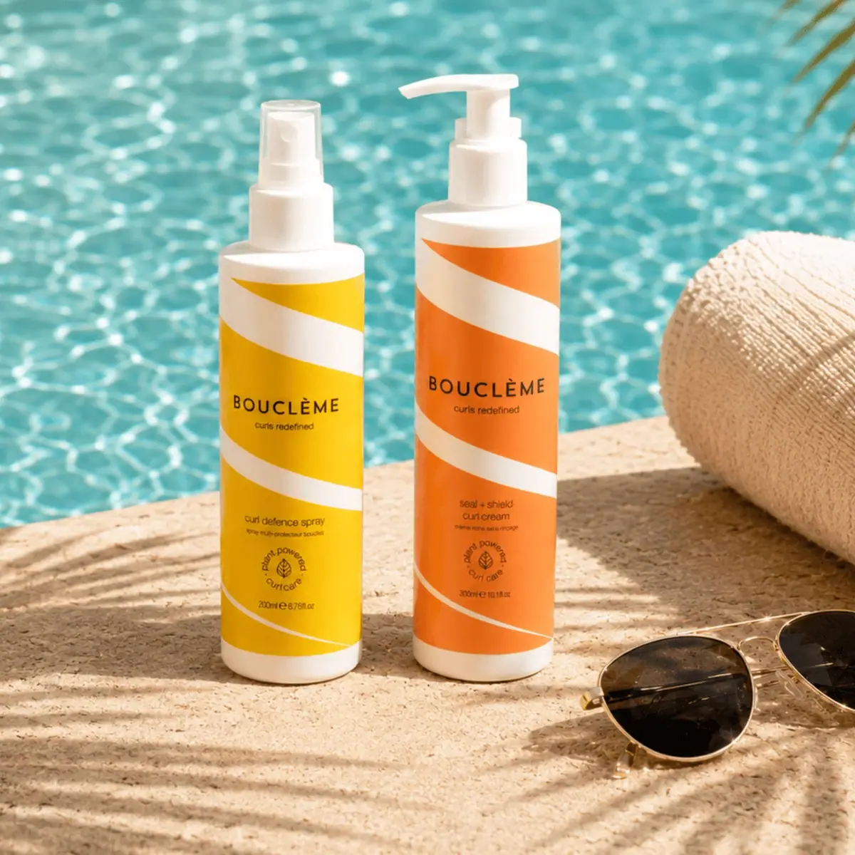
Bouclème
warm colour blocks crossed by flowing white ribbons

Byoma
candy-coloured barrier science on a shelf
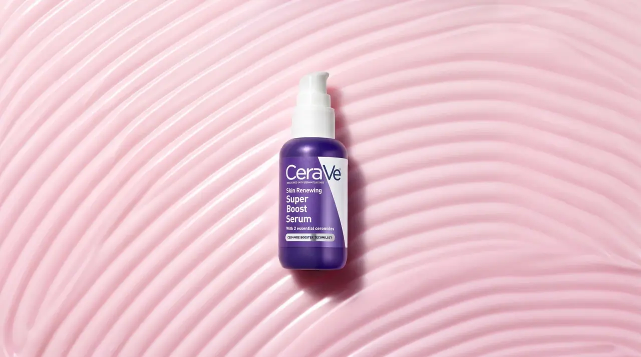
CeraVe
white pump bottles split by a coloured diagonal
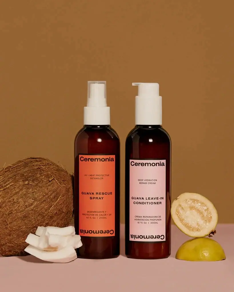
Ceremonia
Warm colour labels bounded by upright and inverted wordmarks