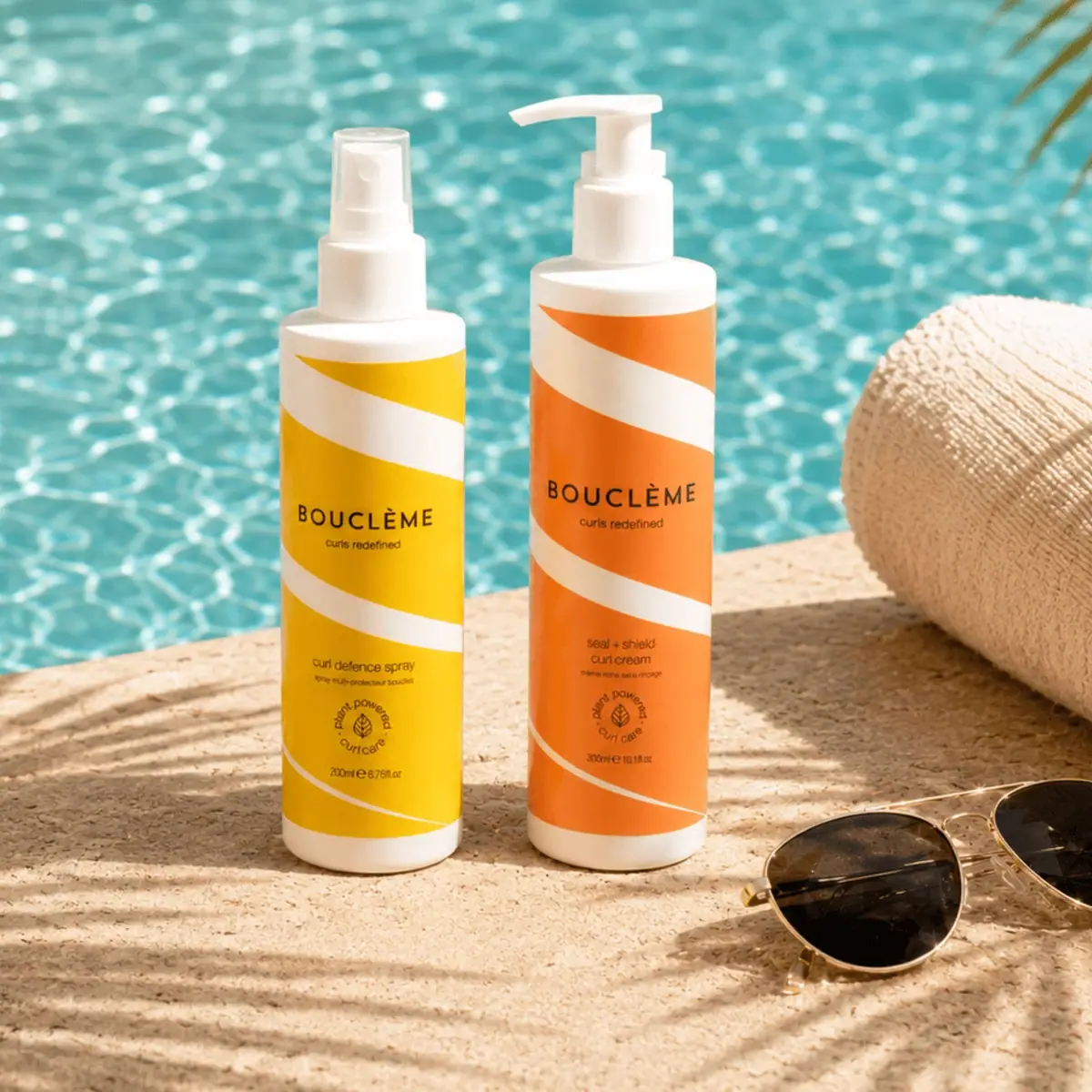
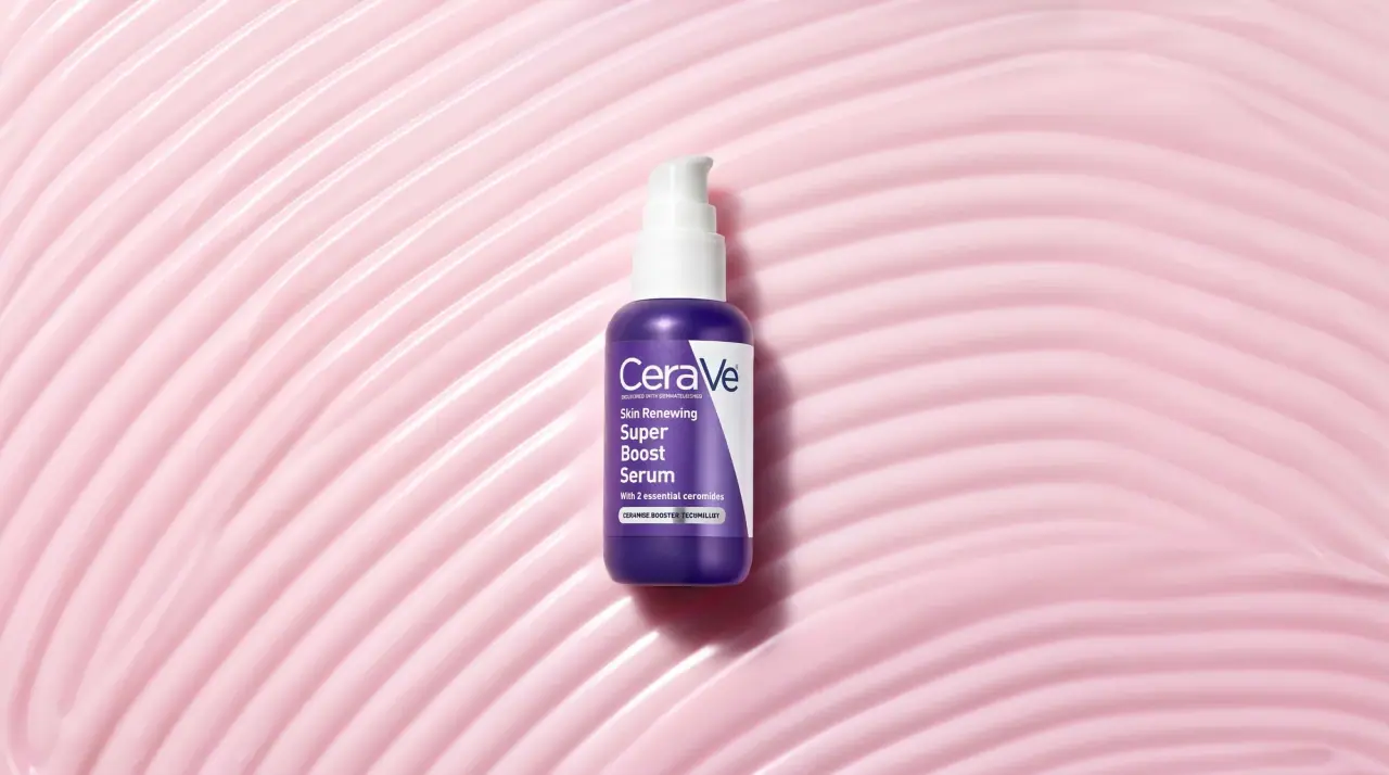
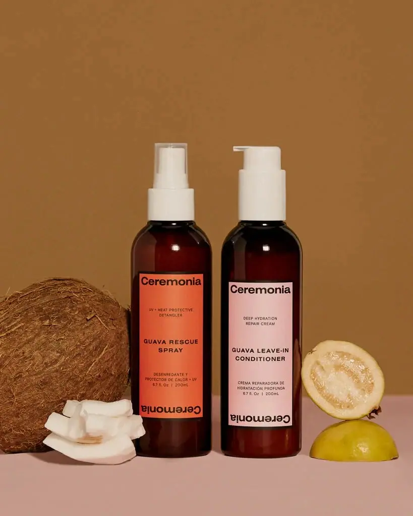
white drugstore bottles, scent-tinted vertical caps
Native keeps every pack plain matte white and lets one ink colour do the work: the wordmark runs vertically in tall condensed capitals down the centre of the bottle, stick or can, printed in a colour that belongs to the scent. Coconut & Vanilla is a warm brown (#8a4e33), Citrus & Herbal Musk a bright orange, Sea Salt & Cedar a deep blue, and the same colour reappears in the small spaced scent name at the top, the 'free from' list and a small boxed product type below. Formats change (pump bottle, flip-cap bottle, stick, spray can, jar, clear hand-soap bottle) but the white field and centred vertical mark stay fixed; the scrub jar and hand soap carry the scent colour on a lid, collar or vertical band.
Approximate colours interpreted from photography. These are screen references, not official brand colours or print specifications.
Pack body
Pump White
#f6f6f4
Opaque white bottles, sticks, cans, caps and pumps across the range
Clear Soap
#e7e8e6
Transparent bottle used for hand soap, with a printed colour band on one side
Ink
Fine Print Tan
#b08a76
Lighter tint of the scent colour for 'free from' lists and small claims
Reverse White
#ffffff
Product type reversed out of the scent-colour box and type on the jar lid
Range coding
Coconut Brown
#8a4e33
All ink plus the jar lid, pump collar and soap band for Coconut & Vanilla
Citrus Orange
#e8582f
All ink for Citrus & Herbal Musk hair care
Sea Salt Blue
#24577f
All ink for Sea Salt & Cedar deodorant spray and stick
Cucumber Lime
#b4bd5a
Light green ink on a limited whole-body deodorant spray
Typography
Suggested visual alternatives, not confirmed brand typefaces. Any scale below is an illustrative estimate.
The brand name is set huge and rotated 90 degrees down the centre of the front, the only big element. Above it sit the scent name in small spaced capitals and a 'free from' list; below it a small reversed or outlined box holds the product type, then claims and net contents at the base.
Type scale
Estimated cap size as a share of the panel · Front of the 16.5 fl oz pump bottle body, about 180 mm tall (excluding pump)
jar-wordmark
14% · Medium · Display
PLAIN
vertical-wordmark
9% · Medium · Display
PLAIN
category-tag
2.5% · Medium · Label
HAIR CARE
scent-name
1.8% · SemiBold · Label
FIG & AMBER
product-box
1.7% · SemiBold · Label
MOISTURIZING LOTION
free-from
1.3% · Book · Label
SULFATE FREE • DYE FREE
Fonts
Display
Antonio
Looks like
Futura Medium Condensed, Brandon Grotesque
Type
Condensed geometric sans, medium weight
Weight
Medium, SemiBold
Case
Uppercase
Tracking
Slightly open, about +3%
Fallback
Futura Condensed, Arial Narrow
Wordmark only, rotated vertically and centred in the scent colour; horizontal on the wide scrub jar.
Label
Jost
Looks like
Futura Bold, Gotham Bold
Type
Geometric sans
Weight
SemiBold, Medium, Book
Case
Uppercase
Tracking
Wide, about +15% for scent names
Fallback
Futura, Gotham, Arial
Spaced scent name at the top, boxed product type, 'free from' lists, claims and net contents.
Structure & Proportions
Proportions
Purpose
Value
Preview
Wordmark length
About 40% of bottle body height, centred vertically
Wordmark cap height
About 18% of bottle width
Print coverage
About 15% of the front; the rest is white
Top margin
About 10% of body height above the scent name
Soap band
About 20% of the clear bottle width, left edge
Colours per pack
One ink plus its lighter tint on white
—
Density
Very sparse: small text top and bottom, one tall word in the middle
HDPE plastic, Glass jar, Aluminium aerosol, Clear PET
Closures
White pumps and flip caps; a scent-colour screw lid on the scrub jar; a scent-colour collar under the hand-soap pump
Decoration
Direct-print single-colour ink, Reversed text box, Outlined text box, Vertical colour band on clear bottle
Front Panel
Schematic reading order. The diagram’s zone heights do not represent measured artwork proportions.
Top
Centre
Lower
Base
Direct print on a white body with a strict centred stack: small text top, giant rotated wordmark middle, small boxed name and contents bottom.
Zone
Content
Top
Scent name, free-from list
Centre
Vertical brand name in the scent colour, optional category tag
Lower
Boxed product type (reversed or outlined), short benefit claim
Base
Net contents
Range System
One colour per scent, used for all ink on the pack and for the lid, collar or band where there is one; the white body, centred vertical mark and layout never change across categories.
Coconut & Vanilla = brown ink + brown jar lid + brown soap band
Citrus & Herbal Musk = orange ink
Sea Salt & Cedar = blue ink
Hair care = same layout with a 'HAIR CARE' tag after the wordmark
Body care = reversed product box; hair care = outlined product box
Back of Pack & Shelf
The back is white with the same single ink: a short friendly paragraph, directions, ingredient list and legal in small caps-heavy text, left aligned.
Short paragraph about the scent and the product
Directions in one or two lines
Ingredient list with plain-language notes
Free-from list repeated
Barcode, recycling marks and distributor address
On shelf
On a drugstore shelf the white packs form one clean band and the vertical colour words act like spines, so each scent reads as a coloured stripe across categories.
Imagery
None: no illustration, photography or icons on the main face beyond a tiny spray-protection roundel; the pack is pure typography on white.
Guidelines
Do
Keep every body plain matte white (#f6f6f4) and print in one scent colour only.
Rotate the wordmark 90 degrees and centre it at about 40% of body height.
Assign each scent one ink colour and reuse it on lids, collars and bands.
Box the product type in a small rectangle, reversed for body care and outlined for hair care.
Put the scent name small and letterspaced at the top.
Use a clear bottle only for hand soap, with a solid colour band carrying the vertical wordmark.
Don't
Don't add photos of ingredients or illustrations.
Don't use more than one ink colour (plus its tint) on a pack.
Don't run the wordmark horizontally on tall formats.
Don't use coloured or tinted plastic for the main body.
Don't vary the type stack between product categories.
Give your AI packaging taste
Give your design or image tool a packaging study: palette, type, structure, front panel and principles for an original brief.