Photography: Halves Studio portfolio photography. Images belong to their respective owners.
Olaplex

Clear compact bottle with golden oil and precise black type
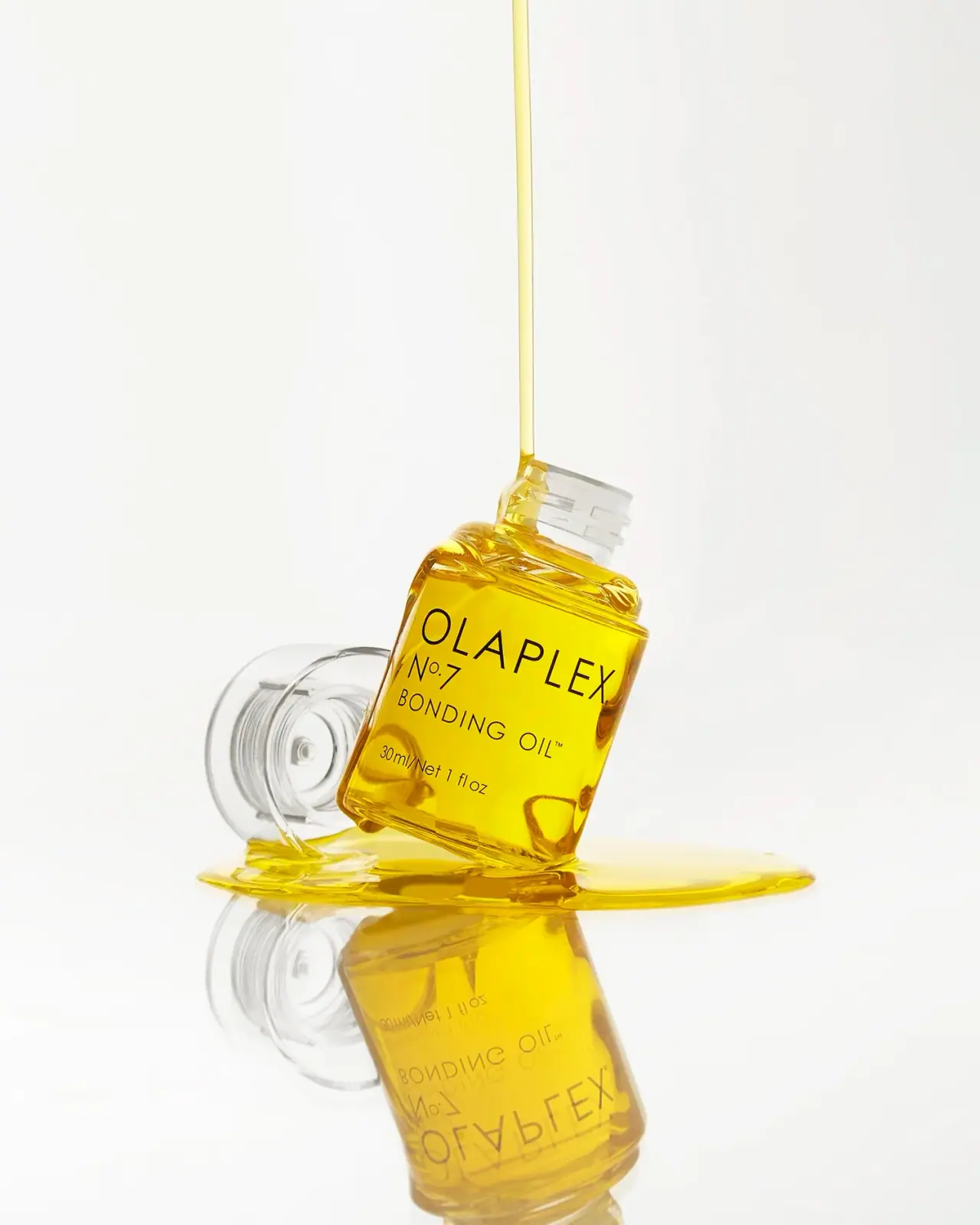
The selected No.7 Bonding Oil bottle is small, transparent and broadly rectangular, with softened corners and a clear cylindrical closure placed beside it. Golden-yellow contents supply nearly all of the color. Sparse black lettering sits directly over that visible field: a broad producer name, product number, functional name and small quantity line. The open neck and external oil stream make the photograph tactile, but the scene is a stylized still life rather than a demonstration of the brand’s prescribed inverted tapping gesture. This study concerns the photographed 30 ml edition.
- Hair
- Light pack
- Clinical minimal
- Bold typographic
About this study
Selected 30 ml open-bottle still life; larger oil and oil-mist formats remain separate.
Sources & evidence · Reviewed 2026-10-19Color Palette
Approximate colours interpreted from photography. These are screen references, not official brand colours or print specifications.
Pack body
Golden oil appearance
#E7C20B
Visible contents and external liquid styling, not a yellow printed bottle coating. The shade varies with light path and liquid depth.
Clear edge highlight
#E9E9DF
Representative light reflection on transparent bottle and cap; not an opaque white structural color.
Ink
Restrained black
#191712
All readable front wording, providing a simple high-contrast information layer over the golden contents.
Typography
Suggested visual alternatives, not confirmed brand typefaces. Any scale below is an illustrative estimate.
The broad uppercase producer name dominates the upper front. No.7 sits beneath toward the left, followed by the Bonding Oil line. The amount is lower and smaller. This is an open stack with a shared left origin for supporting lines, not a dense centered paragraph or a large number badge.
Fonts
Producer and product descriptor
Jost
- Looks like
- Open geometric sans-serif
- Type
- Geometric sans-serif
- Weight
- Light 300 / Regular 400
- Case
- Uppercase
- Tracking
- Open, especially for the producer; avoid thinning strokes until they disappear over highlights.
- Fallback
- Arial, sans-serif
An original wide producer name with a smaller category line beneath. Keep the identity within the flatter central face rather than wrapping its final letters onto strong corner reflections.
Number and quantity
Roboto
- Looks like
- Clear restrained functional sans
- Type
- Grotesque sans-serif
- Weight
- Light 300 / Regular 400
- Case
- Mixed case for units; uppercase-style numbered identifier
- Tracking
- Neutral to slightly open, with careful spacing around the number and units.
- Fallback
- Arial, sans-serif
A compact identifier and independently readable amount. Preserve the distinction between product number and quantity, and do not interpret the number as a required seven-step regimen without evidence.
Structure & Proportions
Visual proportions and finish previews are illustrative. Confirmed construction details and uncertainties are distinguished in the study notes.
Proportions
| Purpose | Value | Preview |
|---|---|---|
| Compact front face | The body is broader relative to height than a conventional tall serum bottle, leaving enough width for a short producer line. The tilted pose prevents reliable measurement. | — |
| Typography coverage | The producer spans much of the usable face width, while the number and amount occupy shorter lines with open space to their right. | — |
| Closure distinction | The clear cylindrical cap is narrower than the broad rectangular body. Its detached position makes its circular section more obvious than in a closed packshot. | — |
Shapes
| Element | Value | Preview |
|---|---|---|
| Rounded rectangle | Broad flat-looking front with rounded edges that refract the golden contents. | |
| Threaded neck | Short circular neck with visible exterior thread ridges. | |
| Detached cap | Transparent cylindrical closure shown sideways; exact insert and liner details remain unverified. |
Finishes
Transparent body and closure
Bottle and detached cap; exact materials unverified · transparent
Reflective liquid surface
Contents and external photographic oil pool · gloss
Formats and materials
| Formats | Compact clear bottle with a broad rectangular front, rounded shoulders and softened corners. Its visible face reads 30 ml / Net 1 fl oz., The detached transparent cylindrical cap is shown on its side, exposing its internal circular geometry. No outer carton is present in the approved image. |
| Materials | Bottle and cap are visibly transparent. Their exact polymer or glass specification was not established from the consulted product page., The golden color is supplied by liquid in and around the bottle; transparency does not establish an uncolored substrate specification or a particular recycled-content claim. |
| Closures | External neck threads are visible, consistent with a screw-on closure. The official directions say to remove the cap, invert the bottle and tap its base to release a metered drop. The image does not reveal enough of the internal dispensing insert to specify its construction or flow calibration. |
| Decoration | Four sparse levels of black front information preserve a broad view of the oil., There is no illustrated botanical ingredient, bright range stripe or oversized badge on the photographed face., The number appears as part of the typographic system rather than a separate colored component. |
Front Panel
Schematic reading order. The diagram’s zone heights do not represent measured artwork proportions.
Use a sparse upper-to-lower sequence with an aligned starting edge for the supporting text. Leave the golden field exposed rather than surrounding each information tier with rules or boxes. The bottle’s rectangular face supplies the alignment framework that a separate label border would otherwise provide.
| Zone | Content |
|---|---|
| Upper identity | Wide OLAPLEX uppercase name in light-looking black sans-serif. |
| Product identifier | No.7 below the producer toward the left; distinct from the volume line. |
| Functional name | Bonding Oil in a smaller open uppercase line. |
| Quantity | 30 ml / Net 1 fl oz low on the face, separated from the product name by a modest interval. |
Range System
The official page offers 30 ml and 60 ml oil sizes and separately compares a newer oil mist. This study retains the selected 30 ml bottle. A number is a useful product identifier, but it should not replace the exact category or be treated as proof that all numbered products use the same dispensing mechanism.
- Keep number, function and amount as separate information fields across any proposed size family.
- Do not illustrate the oil-mist format with this metered-drop bottle merely because both use a related number.
- Retain transparency only where the actual formula and container specification make it appropriate; do not universalize the selected oil’s golden color.
Back of Pack & Shelf
The reverse label and base markings are not readable. The open neck is visible, but it does not show a complete exploded dispensing assembly or guarantee a refill pathway.
- For an original concept, provide clear cap-removal and dosing instructions separately from the front identity.
- Reserve space for full ingredient information and traceability without making the front oil view artificially crowded.
- Verify container material and disposal instructions before adding recycling marks.
On shelf
A small clear bottle can become visually lost in a pale catalogue grid; here the yellow contents and broad black identity maintain a recognizable center. The number supplies a secondary recognition cue, while the functional name prevents it from becoming an unexplained code. Clear edges need controlled light to remain visible. These are visual observations, not measured shelf-performance results or evidence of product efficacy.
Imagery
The Halves Studio photograph tilts the open bottle over a glossy pale surface, places the clear closure behind it and introduces a thin stream of golden liquid from above. A pool and mirror reflection amplify the oil’s color and viscosity impression. This is not the same action as the official inverted bottle-and-tap directions: no dispensing hand is shown, and the bottle is not inverted. The distinction matters when converting an expressive campaign image into factual use instructions.
Guidelines
Editorial principles for an original design brief, not official brand guidelines.
Do
- Align the short supporting lines deliberately within the broad front face.
- Identify the product number separately from its function and nominal contents.
- Use lighting that defines clear cap and bottle edges without erasing black text.
- Distinguish a dramatic external oil stream from verified dosing instructions.
Don't
- Do not call the clear bottle glass or a specific polymer without supporting specifications.
- Do not describe the contents color as an opaque yellow label or molded body color.
- Do not replace the photographed 30 ml edition with the current larger size or oil mist.
- Do not assume visible threads mean the package is designed for consumer refilling.
Sources & evidence
- OLAPLEX — No.7 Bonding Oilproduct
How this study was built
structure · Sourced fact
Official directions specify uncapping, inversion and base tapping for a metered drop.OLAPLEX — No.7 Bonding Oiledition · Sourced fact
Official source lists 30 ml and 60 ml; image reads 30 ml.OLAPLEX — No.7 Bonding Oilpalette · Visual observation
Golden contents, clear edges and black text; pale background not a white bottle color.typography · Visual observation
Open sans producer with left-starting shorter support lines.label · Visual observation
Number, function and quantity separated in a sparse stack.imagery · Visual observation
Stream arrives from above beside an angled non-inverted bottle; not a literal prescribed-use demonstration.range · Sourced fact
Current product page distinguishes the oil from an oil-mist format.OLAPLEX — No.7 Bonding Oil
What remains unverified
- Exact bottle and cap substrates unverified.
- Clear-label versus direct-print method unknown.
- Internal dispensing insert and reverse markings not resolved.
- Original fonts unknown; colors and proportions approximate.
Give your AI
packaging taste
Give your design or image tool a packaging study: palette, type, structure, front panel and principles for an original brief.
Export this styleFree with an email. PACK.md works in Claude, ChatGPT, Cursor and image tools.
More like this

AussieZinc
Sun-yellow numerals on a tall, information-rich white cylinder

BioSeivas
Vertical serif identity on a mauve treatment band
ELEVEN Australia
Deep blue open jar with emphatic hold-first typography
Gatineau
Turquoise tube with lengthwise white name and silver accent

Malin+Goetz
pharmacy label set in bracketed helvetica
Murad
Purple inner field framed by clear walls and silver

Native
white drugstore bottles, scent-tinted vertical caps
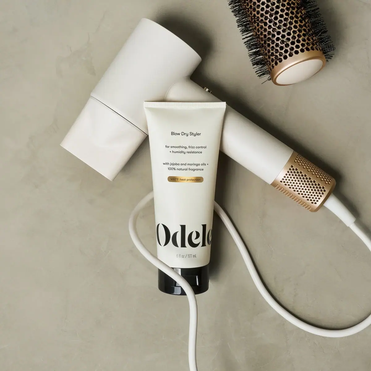
Odele
Cream tube with tiny utility copy and oversized lower serif