Photography: Lucas Zarebinski — product photography. Images belong to their respective owners.
Murad

Purple inner field framed by clear walls and silver
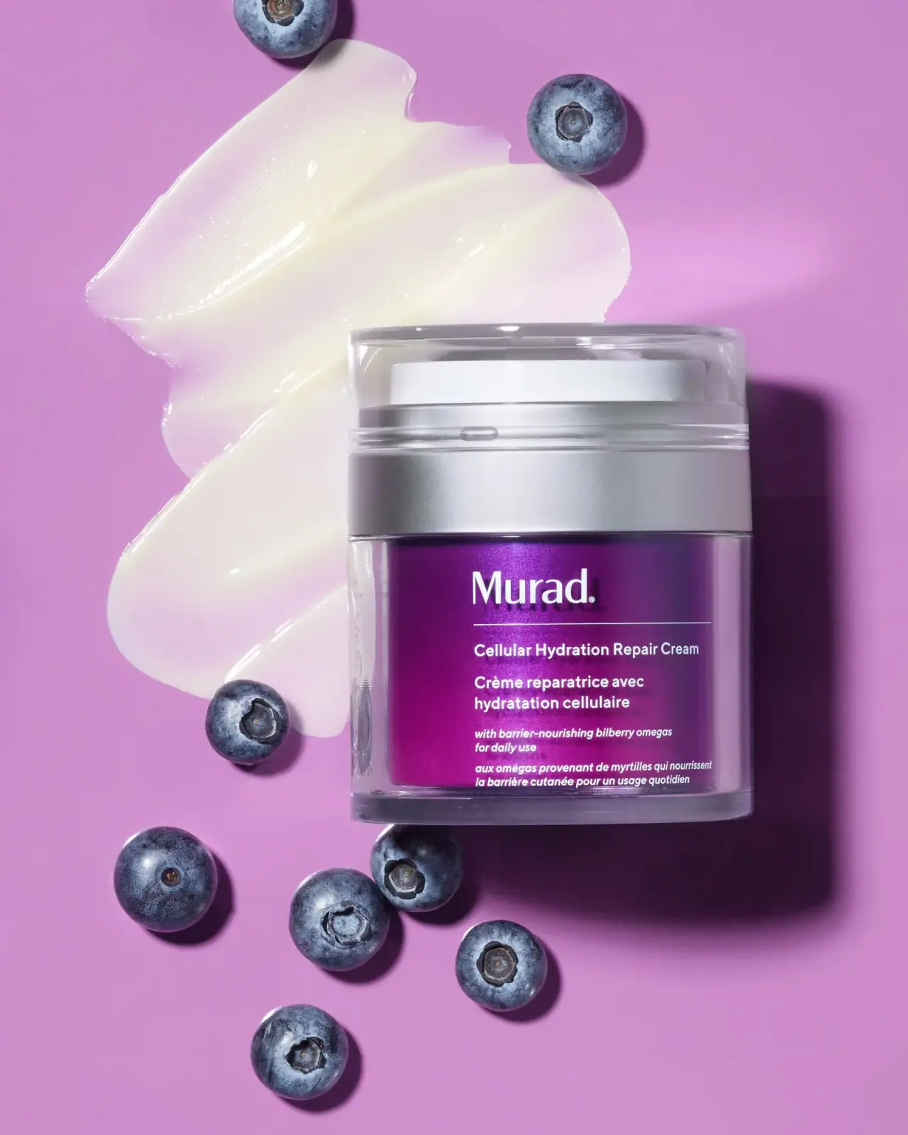
The selected Murad jar presents a vivid purple inner field through a clear outer body, topped by a broad silver-looking collar and transparent cover. White left-aligned type gives the coloured face a compact clinical hierarchy: maker, rule, English and French product names, then smaller italic supporting wording. The photograph reads Cellular Hydration Repair Cream, while the current official listing adds Barrier to the name. That difference is preserved as an edition boundary. A cream swipe and loose blue berries extend the purple colour story into the scene without becoming package decoration.
- Skincare
- Light pack
- Clinical minimal
- Bold typographic
About this study
Selected photographed label omits Barrier from the product name. Current official title and capacity are contextual facts, not specifications assigned to the photographed edition.
Sources & evidence · Reviewed 2026-10-19Color Palette
Approximate colours interpreted from photography. These are screen references, not official brand colours or print specifications.
Pack body
Vivid purple inner field
#86208B
Approximate central coloured region seen through the clear outer body. Highlights and the surrounding pink set shift its appearance; this is not a production colour specification.
Silver-looking collar
#B8B8BC
Approximate broad upper band, with reflected light varying across its curved face. Material and metallisation method are unverified.
Ink
White information
#F5F4F1
Maker, divider and bilingual copy. The white upper internal element is a separate physical surface, not necessarily the same colour specification.
Typography
Suggested visual alternatives, not confirmed brand typefaces. Any scale below is an illustrative estimate.
The mixed-case Murad wordmark sits at the upper left of the purple front, with a thin horizontal rule extending beneath it. The English product name follows on one compact line in the photograph; the French translation wraps beneath it. Smaller italic English and French supporting statements form a second pair near the base. The maker is substantially larger, but the body copy is not reduced to an indistinct decorative texture: its consistent left edge makes the sequence understandable. Different line lengths arise from the two languages rather than being forced into symmetrical centred blocks.
Fonts
Original maker alternative
Lato
- Looks like
- Clear restrained sans serif
- Type
- Humanist sans serif
- Weight
- Regular, Bold
- Case
- Mixed case
- Tracking
- Normal
- Fallback
- Arial, sans-serif
Create a distinct short maker with a calm mixed-case rhythm. Keep its identity independent from Murad and do not imitate the precise letter spacing or proportions of the registered mark.
Bilingual information alternative
Open Sans
- Looks like
- Compact readable sans with italic
- Type
- Humanist sans serif
- Weight
- Regular, SemiBold
- Case
- Sentence case
- Tracking
- Normal
- Fallback
- Arial, sans-serif
Build separate English and French blocks with consistent alignment. Use a real italic style only for supporting information, and preserve enough size for the longer translation instead of shrinking it to match the shorter line.
Structure & Proportions
Visual proportions and finish previews are illustrative. Confirmed construction details and uncertainties are distinguished in the study notes.
Proportions
| Purpose | Value | Preview |
|---|---|---|
| Layered silhouette | The clear top and silver collar form a substantial upper assembly above the longer purple information region. Their horizontal boundaries remain distinct even without reading text. | — |
| Transparent border | The coloured inner field leaves visible clear margins along the sides and a deeper clear-looking lower edge, giving the purple face a framed appearance. | — |
| Shared text alignment | Maker, divider and bilingual copy begin along a common leftward axis, while their right edges vary with language and line length. | — |
Shapes
| Element | Value | Preview |
|---|---|---|
| Outer body | Short cylindrical vessel with clear curved wall and softened base. | |
| Upper cover | Transparent shallow cylindrical cover over a visible white circular element. | |
| Silver collar | Broad horizontal reflective band separating upper assembly and purple body. | |
| Information field | Purple curved front area containing a left-aligned rectangular text column. |
Finishes
Clear outer framing
Body perimeter and top cover; material unverified · transparent
Silver collar appearance
Broad upper band; no metal specification confirmed · metallic
Reflective purple interior appearance
Coloured front field; exact finish and layer unknown · gloss
Formats and materials
| Formats | Compact cylindrical jar-like package with clear outer body, Purple internal front field framed by transparent side and base margins, Broad silver-looking upper collar, Clear top cover with a white circular element visible beneath it |
| Materials | The transparent outer wall is visible, but glass, acrylic or another polymer is not confirmed., The purple field appears inside the clear perimeter; exact decoration layer and insert construction are not established., The silver-looking collar has a reflective appearance without proving solid metal, foil or a particular coating., Current official size is 1.7 fl oz; the photographed label edition has no readable quantity in this view. |
| Closures | The upper clear cover reveals a white circular component inside, rather than presenting a simple opaque jar lid. A broad silver-looking collar sits below this upper assembly. The photograph supports describing those visible layers, but not the precise dispensing mechanism, airless performance, lock method or refill system. No component is removed, and the top surface is not shown closely enough to identify an outlet. The package should therefore not be described as a conventional open-mouth screw-top jar solely from its squat silhouette. |
| Decoration | Left-aligned white mixed-case maker, Fine rule extending across the upper text area, English and French product headings in separate blocks, Smaller italic bilingual supporting copy near the lower edge |
Front Panel
Schematic reading order. The diagram’s zone heights do not represent measured artwork proportions.
The purple face uses a single left-aligned information column. The maker and rule establish its top, followed by an English product name and a longer French equivalent. Supporting wording changes to italic, preserving the same white colour while distinguishing a second kind of statement. The selected name omits Barrier, and the study retains that wording instead of silently applying today's online title. The clear margins remain largely outside the reading column, so optical reflections do not interrupt every line equally. Exact placement of the ink on an inner or outer surface is not confirmed.
| Zone | Content |
|---|---|
| Upper maker | White Murad wordmark above a fine horizontal rule. |
| Primary product identity | Cellular Hydration Repair Cream, followed by the French product description on two lines. |
| Supporting statements | Smaller italic English and French wording referring to bilberry omegas and daily use; observed label copy rather than independently assessed efficacy. |
| Transparent perimeter | Clear-looking side and lower margins around the purple field, with no readable quantity in the selected front. |
Range System
This is primarily an edition comparison, not a full range analysis. The current official name is Cellular Hydration Barrier Repair Cream and the current listing gives 1.7 fl oz. The selected photograph uses the shorter name. Those facts justify preserving both references with clear scope, but do not prove a launch date, reformulation or a particular packaging transition. The purple colour could support recognition within a larger system, yet no complete colour-to-category map is inferred from this single jar. Other Murad products need their own image inspection before their colour, closure or construction is connected to this study.
- Photographed front: Cellular Hydration Repair Cream, without Barrier in the English product heading.
- Current official listing: Cellular Hydration Barrier Repair Cream, with a separately sourced 1.7 fl oz size.
- For an original bilingual range, reserve enough space for the longer language while retaining a stable maker and divider position.
Back of Pack & Shelf
The reverse, underside, opened top and carton are not visible. The photograph gives a detailed front, not a complete packaging specification.
- No batch, barcode, full ingredient list or quantity location is established for this photographed edition.
- Current online usage instructions are not treated as a transcription of its reverse label.
- Clear layers alone do not establish disassembly, refill access, recyclability or airless functionality.
On shelf
The purple block and broad silver band form the strongest distant cues, while the clear frame adds depth at closer range. The left-aligned bilingual layout is practical on a short front because it lets each language wrap naturally. This remains a visual interpretation rather than measured shelf performance. Glare across the clear wall could interfere with small italic text under different lighting, so testing should include diffuse overhead light and an oblique viewing angle. The crisp studio image should not be taken as proof that every fine line remains readable in a bathroom or retail display.
Imagery
The approved photograph, sourced in the catalogue to Lucas Zarebinski's portfolio, places the jar on a pink-purple ground beside a broad pale cream swipe and scattered blue berries. Directional light produces a strong shadow to the right and catches the transparent walls, making the layered construction unusually easy to notice. The cream swipe communicates texture visually but does not identify a measured dose or prove that the smear came from this exact unit. The berries connect with the photographed bilberry wording without justifying an exact botanical species identification from their appearance. Neither prop belongs to the printed label palette.
Guidelines
Editorial principles for an original design brief, not official brand guidelines.
Do
- Preserve the exact product wording visible on an archival image.
- Separate current product facts from photographed-edition facts.
- Let bilingual text wrap naturally along one alignment.
- Describe visible layers before inferring hidden mechanisms.
- Test small white italic copy through reflective walls.
Don't
- Do not rename the photographed label to match today's listing.
- Do not assume the selected capacity from a current product page.
- Do not identify acrylic, glass or solid metal from appearance.
- Do not equate a clear cover with verified airless or refillable construction.
- Do not infer a campaign date from an image filename.
Sources & evidence
- Cellular Hydration Barrier Repair Cream — Muradproduct
- Lucas Zarebinski — Still Life Photographyphotographer
How this study was built
edition · Sourced fact
Current official page uses Cellular Hydration Barrier Repair Cream and lists 1.7 fl oz.Cellular Hydration Barrier Repair Cream — Muradedition · Visual observation
Selected front reads Cellular Hydration Repair Cream, without Barrier in the English title.structure · Visual observation
Clear outer body frames purple inner field; clear top cover reveals a white circular component above a broad silver-looking collar.typography · Visual observation
White maker, fine rule, bilingual headings and smaller italic statements share a leftward alignment.imagery · Visual observation
Cream swipe and loose blue berries sit on the pink-purple set outside the package.edition · Editorial interpretation
The name difference warrants an edition boundary, not an inferred reformulation date or capacity assignment.Cellular Hydration Barrier Repair Cream — Murad
What remains unverified
- Photographed capacity, production date and exact edition transition are unverified.
- Exact Murad project caption was not found in extracted photographer homepage; approved asset provenance supplies the portfolio connection.
- Substrates, decoration layer, internal mechanism and refill access are unverified.
- No exact typeface or production colour specification established.
Give your AI
packaging taste
Give your design or image tool a packaging study: palette, type, structure, front panel and principles for an original brief.
Export this styleFree with an email. PACK.md works in Claude, ChatGPT, Cursor and image tools.
More like this

AussieZinc
Sun-yellow numerals on a tall, information-rich white cylinder

BioSeivas
Vertical serif identity on a mauve treatment band
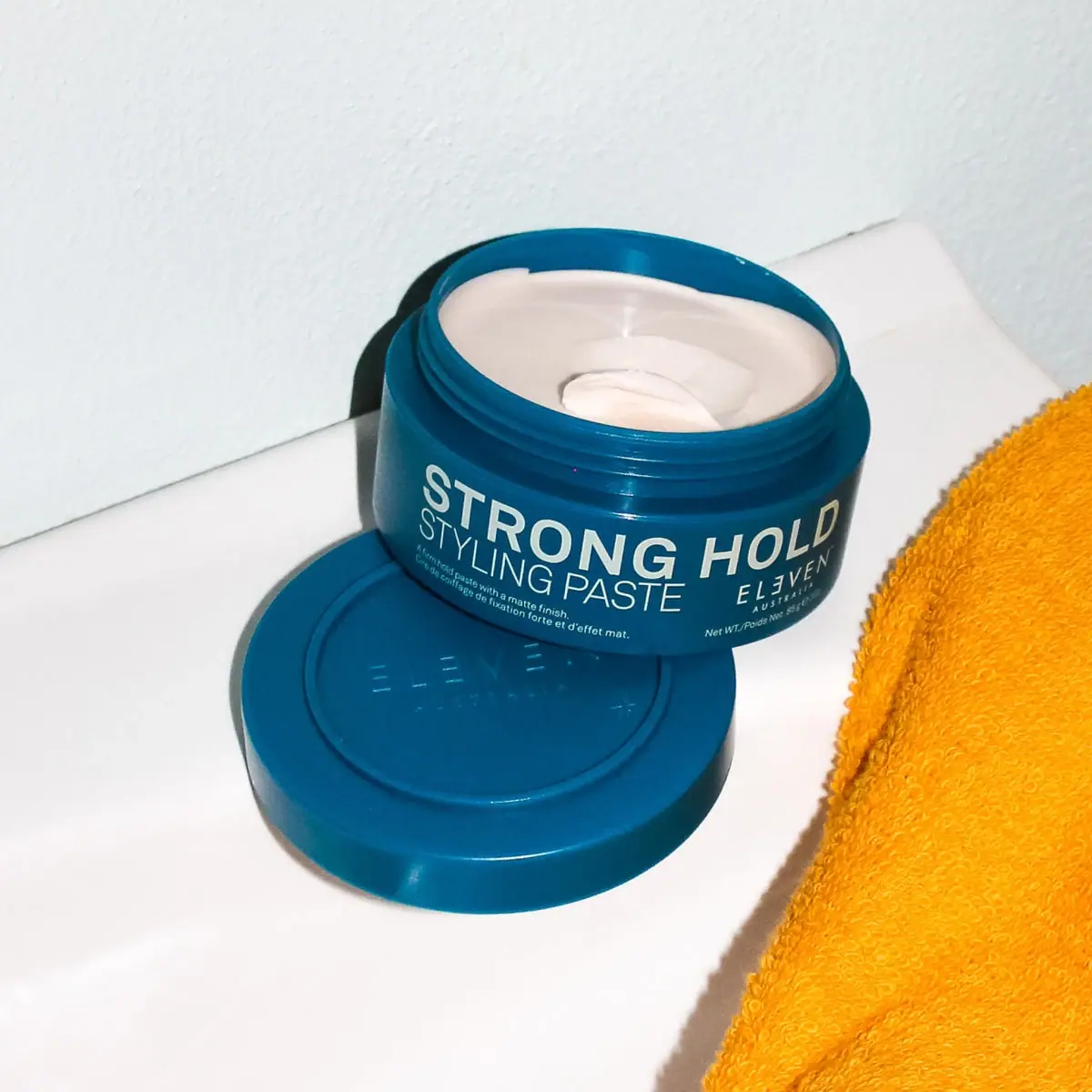
ELEVEN Australia
Deep blue open jar with emphatic hold-first typography
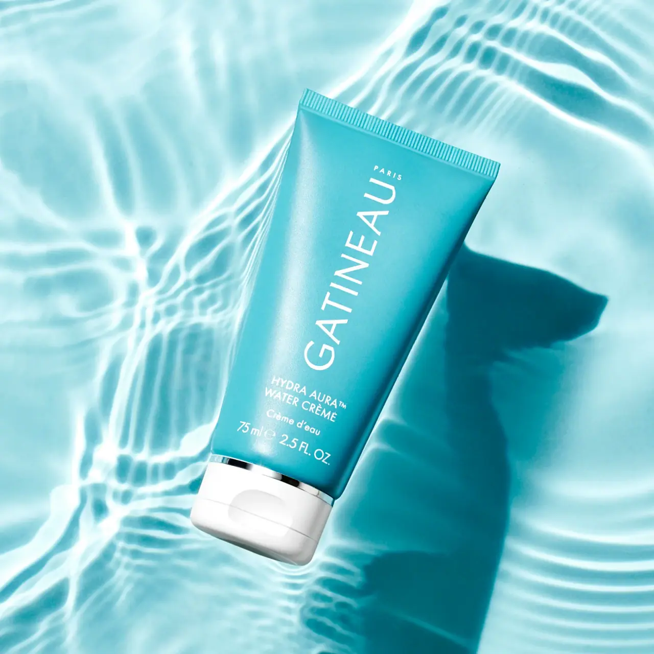
Gatineau
Turquoise tube with lengthwise white name and silver accent

Malin+Goetz
pharmacy label set in bracketed helvetica

Native
white drugstore bottles, scent-tinted vertical caps
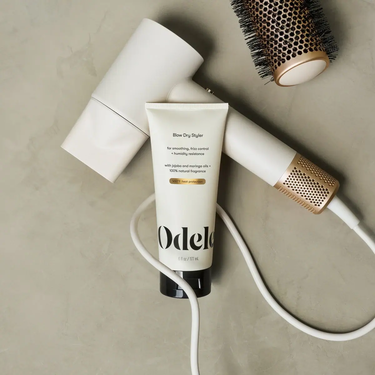
Odele
Cream tube with tiny utility copy and oversized lower serif
Olaplex
Clear compact bottle with golden oil and precise black type