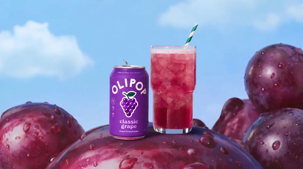
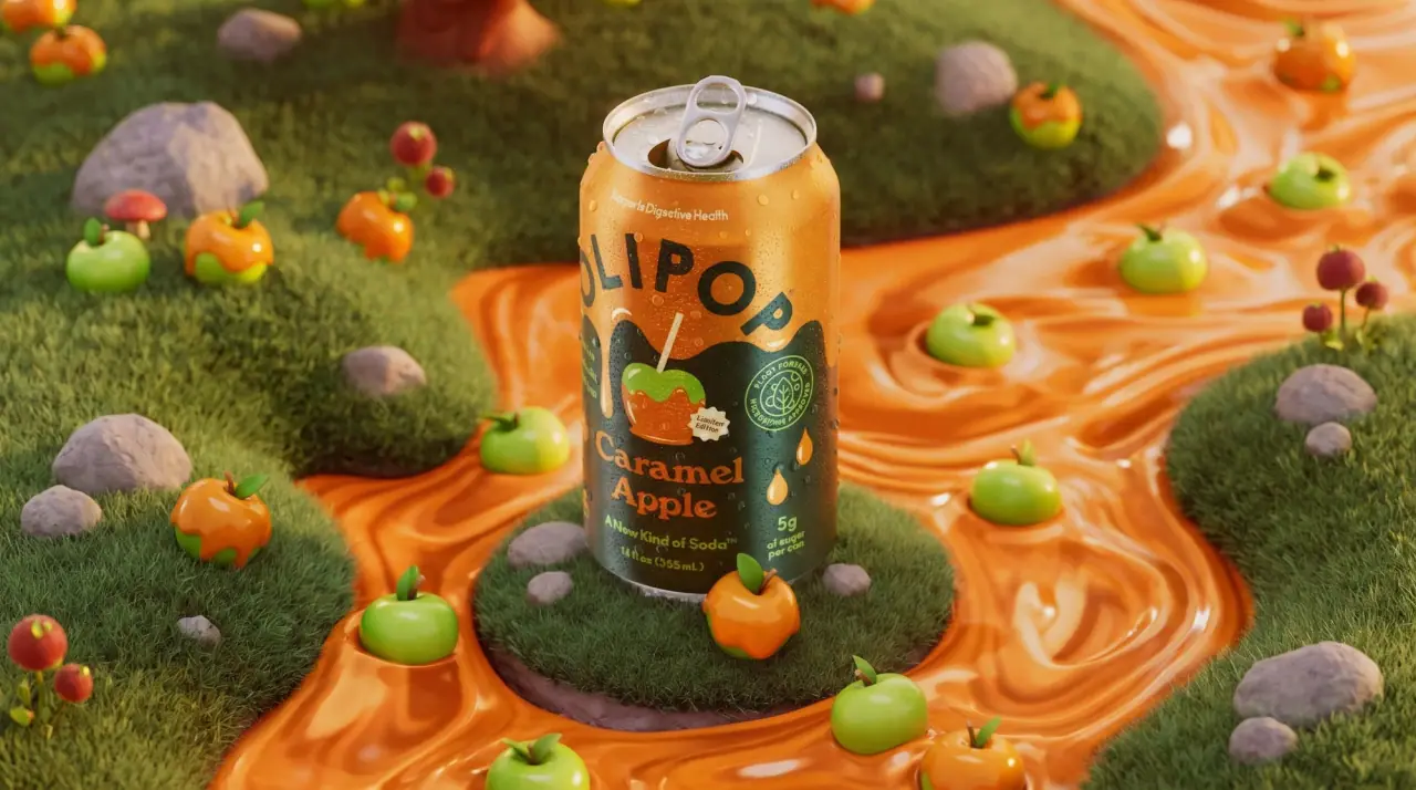
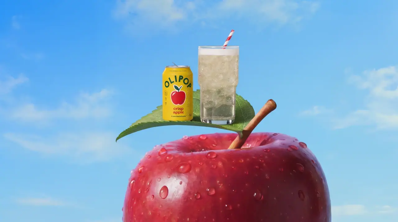
Olipop packages soda like a retro soda-fountain brand, with one fully saturated colour per flavour wrapped around a standard 12 oz can. Every can carries the same arched, widely spaced geometric wordmark across the shoulder, a single chunky flat-colour icon of the flavour (cherries, an apple, grapes, a mountain, bottle caps) in the middle, and a soft bold serif flavour name stacked on two lines below. Small side columns hold the ingredient-type list and sugar figures, so the front stays simple and colour does the range navigation. Each can limits itself to the body colour plus two or three flat inks chosen for contrast.
Approximate colours interpreted from photography. These are screen references, not official brand colours or print specifications.
Ink
Fountain Green
#14503a
Recurring dark ink for flavour names and icon outlines on light cans
Cap Maroon
#7c1f2a
Wordmark and icons on the white can, and red wordmark accents on pale cans
Accent
Soda Cream
#f6eed6
Light wordmark and type colour on dark and saturated cans
Range coding
Cherry Cola Wine
#7a1428
Cherry Cola can body under a pale pink wordmark
Vanilla Blush
#f3b4cb
Cherry Vanilla can body with deep green and red type
Citrus Lime
#5fbb44
Citrus Rush can body with yellow wordmark and dark green mountain icon
Grape Violet
#6f2e9b
Classic Grape can body with lilac type
Cream Soda Sky
#2aa6d6
Cream Soda can body with cream type and orange glass icon
Caramel Forest
#0f4a33
Caramel Apple can body under dripping caramel-orange art
Apple Butter Yellow
#eee6a3
Crisp Apple can body with red wordmark and green name
Fountain White
#f4f2ee
Doctor Goodwin can body under maroon type and bottle-cap icons
Typography
Suggested visual alternatives, not confirmed brand typefaces. Any scale below is an illustrative estimate.
The arched wordmark curves over the can shoulder and is the first read; the flavour icon sits centre stage beneath it; the flavour name in a large two-line soft serif follows, then a small serif tagline and the volume. Ingredient-type and sugar figures run in narrow columns down the left and right edges.
Type scale
Estimated cap size as a share of the panel · Front of the 12 oz can, about 120 mm tall
wordmark
13% · Bold · Display
FIZZWELL
flavour-name
9% · Bold · Headline
Peach Fizz
edge-figure
3.5% · Bold · Numeral
5g
tagline
3% · SemiBold · Headline
A new kind of fizz
edge-list
2.4% · Medium · Label
Fruit Juice · Botanicals
volume
2.2% · Medium · Label
12 fl oz (355 mL)
Fonts
Display
Jost
Looks like
Futura Bold, Brandon Grotesque Black
Type
Bold geometric sans, widely spaced
Weight
Bold
Case
Uppercase
Tracking
Wide, about +8%
Fallback
Futura, Century Gothic, sans-serif
The wordmark set on an upward arc across the can shoulder, letters individually rotated, about 85% of the front width.
Headline
Fraunces
Looks like
Cooper Bold, Recoleta Bold
Type
Soft bold serif with rounded terminals
Weight
Bold, SemiBold
Case
Title case or lowercase depending on can
Tracking
Tight, about -1%
Fallback
Cooper Black, Georgia Bold
Flavour name stacked on two lines, centred, in a contrasting colour to the body; also the small tagline in Regular.
Label
Montserrat
Looks like
Gotham Medium, Proxima Nova
Type
Compact geometric sans
Weight
Medium, SemiBold
Case
Title case, uppercase for the shoulder line
Tracking
Normal
Fallback
Helvetica, Arial, sans-serif
Edge columns (ingredient types, sugar grams, calories), the shoulder line, volume and the round side badge.
Numeral
Montserrat
Looks like
Gotham Bold
Type
Bold geometric sans numerals
Weight
Bold
Case
Numerals with lowercase units
Tracking
Normal
Fallback
Helvetica Bold, Arial Bold
Stacked sugar, fibre and calorie numbers in the left edge column.
Structure & Proportions
Proportions
Purpose
Value
Preview
Print coverage
100% full-wrap colour on the can body
Wordmark arc width
About 85% of the visible can width
Icon size
About 30% of can height, centre
Flavour name block
About 20% of can height, two lines
Edge columns
About 10% of the front width each side
Colours per can
Body colour plus two or three flat inks
—
Density
Simple centred stack with generous colour field; dense only at the edges
—
Shapes
Element
Value
Preview
Wordmark
Upward arc of rotated capitals
Can
Standard 12 oz cylinder
Side badge
Small circular seal
Icon
Chunky outlined flat vector
Limited-edition seal
Small starburst sticker
Finishes
Gloss printed aluminium
Can body · gloss
Bare metal end
Can top and base · metallic
Matte carton
Multipack outer · matte
Formats and materials
Formats
12 oz standard can, Multipack carton, Glass jar
Materials
Aluminium, Paperboard, Glass
Closures
Standard silver ring-pull can ends
Decoration
Full-wrap direct print, Flat vector icon with outline, Arched wordmark, Small sparkle and starburst marks, Circular side badge
Front Panel
Schematic reading order. The diagram’s zone heights do not represent measured artwork proportions.
Shoulder
Centre
Lower centre
Edges
Base
A single solid can colour with a centred vertical stack: arched wordmark, icon, flavour name, tagline, volume; narrow claim columns on both edges.
Zone
Content
Shoulder
Small line of copy, then the arched wordmark
Centre
One chunky flat icon of the flavour with small sparkle marks
Lower centre
Two-line serif flavour name and the tagline
Edges
Left: ingredient-type list or stacked figures and Non-GMO; right: sugar grams and a circular badge
Base
Volume line
Range System
One saturated can colour and one icon per flavour, with a two- or three-colour ink set chosen for contrast; wordmark arc, layout and type stay identical across the range.
Cherry Cola = wine red can + pink wordmark + cherries
Cream Soda = sky blue + cream + two clinking glasses
Doctor Goodwin = white can + maroon bottle caps
Caramel Apple = forest green + caramel drip
Back of Pack & Shelf
The can colour wraps all the way round: the back face holds the US Nutrition Facts panel on a white box, the ingredient list, a short brand line, then deposit and recycling marks and the barcode near the base.
Nutrition Facts panel on a white rectangle
Ingredient list in small sans
Short brand story line in the serif
State deposit and recycling marks
Barcode and best-by code near the base
On shelf
In the cooler the cans form a rainbow of solid colours, each column one flavour, while the identical arched wordmark repeats across every shoulder and reads as one brand band.
Imagery
One bold flat vector icon per can, outlined and simplified like a vintage sticker, plus tiny sparkle accents; limited editions break the frame with a drip or pattern.
Guidelines
Do
Flood the whole can in one saturated flavour colour, for example lime (#5fbb44) or violet (#6f2e9b).
Set the wordmark in widely spaced Display caps on an upward arc across the shoulder, about 85% of the front width.
Draw the flavour as one chunky flat icon with a dark outline, about 30% of can height, centred.
Stack the flavour name on two lines in the soft Headline serif in a contrasting colour.
Push ingredient-type words and sugar figures into narrow vertical columns at the can edges.
Limit each can to the body colour plus two or three flat inks.
Keep the wordmark arc, icon position and name position identical on every flavour.
Don't
Don't use photography or realistic fruit renders.
Don't use gradients or metallic effects on the body.
Don't straighten the wordmark; the arc is the identity.
Don't put claims in the centre of the can.
Don't use muted or grey tones except as deliberate pale flavour colours.
Don't put two icons of equal size on one can.
Give your AI packaging taste
Give your design or image tool a packaging study: palette, type, structure, front panel and principles for an original brief.