Photography: Milkjar official photography. Images belong to their respective owners.
Milkjar

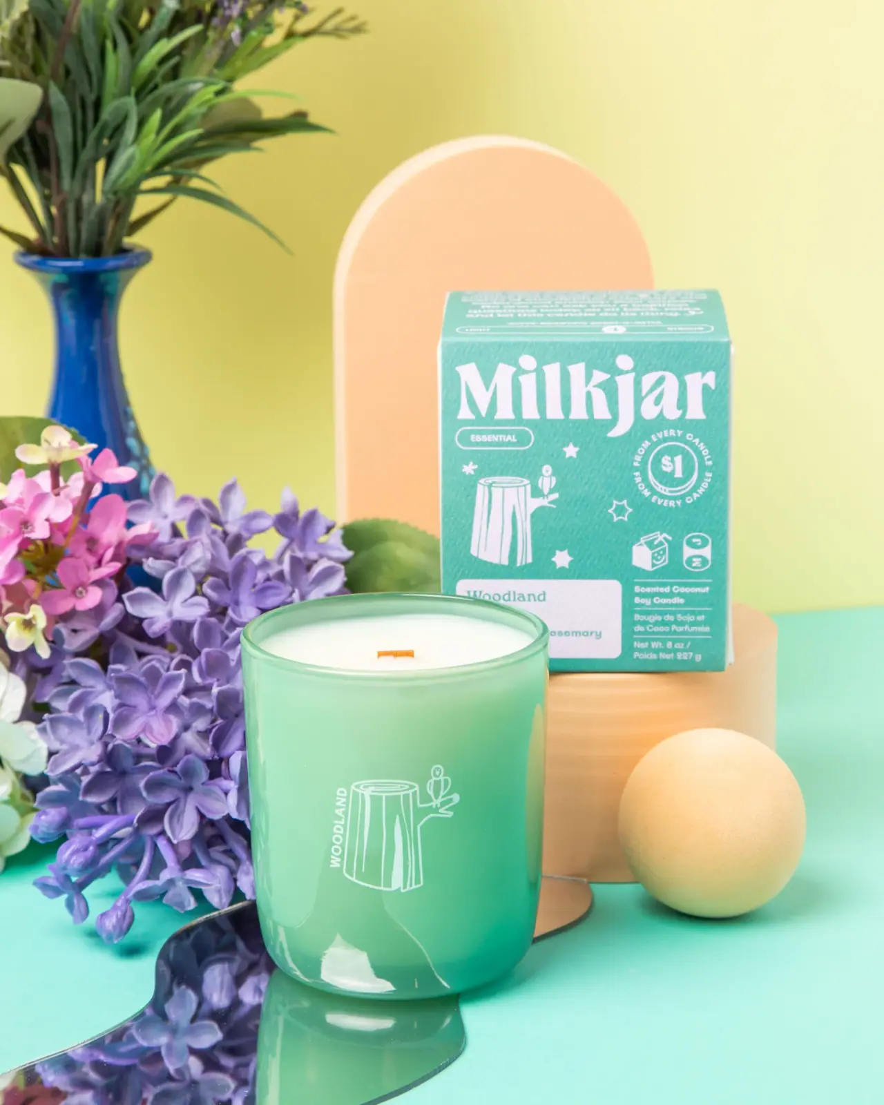
Green candle and carton share a white woodland illustration
Woodland connects its candle vessel and carton through green colour and a small white tree-stump illustration with a perched bird. Their information density is deliberately different in the selected view: the jar keeps only the illustration and vertical scent name prominent, while the carton gives Milkjar a large expressive wordmark above symbols, scent information and a donation statement. The pair demonstrates how recognisable elements can move between a cylindrical object and a flat retail panel without identical layouts. The approved image shows the 8 oz candle open and unlit, with its matching carton behind it.
- Candles & home scent
- Light pack
- Retro illustrated
- Playful colour
About this study
Selected Woodland 8 oz candle and matching carton in official styled photography. Their shared icon and contrasting information density are directly compared; other scent packaging is not audited.
Sources & evidence · Reviewed 2026-10-19Color Palette
Approximate colours interpreted from photography. These are screen references, not official brand colours or print specifications.
Pack body
Fresh vessel green
#65B497
Approximate jar colour with glossy highlights and darker curved edges. Exact tint, coating and physical colour standard remain unverified.
Label
Carton teal-green
#6BB6AB
Approximate carton field in this photograph. Its relationship to the jar is visibly close, but different substrates and lighting prevent treating the two as an exact ink match.
Ink
Pale white artwork
#F2F0E9
Approximate maker lettering, stump illustration, symbols and pale scent panel. Warm light gives it a slight cream cast.
Typography
Suggested visual alternatives, not confirmed brand typefaces. Any scale below is an illustrative estimate.
On the carton, Milkjar fills much of the upper width in large expressive mixed-case serif lettering. Its strong shape leads before the smaller ESSENTIAL capsule and the numerous little icons below. The lower pale field carries Woodland and scent detail, while a narrow adjacent information area contains product description and quantity. On the jar, WOODLAND is much smaller and runs vertically beside the stump illustration, with the image becoming the main focal point. This is a real contrast between two inspected components, not an assumed universal brand hierarchy.
Fonts
Original large carton-maker alternative
Fraunces
- Looks like
- Expressive chunky serif
- Type
- Display serif
- Weight
- Bold, ExtraBold
- Case
- Mixed case
- Tracking
- Compact with optical adjustments
- Fallback
- Georgia, serif
Explore a new short maker name that has personality at large scale without copying Milkjar's distinctive letterforms. Check how the shape balances a busy field of smaller supporting graphics.
Scent and compact-support alternative
Nunito Sans
- Looks like
- Friendly practical sans
- Type
- Sans serif
- Weight
- SemiBold, Bold
- Case
- Title case for scent; uppercase for small category
- Tracking
- Normal to slightly open
- Fallback
- Arial, sans-serif
Use for short secondary labels and an original vertical variant name. Keep the smallest reversed wording separate from decorative stars so functional text does not disappear into the icon field.
Structure & Proportions
Visual proportions and finish previews are illustrative. Confirmed construction details and uncertainties are distinguished in the study notes.
Proportions
| Purpose | Value | Preview |
|---|---|---|
| Quiet vessel front | The small white illustration and vertical name occupy a limited central area, leaving much of the green cylinder visually uninterrupted. | — |
| Large carton header | Milkjar spans nearly the front width above the smaller graphic and informational elements, making the flat panel more brand-forward than the jar. | — |
| Visible candle contents | The open rim leaves the pale fill and short flat wick visible above the green wall. No burn depth or physical diameter is measured from the photograph. | — |
Shapes
| Element | Value | Preview |
|---|---|---|
| Candle vessel | Straight-sided cylinder with softened lower corners and an elliptical open rim in perspective. | |
| Carton | Upright rectangular box with a broad front and a visible top plane. | |
| Woodland icon | Stylised cut stump with vertical grain lines, a side branch and a small perched bird. | |
| Category capsule | Small rounded outline enclosing the Essential collection cue. | |
| Donation device | Circular amount-and-text arrangement on the carton, separate from the scent field. |
Finishes
Reflective green vessel appearance
Jar sidewall and curved lower edge · gloss
Low-glare carton appearance
Printed box front and top; coating unverified · matte
Formats and materials
| Formats | Open cylindrical candle vessel with rounded lower edge, Matching upright rectangular carton behind the jar, Pale wax surface with one flat unlit wick, Source-confirmed 8 oz candle; carton visibly includes 227 g |
| Materials | The official product title identifies a coconut-soy wood-wick candle, consistent with the visible pale fill and flat wick; the blend ratio is not established., The glossy vessel has a glass-like appearance, and general candle guidance refers to glass, but the inspected page does not provide a detailed vessel composition or colour-treatment specification., The carton appears paperboard-like with a visible fine texture. Board grade, recycled content, coating and print process are not documented. |
| Closures | No lid is fitted or separately identified in the selected image. The jar's open top reveals the wax and unlit flat wick. The carton is closed, with its top panel visible in perspective, but its opening sequence and internal support are not demonstrated. No insert, sleeve, magnetic closure or resealing arrangement is inferred. The decorative forms behind the products belong to the scene rather than the package system. |
| Decoration | Repeated tree-stump and bird motif, Vertical WOODLAND beside the jar illustration, Oversized white Milkjar wordmark on the carton, Scattered small stars and supporting iconography, Pale lower carton scent field and circular donation statement |
Front Panel
Schematic reading order. The diagram’s zone heights do not represent measured artwork proportions.
The jar artwork sits directly against the green surface without a visible enclosing white label rectangle. The stump is central and the short scent name runs vertically beside it. On the carton, the same motif becomes one element within a much busier field beneath a large maker header. A pale lower rectangle isolates the scent information, while descriptive copy and quantity sit nearby. The graphic connection is therefore repeated illustration and colour, rather than copying one complete label from vessel to box. Decoration method on the jar is not established by appearance alone.
| Zone | Content |
|---|---|
| Jar focal graphic | White stump-and-bird line drawing paired with vertical WOODLAND lettering. |
| Carton header | Large white Milkjar maker wordmark and small Essential capsule. |
| Carton supporting graphics | Repeated stump motif, stars, small symbols and a circular $1 donation statement, described as printed communication rather than an audited program claim. |
| Carton scent field | Pale rectangle carrying Woodland and smaller scent detail, partly obscured by the jar in this composition. |
| Carton lower information | Bilingual candle description and 8 oz / 227 g quantity in smaller white text. |
Range System
The official page identifies Woodland within an Essential Oil Collection and lists eucalyptus, rosemary and cedarwood notes. It also links another Woodland product format, but that does not prove the same package layout or vessel material across the scent family. Here, the directly inspected relationship is between the candle and its carton. The repeated stump and bird can function as a scent cue even when the maker's scale changes. Further products would need individual review before identifying a complete system of colours or illustrations.
- The same stump-and-bird motif appears on the cylindrical vessel and the flat carton.
- The jar emphasises scent illustration while the carton foregrounds the maker and supporting information.
- A hypothetical original range could pair each scent with a distinct simple icon, but the selected photograph alone does not document Milkjar's entire icon system.
Back of Pack & Shelf
The carton top is partly visible with small copy, but its full text, rear and side panels are not inspected. The candle underside is hidden.
- The official candle guidance refers to a caution sticker on the bottom; this supports that location generally without revealing this unit's sticker artwork.
- No barcode, batch-code placement or complete safety text is reconstructed.
- For original packaging, keep important product and use information independent of decorative symbols and ensure the jar remains identifiable after its carton is discarded.
On shelf
As a visual interpretation, the carton offers a loud maker-led first impression, while the jar becomes a quieter decorative object once removed. The white illustration is simple enough to survive at small size, but its vertical scent name requires a closer look. The bright green surface helps the jar hold a distinct silhouette against the surrounding pale colours. A useful review would compare the two components separately, because their roles differ and the large carton wordmark cannot be relied on after purchase. The repeated motif is what carries continuity into the vessel-only state.
Imagery
The green jar stands in front of its carton amid a pastel still life: lilac and pink flowers, a blue vase, a peach arch and cylinder, a yellow sphere and a mirrored curved strip. The mirror repeats the jar and nearby flowers, while the soft yellow background and turquoise surface extend the fresh colour mood. None of these props is established as part of the supplied product. The flowers also should not be treated as a literal list of scent ingredients; the official note description supplies that information separately. The wick is visibly unlit.
Guidelines
Editorial principles for an original design brief, not official brand guidelines.
Do
- Repeat a recognisable motif across primary and secondary packaging.
- Allow carton and vessel to carry different information densities.
- Keep the vessel identifiable when separated from its box.
- Differentiate observed donation wording from verified program details.
- Use source-confirmed scent notes instead of interpreting every flower prop as an ingredient.
Don't
- Do not assume the jar and carton use an exact matching colour specification.
- Do not invent a supplied lid or internal carton insert.
- Do not copy the stump illustration, Milkjar wordmark or donation badge.
- Do not describe the photographed wick as burning.
- Do not infer the entire collection's icon system from one candle.
Sources & evidence
How this study was built
edition · Sourced fact
The official page identifies Woodland 8 oz in the Essential Oil Collection with eucalyptus, rosemary and cedarwood notes.Woodland 8 oz Coconut Soy Wood Wick Candle — Milk Jar Candle Co.structure · Sourced fact
The official title identifies coconut-soy wax and a wood wick; the photo shows pale wax and a flat unlit wick.Woodland 8 oz Coconut Soy Wood Wick Candle — Milk Jar Candle Co.label · Visual observation
The stump-and-bird motif repeats on jar and carton, but the carton adds a large maker, symbols and more information.Woodland 8 oz Coconut Soy Wood Wick Candle — Milk Jar Candle Co.typography · Visual observation
Large mixed-case serif maker lettering leads the carton, while the jar carries a small vertical scent name beside its illustration.Woodland 8 oz Coconut Soy Wood Wick Candle — Milk Jar Candle Co.structure · Sourced fact
General candle guidance refers to a bottom caution sticker; the selected underside and sticker design remain unseen.Woodland 8 oz Coconut Soy Wood Wick Candle — Milk Jar Candle Co.imagery · Visual observation
Flowers, geometric props and a mirror create the surrounding scene and are not verified supplied package components.Woodland 8 oz Coconut Soy Wood Wick Candle — Milk Jar Candle Co.
What remains unverified
- Exact vessel composition, colour application, carton grade and print processes are unverified.
- The donation badge is observed package wording, not an independent program audit.
- Carton back, full top copy, interior and jar underside are not inspected.
- Fonts, production colour standards, dimensions and edition date are unknown.
Give your AI
packaging taste
Give your design or image tool a packaging study: palette, type, structure, front panel and principles for an original brief.
Export this styleFree with an email. PACK.md works in Claude, ChatGPT, Cursor and image tools.
More like this
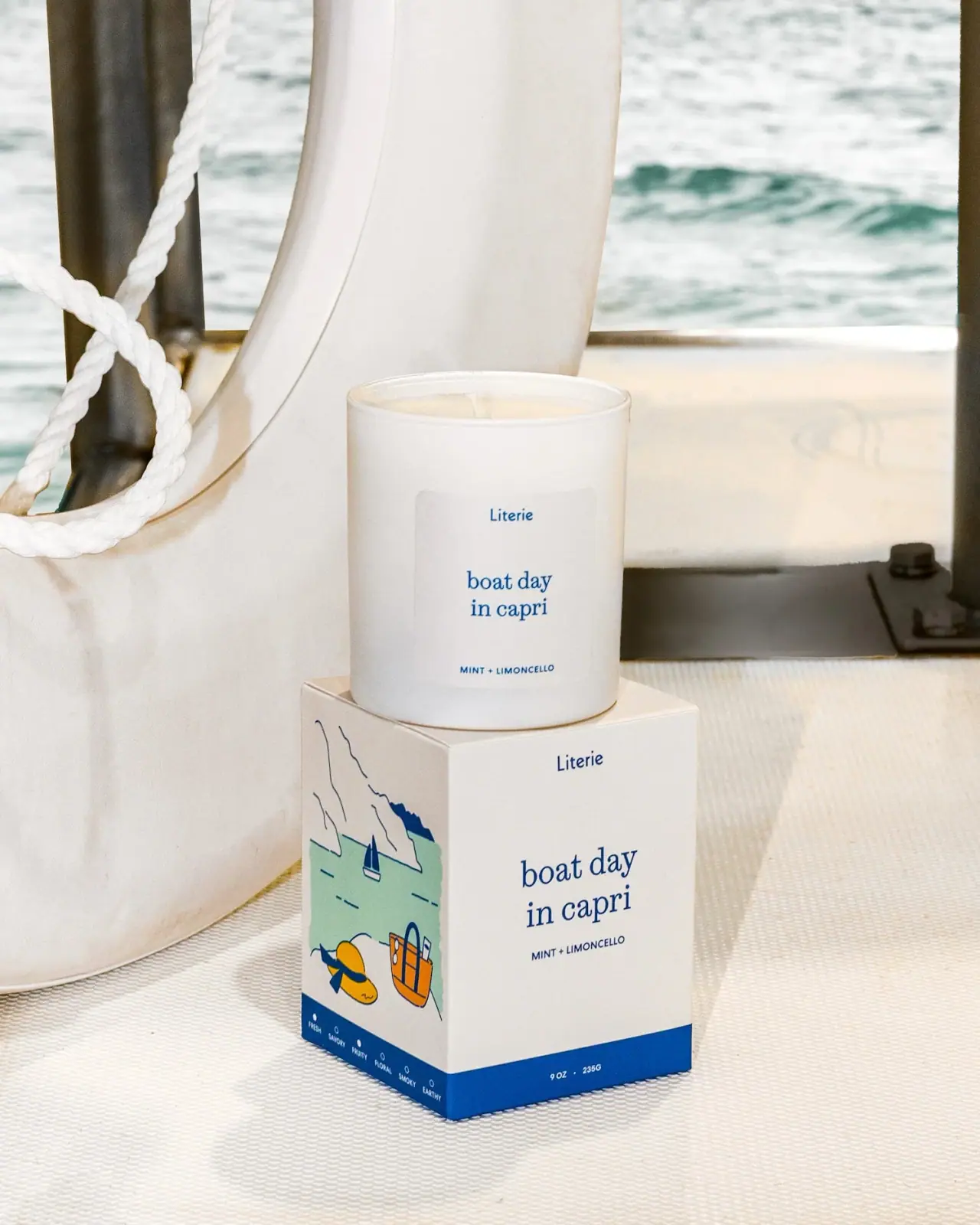
Literie
Quiet blue destination type with a playful coastal side panel
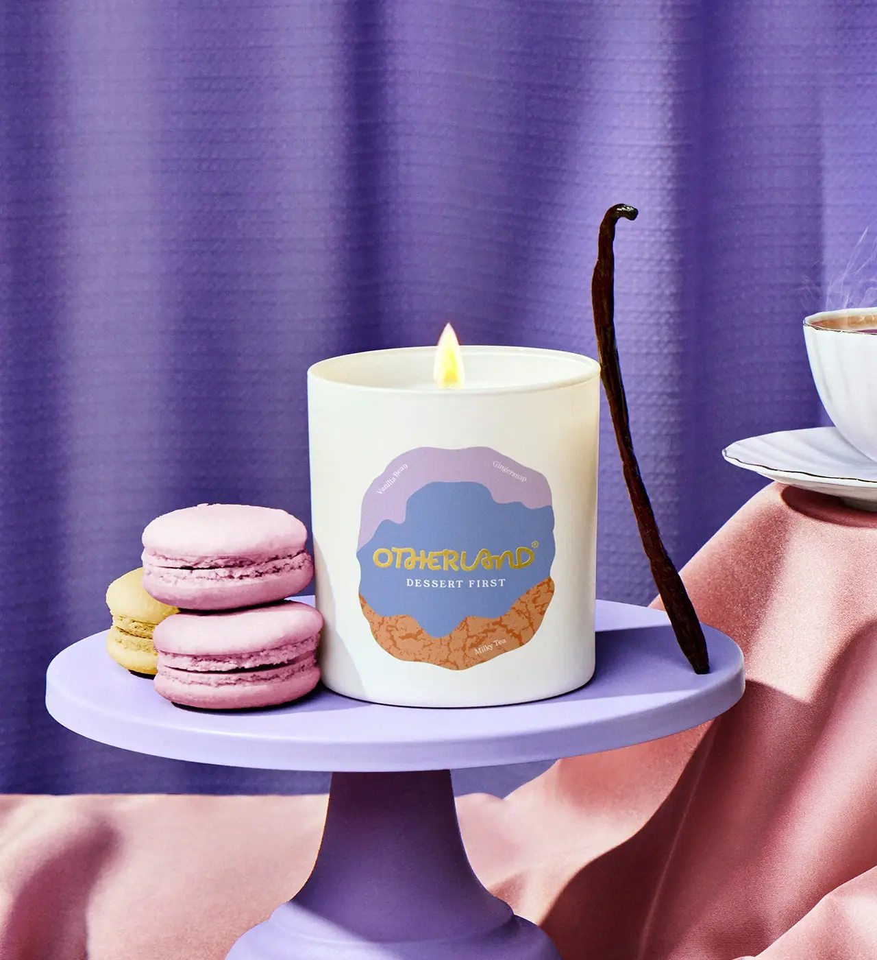
Otherland
Cream candle with a layered lavender and biscuit-coloured badge
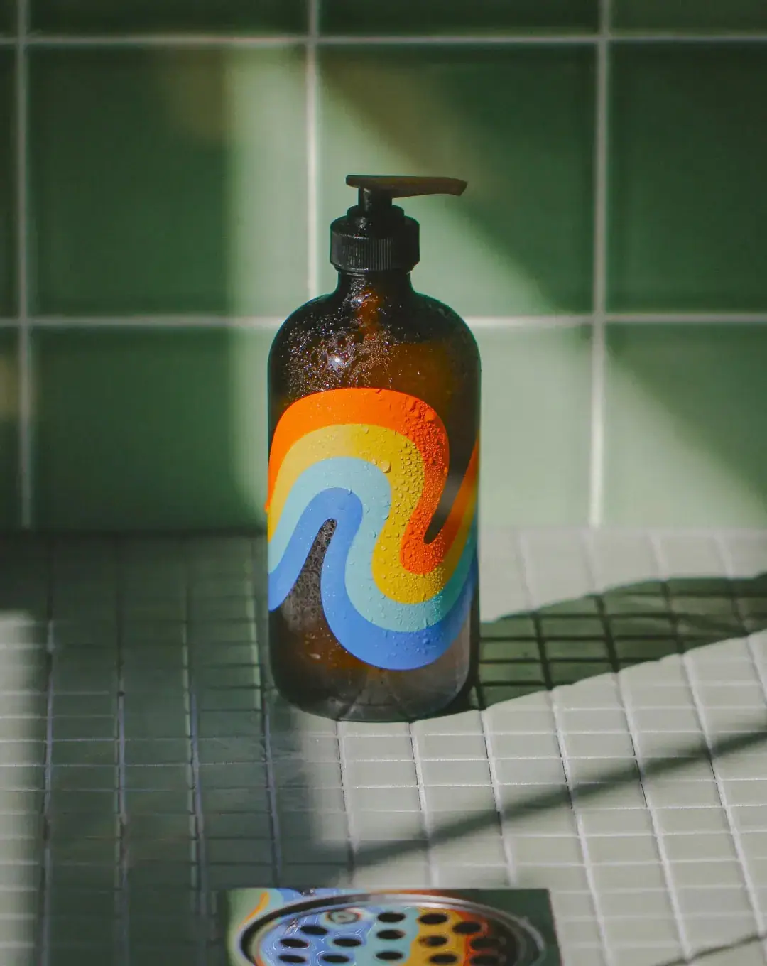
Bathing Culture
Flowing rainbow bands on dark refillable glass

Culture Pop
fruit-for-an-o wordmark on dewy cans
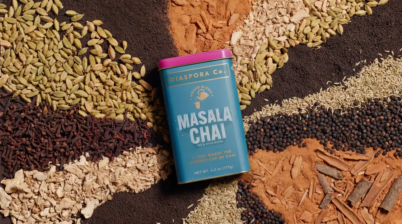
Diaspora Co.
marigold tins with a tiger crest
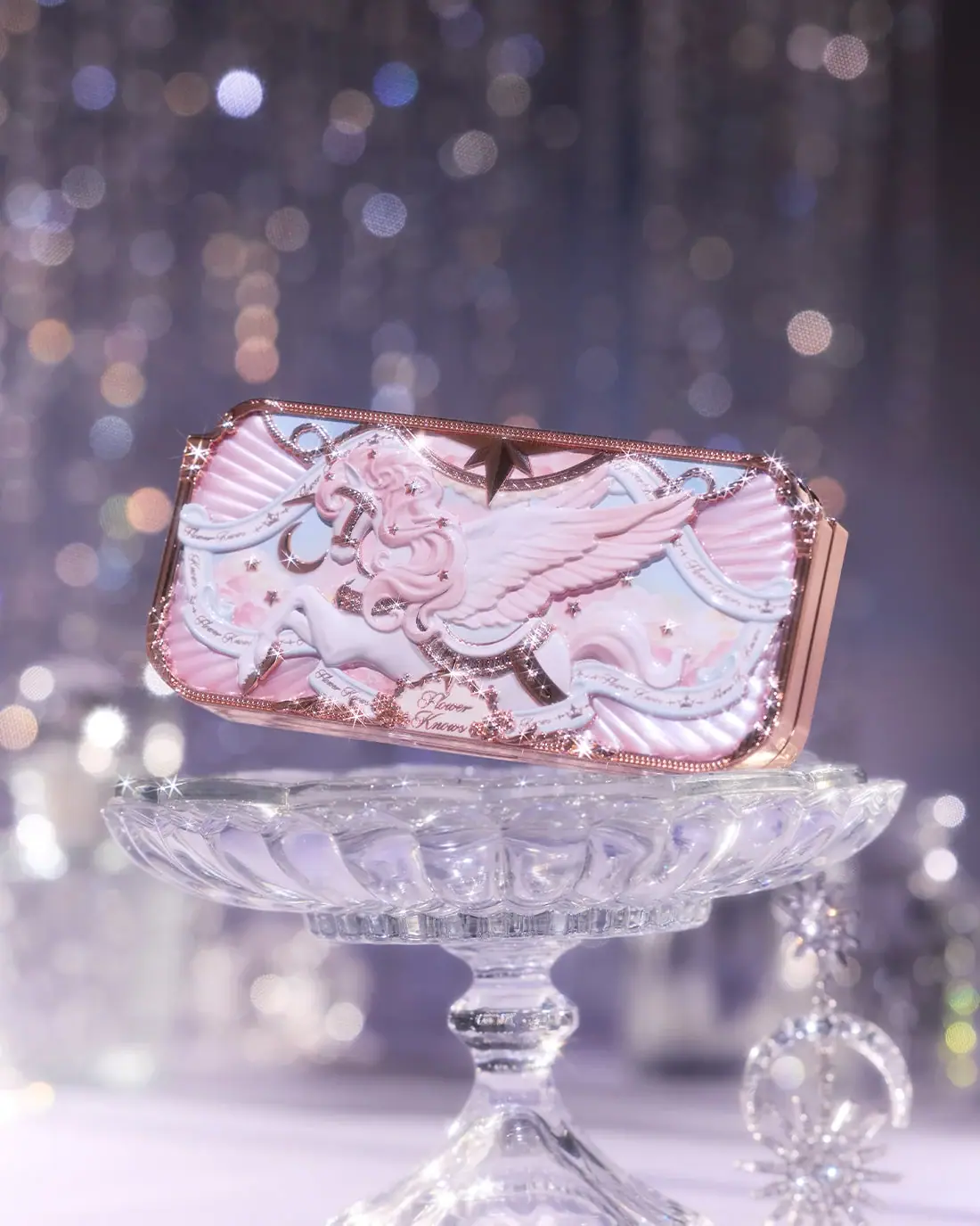
Flower Knows
Winged unicorn relief with pastel ribbons and reflective borders
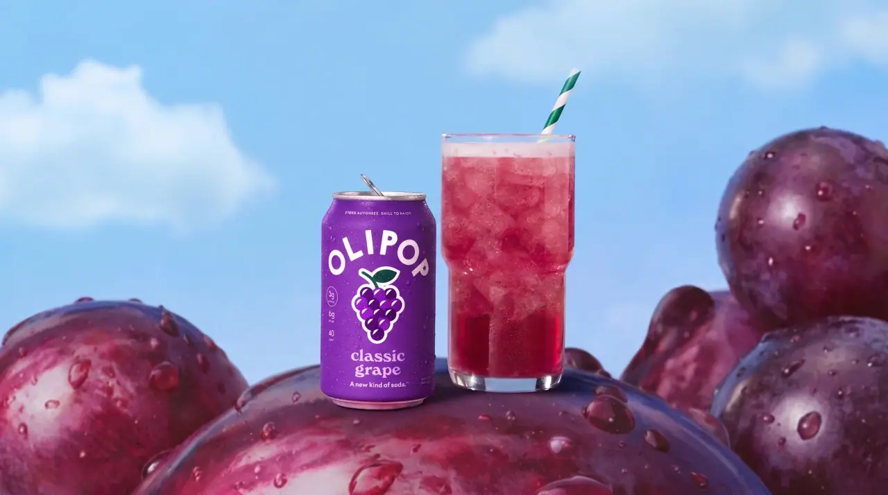
Olipop
sunny soda fountain in flat colour
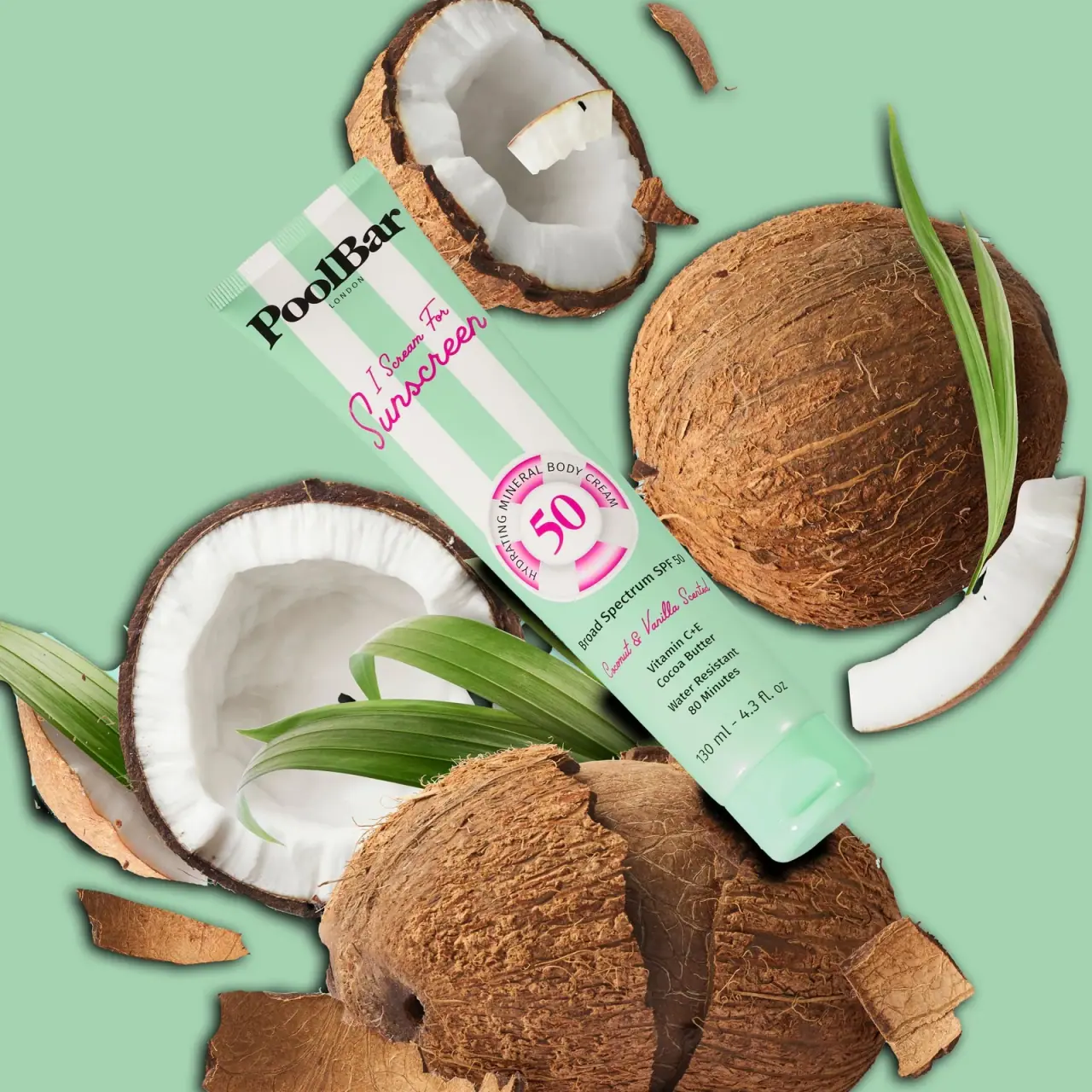
PoolBar London
Mint beach stripes with pink script and a lifebuoy badge