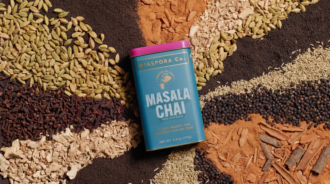
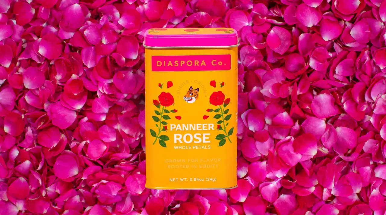
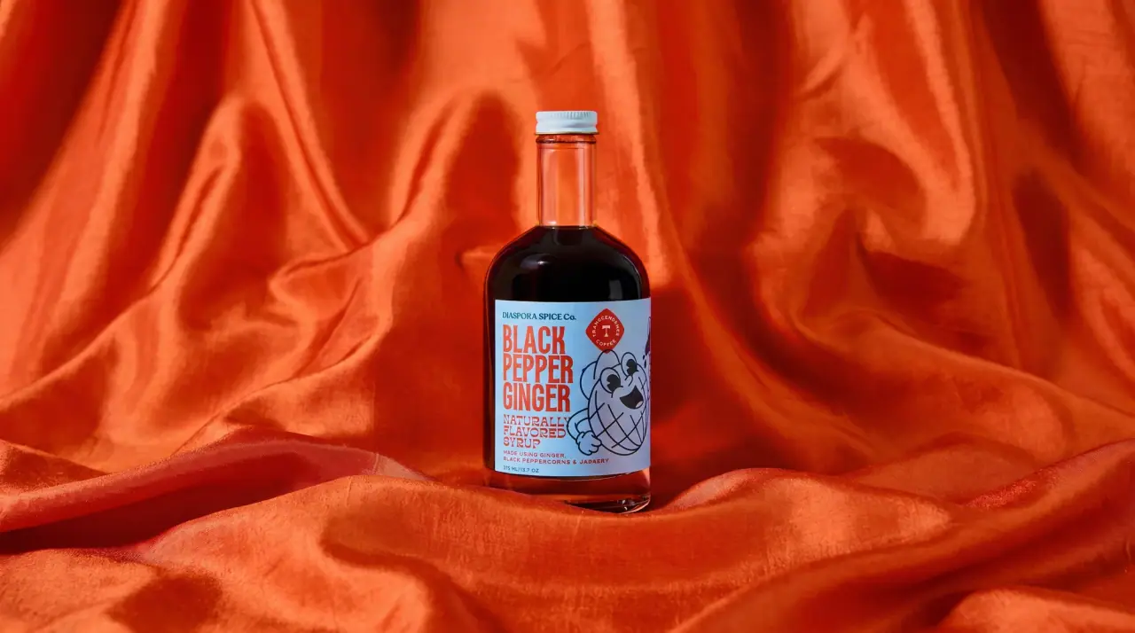
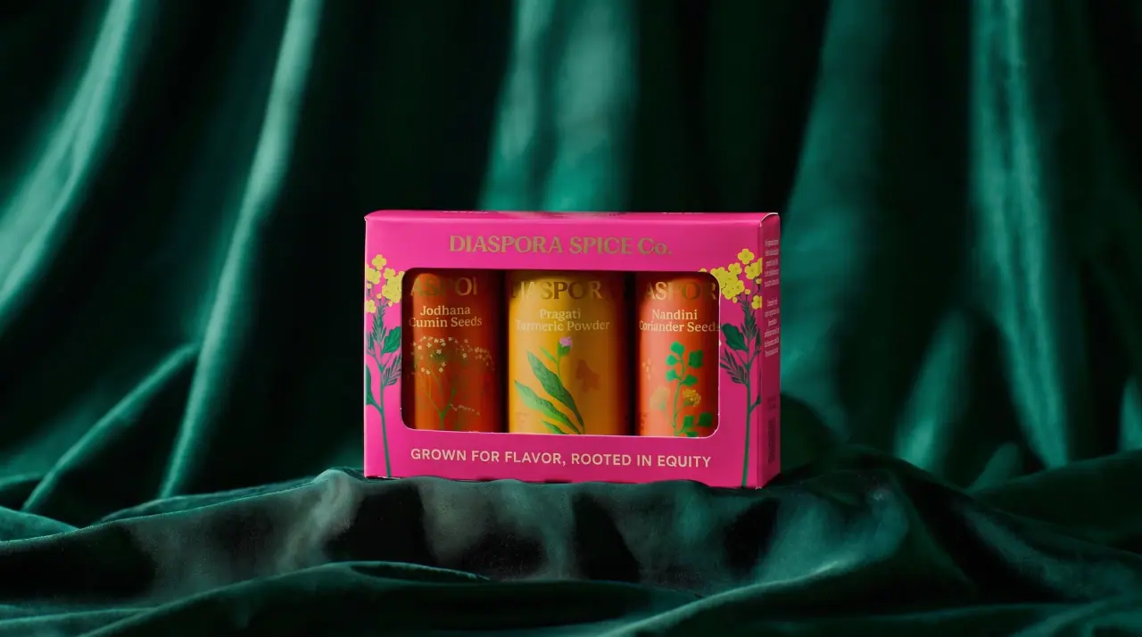
Campaign images © Diaspora Co., from diasporaco.com
Diaspora Co.

marigold tins with a tiger crest
Diaspora Co. packs spices and teas in rectangular tins and slip-lid cylinders printed edge to edge in saturated South Asian festival colours (Rani Pink #e9238a, Chilli Vermilion, Peacock Teal, Indigo), each topped with a contrasting Marigold (#f4b51a) or pink lid. Rectangular tins repeat a fixed centred stack: a thin ruled rectangle holding the flared-capital wordmark, an arched 'house blend' line around a small tiger-face roundel, a fat stacked slab product name in a pale tint of the body colour, line-drawn teapots, cups and sprigs on either side, and a two-line yellow tagline about flavour and equity. Cylinders split the wordmark top and bottom and put a painted portrait or plant between them under a title-case serif name, while gift sets line tins up in a plum window carton.
- Pantry & sauces
- Dark pack
- Playful colour
- Retro illustrated
- Colour-coded range
Color Palette
Approximate colours interpreted from photography. These are screen references, not official brand colours or print specifications.
Pack body
Rani Pink
#e9238a
Body of house blends such as chai spice and biryani masala, and lids on the teal chai tin
Marigold Lid
#f4b51a
Lids on pink, vermilion and indigo tins and the full body of the golden milk cylinder
Ink
Blush Tint
#fbd3e6
Product name, ruled wordmark panel and line drawings on pink tins, printed as a pale tint of the body
Ghee Cream
#fbefd6
Product names and line art reversed out of vermilion, teal and indigo tins
Accent
Turmeric Yellow
#f6c234
Two-line tagline, arched 'house blend' text and net weight on the coloured body
Tiger Orange
#f08a2a
Face of the tiger mascot inside the small roundel
Range coding
Chilli Vermilion
#ef4a2f
Body of garam masala, tandoori masala and hot lime seasoning tins
Peacock Teal
#2f8fa8
Body of the masala chai tea-and-spice tin, worn with a pink lid
Indigo Leaf
#2c3a7a
Body of the single-estate black tea cylinder under a yellow lid
Festival Plum
#3d1d4a
Gift-set window carton framing three tins, with a yellow title
Typography
Suggested visual alternatives, not confirmed brand typefaces. Any scale below is an illustrative estimate.
The product name is the loudest element: two stacked words in a fat condensed slab across the middle of the tin. Above it sit the ruled wordmark panel and the arched 'house blend' line; below it a small format word ('blend', 'powder'), the two-line tagline in yellow tracked capitals, then net weight. Cylinders reverse the order with a big split wordmark and a quieter serif name.
Type scale
Estimated cap size as a share of the panel · Front face of the rectangular 1.5 oz spice tin, about 95 mm tall
product-name
13% · Black · Display
CUMIN SMOKE
cylinder-wordmark
7% · Regular · Label
MONSOON
tin-wordmark
4% · Regular · Label
MONSOON Co.
cylinder-name
4% · Regular · Headline
Saffron Milk
tagline
2.8% · Bold · Body
GROWN FOR FLAVOUR
badge-arc
2.2% · Bold · Body
HOUSE BLEND
Fonts
Display
Alfa Slab One
- Looks like
- Heavy condensed soft slab, close to Cooper Black Condensed
- Type
- Fat condensed slab-serif capitals with a faint inline highlight
- Weight
- Black
- Case
- Uppercase
- Tracking
- Tight, about -1%
- Fallback
- Rockwell Extra Bold, Georgia Bold
Stacked two-line product names on rectangular tins and the gift-carton title.
Label
Marcellus
- Looks like
- Flared roman capitals, close to Optima or Albertus
- Type
- Flared serif capitals with a small-cap 'Co.'
- Weight
- Regular
- Case
- Uppercase with title-case Co.
- Tracking
- Wide, about +10%
- Fallback
- Optima, Palatino
Wordmark inside the thin ruled rectangle on rectangular tins and split top/bottom on cylinders.
Headline
Fraunces
- Looks like
- Soft old-style serif, close to Cooper Light or Windsor
- Type
- Soft wedge serif
- Weight
- Regular, SemiBold
- Case
- Title case
- Tracking
- Normal
- Fallback
- Cooper Light, Georgia
Product names on cylinders and tea cartons ('Golden Milk', 'Black Tea') and the italic carton subline.
Body
Josefin Sans
- Looks like
- Futura Bold tracked
- Type
- Geometric sans, tracked capitals
- Weight
- SemiBold, Bold
- Case
- Uppercase
- Tracking
- Wide, about +8%
- Fallback
- Futura, Century Gothic
Arched badge line, format word, two-line tagline and net weight.
Structure & Proportions
Proportions
| Purpose | Value | Preview |
|---|---|---|
| Print coverage | Edge to edge on the tin body; lid is a separate solid colour | |
| Lid height | About 15% of total tin height | |
| Product name width | About 70% of the front face width | |
| Product name height | About 25% of the face height for the two stacked lines | |
| Wordmark panel width | About 80% of face width, top of the face | |
| Colours per tin | Four: body, lid, pale tint ink, yellow tagline (plus mascot orange) | — |
| Density | Medium: centred stack with small line drawings filling the gaps either side | — |
Shapes
| Element | Value | Preview |
|---|---|---|
| Wordmark panel | Thin-ruled horizontal rectangle | |
| Badge line | Text set on an arch over the mascot | |
| Mascot | Small round tiger-face roundel | |
| Cylinder lid | Domed slip lid in a contrasting colour | |
| Gift carton | Rectangular window showing three tins |
Finishes
Gloss printed tinplate
Tin bodies and lids · gloss
Bare tin rim
Lid edge and base bead · metallic
Matte printed board
Tea cartons and gift sets · matte
Formats and materials
| Formats | Rectangular tin, Cylindrical tin, Folding tea carton, Window gift carton, Pouch |
| Materials | Tinplate, Paperboard, Flexible film |
| Closures | Lift-off rectangular tin lids and slip lids on cylinders, each in a contrasting colour; tuck flaps on cartons |
| Decoration | Ruled wordmark panel, Tiger mascot roundel, Line-drawn teapots, cups and sprigs, Painted portrait illustrations, Arched badge text |
Front Panel
Schematic reading order. The diagram’s zone heights do not represent measured artwork proportions.
A symmetrical centred stack printed directly on the tin: framed wordmark at top, mascot badge, big product name, line drawings on both sides, tagline and weight at the base.
| Zone | Content |
|---|---|
| Top | Thin-ruled rectangle with the wordmark |
| Upper middle | Arched descriptor around the tiger roundel |
| Middle | Two-line slab product name between line-drawn teapots, cups and sprigs |
| Bottom | Format word, two-line yellow tagline, net weight |
Range System
Each product owns a body and lid colour pair drawn from a hot, festive palette, while the framed wordmark, badge, name style and tagline stay put; teas and drinking blends move to cylinders with a split wordmark and a larger painted portrait or plant.
- Chai spice = rani pink + marigold lid
- Garam masala, tandoori, hot lime = vermilion + yellow lid
- Masala chai = peacock teal + pink lid
- Black tea = indigo cylinder + yellow lid with a leaf branch
- Golden milk = marigold cylinder with a painted woman
- Masala essentials = plum window carton holding three tins
Back of Pack & Shelf
The back of the tin keeps the body colour and pale ink: a short paragraph about the farm and harvest, origin details, ingredients and allergens, then a small barcode and legal block near the base.
- Farm partner, region and harvest story paragraph
- Single ingredient or blend ingredient list
- Suggested uses or brewing directions
- Net weight, best-by date and packer address
- Barcode on a small white box and recycling note
On shelf
On shelf the tins read as a row of hot pink, vermilion and teal blocks with contrasting lids, so the range billboards as a festive colour strip while the identical centred stack keeps every tin recognisable.
Imagery
Flat, warm hand-drawn illustration: a stylised tiger face, thin line drawings of teapots, cups, steam and sprigs in a pale tint of the body, and painted portraits of women on the tea and drink cylinders; campaign photos lay tins on fields of whole and ground spices.
Guidelines
Do
- Print the whole tin in one saturated colour such as Rani Pink (#e9238a) and give the lid a contrasting colour such as Marigold (#f4b51a).
- Frame the Label wordmark in a thin ruled rectangle about 80% of the face width at the top.
- Set the product name in the fat Display slab, stacked on two lines, in a pale tint of the body colour.
- Add a small tiger-face roundel under an arched badge line above the name.
- Flank the name with thin line drawings of teapots, cups and sprigs in the same tint.
- Put the two-line tagline in yellow tracked Body capitals under the name.
Don't
- Don't use muted, earthy or kraft colours on the tins.
- Don't use paper labels; print edge to edge on the metal.
- Don't set the product name in a thin or sans-serif face on rectangular tins.
- Don't break the symmetrical centred layout.
- Don't add product photography to the pack.
- Don't match the lid colour to the body.
Give your AI
packaging taste
Give your design or image tool a packaging study: palette, type, structure, front panel and principles for an original brief.
Export this styleFree with an email. PACK.md works in Claude, ChatGPT, Cursor and image tools.
More like this

Culture Pop
fruit-for-an-o wordmark on dewy cans
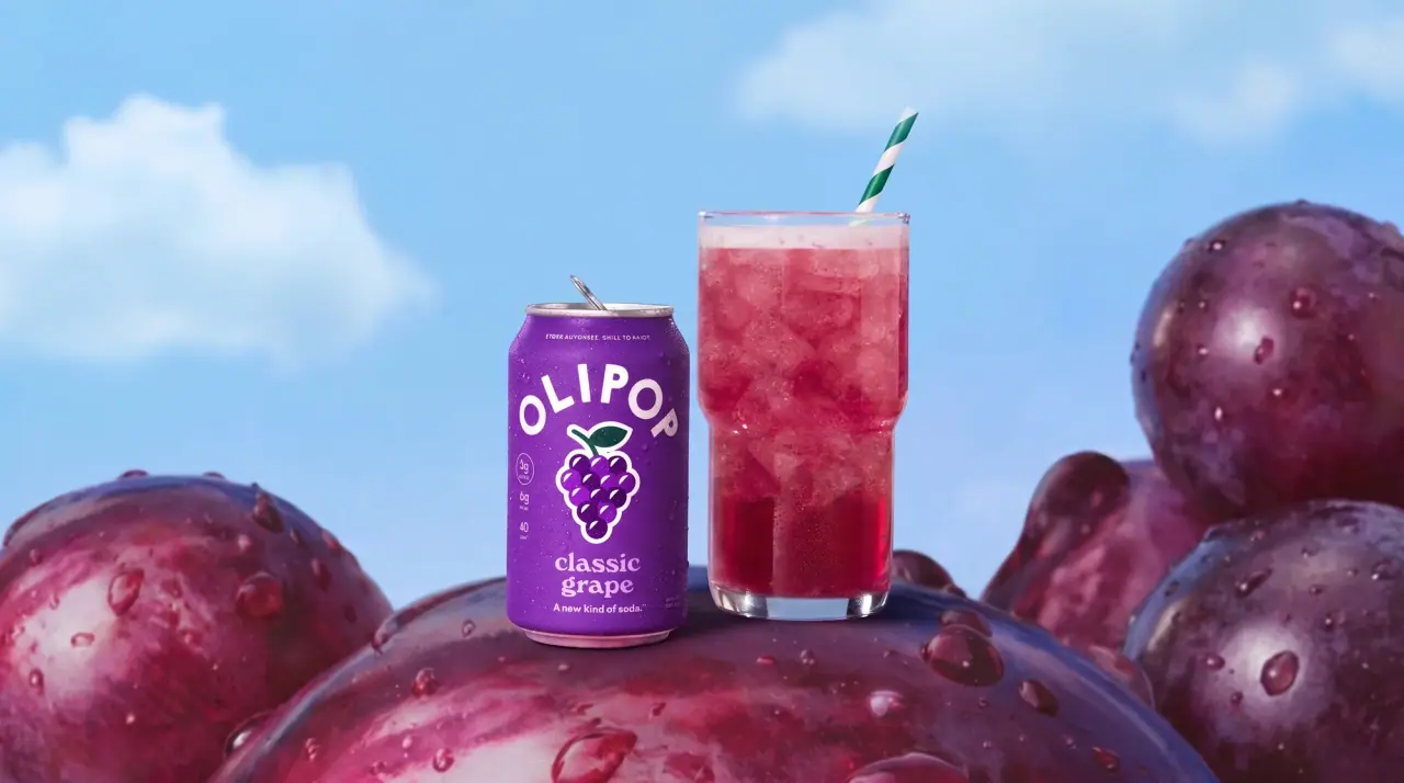
Olipop
sunny soda fountain in flat colour

Bachan's
octopus mascot on a red-capped squeeze

Behave
struck-through wordmark on sour neon pouches
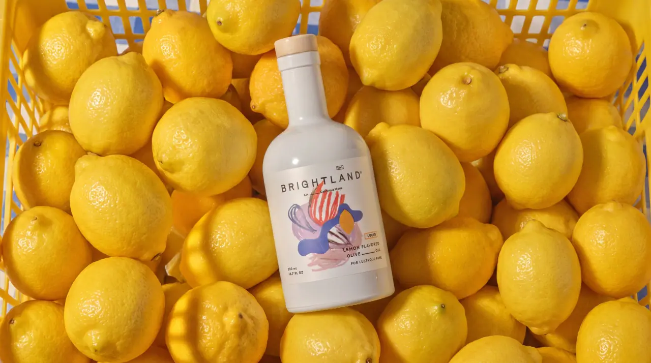
Brightland
painterly swatches on milk-white glass
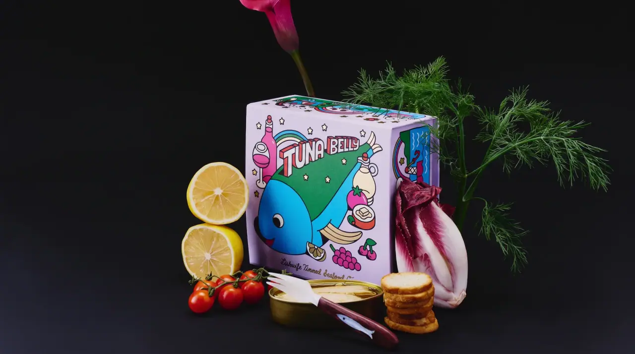
Fishwife
carnival folk art on a tin
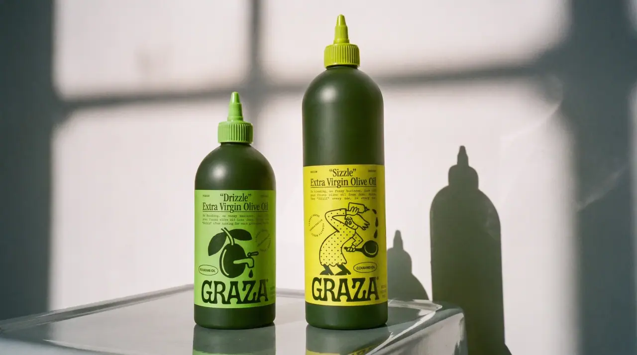
Graza
deli counter comic on bottle green
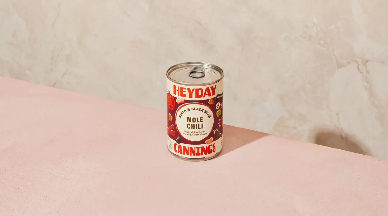
Heyday Canning Co.
saucy pantry tins with a cream band