


Kettle & Fire

farmhouse animal badges on black cartons
Kettle & Fire packs bone broth in matte aseptic cartons, the core range in black (#1b1a19) with a stacked soft heavy serif wordmark knocked out of a bright animal silhouette, a red (#d8323f) bull head for beef and a golden (#f0b22e) rooster for chicken, so the animal names the broth before the words do. Under the badge a small serif flavour line sits over BONE BROTH in a condensed slab in the badge colour, with a protein line beneath; a thin claims band across the top flanks a small flame icon with 'Organic' or 'No preservatives'. Soups, vegetable and specialty broths leave black for full-colour or photographic cartons (mustard soup boxes with a rust name panel, a pale green vegetable carton, a prairie or deer-landscape photo) but keep the same wordmark, flame and slab name.
- Pantry & sauces
- Dark pack
- Heritage label
- Bold typographic
- Colour-coded range
Color Palette
Approximate colours interpreted from photography. These are screen references, not official brand colours or print specifications.
Pack body
Carton Black
#1b1a19
Ground of the core beef and chicken broth cartons and the tallow jar label
Label
Tallow Cream
#f2ead8
Wordmark knocked out of the animal badge and small secondary text on black
Ink
Broth Brown
#3a2a22
Wordmark and type on light cartons such as soup, vegetable and venison
Accent
Reduced Blue
#2e86c8
Reversed-out band naming 'Reduced sodium' above BONE BROTH
Kettle Rust
#b64c24
Rust-red vertical name panel holding the wordmark on soup cartons
Range coding
Bull Red
#d8323f
Bull-head silhouette and BONE BROTH name on beef broth and the tallow jar
Rooster Yolk
#f0b22e
Rooster-and-heart silhouette and BONE BROTH name on chicken broth
Soup Mustard
#e7bc3f
Full-colour carton ground of the chicken noodle and butternut squash soups
Garden Green
#8fc77f
Pale green carton of the low-sodium vegetable broth
Prairie Sky
#a9c6d6
Sky in the landscape photos on the bison and venison broth cartons
Typography
Suggested visual alternatives, not confirmed brand typefaces. Any scale below is an illustrative estimate.
The stacked wordmark is the biggest element, sitting inside or over the animal badge in the upper middle. BONE BROTH (or the soup name) is second in a condensed slab, with the flavour in small serif capitals above it and the protein line below. Claims flank the flame icon in a thin band at the very top, and net weight and certification marks sit at the base.
Type scale
Estimated cap size as a share of the panel · Front of the 16.9 oz broth carton, about 170 mm tall
wordmark
9% · Black · Display
Hearth
product-name
6% · ExtraBold · Headline
BONE BROTH
soup-name
5% · Bold · Headline
CHICKEN NOODLE
variant-band
2.4% · SemiBold · Label
REDUCED SODIUM
flavour-line
2.2% · Bold · Body
CLASSIC CHICKEN
top-claims
1.8% · SemiBold · Label
ORGANIC
Fonts
Display
Fraunces
- Looks like
- Recoleta Bold, Cooper Std Black
- Type
- Soft heavy old-style serif with rounded terminals
- Weight
- Bold, Black with the soft axis up
- Case
- Title case, stacked on two lines
- Tracking
- Tight, about -1%
- Fallback
- Cooper Black, Georgia Bold, serif
The wordmark only, stacked as two lines; cream on the coloured badge on black packs, dark brown on light packs.
Headline
Rokkitt
- Looks like
- Rockwell Condensed Bold, Stymie Condensed
- Type
- Condensed slab serif
- Weight
- Bold, ExtraBold
- Case
- Uppercase
- Tracking
- Normal to slightly wide
- Fallback
- Rockwell, Courier Bold, serif
'BONE BROTH', 'CHICKEN NOODLE', 'BEEF TALLOW' in the badge colour or reversed in white.
Body
Libre Baskerville
- Looks like
- Century Schoolbook, Clarendon Text
- Type
- Transitional text serif
- Weight
- Regular, Bold
- Case
- Uppercase for flavour, sentence case for copy
- Tracking
- Wide in capitals, about +5%
- Fallback
- Century Schoolbook, Georgia, serif
Flavour line above the name, protein per serving, sourcing line, net weight and back-panel copy.
Label
Oswald
- Looks like
- Trade Gothic Bold Condensed
- Type
- Condensed bold sans
- Weight
- SemiBold
- Case
- Uppercase
- Tracking
- Slightly wide, about +3%
- Fallback
- Arial Narrow Bold, sans-serif
Top-band callouts either side of the flame ('ORGANIC', 'NO PRESERVATIVES', '100% GRASS-FED') and the reduced-sodium band.
Structure & Proportions
Proportions
| Purpose | Value | Preview |
|---|---|---|
| Black ground coverage | About 70% of the core carton front is black | |
| Animal badge size | About 35% of front height, upper middle | |
| Wordmark width | About 60% of carton front width, inside the badge | |
| Product name width | About 80% of front width | |
| Claims band | Top 8% of the front | |
| Colours per core carton | Three: black, the animal colour, cream | — |
| Density | One dominant badge with a short stack beneath and little else | — |
Shapes
| Element | Value | Preview |
|---|---|---|
| Carton | Upright rectangular aseptic brick | |
| Animal badge | Flat silhouette of a bull head or a rooster with heart | |
| Flame icon | Small three-tongue flame centred in the top band | |
| Variant band | Full-width coloured strip above the product name | |
| Spout | Screw spout on the 32 oz carton |
Finishes
Matte board
All cartons · matte
Uncoated paper label
Tallow jar · uncoated
Clear glass
Tallow jar body · transparent
Formats and materials
| Formats | Aseptic carton, Tall carton with screw spout, Glass jar, Multipack |
| Materials | Paperboard carton, Glass, Metal lid |
| Closures | Plastic screw spout on 32 oz cartons, flat folded tops on 16.9 oz cartons, black metal lid on the tallow jar |
| Decoration | Animal silhouette badge, Flame icon, Food photography on soups, Landscape photography on specialty broths, Vertical name panel |
Front Panel
Schematic reading order. The diagram’s zone heights do not represent measured artwork proportions.
Front panel is a centred vertical stack: claims band with flame icon at the top, animal badge and wordmark in the upper middle, flavour and product name below, protein and weight at the base.
| Zone | Content |
|---|---|
| Top band | Two claims flanking a small flame icon |
| Upper middle | Coloured animal silhouette with the stacked wordmark inside |
| Lower middle | Flavour line, condensed-slab product name, protein line |
| Base | Net weight, certification marks |
Range System
Core broths share a black carton and change the animal silhouette and its colour; soups and specialty broths switch to a full colour or photographic carton while keeping the wordmark, flame and slab name.
- Beef = red bull head on black
- Chicken = golden rooster and heart on black
- Reduced sodium = same badge + blue band above BONE BROTH
- Venison = sky-and-meadow photo with a white deer silhouette
- Chicken noodle soup = mustard carton + rust name panel + bowl photo
- Vegetable = pale green carton with low-sodium band
- Beef tallow = black label on a glass jar with the red bull
Back of Pack & Shelf
Side and back panels keep the front colour: a nutrition facts panel in black and white on one side, a short sourcing story in serif text, then ingredients, storage after opening, certification marks, barcode and recycling note.
- US nutrition facts panel on a white box at the side
- Short story about simmering bones for hours, in the serif body face
- Ingredient list (bones, water, vegetables, herbs, salt)
- Organic, gluten-free and keto marks at the base
- Refrigerate-after-opening note, barcode and carton recycling mark
On shelf
A block of black cartons reads as a dark row punctuated by bright red and yellow animal heads, so beef and chicken are told apart from across the aisle by colour and silhouette alone.
Imagery
Flat single-colour animal silhouettes as the brand device; specialty packs add warm food photography (a bowl of soup, squash, herbs) or an open landscape with a white animal silhouette over it.
Guidelines
Do
- Use a matte black (#1b1a19) carton for the core range and let one bright silhouette colour carry each flavour.
- Knock the stacked soft heavy serif wordmark out of the animal silhouette in Tallow Cream (#f2ead8).
- Set BONE BROTH or the soup name in a condensed slab at about 6% of carton height, in the badge colour.
- Run a thin claims band across the top with a small flame icon in the middle.
- Put the protein and net weight lines at the base in small serif type.
- For soups, switch to a warm mustard carton with a rust vertical name panel and a bowl photo.
- Mark sub-ranges such as reduced sodium with one full-width coloured band.
Don't
- Don't use clean sans-serif for the wordmark or product name.
- Don't drop the animal silhouette on the core broths.
- Don't use pastel or neon colours on the core range; keep them warm and saturated.
- Don't crowd the front with ingredient lists; claims stay in the top band.
- Don't use glossy or metallic finishes.
- Don't draw the animal with detail or outline; it is a flat silhouette.
Give your AI
packaging taste
Give your design or image tool a packaging study: palette, type, structure, front panel and principles for an original brief.
Export this styleFree with an email. PACK.md works in Claude, ChatGPT, Cursor and image tools.
More like this
Verve Coffee
cream coffee bags sliced by a regional diagonal

Dr. Bronner’s
A bright soap wrapper with a densely ordered voice
Liquid Death
blackletter tallboys with a gold death band

Bachan's
octopus mascot on a red-capped squeeze

Behave
struck-through wordmark on sour neon pouches
Burlap & Barrel
field-guide labels on clear spice jars
Fly By Jing
sichuan street poster, turned up loud
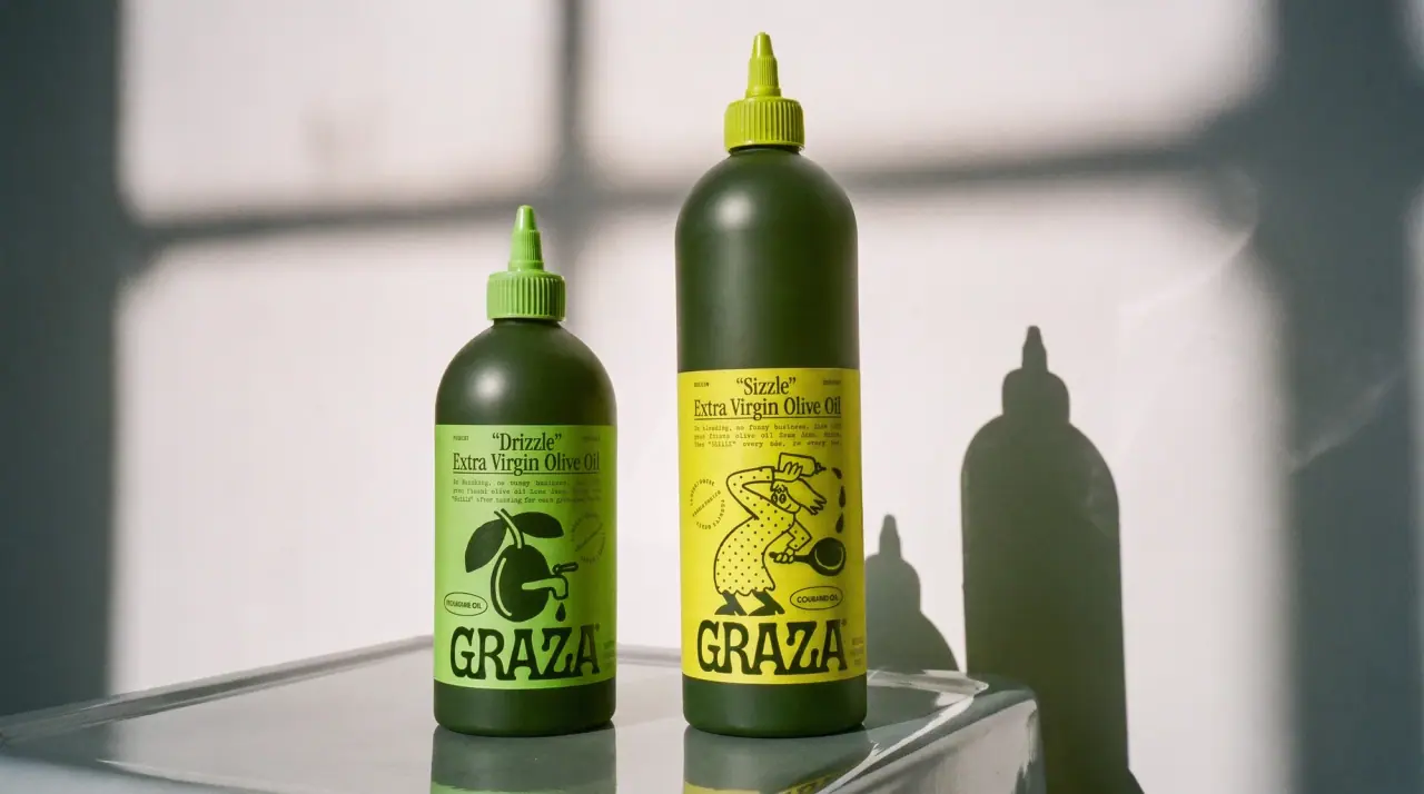
Graza
deli counter comic on bottle green