Photography: Ian Oliver Walsh — product photography. Images belong to their respective owners.
ICONIC London

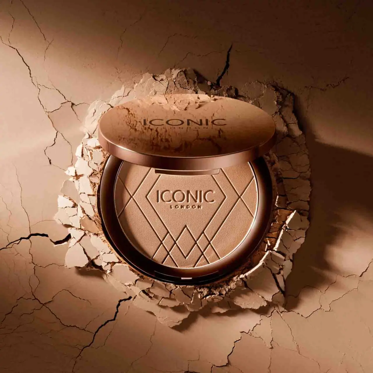
Geometric powder relief inside a warm reflective round compact
Ultimate Bronzing Powder makes the pressed product surface a major part of its presentation. Intersecting diagonal lines form angular compartments around a central ICONIC LONDON mark, while the circular case supplies a contrasting continuous rim. A displaced lid above the pan repeats the identity in dark lettering on a reflective warm metallic-looking face. The approved photograph sets this intact compact into a cracked earth-toned surround, amplifying texture and warmth. The current official page confirms 17 g and describes a gold compact, but the selected image's exact shade and component materials remain unidentified.
- Make-up
- Light pack
- Bold typographic
- Heritage label
About this study
The selected open Ultimate Bronzing Powder compact in Ian Oliver Walsh's photograph. Official current product facts supply context, while the photographed shade and hidden construction remain unverified.
Sources & evidence · Reviewed 2026-10-19Color Palette
Approximate colours interpreted from photography. These are screen references, not official brand colours or print specifications.
Pack body
Warm metallic case appearance
#9B6447
Approximate bronze-gold appearance under the selected warm light. The brand calls the compact gold; neither this HEX nor that wording specifies the substrate or coating process.
Ink
Dark lid lettering
#3B2115
Approximate maker lettering visible on the reflective lid. Its warm cast is affected by the scene and is not a confirmed ink formula.
Accent
Photographed tan powder
#BF9271
Approximate visible bronzer contents, explicitly not an identified retail shade or a package colour specification.
Typography
Suggested visual alternatives, not confirmed brand typefaces. Any scale below is an illustrative estimate.
ICONIC is the dominant word on both visible identity surfaces, with the smaller LONDON line below. On the lid, dark lettering contrasts with the reflective face. On the powder, the identity is formed in relief and becomes legible through shallow highlights and shadows instead of a separate printed ink. The large word uses broad clean uppercase forms, while the small location line is more compact. Product function and shade naming are not readable on these exposed surfaces, so the photograph prioritises brand recognition and tactile product presentation over a complete purchasing label.
Fonts
Original large maker alternative
Montserrat
- Looks like
- Broad clean sans capitals
- Type
- Geometric sans serif
- Weight
- Regular, Medium
- Case
- Uppercase
- Tracking
- Slightly open
- Fallback
- Arial, sans-serif
Create an original maker with different word length and arrangement. Check both printed and relief versions, since the same outlines can appear heavier or weaker when formed in powder.
Secondary identity alternative
Barlow
- Looks like
- Compact plain sans
- Type
- Sans serif
- Weight
- Medium, SemiBold
- Case
- Uppercase
- Tracking
- Open enough to separate small characters
- Fallback
- Arial, sans-serif
Use for a brief original secondary line or function, keeping it legible without turning it into an imitation of the small LONDON signature. Avoid placing essential shade identification only in relief that wears away.
Structure & Proportions
Visual proportions and finish previews are illustrative. Confirmed construction details and uncertainties are distinguished in the study notes.
Proportions
| Purpose | Value | Preview |
|---|---|---|
| Large uninterrupted product area | The circular powder pan occupies most of the visible base face, with a relatively narrow case rim around it. The official large-compact description does not supply a measured diameter. | — |
| Central identity within angular pattern | The logo sits inside a broad central compartment, while diagonal bands become denser toward the lower and side areas. | — |
| Lid overlapping the product view | The upper lid is foreshortened into an ellipse and covers a portion of the pan's upper edge in this staged view. This is a photographic relationship, not an opening-angle specification. | — |
Shapes
| Element | Value | Preview |
|---|---|---|
| Compact outline | Circular pan and case, seen with perspective and a foreshortened lid above. | |
| Powder pattern | Intersecting diagonals create a broad angular centre and smaller diamond-like compartments. | |
| Central maker area | Wide uninterrupted field reserved for the large maker word and small secondary line. | |
| Case perimeter | Continuous curved rim framing the more angular powder decoration. |
Finishes
Warm metallic-looking case
Lid exterior and inner rim; material and process unverified · metallic
Pressed geometric relief
Powder surface; emboss preview describes appearance only · emboss
Fine matte powder appearance
Broad pan surface between relief lines · matte
Formats and materials
| Formats | Broad circular pressed-powder compact, Exposed single pan with angular surface relief, Separate visible upper lid face in the staged composition, Current official product format lists 17 g |
| Materials | The brand describes a gold compact, which establishes its marketed appearance rather than a solid-gold or metal substrate specification., Case shell, pan support, hinge or attachment components and any metallisation method are not identified in the inspected source., The powder's fine surface grain and relief are visible, but their exact tooling, pressing sequence and depth are not documented. Powder decoration should not be confused with embossing a paper label. |
| Closures | The lid is positioned above and partly overlaps the exposed pan in the photograph. Its exterior maker face remains visible, while the interior and any hinge are hidden. This view does not demonstrate how it opens, locks or attaches. A small bright detail appears at the lower edge of the base, but it is not sufficient to classify a magnetic or snap mechanism. No mirror, applicator compartment or refill-removal system is inspected. |
| Decoration | Repeated maker identity on lid and powder, Large angular central field around the powder logo, Intersecting diagonal lines forming smaller diamond-like areas near the perimeter, No visible full ingredient or shade panel in this composition |
Front Panel
Schematic reading order. The diagram’s zone heights do not represent measured artwork proportions.
There is no conventional paper front label in this selected view. Identity is split between the reflective lid and the consumable powder surface. Both favour a large maker word over a small secondary line, giving continuity whether the closed exterior or open product is the focal point. The central pan field remains sufficiently clear for the wordmark despite the surrounding geometric pattern. The relief adds dimension rather than another colour. Exact shade, net weight and product title are supplied by source context where applicable, not inserted into an imagined visible label.
| Zone | Content |
|---|---|
| Lid exterior | Large dark ICONIC name with a smaller LONDON line on a reflective warm surface. |
| Powder centre | Same maker identity formed as dimensional lettering in the tan powder. |
| Powder perimeter | Intersecting diagonal relief surrounding the broad central identity area. |
| Case rim | Smooth reflective border giving a circular boundary to the angular pattern inside. |
Range System
The official page lists six bronzer shades and identifies the current product as 17 g, but the selected photographer image is not linked to a confirmed shade name. The page's default Light Bronze selection must not be treated as an identification of this photograph. The visible pan colour is affected by the warm lighting and surrounding set. As an original design principle, a common case and pattern could unify shade options, but the permanent shade identifier would still need a reliable readable location. No full set of actual shade packaging has been inspected here.
- The source lists names including Light Bronze, Medium Bronze and Rich Bronze, establishing a shade range without identifying this pan.
- The repeated lid and powder identities create continuity between exterior and open-product views.
- A fictional range should keep essential variant information on a durable surface because the powder relief changes as the product is used.
Back of Pack & Shelf
The underside, inner lid, hinge area and carton are not visible. No existing shade label, barcode, ingredient panel or mirror arrangement is reconstructed.
- The official 17 g quantity is a source fact, not a readable mark in this photograph.
- Do not infer refill removal or a replaceable pan from the presence of a circular powder insert.
- For original artwork, assign permanent identification separately from the powder surface so repeated use does not erase practical information.
On shelf
As a visual interpretation, the large round case and reflective face can create a strong display presence, while an open view offers an additional geometric identity through the pan. Closed and open recognition use different contrasts: dark-on-metallic lettering outside, light-and-shadow relief inside. The latter is less durable because brushing wears the product surface. This makes the permanent lid identity important even if the powder is initially the more striking graphic. Retail or use assessment should include glare on the lid and legibility after the relief has partly disappeared, not only the unused campaign presentation.
Imagery
Ian Oliver Walsh's selected beauty photograph places the compact in a cracked clay-coloured surround with loose fragments clustered around its edge. Directional light reveals the powder's fine grain and the relief lines while giving the lid a soft metallic glow. The powder itself appears intact; the cracks belong to the surrounding set and should not be described as product damage. Dust or material on the lid participates in the staging. The visual connection between tan powder and earth-toned background reinforces warmth, but it is not evidence that clay is a formula ingredient or that the case has a distressed finish.
Guidelines
Editorial principles for an original design brief, not official brand guidelines.
Do
- Separate permanent case identity from consumable powder decoration.
- Keep a clear central area within a geometric relief pattern.
- Test identity under both reflective and matte lighting conditions.
- Leave photographed shade unnamed when evidence does not identify it.
- Distinguish set fragments from actual product damage.
Don't
- Do not call the case solid gold or metal without a specification.
- Do not assign the product page's default shade to this photograph.
- Do not infer a mirror, magnetic closure or refill mechanism.
- Do not copy the intersecting diamond pattern or maker wordmark.
- Do not put essential shade information only in relief that wears away.
Sources & evidence
- Ultimate Bronzing Powder — ICONIC Londonproduct
- Beauty Still Life Photography — Ian Oliver Walshphotographer
How this study was built
edition · Sourced fact
The official current product is listed at 17 g and described as a large gold compact.Ultimate Bronzing Powder — ICONIC Londonrange · Sourced fact
The official page lists six shades but does not identify which shade appears in the selected photographer image.Ultimate Bronzing Powder — ICONIC Londonstructure · Visual observation
The selected open circular pan has angular pressed relief around a central maker identity; lid interior and closure mechanism are hidden.Beauty Still Life Photography — Ian Oliver Walshtypography · Visual observation
Maker identity repeats as dark lettering on the lid and dimensional lettering in the powder.Beauty Still Life Photography — Ian Oliver Walshimagery · Visual observation
Cracked earth-toned material surrounds the compact while the powder pan appears intact, separating set texture from product damage.Beauty Still Life Photography — Ian Oliver Walshlabel · Editorial interpretation
Powder relief is consumed during use, so permanent case identity and practical variant information serve a different role.
What remains unverified
- Photographed shade is not identified; default product-page selection is not proof.
- Gold compact wording does not establish case substrate or finishing process.
- Closure mechanism, mirror, underside, carton and refillability are unverified.
- Exact typefaces, relief-tooling details and dimensions are unknown.
Give your AI
packaging taste
Give your design or image tool a packaging study: palette, type, structure, front panel and principles for an original brief.
Export this styleFree with an email. PACK.md works in Claude, ChatGPT, Cursor and image tools.
More like this
Black Girl Sunscreen
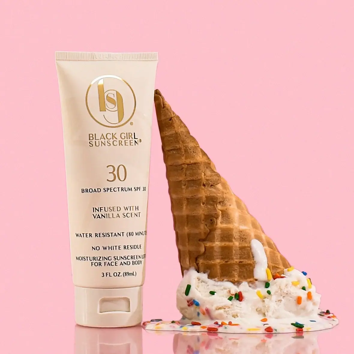
Cream tube with gold crest and an isolated SPF numeral
COOLA
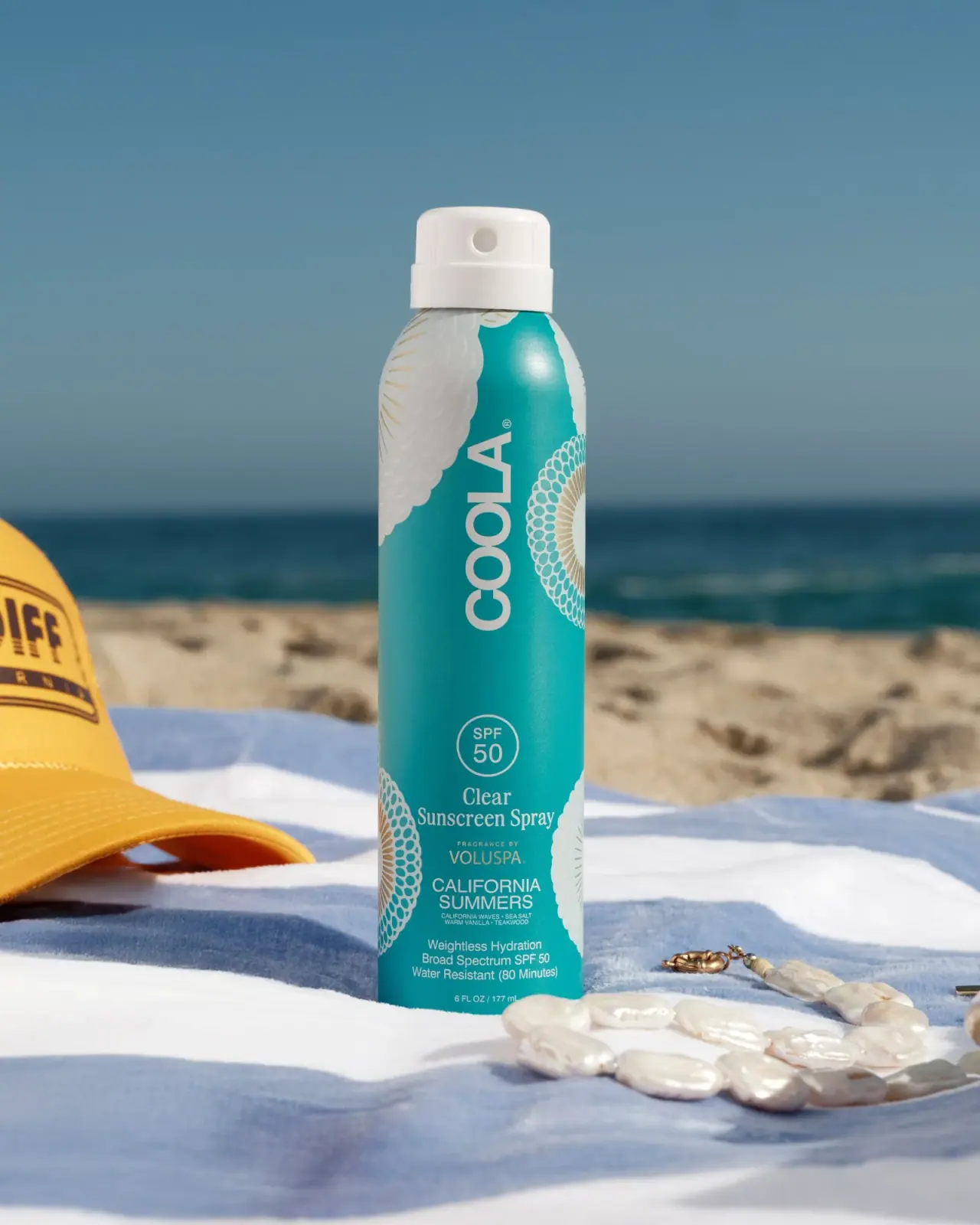
Turquoise cylinder, cropped rosettes, vertical brand and fragrance attribution
Coppertone
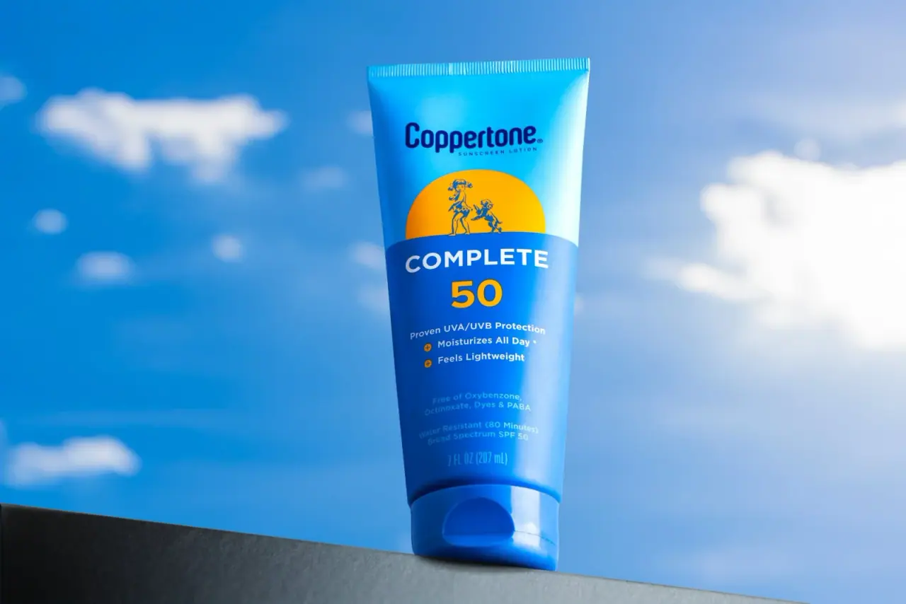
Blue fields, a yellow sun and a clear number

Dr. Bronner’s
A bright soap wrapper with a densely ordered voice
L:A Bruket
Amber pump bottle with a ruled typographic information label
Bijou Candles
Pink blackletter and fine webs on a tall dark candle

Kettle & Fire
farmhouse animal badges on black cartons
La Belle Mèche
Green scent lettering inside an arched white candle label