Images from the packaging case study by Colony
Verve Coffee

cream coffee bags sliced by a regional diagonal
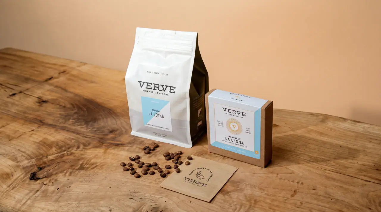
Verve runs its single origins on one matte Bean Cream (#f3f0e5) flat-bottom bag with a wide slab-serif wordmark centred in the upper third, a tracked 'coffee roasters' line under it, and a small white ruled data box below, like a specimen card. The only colour is a diagonal wedge rising from the lower corner across the bag, Latin Sky (#a9d0df) for Latin American coffees and Africa Coral (#d8665f) for East African ones, with a tiny line icon (tree or sun), the region name and three sourcing lines printed inside it in a darker shade of the wedge. Everything that changes per lot (origin, lot or farm name, process, variety, tasting notes, a two-word summary) lives in the box, espressos are marked by outlining the box in the wedge colour, and the shelf reads as two colour families of near-identical bags.
- Coffee & tea
- Light pack
- Colour-coded range
- Heritage label
- Bold typographic
Color Palette
Approximate colours interpreted from photography. These are screen references, not official brand colours or print specifications.
Pack body
Bean Cream
#f3f0e5
Matte cream bag body, the field for the wordmark and data box
Label
Card White
#ffffff
Ruled data box ground sitting across the diagonal edge
Ink
Roaster Black
#2a2826
Wordmark, data box rules and all box text
Coral Deep
#8a4a45
Darker coral for the region name, sun icon, sourcing lines and roast line printed on the coral wedge
Sky Deep
#4f7a8a
Darker blue for the region name, tree icon and sourcing lines on the blue wedge
Range coding
Latin Sky
#a9d0df
Diagonal corner wedge for Latin American origins
Africa Coral
#d8665f
Diagonal corner wedge for East African origins; also the outline of the espresso data box
Typography
Suggested visual alternatives, not confirmed brand typefaces. Any scale below is an illustrative estimate.
The wide capital wordmark is the largest element, with 'coffee roasters' tracked out beneath it. In the box the lot name is the biggest text, set in one or two lines of wide sans capitals, with tiny tracked capitals for origin, process, variety, tasting notes and the summary line. Region and sourcing lines in the wedge, and the roast and weight line at the base, are the quietest text.
Type scale
Estimated cap size as a share of the panel · Front of the 12 oz flat-bottom bag, about 230 mm tall
wordmark
5% · Bold · Display
VANTAGE
lot-name
3% · Regular · Headline
LA ESPERA
region-name
2.4% · Bold · Body
EAST AFRICA
origin-tag
1.5% · SemiBold · Label
SINGLE ORIGIN
summary
1.5% · SemiBold · Label
BRIGHT + SILKY
sourcing-lines
1.4% · Bold · Body
SEASONAL · DIRECT TRADE
Fonts
Display
Arvo
- Looks like
- Custom wide western slab, close to Rockwell Extended or Clarendon Wide
- Type
- Wide slab serif with a distinctive R
- Weight
- Bold
- Case
- Uppercase
- Tracking
- Open, about +8%
- Fallback
- Rockwell, Courier New Bold
The wordmark only, centred in the upper third.
Headline
Archivo
- Looks like
- Eurostile Extended, Neue Haas Grotesk Wide
- Type
- Wide grotesque (expanded width)
- Weight
- Regular, Medium
- Case
- Uppercase
- Tracking
- Open, about +4%
- Fallback
- Helvetica Neue Extended, Arial
Lot or farm name in the main cell of the data box, often broken over two lines.
Label
Archivo Narrow
- Looks like
- Akkurat, Neue Haas Grotesk
- Type
- Small tracked grotesque
- Weight
- Regular, SemiBold
- Case
- Uppercase
- Tracking
- Wide, about +12%
- Fallback
- Arial Narrow, Helvetica
'Coffee roasters' line, origin tag, country and region, process, variety, tasting notes, summary and roast line.
Body
Courier Prime
- Looks like
- Courier, Pitch
- Type
- Typewriter monospace
- Weight
- Bold
- Case
- Uppercase
- Tracking
- Normal
- Fallback
- Courier New, monospace
Region name and the three stacked sourcing lines inside the coloured wedge.
Structure & Proportions
Proportions
| Purpose | Value | Preview |
|---|---|---|
| Wedge coverage | About 35% of the bag front, a triangle-trapezoid from the lower corner | |
| Wedge angle | Rises from the lower left to the right edge at roughly 30 to 35 degrees | — |
| Wordmark width | About 60% of bag width, centred about 25% down | |
| Data box width | About 45% of bag width, centred, straddling the wedge edge | |
| Data box height | About 35% of bag height | |
| Colours per bag | Four: cream, one wedge colour, its darker shade, black ink (plus white box) | — |
| Density | Open cream field with all detail packed into one small grid | — |
Shapes
| Element | Value | Preview |
|---|---|---|
| Region wedge | Diagonal colour block from the lower corner | |
| Data box | Thin-ruled rectangle split into cells | |
| Bag | Flat-bottom pouch with square shoulders | |
| Region icon | Small round sun or tree line icon |
Finishes
Matte paper-look film
Whole bag · matte
Flat printed white box
Data box on the front · uncoated
Formats and materials
| Formats | Flat-bottom coffee pouch |
| Materials | Flexible film |
| Closures | Heat-sealed top, folded flat; flat gusseted base |
| Decoration | Diagonal colour block, Printed ruled data box, Thin-line regional icon |
Front Panel
Schematic reading order. The diagram’s zone heights do not represent measured artwork proportions.
No applied label: a white ruled box is printed straddling the diagonal edge of the colour wedge, under a centred wordmark.
| Zone | Content |
|---|---|
| Upper third | Wordmark and 'coffee roasters' line |
| Data box top | Single origin or espresso tag, country and region |
| Data box middle | Lot name, then split cells for process and variety |
| Data box bottom | Three tasting notes and a two-word summary in its own cell |
| Coloured wedge | Line icon, region name, sourcing lines, roast level and weight |
Range System
Colour coding by growing region via the corner wedge, with every other element fixed; the data box contents change per lot, and espressos are marked by outlining the box in the wedge colour.
- Colombia, Costa Rica, Honduras = light blue wedge + tree icon
- Ethiopia, Kenya = coral wedge + sun icon
- Single origin espresso = coral-outlined data box
Back of Pack & Shelf
The back stays cream with the wedge colour continuing around the base gusset: a short paragraph about the producer and lot, brewing guidance, roast date and the legal block, in the same small tracked capitals.
- Producer and lot story paragraph
- Elevation, harvest and process details
- Brewing recommendation in a short ruled grid
- Roasted-on date stamp area and degassing valve
- Barcode, roaster address and recycling note
On shelf
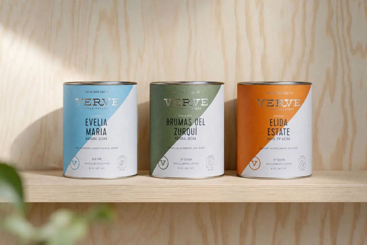
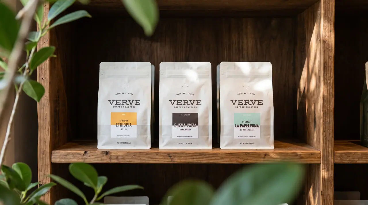
A row of bags reads as near-identical cream cards with the wordmark at the same height, split into a blue group and a coral group by the corner wedge, so customers sort by region before reading a single lot name.
Imagery
No pictures beyond a tiny thin-line regional icon (a tree, a sun) in the wedge; the pack relies on the diagonal colour block and ruled typography.
Guidelines
Do
- Keep the bag body matte Bean Cream (#f3f0e5) and centre the Display wordmark in the upper third at about 60% of the width.
- Run one diagonal colour wedge from the lower corner across about 35% of the front.
- Code the wedge colour by growing region: Latin Sky (#a9d0df) or Africa Coral (#d8665f).
- Put all lot-specific facts in a white thin-ruled box about 45% of the width that straddles the wedge edge.
- Set region and sourcing lines in Body typewriter capitals inside the wedge, in a darker shade of its colour.
- Mark special lots by changing only the box outline colour.
Don't
- Don't use photography, landscapes or illustrations of farms.
- Don't add a second colour wedge or gradient.
- Don't use glossy or kraft materials; the bag is matte cream.
- Don't move the data box or wordmark between coffees.
- Don't set the lot name in the wordmark's slab serif.
- Don't print text in the wedge in black; use the darker wedge shade.
Give your AI
packaging taste
Give your design or image tool a packaging study: palette, type, structure, front panel and principles for an original brief.
Export this styleFree with an email. PACK.md works in Claude, ChatGPT, Cursor and image tools.
More like this

Kettle & Fire
farmhouse animal badges on black cartons

Dr. Bronner’s
A bright soap wrapper with a densely ordered voice
Liquid Death
blackletter tallboys with a gold death band

Bachan's
octopus mascot on a red-capped squeeze

Behave
struck-through wordmark on sour neon pouches
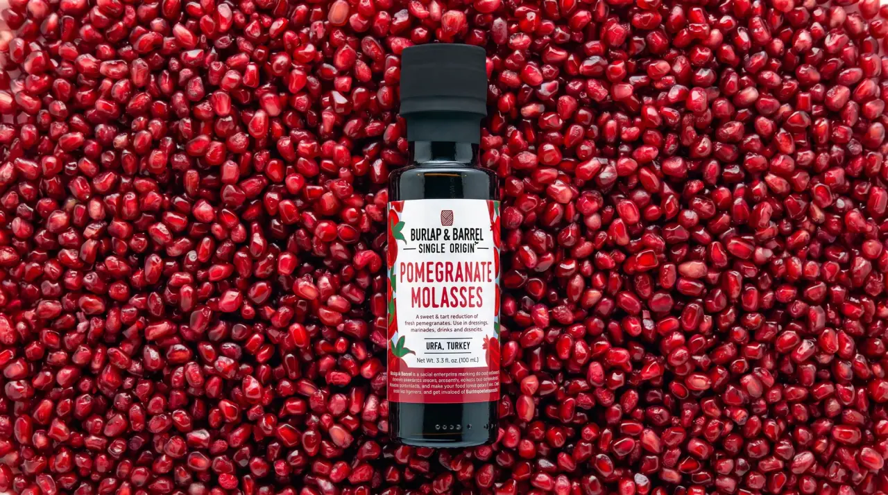
Burlap & Barrel
field-guide labels on clear spice jars
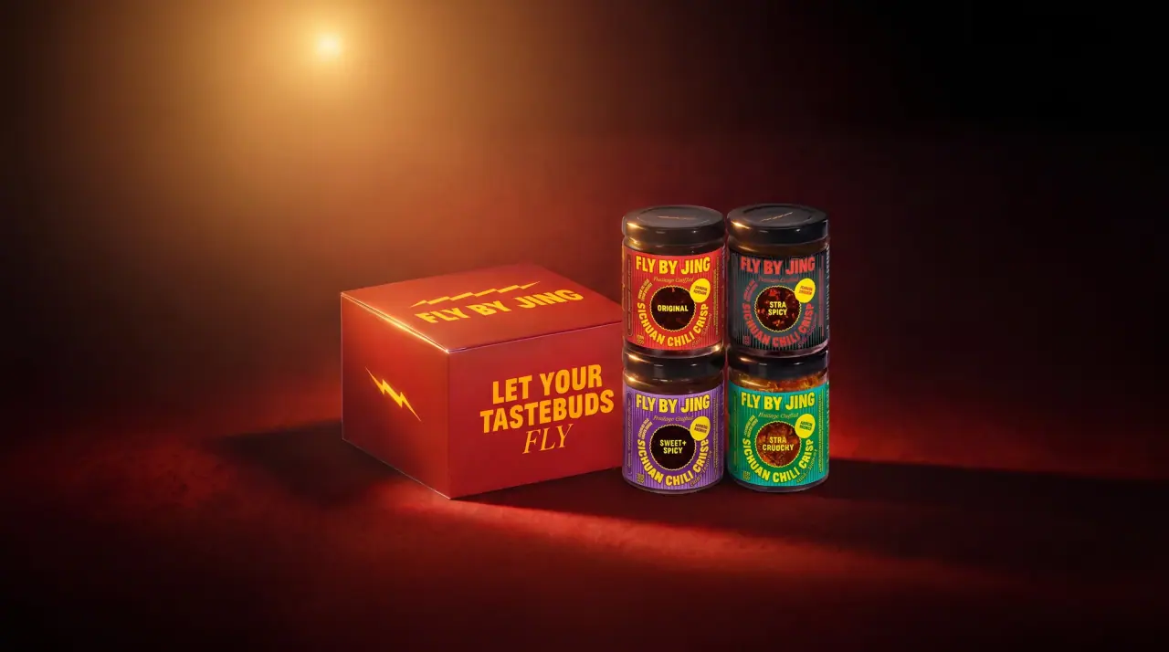
Fly By Jing
sichuan street poster, turned up loud
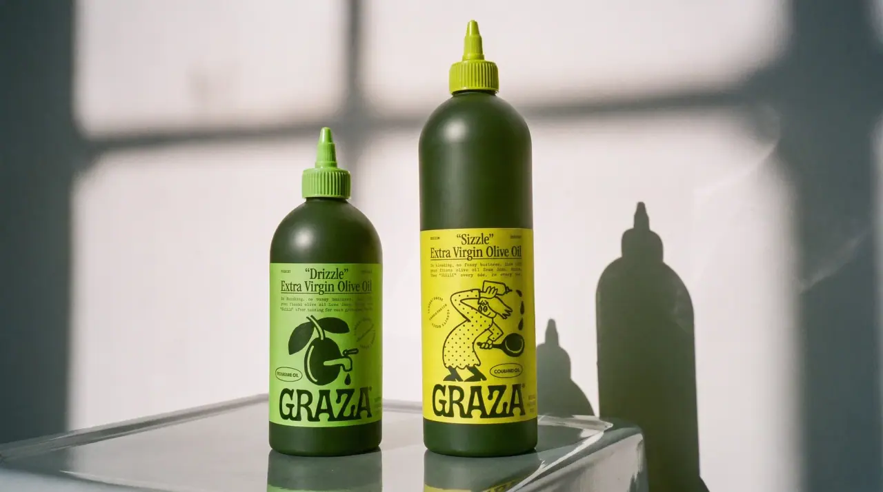
Graza
deli counter comic on bottle green