Campaign images © Ghia, from drinkghia.com
Ghia

riviera aperitivo hour after dark
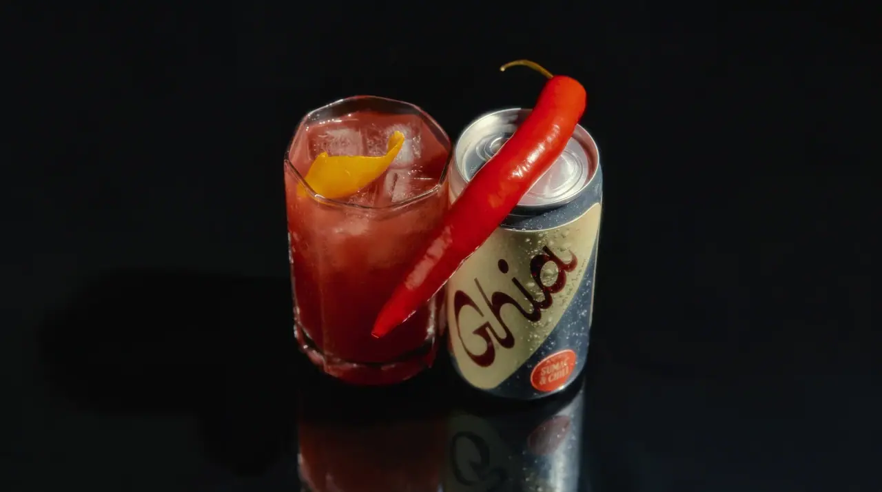
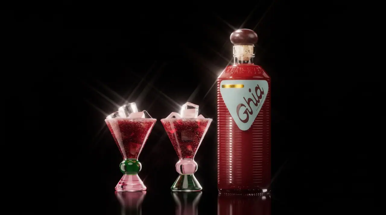
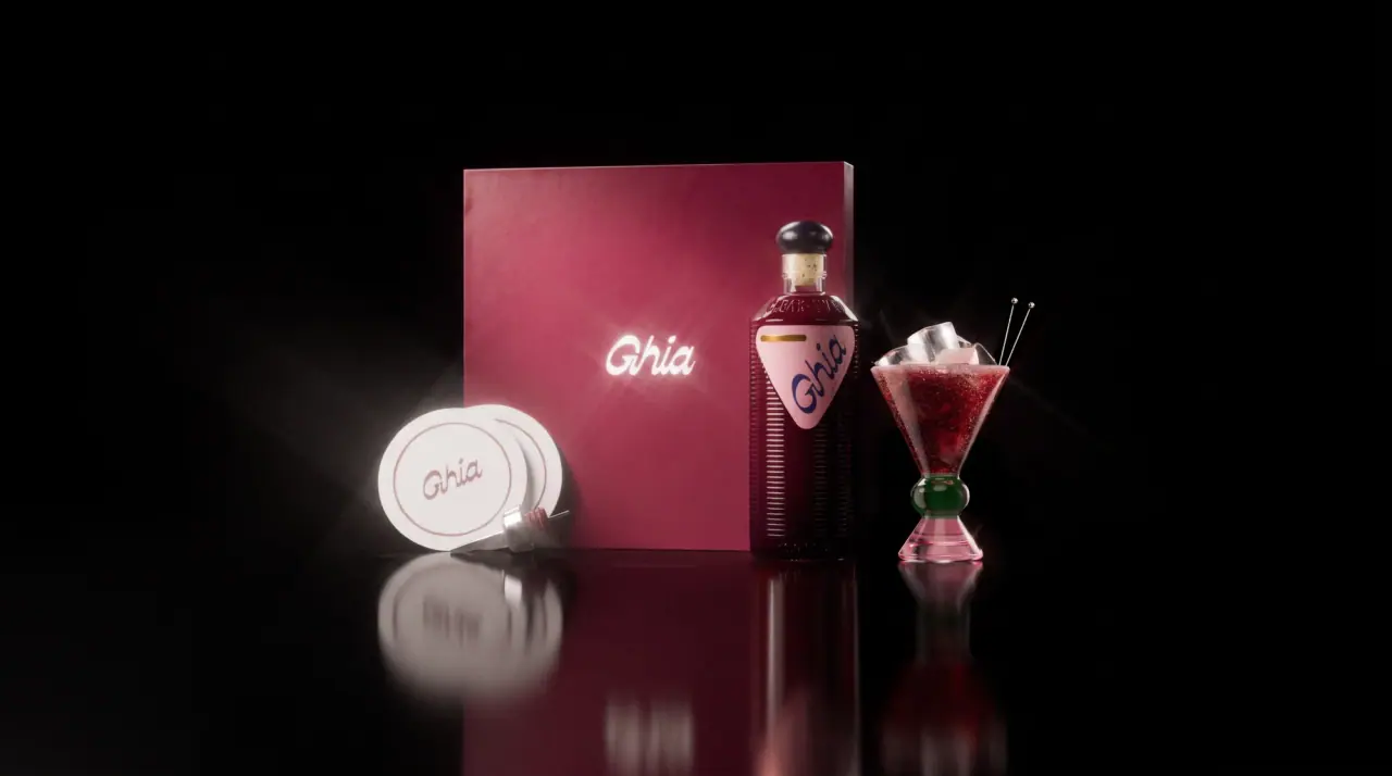
Ghia packages its non-alcoholic apéritifs like a mid-century Mediterranean bar product. Every pack carries one tilted, rounded-triangle label that runs diagonally across the body and holds a huge looping monoline script wordmark, with a small red roundel (#c8282b) naming the flavour and a tiny red tab at the top corner. The apéritif bottles keep a horizontally ribbed glass body full of deep garnet liquid, a cork-style neck and a coloured knob stopper, while the spritz cans leave bare brushed aluminium (#c9cbcf) showing around the triangle and change only the label colour and script colour per flavour. Everything is shot on pure black with glossy reflections and star flares.
- Beer & aperitifs
- Dark pack
- Colour-coded range
- Bold typographic
Color Palette
Approximate colours interpreted from photography. These are screen references, not official brand colours or print specifications.
Pack body
Brushed Aluminium
#c9cbcf
Bare silver can body left visible around the diagonal label on every spritz can
Bitter Garnet
#5a1622
Deep red apéritif seen through the ribbed glass bottle and the Le Fizz bottles
Label
Blush Pink
#e8a9b4
Triangle label on the Berry bottle; pale aqua and coral versions on Original and Le Fizz
Ink
Oxblood Script
#5c1a24
Wordmark and small type on pale labels (Sumac & Chili, Berry, Original)
Chartreuse Script
#d4dc4a
Wordmark ink on the green Lime & Salt label
Accent
Campari Roundel
#c8282b
Circular flavour badge and the tiny 'Apéritif' tab at the label corner
Stopper Plum
#3d2a4f
Rounded knob stopper on the Berry apéritif bottle
Range coding
Riviera Blue
#4a7fc8
Label field on the Blood Orange spritz can, with white script
Lime Leaf
#5f7f3a
Label field on Lime & Salt, with chartreuse script
Sumac Cream
#dcd79a
Pale yellow-cream label field on Sumac & Chili, with oxblood script
Soda Burgundy
#6e2232
Label field on Ghia-Soda cans and the gift carton, with white script
Typography
Suggested visual alternatives, not confirmed brand typefaces. Any scale below is an illustrative estimate.
The script wordmark is almost the whole label: it runs on a rising diagonal at near-full triangle width. Everything else is small and pushed to the edges: a tiny caps tab at the top corner, the volume running vertically along the label edge, and 'Le Spritz' plus the flavour name inside a roundel near the base.
Type scale
Estimated cap size as a share of the panel · Front of the 8 oz Le Spritz can, about 135 mm tall
wordmark
22% · Regular · Script
Bella
bottle-wordmark
12% · Regular · Script
Bella
flavour-name
3% · Bold · Headline
FIG & PEPPER
sub-line
1.8% · Medium · Label
LE SPRITZ
corner-tab
1.5% · Medium · Label
APÉRITIF
volume
1.4% · Medium · Label
8 FL OZ · 236 ML
Fonts
Script
Pacifico
- Looks like
- Sign-painter monoline scripts, Pacifico (lighter and rounder)
- Type
- Rounded monoline connected script with a looping capital
- Weight
- Regular
- Case
- Title case
- Tracking
- Normal, connected
- Fallback
- Lobster, Brush Script MT
Wordmark only, set on a rising angle across the triangle label in the flavour's script colour.
Headline
Bitter
- Looks like
- Clarendon Condensed, Recoleta Condensed
- Type
- Condensed bold serif
- Weight
- Bold
- Case
- Uppercase
- Tracking
- Slightly open, about +3%
- Fallback
- Clarendon, Georgia Bold
Flavour name ('Sumac & Chili') stacked inside the red roundel, white on red.
Label
Archivo
- Looks like
- Neue Haas Grotesk, Akzidenz-Grotesk
- Type
- Small grotesque caps
- Weight
- Medium
- Case
- Uppercase
- Tracking
- Wide, about +10%
- Fallback
- Helvetica, Arial
'Apéritif' on the corner tab, 'Le Spritz' above the flavour, and the vertical volume line.
Body
Inter
- Looks like
- Helvetica, Inter
- Type
- Plain neo-grotesque
- Weight
- Regular, Bold
- Case
- Sentence case
- Tracking
- Normal
- Fallback
- Helvetica, Arial
Nutrition facts, ingredients and story copy on the back of cans and bottles.
Structure & Proportions
Proportions
| Purpose | Value | Preview |
|---|---|---|
| Label coverage (can) | About 60% of the visible can face; the rest is bare silver | |
| Wordmark width | About 90% of the triangle's width | |
| Label tilt | About 20 degrees off vertical, identical on every SKU | — |
| Roundel diameter | About 20% of can width, lower right of the label | |
| Bottle label height | About 30% of bottle height, mid-body | |
| Colours per pack | Three: label field, script ink, red roundel, plus bare metal | — |
| Density | One big gesture, tiny satellites at the edges | — |
Shapes
| Element | Value | Preview |
|---|---|---|
| Label | Rounded triangle, wide at the top, tilted on a diagonal | |
| Flavour badge | Small red roundel | |
| Corner tab | Tiny red rectangle at the top corner | |
| Stopper | Rounded knob over a cork neck | |
| Bottle body | Horizontal ribs around the glass |
Finishes
Brushed aluminium
Exposed can body · metallic
Matte flat print
Triangle labels · matte
Ribbed glass
Apéritif bottle body · gloss
Clear glass
Le Fizz sparkling bottles · transparent
Formats and materials
| Formats | Ribbed glass bottle, Sparkling glass bottle, Slim can, Multipack and gift carton |
| Materials | Glass, Aluminium, Paperboard |
| Closures | Rounded coloured knob stopper over a cork-style neck on the apéritif bottle, red crown cap on Le Fizz, standard can ends |
| Decoration | Diagonal rounded-triangle label, Oversized script wordmark, Circular flavour badge, Small corner tab |
Front Panel
Schematic reading order. The diagram’s zone heights do not represent measured artwork proportions.
A single rounded triangle, wide at the top and tapering towards the base, tilted so it runs across the body on a diagonal; on bottles it sits mid-body as a shield, on cans it wraps from shoulder to base and leaves silver exposed on one side.
| Zone | Content |
|---|---|
| Top corner | Small red tab reading 'Apéritif' |
| Centre | Script wordmark at almost full label width, set on a rising angle |
| Edge | Volume line rotated vertically |
| Lower right | Red roundel with 'Le Spritz' and the flavour name |
Range System
Colour coding with a fixed shape: each flavour owns one label colour and one script colour, while the triangle, the angle, the roundel and the bare metal never change.
- Blood Orange = blue label + white script
- Lime & Salt = green label + chartreuse script
- Sumac & Chili = cream label + oxblood script
- Ghia-Soda = burgundy label + white script
- Berry = pink triangle on garnet bottle
Back of Pack & Shelf
On cans the reverse face repeats the triangle with a nutrition panel set inside a white rounded box and a short ingredient line; bottles carry a small back label in the same colour.
- Nutrition facts in a white box on the bare metal
- Botanical ingredient list in one paragraph
- 'Non-alcoholic' and serving suggestion line
- Barcode and can recycling marks
- Small brand story sentence and web address
On shelf
Stacked cans read as a diagonal stripe of colour repeated on silver, so a fridge row turns into a pattern; the ribbed garnet bottle stands apart as the hero.
Imagery
No illustration or photography on pack; the brand image is staged as glossy product shots on pure black with reflective floors and star-flare highlights.
Guidelines
Do
- Use one rounded triangle label on a diagonal of about 20 degrees and keep that angle identical on every SKU.
- Let the script wordmark fill about 90% of the label width.
- Leave bare brushed aluminium (#c9cbcf) visible around the label on cans.
- Change only two colours per flavour: the label field and the script ink.
- Put the flavour name in a small red (#c8282b) roundel at the lower corner of the label.
- Keep secondary type tiny and pushed to the label edges.
- Shoot packs on black with glossy reflections.
Don't
- Don't print a full-wrap can; the silver showing through is part of the identity.
- Don't add fruit illustrations or photography to the label.
- Don't set the wordmark horizontally or in a sans-serif.
- Don't use more than one accent shape besides the triangle and the roundel.
- Don't use gold foil or embossing; the finish stays flat colour on metal or glass.
- Don't crowd the label with claims; legal text goes to the back.
Give your AI
packaging taste
Give your design or image tool a packaging study: palette, type, structure, front panel and principles for an original brief.
Export this styleFree with an email. PACK.md works in Claude, ChatGPT, Cursor and image tools.
More like this
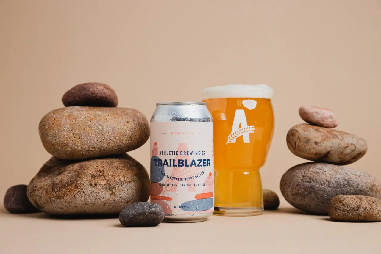
Athletic Brewing
trailhead poster cans under a wheat-stalk monogram
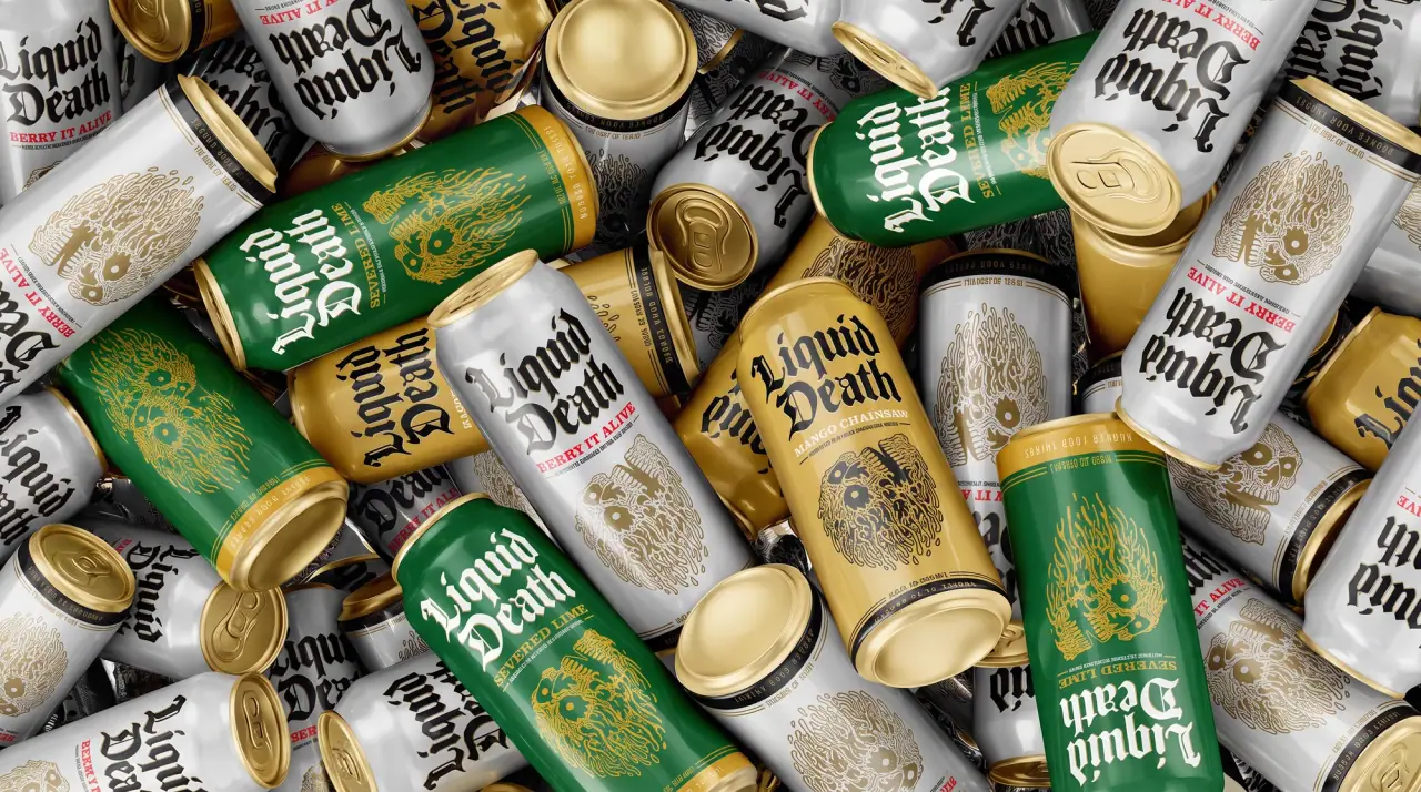
Liquid Death
blackletter tallboys with a gold death band

AKT
Lilac stage directions with a quiet metallic detail

Behave
struck-through wordmark on sour neon pouches
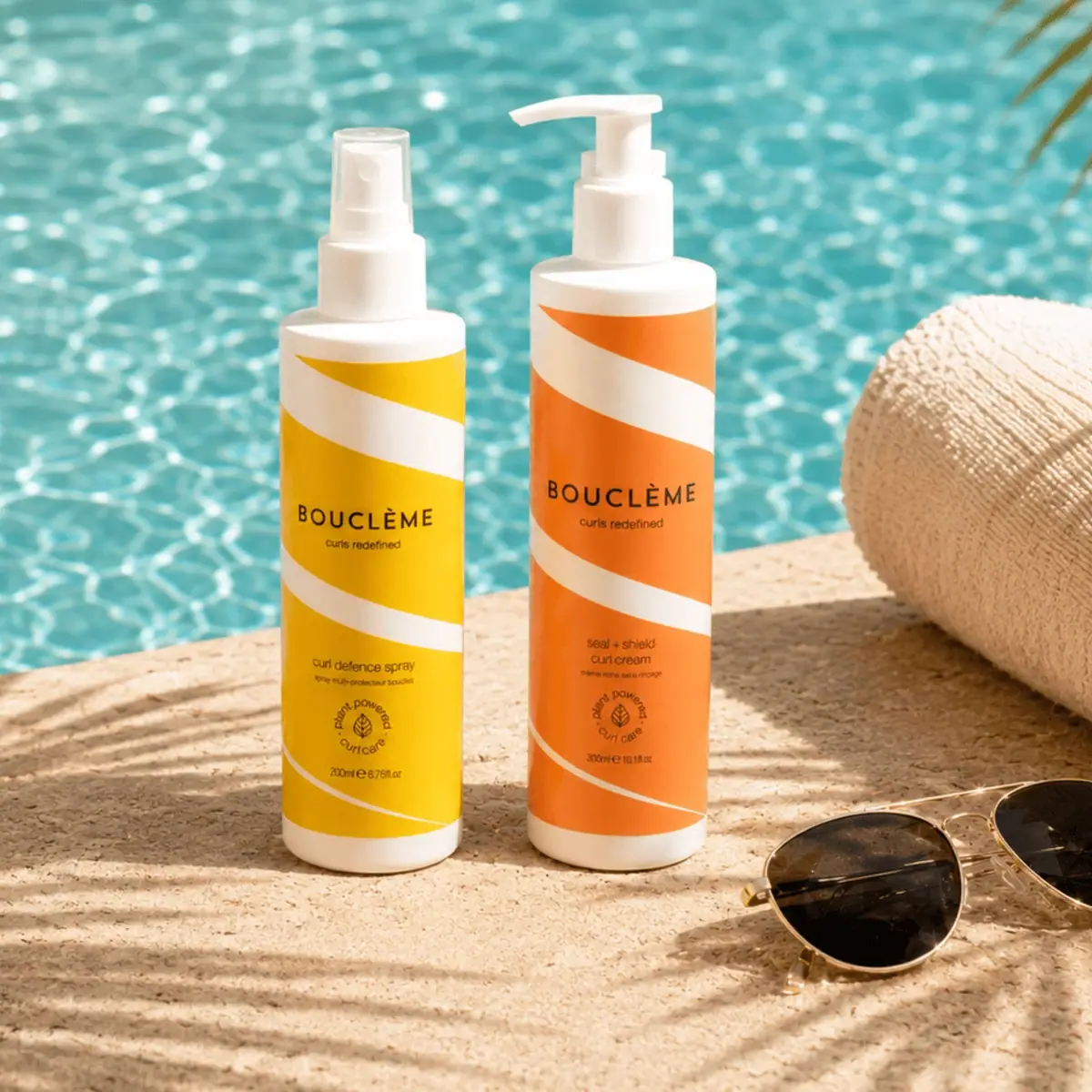
Bouclème
warm colour blocks crossed by flowing white ribbons

Boy Smells
candy-shell flacons over blush pink glass
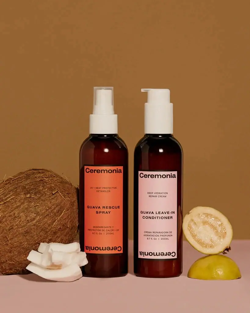
Ceremonia
Warm colour labels bounded by upright and inverted wordmarks

Dr. Bronner’s
A bright soap wrapper with a densely ordered voice