Images from the packaging case study by Alex Lang · Campaign images © Liquid Death, from liquiddeath.com
Liquid Death

blackletter tallboys with a gold death band
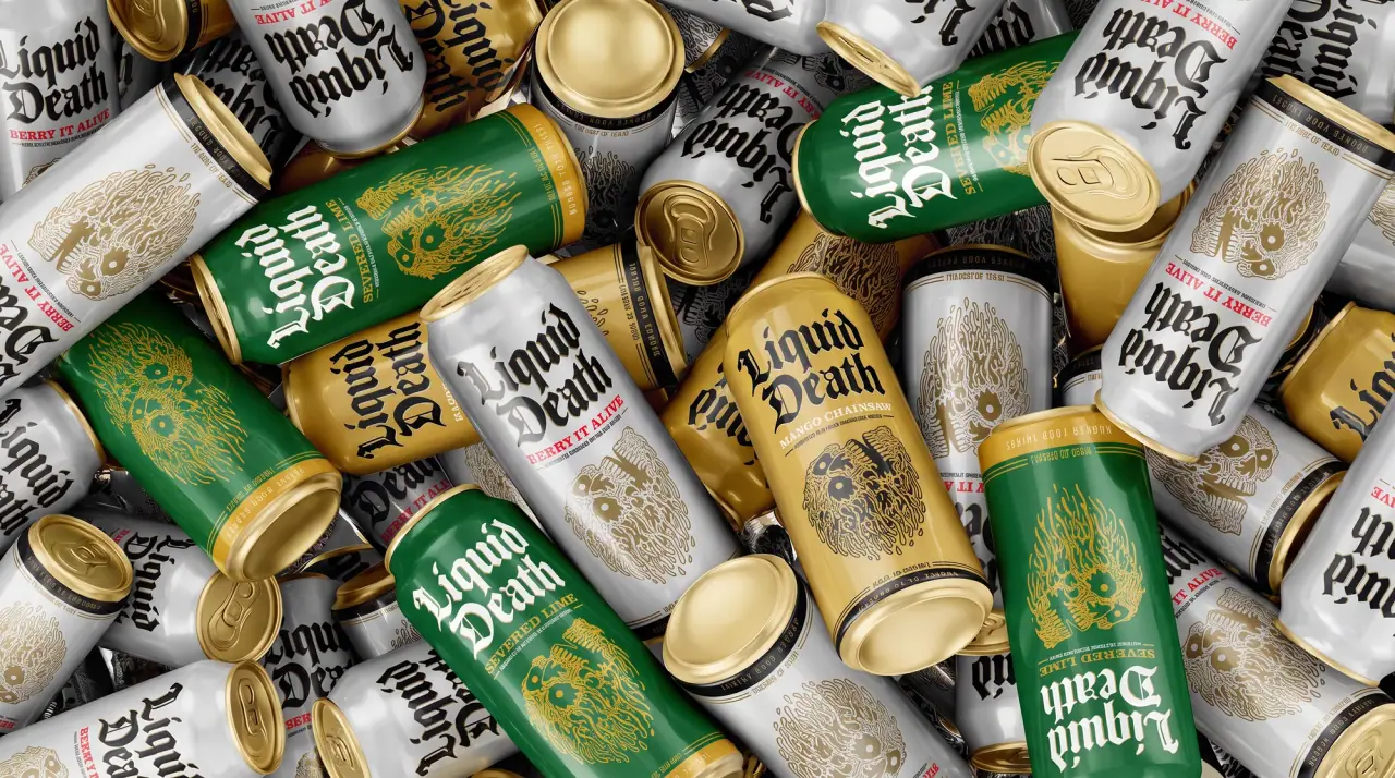
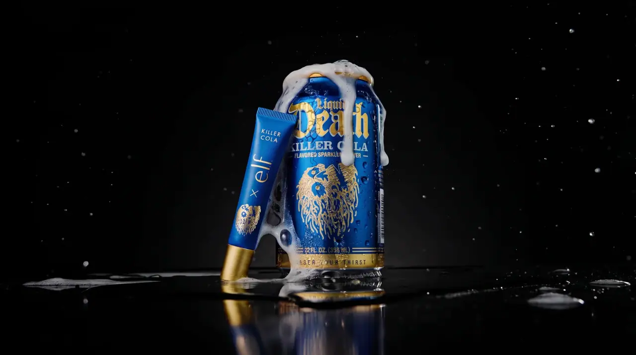
Liquid Death sells water, tea and sparkling flavours in cans styled like a metal band's tour merchandise. Every can runs the same centred stack: a towering two-line textura blackletter wordmark with the second word far larger, a violent pun flavour name in bold Roman capitals, a condensed descriptor between short gold rules, a dense single-ink illustration of a melting skull with dripping strands, and a gold (#d9ad3c) base band with the tracked slogan 'Murder Your Thirst'. Flavours change only the can colour and its ink (navy on white for still water, gold over navy for the tea lemonade, gold on purple, plum or cobalt), and multipack cartons default to matte black (#1c1a1b) or a flat flavour colour with the wordmark recoloured and gold claim roundels in the corner.
- Water
- Soft drinks
- Dark pack
- Bold typographic
- Colour-coded range
- Heritage label
Color Palette
Approximate colours interpreted from photography. These are screen references, not official brand colours or print specifications.
Pack body
Coffin Black
#1c1a1b
Multipack carton ground and blacked-out can bodies such as the citrus flavour
Tombstone White
#f2f1ec
Still mountain water can body behind navy type and gold illustration
Ink
Grave Navy
#1b2a5a
Wordmark on the white can and full body of the cola and tea-lemonade cans
Accent
Reliquary Gold
#d9ad3c
Illustration ink, rules, can ends and the slogan base band on every pack; upper half of split cans
Range coding
Severed Green
#2f9a45
Lime can body and its green wordmark on the black carton
Peach Blood
#b8171a
Lower half of the gold-over-red peach tea can and its wordmark
Doctor Purple
#4b2458
Full purple can under gold blackletter and gold skull
Cider Plum
#7a2140
Limited-edition cider can and its wordmark on the black carton
Chainsaw Orange
#e8922a
Wordmark on the black mango carton and the mango can
Buzzsaw Blue
#2f8fd4
Flat blue 12-pack carton of the blueberry tea with white blackletter
Typography
Suggested visual alternatives, not confirmed brand typefaces. Any scale below is an illustrative estimate.
The two-word blackletter wordmark fills the top third to half of the can, with the first word small and the second huge. A bold Roman flavour pun follows in capitals, then a condensed descriptor between two short gold rules, then the illustration, the volume on a ruled line and the slogan tracked out inside the gold base band.
Type scale
Estimated cap size as a share of the panel · Printed front of the 19.2 oz tallboy can, about 160 mm from shoulder to base
wordmark-main
14% · Bold · Display
Grave
wordmark-first
7% · Bold · Display
Holy
flavour-pun
3.2% · Bold · Headline
LIME TO DIE
descriptor
1.6% · Medium · Label
FLAVORED SPARKLING WATER
carton-roundel
1.5% · Medium · Label
0g SUGAR
slogan
1.2% · SemiBold · Body
QUENCH YOUR DOOM
Fonts
Display
UnifrakturCook
- Looks like
- Old English Text MT, Cloister Black
- Type
- Heavy textura blackletter
- Weight
- Bold
- Case
- Title case
- Tracking
- Tight
- Fallback
- Old English Text MT, serif
The wordmark only, stacked on two lines with the second word about twice the size of the first, sometimes with a thin offset outline in a second colour.
Headline
Cinzel
- Looks like
- Trajan Bold, Clarendon Bold Wide
- Type
- Bold Roman inscriptional capitals
- Weight
- Bold, Black
- Case
- Uppercase
- Tracking
- Slightly wide, about +3%
- Fallback
- Trajan Pro, Times New Roman Bold, serif
Pun flavour names ('DOCTOR DEATH', 'KILLER COLA') directly under the wordmark, in the wordmark colour or white on black cartons.
Label
Oswald
- Looks like
- Trade Gothic Bold Condensed
- Type
- Condensed grotesque
- Weight
- Medium
- Case
- Uppercase
- Tracking
- Wide, about +6%
- Fallback
- Arial Narrow, sans-serif
Format line between two short gold rules ('FLAVORED SPARKLING WATER') and the claim figures in carton roundels.
Body
Montserrat
- Looks like
- Gotham Medium, Futura Medium
- Type
- Geometric sans, widely tracked
- Weight
- Medium, SemiBold
- Case
- Uppercase
- Tracking
- Very wide, about +25%
- Fallback
- Futura, Arial, sans-serif
The slogan letterspaced across the gold base band, the volume line above it and back-of-can copy.
Structure & Proportions
Proportions
| Purpose | Value | Preview |
|---|---|---|
| Wordmark height | About 30% of the printed can height, top of the stack | |
| Wordmark width | About 85% of the visible can face | |
| Illustration area | About 35% of can height, lower half | |
| Base band | About 5% of can height, very bottom | |
| Split-can boundary | On split cans the colour change sits about 40% down from the top | |
| Inks per can face | Two plus gold: body colour, one ink, gold for rules and band | — |
| Density | Dense vertical stack, no empty zones; illustration fills what type leaves | — |
Shapes
| Element | Value | Preview |
|---|---|---|
| Tallboy | Tall slim 19.2 oz cylinder | |
| Base band | Solid gold band across the very bottom | |
| Claim roundel | Gold-outlined circle with a figure inside, on carton fronts | |
| Skull illustration | Melting skull with long dripping strands | |
| Descriptor rules | Two short gold rules flanking the format line |
Finishes
Gloss can print
Can bodies · gloss
Metallic gold
Rules, illustration ink, base band and can ends · metallic
Matte black board
Multipack cartons · matte
Formats and materials
| Formats | 12 oz can, 19.2 oz tallboy can, 6-pack carton, 12-pack carton |
| Materials | Aluminium, Printed paperboard |
| Closures | Standard ring-pull can ends, gold-toned on tallboys and several flavours |
| Decoration | Full-wrap direct can print, Single-ink illustration, Gold ruled base band, Gold claim roundels, Split two-colour can body |
Front Panel
Schematic reading order. The diagram’s zone heights do not represent measured artwork proportions.
A centred vertical stack printed over the full can wrap: wordmark, flavour name, ruled descriptor, illustration, then a separate gold base band; cartons repeat it horizontally with a can render on the right.
| Zone | Content |
|---|---|
| Top | Stacked blackletter wordmark at near full width; small claim line on the shoulder |
| Upper middle | Pun flavour name in bold Roman capitals, descriptor between gold rules |
| Middle | Dense single-ink illustration of a melting skull with eyes and dripping strands |
| Bottom | Ruled volume line and a solid gold band with the tracked slogan |
Range System
One body colour and one ink colour per flavour, with the wordmark, stack order, illustration and gold base band fixed; some flavours split the can into two bands of colour. Cartons default to matte black with the wordmark recoloured to the flavour.
- Mountain water = white can + navy wordmark + gold skull, night-forest carton
- Dead Billionaire tea lemonade = gold top, navy bottom, white skull
- Rest In Peach = gold top, red bottom
- Severed Lime = green can, black carton + green wordmark
- Doctor Death = purple can + gold ink
- Killer Cola = cobalt-navy can + gold ink
- Psycho Cider = plum can, 'Limited Edition' script
Back of Pack & Shelf
The wrap continues round the back with the same colours: a deadpan joke paragraph about killing thirst and plastic, the nutrition facts in the ink colour, ingredients, recycling and deposit marks, barcode and the slogan band continuing all the way round.
- Deadpan joke copy in tracked capitals
- US nutrition facts in the can ink, no white box
- Ingredient list and source of the water
- Infinitely-recyclable aluminium note and deposit marks
- UPC barcode and the gold slogan band running 360°
On shelf
In the chiller the tallboys read as a row of blackletter-topped columns ending in the same gold band, so the brand blocks by the repeated gold base line and wordmark shape across very different can colours.
Imagery
A dense hand-drawn psychedelic illustration of a melting skull with hollow eyes and long dripping hair-like strands, always in one flat ink; the still-water carton adds a dark moonlit pine-forest photograph behind the wordmark.
Guidelines
Do
- Stack the blackletter wordmark on two lines with the second word about twice the first, filling the top 30% of the can.
- Print each can in one body colour plus one ink, reserving Reliquary Gold (#d9ad3c) for rules, ends and the base band.
- Name every flavour with a violent pun in bold Roman capitals directly under the wordmark.
- Fill the lower half with one dense single-ink melting-skull illustration.
- Close every can and carton with a solid gold band carrying a short tracked slogan.
- Default multipack cartons to matte black (#1c1a1b) with the wordmark in the flavour colour and gold claim roundels top right.
- Split tea cans into a gold upper part and a coloured lower part.
Don't
- Don't use wellness cues such as leaves, droplets, fruit photos or soft gradients.
- Don't set the wordmark in a sans-serif or on a single line.
- Don't use more than two ink colours on a can face besides gold.
- Don't move the slogan band from the very bottom.
- Don't scatter claims across the can; keep them to one shoulder line or carton roundels.
- Don't draw the skull in full colour; it is always one flat ink.
Give your AI
packaging taste
Give your design or image tool a packaging study: palette, type, structure, front panel and principles for an original brief.
Export this styleFree with an email. PACK.md works in Claude, ChatGPT, Cursor and image tools.
More like this

Dr. Bronner’s
A bright soap wrapper with a densely ordered voice

Kettle & Fire
farmhouse animal badges on black cartons
Verve Coffee
cream coffee bags sliced by a regional diagonal
Athletic Brewing
trailhead poster cans under a wheat-stalk monogram
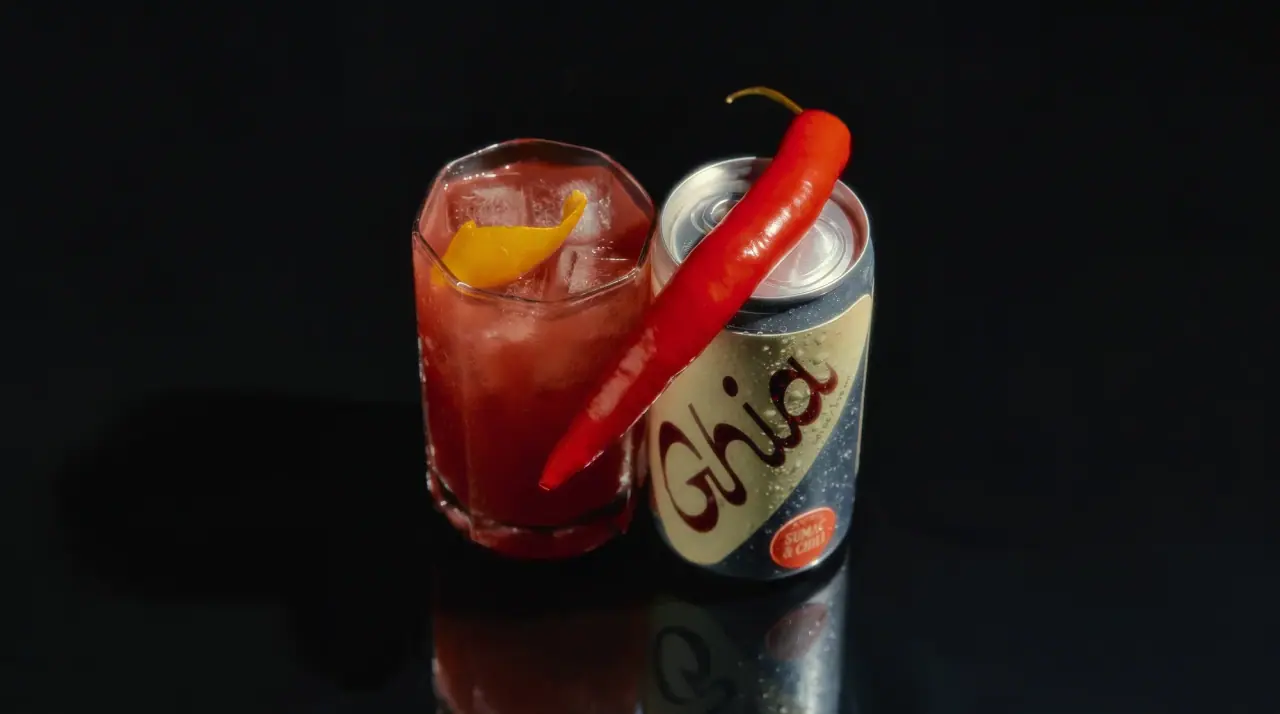
Ghia
riviera aperitivo hour after dark

AKT
Lilac stage directions with a quiet metallic detail

Bachan's
octopus mascot on a red-capped squeeze

Behave
struck-through wordmark on sour neon pouches