trailhead poster cans under a wheat-stalk monogram
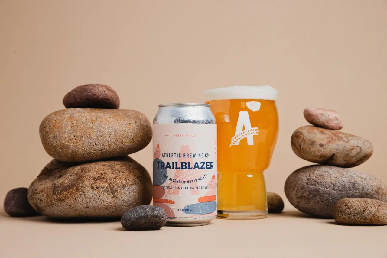
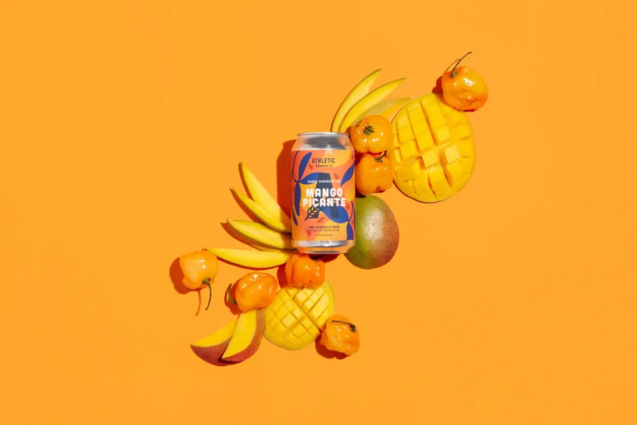
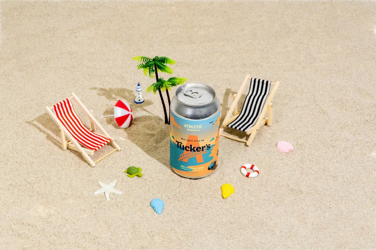
Athletic Brewing builds every can around a fixed upper half: an arched 'non-alcoholic brew' line at the rim, a large italic slab capital A crossed by a wheat stalk, and the condensed wordmark stacked beneath it in Trail Navy (#14354d). The beer's name then sits in a small coloured box over the style in spaced capitals, and the lower third becomes a flat, layered landscape (rolling hills with a winding path, a breaking wave, a river) in the can's colour family. Each core beer owns one body colour, while seasonal and cocktail-inspired cans swap the landscape for a bold two-colour horizontal split, a quoted name and a small drink icon; collaborations take the whole can over with illustration.
Approximate colours interpreted from photography. These are screen references, not official brand colours or print specifications.
Pack body
Bare Aluminium
#c3c5c6
Unprinted can end, ring pull and base rim on every can
Lager Cream
#eee3c9
Full body colour of the Mexican-style lager and the lower band of the light lager
Label
Lite White
#f6f6f3
Upper body of the light lager can, carrying the gold monogram
Ink
Trail Navy
#14354d
Monogram, wordmark, style line and the darkest layer of every landscape
Accent
Barley Gold
#e4b84f
Beer-name box, winding path in landscapes and the monogram on the light lager
Range coding
Run Teal
#2fa6b8
Body colour and hill layers of the flagship IPA
Hazy Terracotta
#e0745a
Body colour and river landscape of the hazy IPA tallboy
Paloma Coral
#e0566a
Upper half of the split cocktail-inspired can, behind the monogram
Grapefruit Yellow
#f3d22c
Lower half of the split cocktail can and the drink icon field
Pumpkin Orange
#e0782a
Body of the autumn seasonal can with a tonal leaf pattern
Typography
Suggested visual alternatives, not confirmed brand typefaces. Any scale below is an illustrative estimate.
The italic slab A monogram is the largest element, centred in the upper half. The condensed wordmark sits directly beneath it with a smaller 'brewing co.' line. The beer name comes next, framed in a small contrasting box or set large in quotes on seasonals, with the beer style in spaced capitals below; the arched alcohol line at the shoulder and the volume at the base are the quietest text.
Type scale
Estimated cap size as a share of the panel · Printed wall of the 12 oz (355 ml) can, about 105 mm tall from shoulder to base bead
monogram
26% · Bold Italic · Display
T
seasonal-name
9% · Bold · Headline
“SUNSET”
wordmark
8% · Bold · Headline
TRAIL
beer-name-box
4% · SemiBold · Headline
RIDGE RUN
beer-style
3.5% · Bold · Label
HAZY IPA
sub-wordmark
2.8% · SemiBold · Headline
BREWING CO.
Fonts
Display
Zilla Slab
Looks like
Custom italic slab capital, close to Clarendon Bold Italic
Type
Heavy italic slab serif capital used as a single-letter monogram
Weight
Bold Italic
Case
Uppercase single letter
Tracking
n/a
Fallback
Rockwell Bold Italic, Georgia Bold Italic
The monogram letter only, crossed diagonally by a wheat stalk, printed in Trail Navy or Barley Gold.
Headline
Oswald
Looks like
Trade Gothic Bold Condensed No. 20
Type
Bold condensed grotesque
Weight
SemiBold, Bold
Case
Uppercase
Tracking
Slightly open, about +2%
Fallback
Franklin Gothic Condensed, Arial Narrow Bold
Wordmark, the 'brewing co.' line, the beer name inside its box and quoted seasonal names.
Label
Barlow Condensed
Looks like
Trade Gothic Condensed, slab-mono descriptor on some cans
Type
Condensed neutral grotesque
Weight
Medium, Bold
Case
Uppercase
Tracking
Wide, about +12% on style lines
Fallback
Arial Narrow, Helvetica Condensed
Arched shoulder claim, beer style in spaced capitals, flavour lines and the volume at the base.
Structure & Proportions
Proportions
Purpose
Value
Preview
Brand block height
About 45% of the printed wall, shoulder to the bottom of the wordmark
Monogram height
About 26% of the printed wall
Landscape band
About 30% of the wall at the base on core cans
Seasonal split line
Colour change at about 55% down the wall, just under the wordmark
Wordmark width
About 32% of the can circumference, i.e. most of the front face
Colours per can
Three to four flat colours: body, navy ink, one accent, one landscape tone
—
Density
Open upper half, busier illustrated lower third
—
Shapes
Element
Value
Preview
Beer-name box
Small horizontal rectangle with square corners
Shoulder claim
Text set on a shallow arc following the can shoulder
Landscape
Layered rolling hills and wave crests
Seasonal split
Straight horizontal two-colour division
Award and size callouts
Solid roundels on e-commerce renders and carton fronts
Finishes
Gloss printed aluminium
Full can wall · gloss
Bare aluminium
Can end, neck and base rim · metallic
Matte printed board
Multipack carriers · matte
Formats and materials
Formats
12 oz can, 19.2 oz tallboy can, Variety multipack
Materials
Aluminium, Paperboard multipack carton
Closures
Standard ring-pull can ends left bare aluminium
Decoration
Wheat-stalk monogram, Arched shoulder text, Flat layered landscape illustration, Two-colour horizontal split on seasonals, Small line icon of a cocktail
Front Panel
Schematic reading order. The diagram’s zone heights do not represent measured artwork proportions.
Shoulder
Upper half
Middle
Lower third
Full-wrap printed can divided into three bands: brand and claim in the upper half, product box in the middle, illustration in the lower third.
Zone
Content
Shoulder
Arched 'non-alcoholic brew' line and alcohol limit
Upper half
Italic A monogram with wheat stalk, stacked condensed wordmark
Middle
Beer name in a coloured box, style in spaced capitals
Lower third
Flat landscape of hills, waves or ridges, with the volume line at the base
Range System
The upper brand block never moves; each beer is coded by a body colour, a landscape scene and a name-box colour, while limited releases replace the landscape with a two-colour split and quoted name, and collaborations take over the whole can with illustration.
IPA = teal can, teal hills, gold winding path
Light lager = white and cream can, gold monogram
Mexican-style lager = cream can, blue wave
Hazy IPA = terracotta tallboy with river landscape
Cocktail-inspired = coral top, yellow bottom, quoted name and drink icon
Autumn seasonal = orange can, tonal leaf pattern, slanted name
Back of Pack & Shelf
The rear half of the can repeats the body colour with a narrow column of navy text beside the barcode, and the side carries the brand story and ingredient line, all in one or two flat colours.
Short description of the beer's taste and calories in condensed capitals
Ingredients line (water, malted grains, hops, yeast) and allergen note
Nutrition facts panel in navy on the body colour
UPC barcode on a white rectangle
Deposit and recycling marks with state codes
Brewery address and website in small capitals
On shelf
In the cooler, the identical monogram and wordmark line up across every can so the range reads as one brand, while the body colours (teal, cream, coral and yellow, terracotta) separate the beers from a distance.
Imagery
Flat, layered vector landscapes in three or four tones of the can colour, outdoor and route-like (a path, a river, a wave), with no outlines and no photography; seasonals use a single small line icon of a glass with fruit.
Guidelines
Do
Fix the brand block in the upper 45% of the wall: arched claim, monogram at about 26% height, stacked condensed wordmark.
Give each core beer one body colour and a matching three-tone landscape in the lower 30%.
Print the monogram, wordmark and style line in Trail Navy (#14354d) on all mid and light bodies.
Frame the beer name in a small Barley Gold (#e4b84f) or white rectangle with the style in spaced Label capitals beneath.
For seasonal cans, split the body into two flat colours just under the wordmark and put the name in quotes in the Headline face.
Leave the can end and base rim as bare aluminium.
Don't
Don't move or resize the monogram between beers.
Don't use outlined or detailed illustration on core cans; keep scenes flat and tonal.
Don't set the wordmark in serif or script; only the monogram is a slab.
Don't use photography on the can.
Don't put more than two flat colours plus navy ink on a seasonal split can.
Don't print the beer name larger than the wordmark except for quoted seasonal names.
Give your AI packaging taste
Give your design or image tool a packaging study: palette, type, structure, front panel and principles for an original brief.