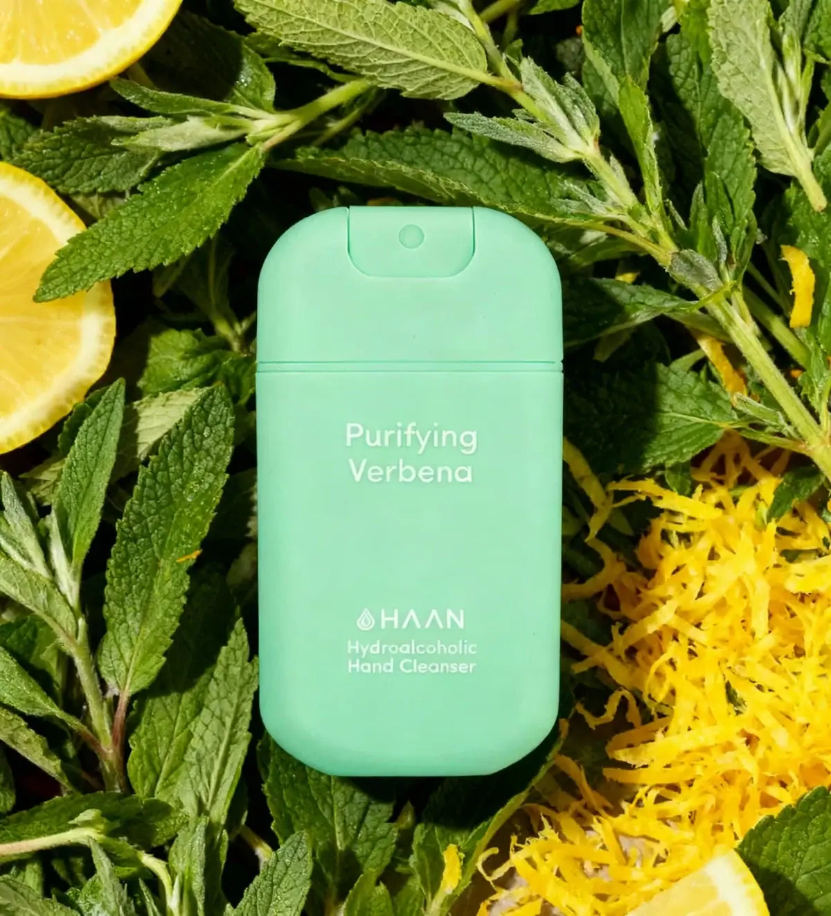
Photography: HAAN official photography. Images belong to their respective owners.
HAAN

Mint pocket rectangle with two quiet white text groups
Purifying Verbena compresses a spray format into a soft mint rounded rectangle. The dispensing insert stays within the upper outline, avoiding a projecting nozzle in the selected view. A two-line scent name occupies the upper body, while the smaller HAAN signature and hand-cleanser descriptor sit near the bottom. Their generous separation makes a small front feel open. The brand identifies this as a refillable 30 mL product; the image alone would not establish the refill mechanism.
- Body & bath
- Light pack
- Clinical minimal
- Playful colour
About this study
Selected mint Purifying Verbena dispenser, identified by the brand as refillable and 30 mL. Refill existence is sourced; refill package graphics and hidden mechanism remain outside the visual study.
Sources & evidence · Reviewed 2026-10-19Color Palette
Approximate colours interpreted from photography. These are screen references, not official brand colours or print specifications.
Pack body
Mint green shell
#9DDFC0
Approximate continuous color across the body, upper section and spray insert. Subtle tonal variation comes from light and curved surfaces.
Ink
Soft white lettering
#E9F1DF
Scent, maker symbol and category information share a pale tone, using spacing and size rather than extra colors for hierarchy.
Typography
Suggested visual alternatives, not confirmed brand typefaces. Any scale below is an illustrative estimate.
Purifying Verbena appears in two centered mixed-case lines high on the main body. Near the bottom, the HAAN name and droplet emblem introduce a smaller two-line Hydroalcoholic Hand Cleanser descriptor. The separation creates two information groups rather than a single uninterrupted stack. The scent name is the first read, but the lower block keeps function explicit. Rounded-looking sans-serif forms and moderate weights suit the soft geometry without adding a second expressive type style.
Fonts
Scent name
Nunito Sans
- Looks like
- Friendly rounded geometric sans-serif
- Type
- Rounded humanist sans-serif
- Weight
- Regular, Medium
- Case
- Title case
- Tracking
- Natural spacing
- Fallback
- Arial, sans-serif
Proposed for a clear two-line original scent name. Choose line breaks according to the new wording rather than imitating the exact length and position of Purifying Verbena.
Maker and category
DM Sans
- Looks like
- Restrained geometric sans-serif
- Type
- Geometric sans-serif
- Weight
- Regular, Medium
- Case
- Uppercase maker; mixed-case category
- Tracking
- Open for the maker, natural for the descriptor
- Fallback
- Arial, sans-serif
Alternative for a small lower identity group with an independent symbol. Keep the category legible enough that the fragrance-led upper title does not obscure what the product is.
Structure & Proportions
Visual proportions and finish previews are illustrative. Confirmed construction details and uncertainties are distinguished in the study notes.
Proportions
| Purpose | Value | Preview |
|---|---|---|
| Broad pocket face | The front offers substantial width relative to its height, leaving room for short two-line names without narrow condensed lettering. Pack depth is not visible enough to measure. | — |
| Rounded perimeter | Deeply rounded corners soften the rectangular shape, while straighter side sections preserve a useful reading area. | — |
| Two text islands | A large blank interval separates the upper scent name from the lower maker/category group, making each group easy to locate. | — |
| Integrated top | The dispensing insert remains within the rounded top perimeter, with no long external nozzle extending beyond the object in this view. | — |
Shapes
| Element | Value | Preview |
|---|---|---|
| Main body | Broad rounded rectangle with a soft bottom arc and relatively flat front. | |
| Upper spray insert | Small rounded inset centered at the top, with a visible circular outlet. | |
| Component seam | Fine horizontal boundary below the curved upper section. | |
| Lower identity group | Small centered emblem and maker line above two lines of product-category text. |
Finishes
Quiet mint shell
Body and upper section; low sheen in the selected light without a verified tactile coating. · matte
Matching recessed insert
Dispensing area shares the shell color, with shadow defining its boundary rather than a contrasting finish. · matte
Formats and materials
| Formats | Refillable 30 mL portable hand-cleanser spray in a broad rounded rectangular format, confirmed by the official product page |
| Materials | The opaque-looking mint shell and matching spray insert appear smooth, but exact polymer, recycled content, coating and internal container materials are not specified in the accessed product text., The low-glare appearance does not establish a rubberized or soft-touch surface. |
| Closures | The upper section has a rounded inset with a circular spray outlet and a horizontal seam across the pack below it. The brand provides a refill procedure involving access through the top, but the selected closed view does not show that sequence. Tool requirements, retention features, seals and detailed tolerances are not inferred from the seam. |
| Decoration | Two-line mixed-case scent title, Small droplet emblem and uppercase maker name, Two-line functional descriptor grouped with the maker, No printed ingredient illustration on the visible face |
Front Panel
Schematic reading order. The diagram’s zone heights do not represent measured artwork proportions.
The front reads as white text placed directly against mint rather than a separate paper panel. The upper scent and lower maker/category groups align to the same center but have deliberately different vertical positions. The horizontal physical seam sits above the scent name, so the main reading area remains on one body section. The actual decoration method is not established by the image.
| Zone | Content |
|---|---|
| Scent title | Purifying and Verbena occupy two clear mixed-case lines, giving the variant its own upper-body identity. |
| Open interval | A broad plain mint area separates scent from maker. This is an intentional-looking spacing relationship, not evidence of missing artwork. |
| Maker signature | A small outlined droplet symbol accompanies HAAN, forming a compact identity anchor near the lower front. |
| Category descriptor | The hand-cleanser wording sits directly beneath the maker, tying function to brand rather than adding another isolated badge. |
Range System
A matching Purifying Verbena refill is offered by the brand, which establishes a portable dispenser and replenishment relationship for this product. The refill package itself is not visually studied here. Nor does one mint version establish the exact color code of all HAAN scents. The transferable principle is maintaining clear scent identification and functional naming across a compact object and its supporting refill system.
- For an original refillable range, repeat the exact variant name on the portable dispenser and refill so matching does not depend solely on color.
- Preserve the two-group hierarchy when a new scent name changes length, rather than filling the central blank area with decorative claims.
- Document the actual refill operation separately from appearance, since a clean closed silhouette does not explain access on its own.
Back of Pack & Shelf
The reverse, bottom and opened top are unseen. The selected front does not show the printed quantity, complete directions, warnings or refill instructions, even though the official page supplies the 30 mL context and refill guidance.
- Obtain reverse and open-top views before mapping functional information or component assembly.
- Keep the documented refill procedure linked to the actual product rather than inventing an easier opening motion.
- Do not infer leak resistance, durability or pocket dimensions from a single front image.
On shelf
Interpretively, the rounded rectangular silhouette can distinguish the spray from ordinary cylindrical travel bottles, while the pale mint surface makes the object feel visually light. White lettering on mint is a gentler contrast than black on white, so a new concept should test small-category readability under varied light. The source's close view does not demonstrate actual pocket fit or resistance to accidental actuation.
Imagery
The mint pack lies among textured green leaves, lemon slices and bright zest. The surrounding greenery is darker and more detailed than the smooth pale body, giving the simple object visual separation. Yellow citrus adds flavor context outside the package. The props do not establish that each visible plant is an ingredient, and they should not be recorded as printed botanical motifs or additional shell colors.
Guidelines
Editorial principles for an original design brief, not official brand guidelines.
Do
- Keep scent and function easy to locate on a small pack.
- Use spacing to distinguish information roles.
- Support refillability with an actual sourced replenishment system.
- Describe integrated-looking parts without inventing hidden mechanisms.
- Test subtle light-on-light copy at real size.
Don't
- Do not infer soft-touch treatment from a matte-looking image.
- Do not describe leaf and citrus props as pack graphics.
- Do not claim the top opens in one step without examining the procedure.
- Do not infer leakproofness or automatic actuation protection.
- Do not copy the HAAN droplet emblem or exact mint layout.
Sources & evidence
How this study was built
structure · Sourced fact
Official product page identifies a refillable 30 mL format and gives refill guidance.HAAN — Hand Cleanser Purifying Verbenarange · Sourced fact
A matching Purifying Verbena refill is listed separately, confirming replenishment support for the dispenser.HAAN — Hand Cleanser Refill Purifying Verbenastructure · Visual observation
Rounded rectangular body, horizontal upper seam and contained spray insert form a compact outline.HAAN — Hand Cleanser Purifying Verbenatypography · Visual observation
Upper mixed-case scent name is separated from the lower maker and category group by generous blank space.HAAN — Hand Cleanser Purifying Verbenapalette · Visual observation
Mint shell and white lettering define the package; green leaves and yellow citrus belong to the scene.HAAN — Hand Cleanser Purifying Verbenalabel · Visual observation
No separate front label border or printed botanical imagery is visible.HAAN — Hand Cleanser Purifying Verbenarange · Editorial interpretation
Repeating variant names across dispenser and refill is an original-system principle, not a claim about unseen refill artwork.
What remains unverified
- Exact component materials and coating unspecified.
- Reverse, bottom and open mechanism not visible.
- Pack depth, dosing and durability not measured.
- Exact font and print process unknown.
- Only selected scent graphics inspected; no universal range-color map inferred.
Give your AI
packaging taste
Give your design or image tool a packaging study: palette, type, structure, front panel and principles for an original brief.
Export this styleFree with an email. PACK.md works in Claude, ChatGPT, Cursor and image tools.
More like this

Byoma
candy-coloured barrier science on a shelf
Glossier
clean white tubes with candy accents

ACURE
Iridescent spectacle with practical, tightly ordered type

African Botanics
Technical black label with a low serif signature

AussieZinc
Sun-yellow numerals on a tall, information-rich white cylinder

bareMinerals
a restrained black compact framing the powder itself

Bask
sunny yellow with a playful turquoise signature
Bathing Culture
Flowing rainbow bands on dark refillable glass