Photography: Hobo + Co. official photography. Images belong to their respective owners.
Hobo + Co.

A pale oval, visible fragrance and an airy reed fan
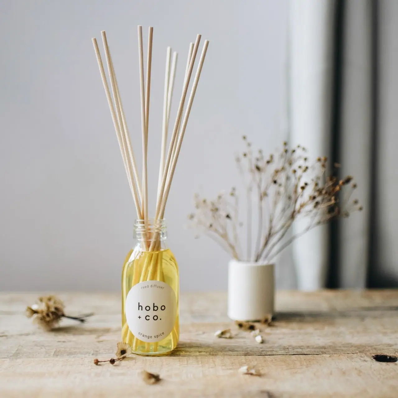
The selected Orange Spice diffuser keeps its identity compact: a cream oval on a clear rounded-shoulder bottle, a large lowercase two-line house name and small curved product and scent lines. Pale golden liquid and light reeds remain visible around the label, becoming part of the display object. The tall reed fan gives the modest bottle height without requiring a large decorative cap. This is an in-use presentation, with the transport lid removed. The exact official product page confirms a 100 ml glass bottle and aluminium lid, so those material details are source-backed rather than guessed from transparency.
- Candles & home scent
- Light pack
- Apothecary
About this study
Orange Spice diffuser in its open, reed-inserted state. Exact product source confirms 100 ml glass bottle, aluminium lid and refill use; lid and carton are not visually analysed.
Sources & evidence · Reviewed 2026-10-19Color Palette
Approximate colours interpreted from photography. These are screen references, not official brand colours or print specifications.
Pack body
Visible pale gold
#D9C570
Approximate liquid colour seen through the clear bottle. It is not a tinted-glass specification or an exact colour reference for every batch.
Label
Warm cream
#E6E1D0
Approximate oval-label colour. It provides a quiet opaque ground for the name while staying close to the pale reeds and neutral room setting.
Ink
Dark brown-black
#29271F
Approximate wordmark and small descriptor colour. The larger central name has stronger visual presence than the fine curved lines, even though they share a restrained ink family.
Accent
Natural pale reed
#D5C6A8
Approximate reed appearance in the photograph. Their material species and treatment are unverified, so the colour should not be translated into a claim about bamboo or rattan.
Typography
Suggested visual alternatives, not confirmed brand typefaces. Any scale below is an illustrative estimate.
The central lowercase house name is the dominant text, split across two lines with generous spacing. A small product-type line curves above it, while the scent curves below. This makes the label readable as one oval unit: the middle carries recognition, and the perimeter carries classification. The arcs are restrained enough that the central name remains the natural first read.
Fonts
Lowercase house-name alternative
Poppins
- Looks like
- Poppins
- Type
- Geometric sans serif
- Weight
- Regular 400 / Medium 500
- Case
- Lowercase
- Tracking
- Generous but optically balanced
- Fallback
- sans-serif
An alternative for an original short name with round counters and an informal lowercase voice. Use a distinct word arrangement and punctuation rather than reproducing the original two-line hobo + co. mark.
Curved product and scent
Nunito Sans
- Looks like
- Nunito Sans
- Type
- Sans serif
- Weight
- Regular 400
- Case
- Lowercase
- Tracking
- Slightly open for small curved lines
- Fallback
- sans-serif
Use for concise perimeter information. Adjust the curve and spacing to the actual word lengths; a small scent name should remain readable rather than being forced to occupy the full oval circumference.
Structure & Proportions
Visual proportions and finish previews are illustrative. Confirmed construction details and uncertainties are distinguished in the study notes.
Proportions
| Purpose | Value | Preview |
|---|---|---|
| Display silhouette | The exposed reeds extend well beyond the bottle height, forming a light fan above a compact liquid reservoir. This is the staged arrangement, not a measured reed-length specification. | — |
| Label | A vertically oriented oval covers the central lower front while leaving shoulders, side margins and the base visible. | — |
| Information | The central name is several times more visually prominent than the curved descriptor lines, but no exact point-size ratio is inferred. | — |
Shapes
| Element | Value | Preview |
|---|---|---|
| Bottle | Cylindrical reservoir with rounded shoulders narrowing into a short neck. | |
| Label | Pale vertical oval that softens the front and echoes the rounded vessel. | |
| Reed arrangement | Long straight elements spread outward into an open fan. Their arrangement is variable rather than a fixed package mould. |
Finishes
Clear glass
Bottle body; glass is confirmed by the official product specification. · transparent
Low-sheen cream label
Oval front panel; exact paper and coating unverified. · matte
Formats and materials
| Formats | A 100 ml glass reed-diffuser bottle with rounded shoulders, a short narrow neck and a clear cylindrical body. Capacity and glass are specified on the exact official Orange Spice product page. |
| Materials | The brand specifies a glass bottle, aluminium lid and cardboard packaging for this product. The lid and cardboard are not visible in the selected in-use photograph., The exact glass composition, label stock, adhesive, reed species and lid liner are not specified by the inspected source. Material identification does not establish local collection or recycling outcomes. |
| Closures | The image shows an open neck with visible external rings and reeds inserted. The source instructs removal of the aluminium lid before inserting reeds, explaining the difference between the packed state and the photographed display state. Exact lid geometry and sealing components remain unseen. |
| Decoration | A single oval label carries all clearly readable front information. Its large central name and two small arcs avoid the need for a large illustration or contrasting colour band. |
Front Panel
Schematic reading order. The diagram’s zone heights do not represent measured artwork proportions.
The oval acts as a small identity island within a much larger transparent display. The two outer text arcs follow its shape, while the central name remains on straight baselines. That combination makes the label feel rounded without sacrificing a stable reading centre.
| Zone | Content |
|---|---|
| Upper arc | A small product-type phrase follows the top of the oval. It tells the viewer what the object is while leaving the largest scale to the house identity. |
| Central name | Two lowercase lines occupy the widest area. Open spacing and simple forms give the mark presence without a heavy weight or additional badge. |
| Lower arc | The scent appears along the bottom curve, keeping variant information in the same compact unit as the producer and product type. |
| Clear surrounding area | Visible liquid and submerged reeds remain part of the composition around the label. The panel is large enough to read, but does not turn the bottle into an opaque object. |
Range System
The exact product page links the diffuser to replacement reeds and a refill, supporting refill use for this named product. It also identifies the scent as one member of a wider diffuser offer. Other labels were not visually compared here, so no universal scent-colour or oval specification is asserted.
- For an original family, a stable central name and small lower scent arc could accommodate several variants. Longer scent names need separate fitting tests rather than automatic reductions in type size.
- The visible liquid level and reed arrangement will change during use. A label system should remain recognisable through those changes instead of depending on a full bottle or an exact fan silhouette.
Back of Pack & Shelf
The reverse, underside, packed aluminium lid and cardboard presentation are not shown. Their existence or material does not provide an artwork map.
- Verify actual fragrance warnings, quantity placement and responsible-party information from the final product artwork before transcribing a reverse.
- Do not infer the lid finish, carton colour or opening construction from the in-use bottle.
- Keep refill compatibility tied to the exact official product instructions; this study does not provide a new refill procedure.
On shelf
The oval and lowercase name provide a stable identity on the bottle, while the reed fan expands its visual presence after opening. Packed retail recognition may differ because the aluminium lid and cardboard presentation are absent here. This is a visual interpretation, not a tested shelf result. A complete packaging review would therefore separate the in-use display from the unopened sales presentation.
Imagery
The diffuser stands on a weathered wooden table in soft window light. A pale vase of dried stems sits farther back, while small dried flower heads lie around the base. The muted setting lets the golden liquid provide the warmest concentrated colour. The reeds echo the thin botanical stems without being mistaken for the background bouquet. The image presents the diffuser as a small domestic object; dried flowers and timber are styling, not printed decoration or proof of fragrance ingredients.
Guidelines
Editorial principles for an original design brief, not official brand guidelines.
Do
- Distinguish the open in-use display from the unopened lid-and-carton presentation.
- Keep the central name readable on straight baselines while limiting curved text to short descriptors.
- Leave sufficient clear bottle area for liquid and reed ends to remain visible.
- Test the identity with changing liquid levels and different reed arrangements.
Don't
- Do not infer reed species or label stock from their pale natural appearance.
- Do not invent a lid colour or carton design that is absent from the selected photograph.
- Do not copy the original punctuation and exact stacked wordmark into a fictional concept.
- Do not present glass and aluminium identification as a guarantee of collection or recycling in every location.
Sources & evidence
How this study was built
structure · Sourced fact
Exact product page specifies 100 ml glass bottle and aluminium lid, with cardboard packaging.Orange Spice Reed Diffuser — Hobo + Co.edition · Sourced fact
Official instructions describe lid removal, reed insertion and refill use for this named diffuser.Orange Spice Reed Diffuser — Hobo + Co.label · Visual observation
Cream oval contains central two-line lowercase name with small upper and lower text arcs.typography · Visual observation
Straight central baselines contrast with curved product and scent descriptors.palette · Visual observation
Cream, dark lettering, golden liquid and pale reeds form the visible package/display palette.imagery · Visual observation
Wooden table and dried stems are domestic scene elements rather than package artwork.range · Editorial interpretation
Suggested variant handling preserves a central identity and short lower scent arc; other labels were not audited.
What remains unverified
- Non-www URL failed; exact www product page was accessible.
- Reed species, label stock, adhesive and lid liner remain unspecified.
- Packed lid, cardboard presentation, reverse and underside are unseen.
- Original fonts, print colours and physical dimensions are not verified.
Give your AI
packaging taste
Give your design or image tool a packaging study: palette, type, structure, front panel and principles for an original brief.
Export this styleFree with an email. PACK.md works in Claude, ChatGPT, Cursor and image tools.
More like this
Black Blaze
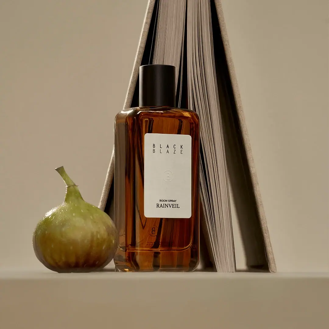
Warm amber, quiet paper and a deliberate vertical rhythm

D.S. & Durga
deadpan grotesk names on parchment labels
Sydney Hale Co.
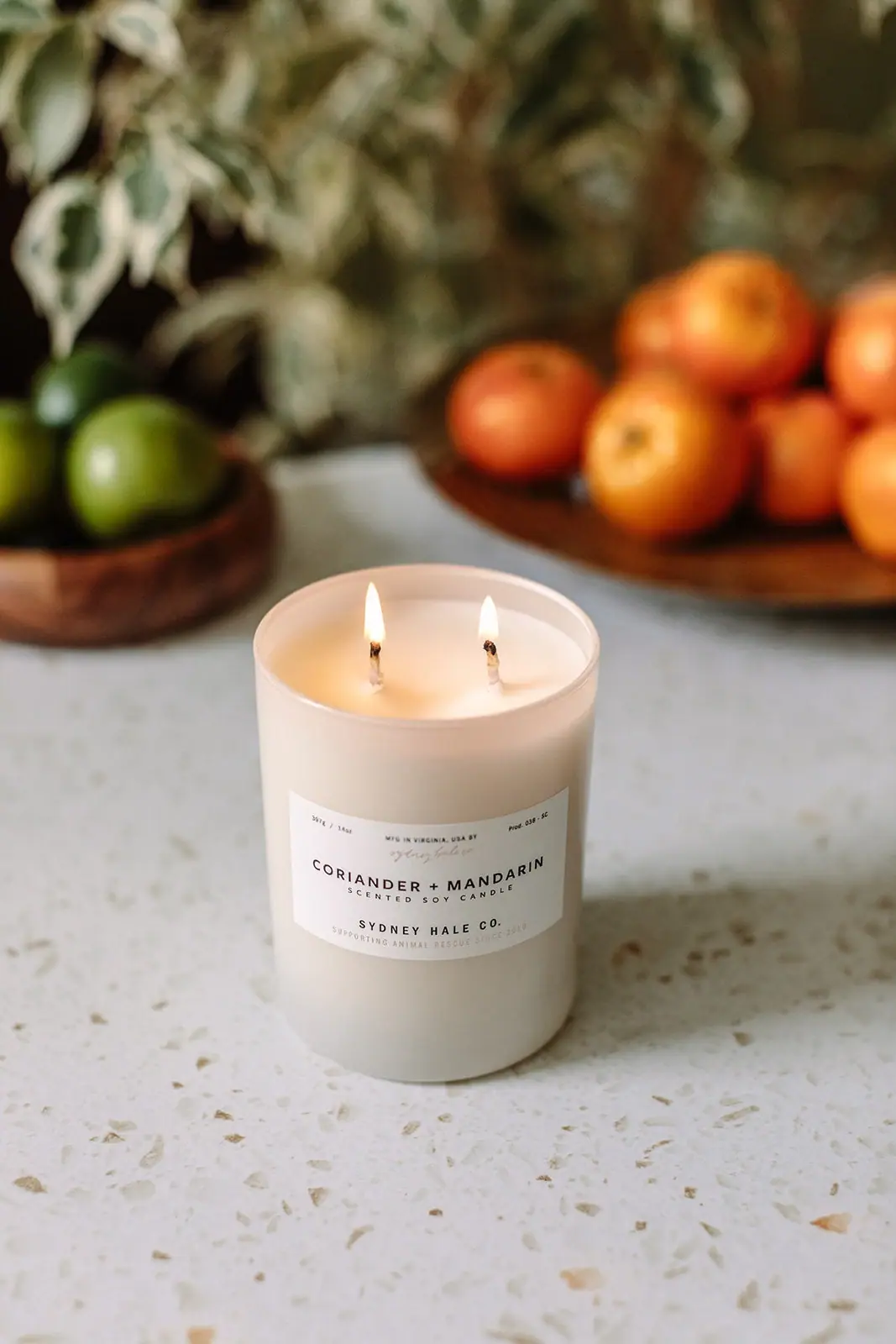
Pale double-wick tumbler with a scent-first maker label

Aesop
a botanical still life around a disciplined apothecary label
AMASS
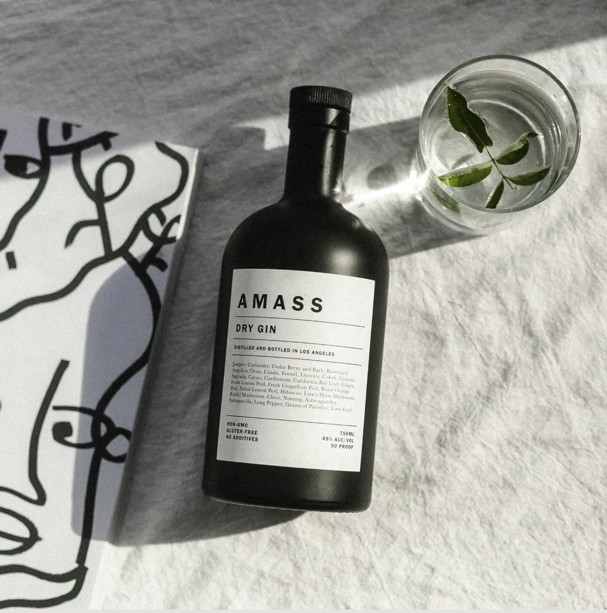
A ruled botanical document on a dark rounded bottle
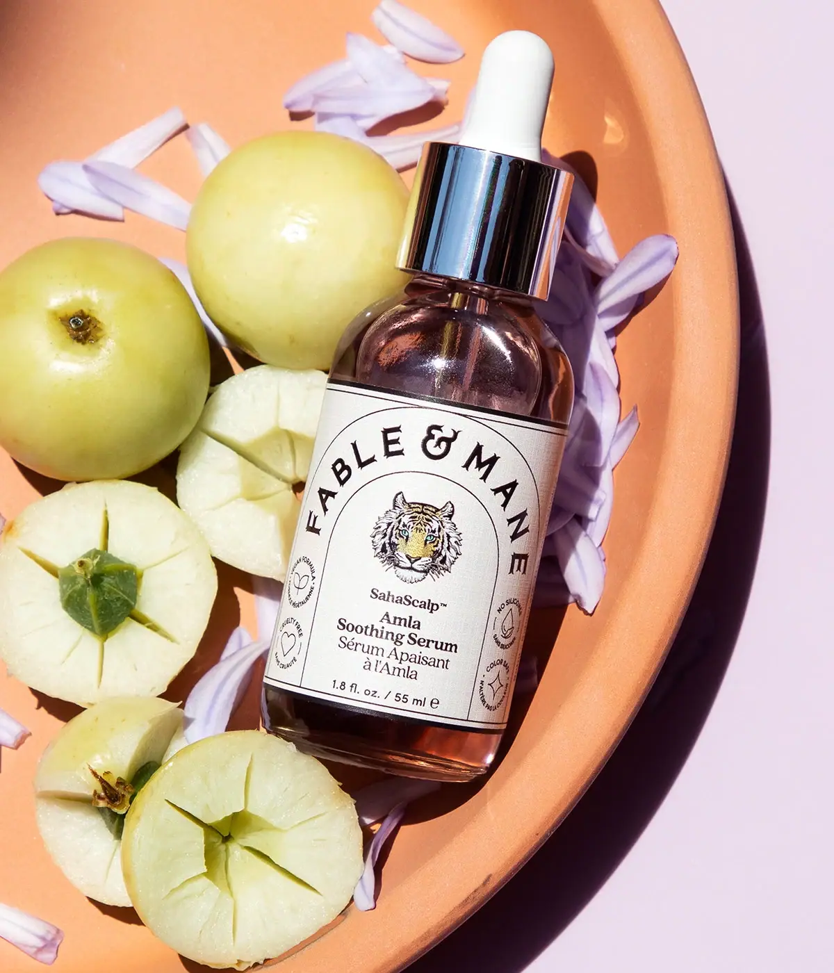
Fable & Mane
Arched serif maker, tiger portrait and amber dropper bottle
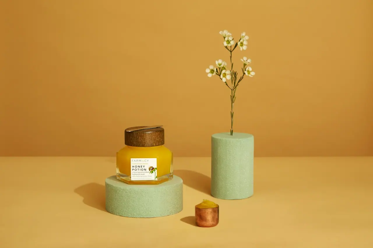
Farmacy
Golden contents in a faceted jar beneath a wood-toned lid
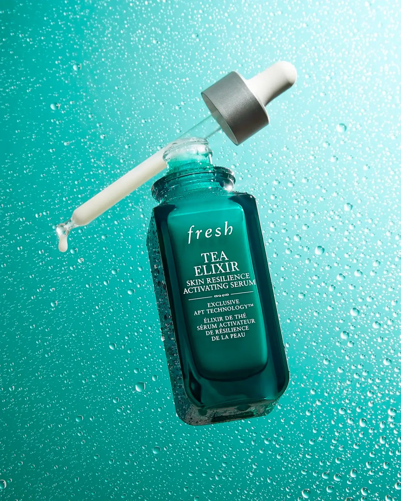
Fresh
Teal dropper bottle with white serif naming and silver collar