Photography: Homesick official photography. Images belong to their respective owners.
Homesick

Bold black scent name with a small violet motif
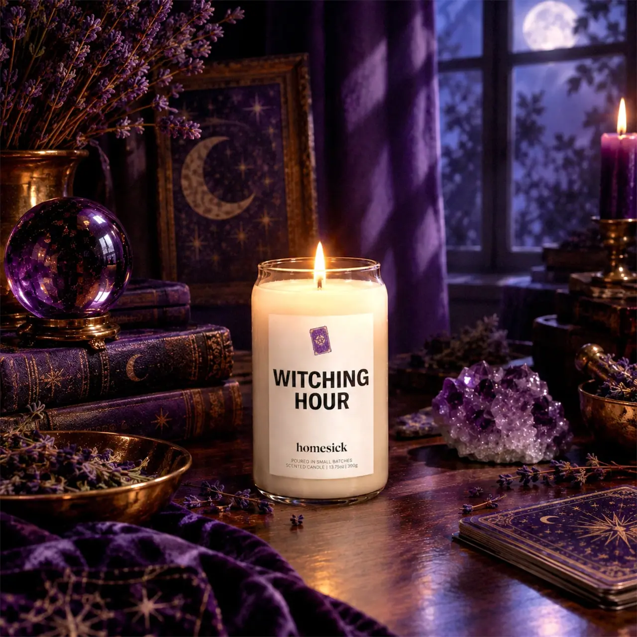
Witching Hour keeps its actual candle package much quieter than its elaborate setting. A pale rectangular label carries a small violet book-like motif, a dominant two-line black scent name and a lower serif Homesick wordmark. The clear jar exposes pale wax and a lit wick, while its gently narrowed shoulder gives the open rim a slight change in contour. Most of the purple, gold and celestial imagery belongs to the surrounding scene. The package's useful lesson is how a readable title and one small narrative cue can remain distinct inside highly atmospheric photography.
- Candles & home scent
- Light pack
- Bold typographic
- Retro illustrated
About this study
The approved Witching Hour lit-jar photograph. The exact product page was inaccessible; general candle context comes from the official FAQ and is kept distinct from edition-specific evidence.
Sources & evidence · Reviewed 2026-10-19Color Palette
Approximate colours interpreted from photography. These are screen references, not official brand colours or print specifications.
Pack body
Pale candle fill
#ECE1C9
Approximate visible wax appearance. The lit upper portion is warmer and brighter, so this is an image reading rather than a guaranteed wax colour.
Label
Warm pale label
#EFE3D4
Approximate light front-label ground under candlelight. The warm cast should not be treated as a fixed cream paper specification.
Ink
Black scent lettering
#151613
Approximate title and maker lettering. Strong tonal contrast makes the scent name more prominent than the much smaller decorative motif.
Accent
Violet motif
#72507E
Approximate colour of the small illustrated book/card-like emblem above the title. It echoes the scene without turning the whole label purple.
Typography
Suggested visual alternatives, not confirmed brand typefaces. Any scale below is an illustrative estimate.
WITCHING HOUR is the label's clear primary reading, split into two centred lines of heavy uppercase sans-serif lettering. The second line is shorter and remains centred beneath the first. A large gap separates that title from the smaller lowercase serif homesick name near the bottom. The smallest lines contain the production statement, candle description and amount. This creates three typographic jobs: bold scent identification, a contrasting maker signature, then quiet practical information. The tiny violet illustration has narrative importance but is not allowed to compete with the large name.
Fonts
Original scent-title alternative
Roboto Condensed
- Looks like
- Bold compact uppercase sans
- Type
- Condensed sans serif
- Weight
- Bold
- Case
- Uppercase across two short lines
- Tracking
- Normal to slightly close
- Fallback
- Arial Narrow, Arial, sans-serif
Start with a short name that forms a clear block without shrinking the words excessively. Preserve counters and check whether the shorter second line feels intentionally centred on a curved label.
Original maker-signature alternative
Libre Baskerville
- Looks like
- Contrasting lowercase serif
- Type
- Serif
- Weight
- Bold
- Case
- Lowercase or title case for a different maker name
- Tracking
- Normal
- Fallback
- Georgia, serif
Create a distinct but smaller maker signature below the scent title. Do not imitate the exact Homesick wordmark; develop a new word shape and spacing.
Practical footer alternative
Source Sans 3
- Looks like
- Small uncomplicated sans serif
- Type
- Sans serif
- Weight
- Regular
- Case
- Uppercase for concise practical lines
- Tracking
- Slightly open if print testing permits
- Fallback
- Arial, sans-serif
Keep production and quantity details readable at actual size. Their role is useful information, not a decorative texture beneath the maker name.
Structure & Proportions
Visual proportions and finish previews are illustrative. Confirmed construction details and uncertainties are distinguished in the study notes.
Proportions
| Purpose | Value | Preview |
|---|---|---|
| Large pale reading field | The label occupies much of the visible jar height while leaving clear glass and wax visible above, below and at the sides. | — |
| Small narrative cue | The violet motif is much smaller than the scent title, allowing it to suggest a theme without becoming the main navigation device. | — |
| Separated maker footer | A generous vertical gap distinguishes the bold scent title from the lower maker and practical details rather than merging all text into one dense block. | — |
Shapes
| Element | Value | Preview |
|---|---|---|
| Jar body | Tall rounded vessel with a slight inward transition below the open rim and a rounded base. | |
| Front label | Simple pale rectangular panel that curves with the jar wall. | |
| Violet motif | Small tilted book/card-like rectangle with a central decorative figure, not a verified specific symbolic reference. |
Finishes
Clear jar appearance
Exposed rim, sides and base · transparent
Quiet pale label
Front printed panel · matte
Formats and materials
| Formats | Clear candle jar with a broad mostly straight body and gently narrowed upper shoulder, Single visible lit wick in pale wax, Large pale rectangular front label following the curved wall |
| Materials | Homesick's FAQ describes its candles generally as hand-poured into 13.75 oz glass jars. That supports brand-level glass context and aligns with the pictured format, but is not a component-specific technical sheet for Witching Hour., The FAQ's general soy-wax and cotton-wick statements are not expanded into an exact wax blend, wick treatment or edition-specific burn specification., Label stock, adhesive, ink system and any surface coating remain unverified; a pale low-glare label does not automatically mean uncoated paper. |
| Closures | The candle is open and burning, with no lid visible. The rim and slight shoulder transition are clear, but they do not establish what cover, dust protector or shipping insert accompanies the retail product. The study therefore describes the open vessel and leaves the closure unresolved. |
| Decoration | Two-line scent title dominating the label, Small tilted book/card-like illustration above, Lower maker name and compact practical footer |
Front Panel
Schematic reading order. The diagram’s zone heights do not represent measured artwork proportions.
A centred vertical stack places the small motif above the dominant name, with a separate footer below. The light panel becomes a stable reading surface against both pale wax and the dark purple setting. Its boundaries are simple, leaving the lettering and spacing to carry the hierarchy. There is no broad decorative border or all-over celestial pattern on the selected label, despite the abundance of such motifs around it.
| Zone | Content |
|---|---|
| Top illustration | Small violet book/card-like motif, slightly tilted within the otherwise centred composition. |
| Central title | WITCHING above HOUR in heavy black capitals. |
| Maker signature | Lowercase homesick in a smaller contrasting serif treatment. |
| Practical footer | Small-batch wording, scented-candle description and a printed 13.75 oz / 390 g amount, with the exact typography much smaller than the title. |
Range System
Only the selected Witching Hour label is directly analysed. The general candle FAQ supplies format context, but it does not establish the exact artwork system for every seasonal or location candle. A potential family principle is to keep maker and quantity positions stable while changing the name and small motif. This remains an interpretation, not a verified rule or a reason to assign the candle to a specific current collection.
- The short two-word title fits naturally into two large lines.
- A different scent name would need its own line-break test rather than a fixed font size.
- The violet motif provides a compact theme cue without requiring a fully coloured vessel or illustrated wrap.
Back of Pack & Shelf
No reverse label, underside warning panel, lid or carton is shown. The open candle photograph cannot establish the retail information layout beyond the visible front.
- Do not infer fragrance notes from the botanical stems or books in the scene.
- Do not transfer the FAQ's general burn-time language into an exact edition specification.
- A new candle design should plan practical and safety information from its own product requirements rather than copying the tiny footer alone.
On shelf
As an interpretation, the large black title should be more immediately readable than the small maker name or motif. This is useful when customers browse candles by a memorable scent concept. The simple pale label also gives the jar a recognisable front in a detailed setting. However, actual shelf readability depends on label size, viewing distance and neighbouring products; the large campaign photograph cannot establish those outcomes. The rich scene supplies much of the theme, so the unstyled jar should also be evaluated on its own.
Imagery
The approved source record attributes this image to Homesick's official product photography, although the exact product page was inaccessible during review. The scene contains violet fabrics, stacked illustrated books, a crystal ball, a crystal cluster, botanical stems, celestial artwork and a moonlit window. These repeated purple cues surround the pale jar rather than covering it. The lit wick creates a small warm centre within the cooler setting, and the white label remains a readable island. None of the props proves a scent ingredient, included accessory, collaboration or special material in the candle package.
Guidelines
Editorial principles for an original design brief, not official brand guidelines.
Do
- Let the scent name remain the first readable element.
- Use one small illustration to suggest a theme.
- Give maker and practical details distinct secondary roles.
- Keep broad brand specifications separate from exact-edition evidence.
- Evaluate the plain jar as well as its dramatic campaign setting.
Don't
- Do not turn surrounding purple props into a full package palette.
- Do not infer lavender fragrance notes from photographed stems.
- Do not invent the unseen lid or carton.
- Do not reproduce the book motif, wordmark or celestial scene.
Sources & evidence
How this study was built
structure · Sourced fact
The official FAQ describes a general 13.75 oz glass-jar candle format, not an exact Witching Hour construction specification.Homesick FAQs — About Our Candleslabel · Visual observation
The approved image shows a pale rectangular label with a small violet motif, bold two-line title and lower maker footer.typography · Visual observation
Heavy uppercase scent lettering contrasts with the smaller lowercase serif maker name.palette · Visual observation
Purple occupies a small label motif but most of the surrounding scene; wax and label appear pale under warm candlelight.imagery · Visual observation
Books, crystals, botanical stems and celestial forms are photographic props, not verified ingredients or packaging components.range · Editorial interpretation
A stable footer and changing title could organise a family, but only this selected label has been directly analysed.
What remains unverified
- The exact Witching Hour page could not be accessed or recovered through targeted official-domain search.
- Fragrance notes, exact wax blend, edition date and burn time remain unverified.
- The lid, reverse, underside and carton are absent.
- Font identities, label stock, print process and colour standards are unknown.
Give your AI
packaging taste
Give your design or image tool a packaging study: palette, type, structure, front panel and principles for an original brief.
Export this styleFree with an email. PACK.md works in Claude, ChatGPT, Cursor and image tools.
More like this
Athletic Brewing
trailhead poster cans under a wheat-stalk monogram
Graza
deli counter comic on bottle green
Heyday Canning Co.
saucy pantry tins with a cream band
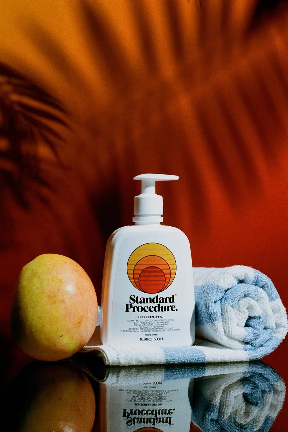
Standard Procedure
White family pump with striped sunset circles and heavy serif
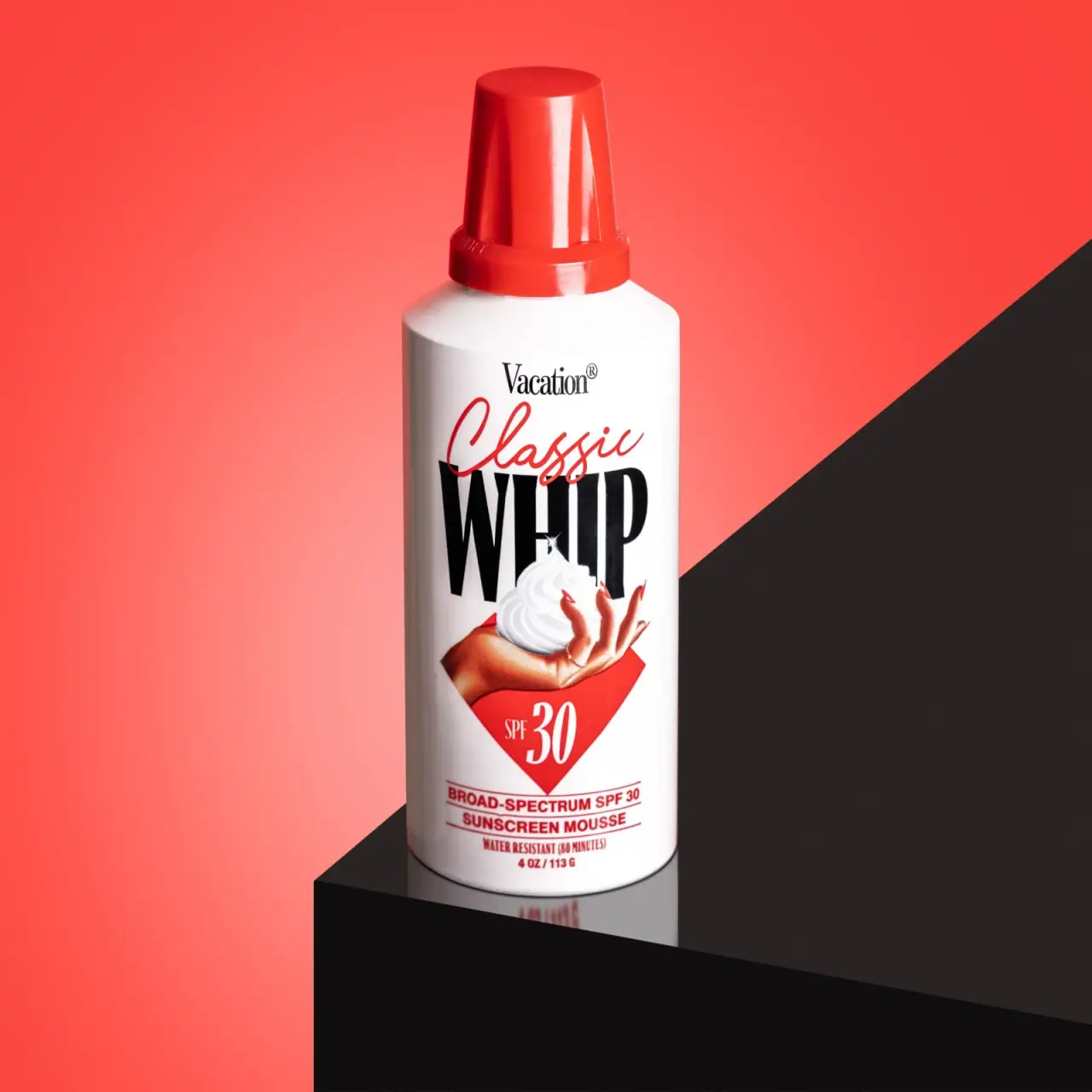
Vacation
Retro whipped-can theatre with explicit sunscreen identification

Akro
soft pink interrupted by an assertive black signature
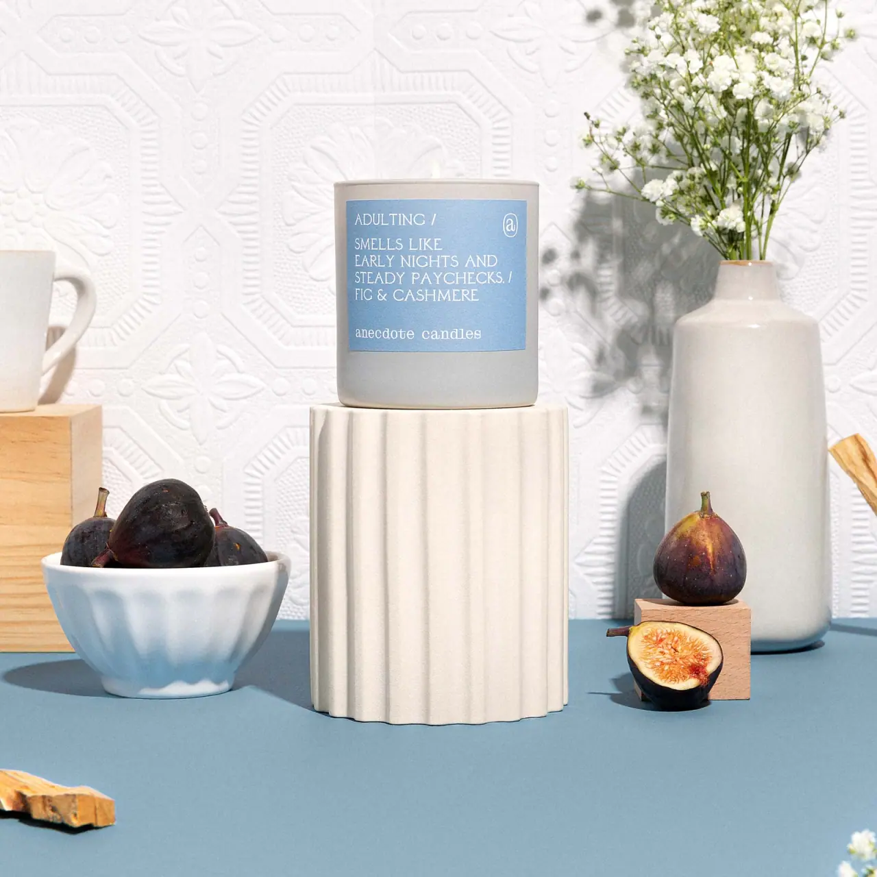
Anecdote Candles
A pale-blue label tells its story through punctuation
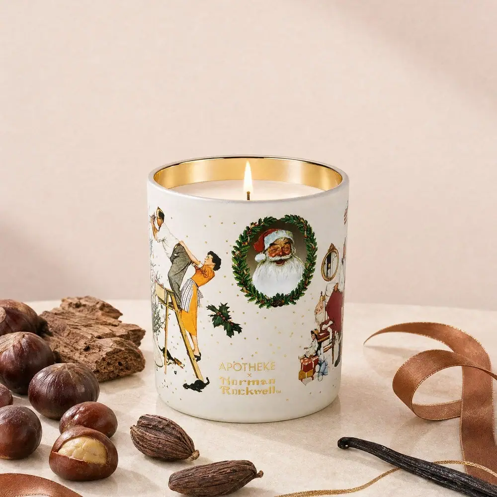
Apotheke
White holiday vignettes with a warm golden interior