Photography: Anecdote Candles official photography. Images belong to their respective owners.
Anecdote Candles

A pale-blue label tells its story through punctuation
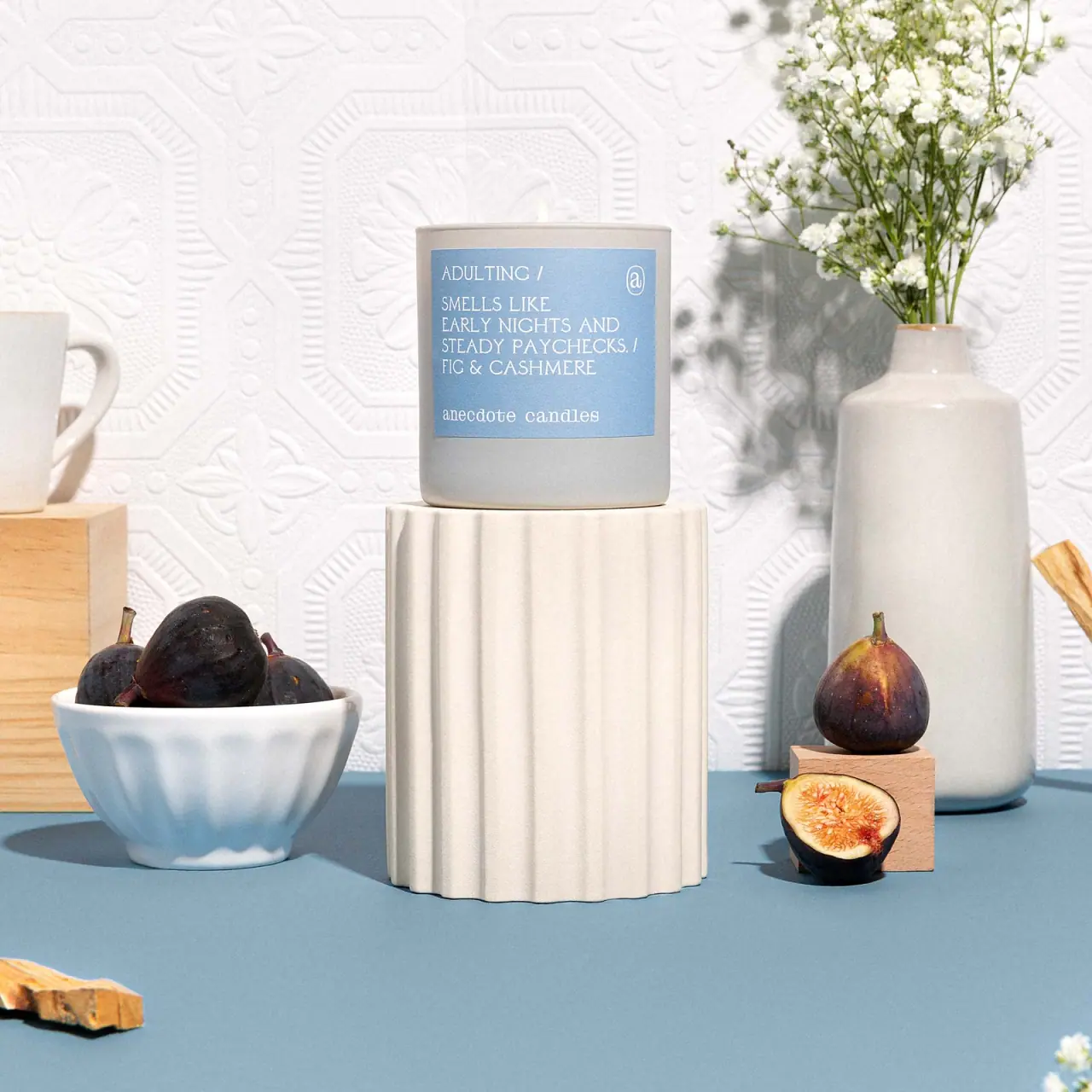
The selected Adulting tumbler gives a small everyday joke the prominence usually reserved for a candle's logo. White uppercase text sits on a pale blue rectangular label, moving from a short title to a conversational anecdote and then the Fig & Cashmere scent name. Slashes and empty space organise these closely related text sizes. A lowercase brand signature rests near the bottom, with a small outlined monogram at upper right. The light grey cylindrical vessel stays quiet so the label can read like a short printed note. This study covers the pictured tumbler, not the travel tin or smaller jar listed under the same scent.
- Candles & home scent
- Light pack
- Bold typographic
About this study
Adulting/Fig & Cashmere in the approved blue-label tumbler photograph. Current product sizing identifies a 9 oz tumbler distinct from jar and tin versions. Exact artwork date and printing process for this pictured edition were not established.
Sources & evidence · Reviewed 2026-10-19Color Palette
Approximate colours interpreted from photography. These are screen references, not official brand colours or print specifications.
Pack body
Soft grey vessel
#C9CAC5
Approximate tumbler appearance under bright scene lighting. Material, tint and coating cannot be established solely from this colour.
Label
Adulting blue
#91B9D2
Approximate pale-blue label ground. It creates a distinct reading panel against the neutral vessel without requiring a dark or highly saturated field.
Ink
Warm white lettering
#F7F4E9
Approximate title, anecdote, scent and brand lettering. Its gentle contrast is part of the appearance, but small text must still be tested in actual use.
Typography
Suggested visual alternatives, not confirmed brand typefaces. Any scale below is an illustrative estimate.
The title occupies the top left, followed by a slash and a blank interval. The anecdote then unfolds over several short uppercase lines, ending with another slash before the scent pairing. These levels are not separated by a dramatically oversized title: their similar fine serif-like capitals create a continuous editorial voice. The lowercase brand at the bottom changes case and receives its own breathing room. The small monogram is a secondary signature, not a substitute for the written identity.
Fonts
Editorial-copy alternative
Cutive Mono
- Looks like
- Fine serif lettering with a slightly typewritten rhythm
- Type
- Monospaced serif
- Weight
- Regular
- Case
- Uppercase for a short label narrative
- Tracking
- Natural spacing, adjusted only after print testing
- Fallback
- Courier New, monospace
A new short title and anecdotal sentence in one restrained voice. Its monospace rhythm is a proposal, not proof that the photographed font is monospaced.
Alternative narrative voice
Libre Caslon Text
- Looks like
- Light literary serif direction
- Type
- Text serif
- Weight
- Regular
- Case
- Uppercase or sentence case in an original system
- Tracking
- Modestly open for short capitals
- Fallback
- Georgia, serif
An alternative to the typewritten option if the new label needs more varied word shapes. Keep the title and narrative close enough in tone to feel like one note.
Original brand-signature alternative
Source Serif 4
- Looks like
- Compact readable serif lowercase
- Type
- Text serif
- Weight
- Regular
- Case
- Lowercase for an independent identity
- Tracking
- Normal
- Fallback
- Georgia, serif
A modest fictional brand signature below the narrative. One chosen family can serve all roles; these proposals are not a requirement to mix three serifs.
Structure & Proportions
Visual proportions and finish previews are illustrative. Confirmed construction details and uncertainties are distinguished in the study notes.
Proportions
| Purpose | Value | Preview |
|---|---|---|
| Published vessel dimensions | The current official listing gives the tumbler as 3.25 inches in diameter and 3.75 inches tall. These are sourced product dimensions, not measurements taken from the photograph or the separate pedestal. | — |
| Label footprint | The label occupies much of the upper and middle visible wall, leaving a wider grey band below than above. Its curved edges follow the cylinder in perspective. | — |
| Text spacing | A distinct gap separates the narrative block from the lowercase brand. Hierarchy comes from intervals and punctuation rather than a large range of letter sizes. | — |
Shapes
| Element | Value | Preview |
|---|---|---|
| Tumbler | Straight cylindrical wall with a gently rounded lower edge and an open circular rim. | |
| Label | Near-square rectangular panel, whose apparent side curvature comes from its placement on the vessel. | |
| Monogram enclosure | Small oval-like outlined signature in the label's upper right; distinctive brand artwork is not reconstructed here. |
Finishes
Low-glare neutral vessel
Grey exterior wall, with softly changing highlights; no exact surface treatment is established · matte
Pale printed-label appearance
Blue front panel; a historic designer case study mentions letterpress, but that process is not verified for this pictured blue-label tumbler · matte
Formats and materials
| Formats | Straight-sided candle tumbler shown open and lit |
| Materials | Opaque-looking light-grey vessel visible; the consulted product text does not establish its precise composition or coating., Pale blue rectangular label visible; substrate and adhesive are unverified., Wax and a small flame are visible at the rim; this design study does not derive wax specification or burn performance from appearance. |
| Closures | No lid, carton or protective cover is present in the selected photograph. The open top and small flame show an in-use presentation. Any retail closure, dust cover or outer packaging must be documented separately rather than invented from the tumbler silhouette. |
| Decoration | A short narrative printed directly within the visible label field, Slash separators and a small outlined monogram, No printed fig illustration or all-over pattern on the selected vessel |
Front Panel
Schematic reading order. The diagram’s zone heights do not represent measured artwork proportions.
The label reads down a left-aligned column. A title begins the small narrative, the anecdote supplies its personality, and the scent pairing translates that story into a product choice. A separate lowercase brand line closes the panel. The slashes operate as punctuation between ideas, so no horizontal rules or nested boxes are needed. The upper-right monogram balances the text without competing with the story.
| Zone | Content |
|---|---|
| Top left | Adulting title followed by a slash, with space below before the next phrase. |
| Upper right | Small outlined monogram, providing a secondary brand cue without expanding into a large seal. |
| Main narrative | Several lines of uppercase copy relating the candle to ordinary grown-up routines. It is word-led storytelling rather than an ingredient diagram. |
| Scent line | Fig & Cashmere appears immediately below the anecdote, identifying the fragrance separately from the humorous title. |
| Lower signature | Lowercase anecdote candles, separated from the text above by a conspicuous blank interval. |
Range System
The official product page distinguishes tumbler, jar and travel-tin formats for Adulting. Nice People's 2019 primary case study explains the broader idea of bringing playful product descriptions onto the labels. That establishes a narrative principle, not proof that every later vessel uses identical colour, typography or printing. This selected tumbler should retain its own format and edition scope.
- Observed: blue label on a light-grey tumbler with a title, anecdote, scent pairing and small brand signature.
- Sourced format distinction: the same named candle is sold in more than one vessel size; this study uses the 9 oz tumbler context only.
- Original-design interpretation: maintain the reading sequence but edit each new anecdote for its own line lengths rather than shrinking text to fit a fixed joke length.
Back of Pack & Shelf
The reverse and underside are not visible. No safety-label position, barcode, wax-weight marking or care-copy arrangement is established by the selected photograph. The readable front narrative must not be mistaken for the whole retail information system.
- Inspect the base and rear before describing actual warning and product-detail placement.
- For a new candle design, reserve practical information outside the storytelling panel without presenting that recommendation as this brand's documented construction.
On shelf
Interpretation: the blue panel and grey cylinder give a calm first impression, while the wording provides a reason to pick up the candle and read. This approach depends more on close engagement than on a giant brand mark. The scent name remains essential because the lifestyle title alone does not tell a shopper how the candle smells. A new design should therefore preserve both the humorous idea and the practical scent identifier.
Imagery
The candle sits on a separate fluted white pedestal among a bowl of figs, a cut fig, pale ceramics and a small flowering arrangement. The pale patterned backdrop gives the scene domestic texture. Blue on the tabletop echoes the label, while the fruit connects to the named scent. None of the pedestal's fluting, wall relief or flowers is decoration on the actual tumbler. The image creates a comfortable home scene while keeping the narrative panel unobstructed.
Guidelines
Editorial principles for an original design brief, not official brand guidelines.
Do
- Make the sentence worth reading before refining its typography.
- Separate a lifestyle title from an explicit scent description.
- Use punctuation and spacing to create hierarchy when sizes remain close.
- Maintain enough empty space around the final brand signature.
- Distinguish the candle vessel from props supporting it in photography.
Don't
- Do not describe the title as oversized when its hierarchy comes mainly from placement.
- Do not copy the existing joke or monogram into an original product.
- Do not assume a historic letterpress claim applies to every later label.
- Do not call the grey tumbler ceramic or glass without a source.
- Do not infer hidden warnings or a retail lid from this lit scene.
Sources & evidence
- Adulting Fig & Cashmere — Anecdote Candles official listingproduct
- Anecdote Candles — Nice People primary design case study, 2019designer
How this study was built
edition · Sourced fact
The official page separates tumbler, jar and tin sizes; this study uses the tumbler context rather than mixing their dimensions.Adulting Fig & Cashmere — Anecdote Candles official listingtypography · Visual observation
The local cover shows closely related fine uppercase text sizes; title position, slashes and spacing establish hierarchy without a giant headline.Adulting Fig & Cashmere — Anecdote Candles official listinglabel · Sourced fact
Nice People describes moving playful descriptions onto labels, supporting the narrative-first design principle.Anecdote Candles — Nice People primary design case study, 2019structure · Visual observation
An open lit cylinder is visible, with no lid or underside information in view.Adulting Fig & Cashmere — Anecdote Candles official listingpalette · Visual observation
The pale-blue panel, light lettering and grey vessel are package colours; the blue table and white pedestal remain scene elements.Adulting Fig & Cashmere — Anecdote Candles official listingrange · Editorial interpretation
A consistent narrative sequence can support other products, but a single tumbler and a historic identity case study do not prove universal current specifications.Adulting Fig & Cashmere — Anecdote Candles official listing · Anecdote Candles — Nice People primary design case study, 2019
What remains unverified
- The grey vessel's composition and coating are not specified in the consulted product text.
- Historic letterpress information is not proof of the process on this later-looking blue-label image.
- The reverse, underside and any retail lid or carton are absent.
- Actual font identities and calibrated colour or type-scale specifications are unavailable.
Give your AI
packaging taste
Give your design or image tool a packaging study: palette, type, structure, front panel and principles for an original brief.
Export this styleFree with an email. PACK.md works in Claude, ChatGPT, Cursor and image tools.
More like this

Akro
soft pink interrupted by an assertive black signature
Bijou Candles
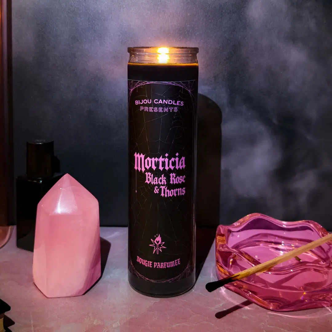
Pink blackletter and fine webs on a tall dark candle
Binaurale
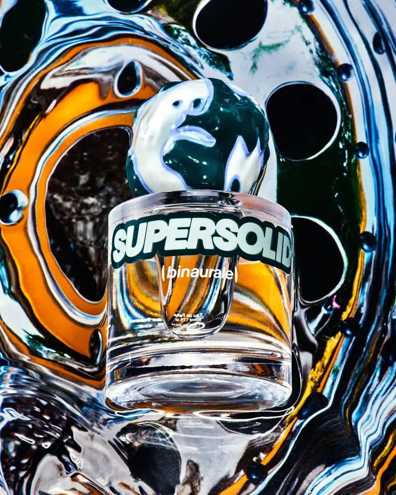
Globular teal cap above slanted pale fragrance lettering
Blake Brown
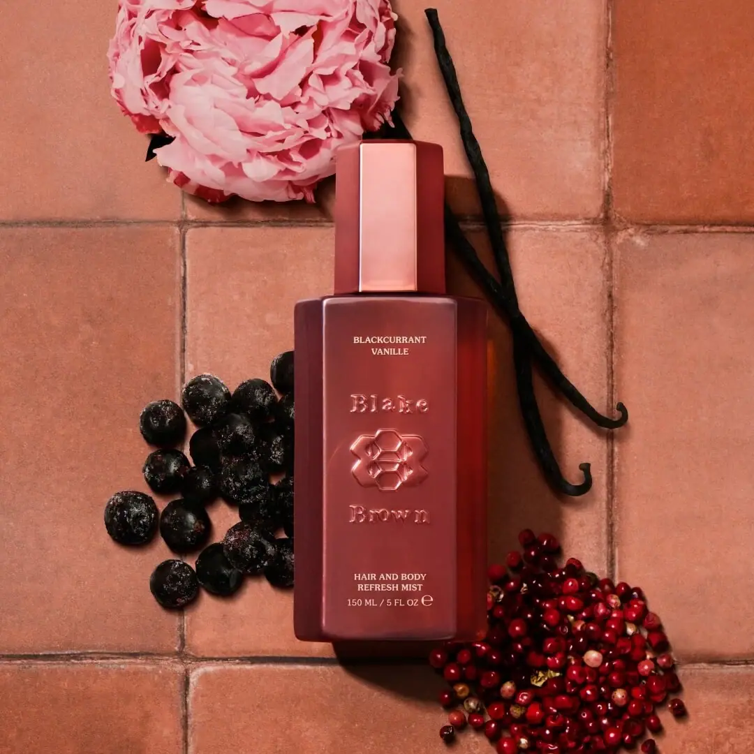
sculptural rose-brown fragrance with a jewel-like centre

Boy Smells
candy-shell flacons over blush pink glass

D.S. & Durga
deadpan grotesk names on parchment labels
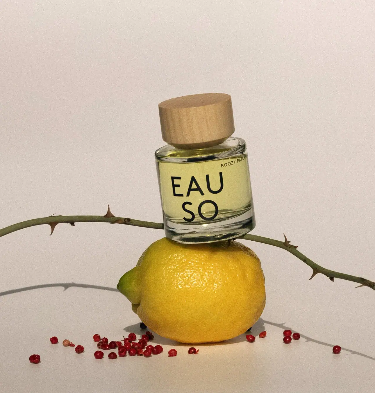
EAUSO VERT
Oversized stacked lettering on a clear round perfume bottle
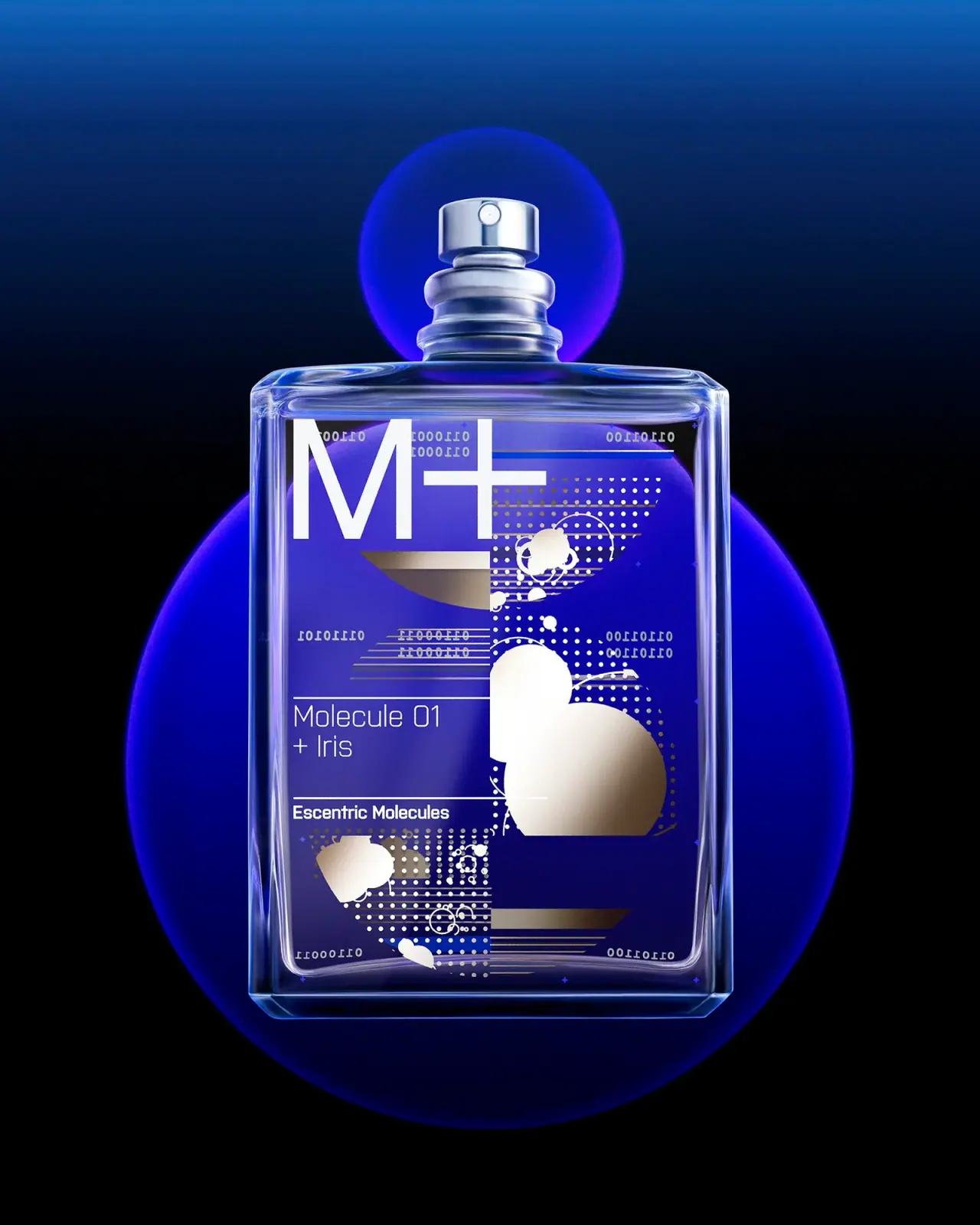
Escentric Molecules
Clear rectangular fragrance with giant symbol and layered coded graphics