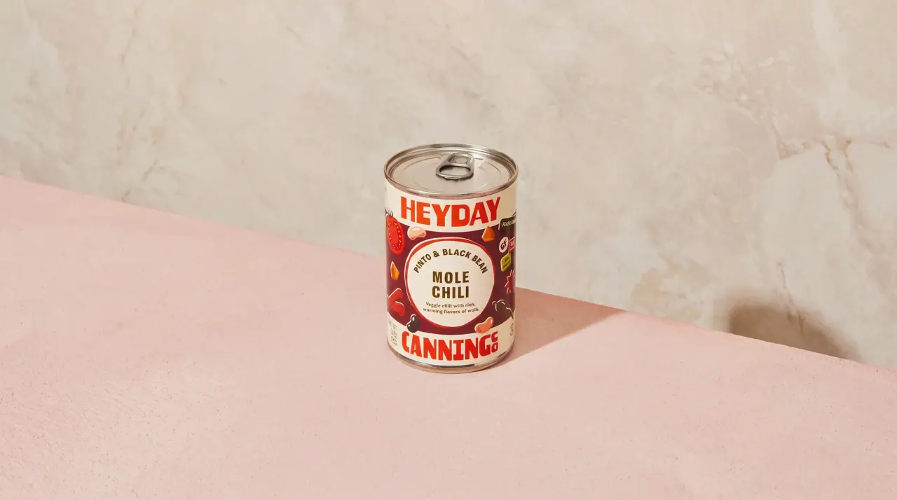
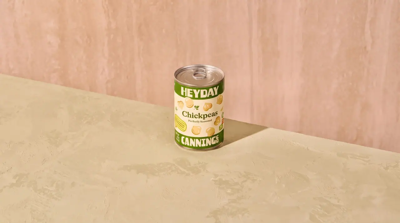
Heyday builds each tin like a sandwich: a Pantry Cream (#f1e8d2) band at the top carrying the wordmark in heavy Garden Green (#3f6a2c) condensed capitals, a matching cream band at the bottom carrying the second half of the name with a small stacked 'co', and a saturated flavour colour in between. The middle field holds a dark green 'saucy' script tab, the flavour name in cream condensed capitals with the bean type in a soft serif beneath, flat painted ingredients (citrus, chillies, ginger, herbs) scattered around a glossy hero spoonful of beans, a red 'meals in minutes' roundel and small protein and fibre boxes. Plain seasoned beans drop the colour field for a cream tin with green top and bottom bands and scattered bean drawings, and soups switch the wordmark to red.
Approximate colours interpreted from photography. These are screen references, not official brand colours or print specifications.
Pack body
Tin Silver
#c9c6bf
Bare tinplate rims, ring-pull lid and base
Label
Pantry Cream
#f1e8d2
Top and bottom wordmark bands, and the full ground of the seasoned-bean tins
Ink
Garden Green
#3f6a2c
Both wordmark halves, the 'saucy' tab and the top and bottom bands on seasoned tins
Accent
Badge Red
#c42b2e
Round 'meals in minutes' badge, and the wordmark on the soup tin
Sauce Brown
#7a2e1c
Glossy beans-in-sauce on the hero spoon, the warm centre of every flavoured tin
Range coding
Apricot Leaf
#8fae3b
Leaf-green middle field of the apricot glazed baked beans
Curry Aqua
#8fd1cb
Aqua middle field of the coconut curry chickpeas
Enchilada Orange
#e9922a
Orange middle field of the enchilada black beans
Harissa Red
#c3262a
Red middle field of the harissa lemon chickpeas
Kimchi Mustard
#d8a83a
Mustard middle field of the kimchi sesame navy beans
Typography
Suggested visual alternatives, not confirmed brand typefaces. Any scale below is an illustrative estimate.
Two wordmark halves book-end the tin: the first word in the top band and the second word in the bottom band, both larger than anything in between. In the middle, a script 'saucy' tab introduces the flavour name in condensed capitals, followed by the bean type in a softer serif, with nutrition callouts in small boxes and a red roundel on the right.
Type scale
Estimated cap size as a share of the panel · Front of the 15 oz food tin label, about 105 mm tall
wordmark-top
13% · Regular · Display
SUNNY
wordmark-bottom
13% · Regular · Display
PANTRY
range-script
6% · Regular · Script
zesty
flavour-name
5% · Bold · Label
MISO GINGER
bean-type
4.5% · Regular · Headline
Butter Beans
roundel
2.4% · Bold · Label
READY IN MINUTES
Fonts
Display
Anton
Looks like
Obviously Narrow Black, Knockout HTF
Type
Heavy condensed grotesque with soft corners
Weight
Regular (heavy)
Case
Uppercase
Tracking
Tight, about -1%
Fallback
Impact, Franklin Gothic Condensed
Both wordmark halves, green on cream; the second word carries a small stacked 'co' at its end.
Script
Kaushan Script
Looks like
Casual brush script, close to Kaufmann
Type
Brush script, lowercase
Weight
Regular
Case
Lowercase
Tracking
Normal
Fallback
Brush Script MT, cursive
The 'saucy' range word, cream reversed out of a dark green tab.
Label
Oswald
Looks like
Trade Gothic Bold Condensed
Type
Bold condensed sans
Weight
SemiBold, Bold
Case
Uppercase
Tracking
Normal
Fallback
Arial Narrow Bold
Flavour name in cream, protein and fibre boxes, roundel text and the vertical net weight.
Headline
Young Serif
Looks like
Cooper Light, Windsor
Type
Soft rounded old-style serif
Weight
Regular
Case
Title case
Tracking
Normal
Fallback
Cooper, Georgia
Bean type under the flavour name ('Chickpeas', 'Black Beans') and the name on seasoned tins.
Structure & Proportions
Proportions
Purpose
Value
Preview
Label height
About 90% of tin height, rim to rim
Top cream band
About 18% of label height
Bottom cream band
About 18% of label height
Middle colour field
About 64% of label height
Wordmark width
About 85% of the front face width in each band
Colours per label
Five to six: cream, green, flavour colour, red badge, ingredient colours
Schematic reading order. The diagram’s zone heights do not represent measured artwork proportions.
Top band
Middle field
Bottom band
Full wraparound label in three horizontal bands: cream top band, full-colour illustrated middle, cream bottom band.
Zone
Content
Top band
First wordmark word in green on cream
Middle field
'saucy' tab, flavour name, bean type, painted ingredients around a spoon of beans, red convenience roundel, side nutrition callouts
Bottom band
Second wordmark word with stacked 'co' in green on cream
Range System
Colour coding by flavour in the middle band with fixed cream wordmark bands; the basic seasoned line keeps the bands but replaces the colour field with cream and scattered bean drawings, and soups swap the wordmark to red.
Apricot Glazed = leaf green
Coconut Curry = aqua
Enchilada = orange
Harissa Lemon = red
Kimchi Sesame = mustard
Cannellini, Chickpeas = cream tin with green bands
Pozole verde soup = red wordmark, green field, white oval
Back of Pack & Shelf
The wrap continues around the tin in the flavour colour: a short 'how to eat it' paragraph and serving ideas, then a cream panel with nutrition facts, ingredients and barcode, with the net weight running vertically along the seam.
Serving suggestions in a few cheerful lines
Nutrition facts panel on a cream box
Ingredients list and allergen statement
UPC barcode on cream
BPA-free lining note, recycling mark and distributor address
On shelf
On shelf the matching cream bands line up into two continuous stripes of green capitals across the row, while the middle colours (green, aqua, orange, red, mustard) code each flavour.
Imagery
Flat, gouache-like painted ingredients (citrus halves, chillies, ginger, herbs, single beans) scattered across the colour field in a cheerful mid-century cookbook manner, around a glossy, near-photographic spoonful of beans in sauce.
Guidelines
Do
Divide the label into a cream top band (18%), a coloured middle (64%) and a cream bottom band (18%).
Split the wordmark across both cream bands in heavy condensed Garden Green (#3f6a2c) capitals at about 85% of the face width.
Give each flavour its own saturated middle colour and scatter flat painted ingredients across it.
Introduce the flavour with a short lowercase Script word on a dark green banner tab.
Set the flavour name in cream Label capitals and the bean type in the soft Headline serif beneath.
Add one Badge Red (#c42b2e) roundel for the convenience promise.
Don't
Don't drop the cream bands or move the wordmarks.
Don't use muted or earthy colours in the middle field.
Don't set the wordmark in serif or lowercase.
Don't leave the middle field empty on the flavoured range.
Don't let ingredient drawings overlap the cream bands.
Don't use more than one red badge per tin.
Give your AI packaging taste
Give your design or image tool a packaging study: palette, type, structure, front panel and principles for an original brief.