Photography: Standard Procedure official photography. Images belong to their respective owners.
Standard Procedure

White family pump with striped sunset circles and heavy serif
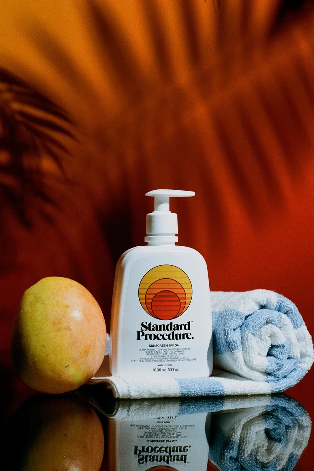
The selected 500 ml sunscreen pump puts a large warm circular emblem above a heavy two-line Standard Procedure wordmark. A white rounded rectangular body and matching pump provide a plain frame for the yellow, orange and red graphic. Small sunscreen information and quantity sit below the maker, creating a strong difference between recognition graphics and close-reading details. The orange backdrop, fruit, pale blue towel and mirrored base are campaign elements rather than additional packaging colors or included accessories.
- Suncare
- Light pack
- Retro illustrated
- Bold typographic
About this study
Selected white 500 ml SPF50+ pump with warm striped circle emblem in the leisure still life. Current official size is verified; material and current-formula equivalence to the photographed label are not inferred.
Sources & evidence · Reviewed 2026-10-19Color Palette
Approximate colours interpreted from photography. These are screen references, not official brand colours or print specifications.
Pack body
Cool-lit white
#E2E9E8
Approximate white bottle and pump under the selected lighting; the slight blue cast comes partly from the towel and scene.
Ink
Deep black maker
#111410
Heavy wordmark, thin emblem outlines and compact functional text provide strong contrast.
Accent
Sun yellow
#DAB734
Upper portion of the large circular emblem supplies the lightest warm graphic tone.
Warm orange
#D77A2B
Middle circle and stripe region connect yellow to the lower red-orange area.
Red-orange center
#BD4222
Small lower circle and warm bars intensify the emblem without extending into a full-body color field.
Typography
Suggested visual alternatives, not confirmed brand typefaces. Any scale below is an illustrative estimate.
Standard Procedure is stacked on two lines in a heavy, rounded serif style with closely packed forms. Title case and the final period make the maker feel like a compact statement rather than spaced technical lettering. A small uppercase sunscreen/SPF line follows, then much finer supporting text and the lower quantity. The maker is visually substantial enough to balance the large emblem above. Small utility lettering is deliberately subordinate, but it still needs a separate close-reading view in a usable product presentation.
Fonts
Independent heavy serif maker
Fraunces
- Looks like
- Soft robust display serif
- Type
- Display serif
- Weight
- ExtraBold, Black
- Case
- Title case
- Tracking
- Compact optical spacing
- Fallback
- Georgia, serif
Use for an original two-line maker with rounded weight and a clear silhouette. Avoid copying the source's exact word breaks, punctuation and letter shapes.
Function and small details
Archivo
- Looks like
- Compact neutral sans
- Type
- Grotesque sans-serif
- Weight
- Regular, Medium
- Case
- Uppercase function; mixed-case units
- Tracking
- Natural compact spacing
- Fallback
- Arial, sans-serif
Alternative for small product and quantity information. Essential details should be sized for real-world reading rather than reduced merely to preserve a large decorative emblem.
Structure & Proportions
Visual proportions and finish previews are illustrative. Confirmed construction details and uncertainties are distinguished in the study notes.
Proportions
| Purpose | Value | Preview |
|---|---|---|
| Broad front panel | The wide rounded-rectangle body gives the circular emblem and two-line maker room to stack without becoming a tall narrow column. | — |
| Dominant warm emblem | The circular graphic occupies much of the upper front and is visually larger than the small functional information below. | — |
| Compact heavy maker | Two closely stacked words form a dense black block beneath the lighter striped circle. | — |
| Raised pump extension | The neck and pump add a clear upper silhouette while remaining narrower than the body, preserving the bottle's broad lower mass. | — |
Shapes
| Element | Value | Preview |
|---|---|---|
| Bottle body | Broad rounded rectangle with soft shoulders and gently curved lower corners. | |
| Dispensing pump | White raised head with long flat projection above a short collar. | |
| Sun-like emblem | One large circle and two smaller circles offset toward the bottom, crossed by horizontal warm stripes. | |
| Maker block | Two dense title-case serif lines beneath the circular graphic. |
Finishes
Soft white appearance
Broad bottle face shows diffuse shading, not a verified matte coating or soft-touch treatment. · matte
Formats and materials
| Formats | Large rounded rectangular pump bottle; visible front and official listing identify 500 ml / 16.9 fl oz |
| Materials | The bottle and pump appear opaque white. The accessed product page does not identify body resin, recycled content, pump components or label stock, so a specific plastic construction is not asserted., The front is smooth with printed-looking graphics and no clearly resolved separate paper edge. Exact ink system, coating and decoration process remain unknown. The blue towel and orange background are not components of the package. |
| Closures | The white pump is raised above a short neck and broad collar, with a long flat head projecting to one side. The body has softly rounded shoulders, broad corners and a comparatively wide front. The image makes the dispensing format clear but does not reveal pump dose, locking direction, internal spring or refill access. Matching white hardware keeps the main color emphasis on the emblem and typography. |
| Decoration | Large circle containing two smaller lower-offset circles, Horizontal warm stripes across the emblem, Heavy stacked serif maker directly below, Small centered sunscreen and supporting details, Low quantity line |
Front Panel
Schematic reading order. The diagram’s zone heights do not represent measured artwork proportions.
The front reads as emblem, maker, function and detail. The large warm circle supplies a simple visual cue; the heavy black maker immediately signs it; the smaller sunscreen line identifies the category. Dense fine print and a lower quantity complete the stack. The circular motif is graphic and abstract rather than a photograph of a beach or fruit. Its thin dark outlines connect visually to the black maker while the white vessel keeps the composition bounded.
| Zone | Content |
|---|---|
| Upper emblem | Yellow, orange and red-orange circles with horizontal stripes form a sun-like image with thin dark outlines. |
| Maker | Standard Procedure appears in two heavy rounded serif lines with a final period and a small trademark mark. |
| Product identifier | A small centered sunscreen SPF50+ line follows the maker; it is recorded as label wording, not independently validated protection data. |
| Fine supporting copy | Several compact lines and a small regulatory-code area sit below; not every tiny character is transcribed from this image. |
| Net contents | 16.9 fl oz and 500 ml are visible near the lower front, matching the official size listing. |
Range System
The study covers the selected 500 ml pump presentation. The official page confirms that format, while the approved source filename suggests an older campaign series; current formula and claims are not automatically assigned to the photographed label. An original family could retain an emblem-and-maker relationship across sizes, but each format would need its own information layout and structural specification. No universal Standard Procedure material system is inferred.
- Use a stable recognition emblem while adapting the lower functional block to the actual format.
- Keep large shared-use dispensers identifiable without assuming all sizes use pumps.
- Separate current source claims from the exact wording visible on an archival campaign bottle.
Back of Pack & Shelf
The reverse, underside and pump internals are unseen. The front's small regulatory area is visible but not sufficiently clear for an exact identifier transcription.
- Inspect the reverse before describing complete directions and ingredient hierarchy.
- Do not reconstruct a regulatory number from indistinct pixels.
- Confirm pump and bottle materials separately before documenting recyclability or refillability.
On shelf
Interpretively, the large circular emblem and heavy maker can remain recognizable from farther away than the small sunscreen details. The white pump reinforces a familiar repeated-use format, but appearance alone does not establish dispensing quantity. The lower fine print deserves a closer product view for practical reading. An original design should test the emblem's scale against required information so the strongest graphic does not leave essential text too small on the physical bottle.
Imagery
A mango-like fruit sits to the left of the bottle and a rolled pale-blue towel to the right, with another fold beneath the base. A saturated orange wall and soft plant shadows fill the background. The glossy ground creates an inverted reflection of the bottle and towel. These elements create a warm leisure setting, but the bottle itself remains white with a small warm graphic palette. The fruit is a campaign prop; it is not a package component or sufficient evidence of a specific formula claim.
Guidelines
Editorial principles for an original design brief, not official brand guidelines.
Do
- Balance a large emblem with a clear maker.
- Use the broad bottle front intentionally.
- Keep functional information readable at physical size.
- Separate scene color from package color.
- Record the exact photographed edition and source size.
Don't
- Do not call the white bottle blue because of reflections.
- Do not infer resin or pump dose from appearance.
- Do not reproduce tiny regulatory characters without legible evidence.
- Do not transfer current formula claims to an undated image.
- Do not copy the source's nested-circle emblem and heavy wordmark together.
Sources & evidence
How this study was built
edition · Sourced fact
Official listing identifies 500 ml / 16.9 fl oz pump presentation, consistent with visible front quantity.Standard Procedure — SPF50+ Sunscreen 500 mlstructure · Visual observation
Broad white rounded-rectangle body supports a matching raised pump.Standard Procedure — SPF50+ Sunscreen 500 mltypography · Visual observation
Heavy rounded serif maker contrasts with compact lower sunscreen information.Standard Procedure — SPF50+ Sunscreen 500 mllabel · Visual observation
Upper emblem contains nested lower-offset warm circles and horizontal stripes above the two-line maker.Standard Procedure — SPF50+ Sunscreen 500 mlpalette · Visual observation
White, black and concentrated yellow/orange/red define the pack; blue cast is scene-dependent.Standard Procedure — SPF50+ Sunscreen 500 mlimagery · Visual observation
Fruit, towel, orange wall and mirrored ground provide external context rather than package components.Standard Procedure — SPF50+ Sunscreen 500 mlrange · Editorial interpretation
Emblem-plus-maker hierarchy can transfer across an original family, but other formats and materials are not established.
What remains unverified
- Bottle/pump materials, decoration process and dose unspecified.
- Reverse, underside and internal pump unseen.
- Tiny regulatory identifier not confidently transcribed.
- Original fonts, dimensions and exact campaign date unknown; current source claims not treated as historical label verification.
Give your AI
packaging taste
Give your design or image tool a packaging study: palette, type, structure, front panel and principles for an original brief.
Export this styleFree with an email. PACK.md works in Claude, ChatGPT, Cursor and image tools.
More like this
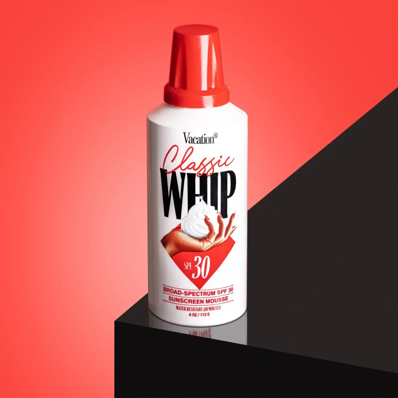
Vacation
Retro whipped-can theatre with explicit sunscreen identification
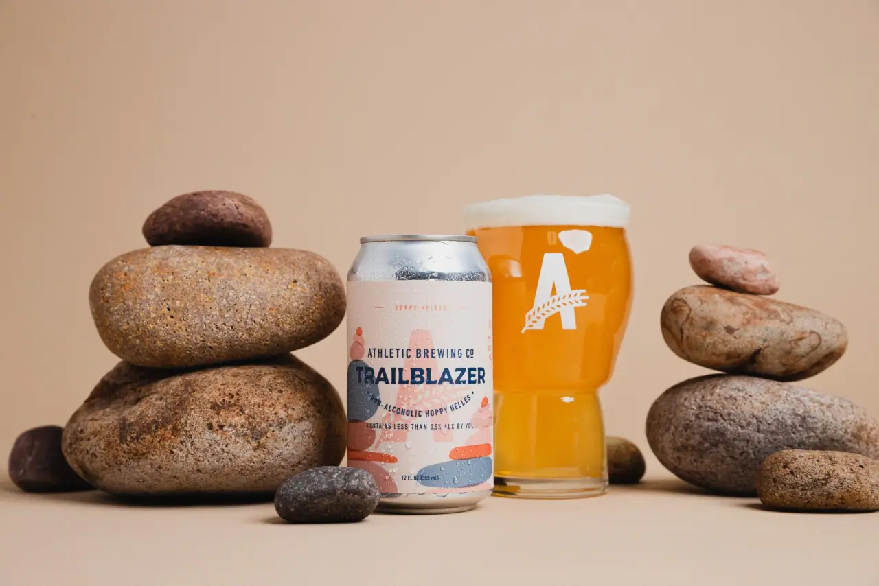
Athletic Brewing
trailhead poster cans under a wheat-stalk monogram
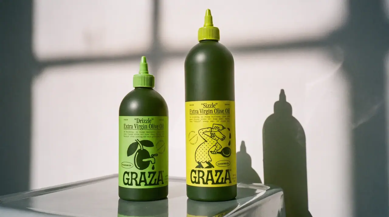
Graza
deli counter comic on bottle green
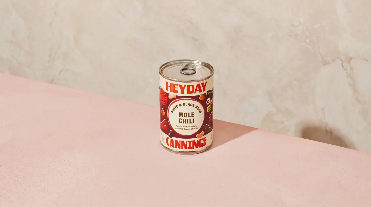
Heyday Canning Co.
saucy pantry tins with a cream band
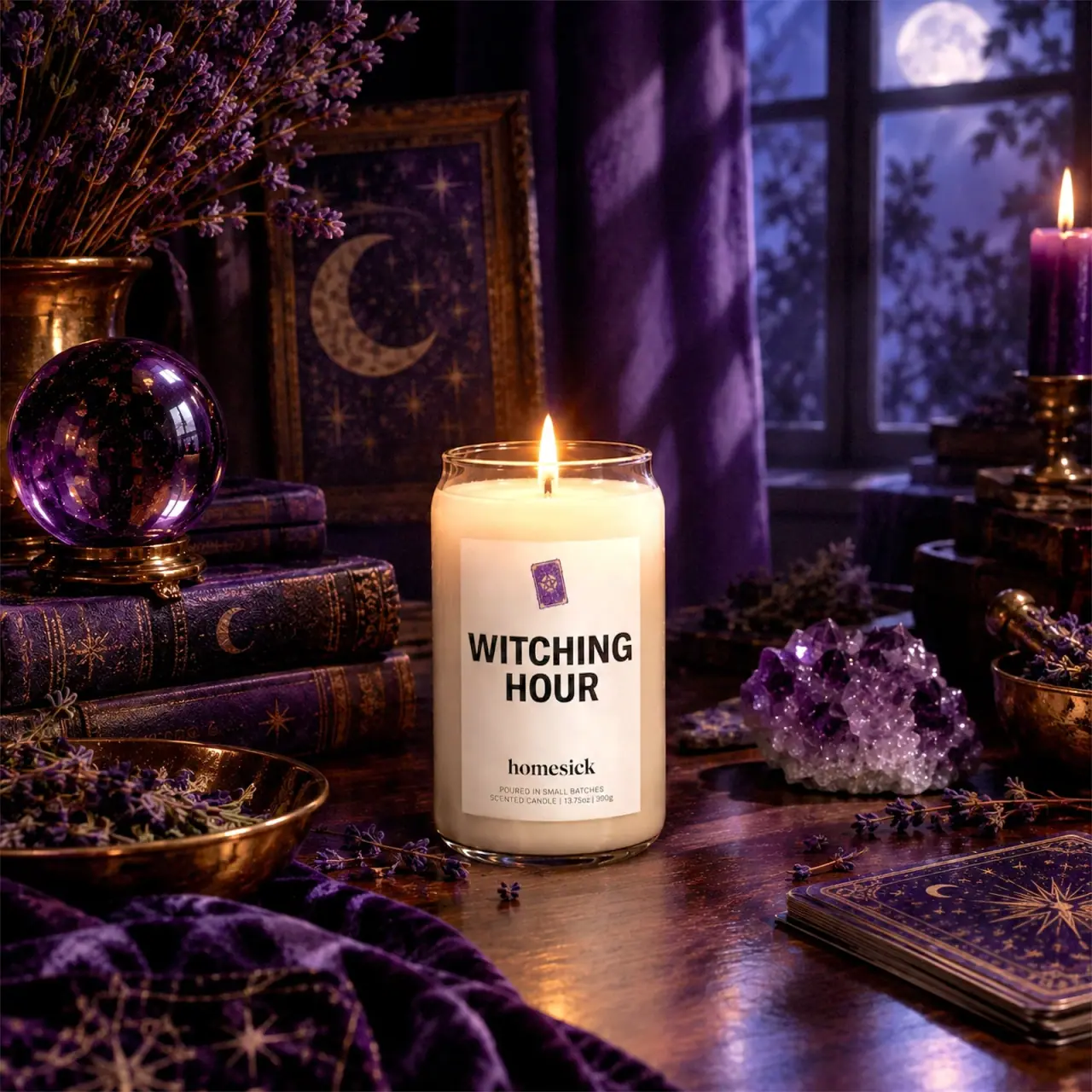
Homesick
Bold black scent name with a small violet motif

ACURE
Iridescent spectacle with practical, tightly ordered type

AKT
Lilac stage directions with a quiet metallic detail
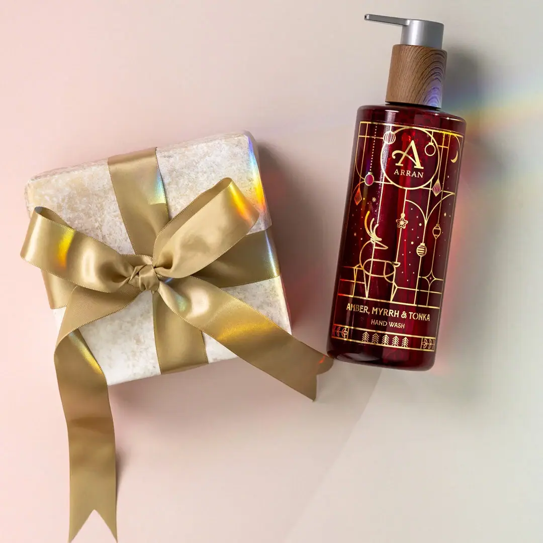
ARRAN
Festive golden linework on garnet with a grain-textured collar