Photography: Hyeja official photography. Images belong to their respective owners.
Hyeja
Amber light and offset bilingual typography beneath a golden collar
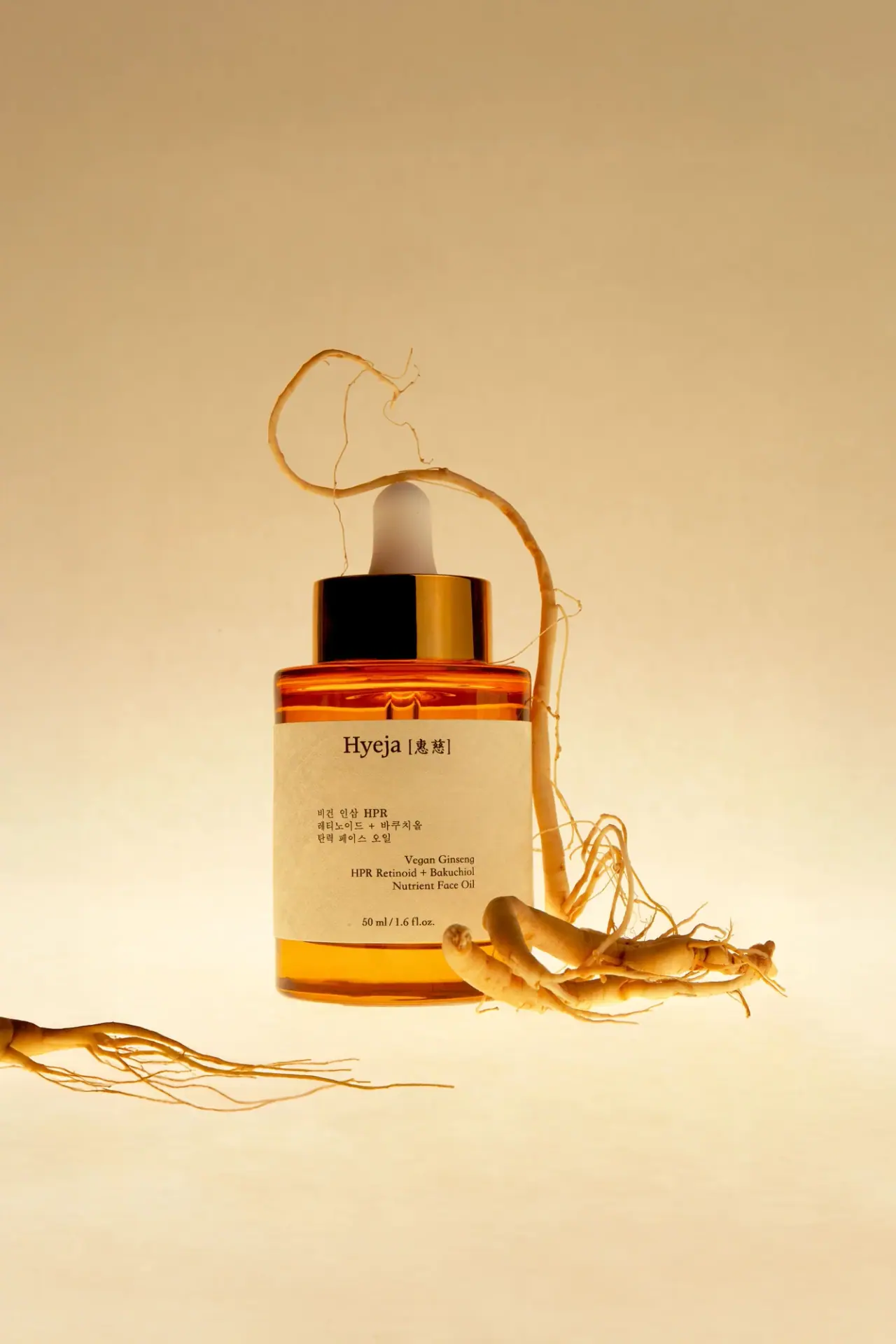
The selected Hyeja face-oil bottle uses a broad cream label to interrupt a luminous amber body. A white dropper bulb and reflective gold-coloured collar form a distinct top, while the producer name sits centrally near the label’s upper edge. Below it, the Korean and English product blocks are deliberately offset: the Korean text begins farther left, and the English block sits lower and farther right. A centred 50 mL line closes the composition. The label is therefore spare but not uniformly centred. Ginseng roots in the photograph supply an ingredient association outside the printed design.
- Skincare
- Light pack
- Apothecary
About this study
Selected 50 mL Ginseng HPR Retinoid + Bakuchiol Nutrient Face Oil image with broad cream wrap and offset bilingual product blocks.
Sources & evidence · Reviewed 2026-10-19Color Palette
Approximate colours interpreted from photography. These are screen references, not official brand colours or print specifications.
Pack body
Luminous amber appearance
#D3840A
Approximate visible amber-orange body under warm backlighting. The relative contribution of bottle tint, oil and lighting is not isolated; no fixed production colour is claimed.
Pale dropper bulb
#E8E0CF
Approximate white bulb under the warm scene light. The elastomer or other material specification is not provided.
Label
Warm cream label
#E7D2A5
Approximate broad label field. Its paper-like texture reads softly in this lighting, but stock, fibre content and coating are unverified.
Ink
Dark brown-black text
#302112
Approximate producer, bilingual information and quantity colour. Warm illumination may shift an originally neutral dark ink.
Accent
Gold-coloured collar
#B37A16
Reflective closure appearance with both bright gold and almost black reflections. It does not establish solid metal, gold plating or any particular metallisation method.
Typography
Suggested visual alternatives, not confirmed brand typefaces. Any scale below is an illustrative estimate.
The largest text is the Hyeja name accompanied by bracketed characters at the top of the label. Its serif character is echoed by the English product wording lower down. The Korean block is left-aligned in the middle-left area, while the English block is right-aligned farther down. That stagger creates a quiet diagonal reading movement without an illustration or border. The small centred quantity at the base returns the composition to the bottle axis. Both languages have their own spatial logic; describing the whole label as a single centred stack would miss its main design decision.
Fonts
Latin producer and English alternative
Libre Baskerville
- Looks like
- Libre Baskerville
- Type
- Serif
- Weight
- Regular 400 / Bold 700
- Case
- Title case and sentence case
- Tracking
- Natural optical spacing
- Fallback
- serif
A proposed serif voice for an original house name and restrained English product block. Use a distinct identity and preserve the readable word shapes rather than imitating the Hyeja mark.
Korean and character companion
Noto Serif KR
- Looks like
- Noto Serif KR
- Type
- Korean serif
- Weight
- Regular 400 / Medium 500
- Case
- Korean script; case not applicable
- Tracking
- Neutral with language-specific proofing
- Fallback
- serif
An accessible alternative for Korean copy with a compatible literary tone. Have a fluent reader check line breaks and character forms; matching Latin point size does not automatically produce equal visual weight.
Structure & Proportions
Visual proportions and finish previews are illustrative. Confirmed construction details and uncertainties are distinguished in the study notes.
Proportions
| Purpose | Value | Preview |
|---|---|---|
| Body and wrap | A broad label covers much of the straight side wall while leaving amber visible at the shoulder and lower base. Its exact wrap seam is out of view. | — |
| Closure | The reflective collar is broad relative to the pale bulb, making a substantial horizontal top above the rounded shoulders. | — |
| Bilingual spacing | A large gap separates the producer from the smaller product blocks. Their left/right offsets use empty space actively rather than centring every line. | — |
Shapes
| Element | Value | Preview |
|---|---|---|
| Bottle body | Broad straight-sided form with rounded shoulders and a flat-looking base. | |
| Cream wrap | Wide rectangular label bending around the body. | |
| Dropper assembly | Pale bulb above a broad reflective collar. | |
| Text-block arrangement | Two compact product blocks staggered left and right within the wrap. |
Finishes
Amber translucence
Visible shoulder and base; tint contribution unisolated. · transparent
Reflective gold appearance
Closure collar; metallic-looking surface, process unknown. · metallic
Soft cream texture
Label face; precise stock and coating unverified. · matte
Formats and materials
| Formats | A broad cylindrical-looking dropper bottle with gently rounded shoulders, a wide cream wrap and a compact closure assembly. The photograph and official product page both identify 50 mL. |
| Materials | Hyeja’s brand-level sustainability text refers to its glass product bottles. That statement supports a glass-bottle context but is not a component specification uniquely naming this photographed oil edition., The dropper bulb, reflective collar, pipette, label stock and adhesive are not itemised in the inspected sources. Amber appearance alone is not used as proof of glass composition. |
| Closures | A pale bulb rises from a broad reflective gold-coloured collar. A pipette-like central element can be seen through the upper body. The bottle is closed; thread construction, seal, pipette length and dosing volume are unverified. |
| Decoration | The wrap relies on dark typography and open space. Roots appear around the bottle in the campaign image, not as a printed botanical pattern on the visible label. |
Front Panel
Schematic reading order. The diagram’s zone heights do not represent measured artwork proportions.
A centred top signature and centred bottom quantity frame an asymmetrical middle. The Korean product block begins at the left, and a lower English block aligns toward the right. The broad cream area provides enough separation for these blocks to remain independent without dividing rules. Rounded bottle edges gently curve the label, but the principal text remains near the frontal reading surface.
| Zone | Content |
|---|---|
| Producer and bracketed characters | The dark serif Hyeja name sits near the upper centre beside bracketed characters. These belong to the identity, distinct from the Korean product paragraph below. |
| Korean product block | A compact left-aligned block appears in the middle-left area. It includes Latin HPR among Korean script; this mixture needs careful language-aware spacing in any original adaptation. |
| English product block | The English Ginseng / HPR Retinoid + Bakuchiol / Nutrient Face Oil wording occupies a lower right-aligned block. It is not simply centred beneath the Korean text. |
| Quantity | The small 50 mL / 1.6 fl. oz. line is centred near the lower edge, visually restoring an axial anchor after the offset product blocks. |
Range System
The official product page independently verifies the face-oil identity and 50 mL format. Hyeja’s homepage describes a minimalist Korean design philosophy, but only this selected label is visually audited. Its bilingual composition is a specific arrangement, not evidence that every product uses identical alignment or the same gold-coloured closure.
- For an original bilingual extension, retain clear language blocks and equal attention to reading quality instead of treating one script as decorative texture. The offset can be maintained only if each new name still fits naturally.
- A longer English name may require a revised line break or block width rather than a smaller font. Such adaptation is a design proposal, not a claim about unseen Hyeja labels.
Back of Pack & Shelf
The rear, label seam and underside are not shown. Directions, full ingredient copy, batch marking and any recycling information cannot be placed from this image.
- Obtain a rear view before describing the complete wrap or its seam.
- Do not infer a refill programme solely from general reuse and repurposing language.
- Do not infer dropper dose, glass grade or light-protection performance from colour.
On shelf
The cream rectangle and reflective collar would likely be noticed before the long ingredient-led product name. At closer range, the offset bilingual blocks add character to an otherwise restrained bottle. This is a visual interpretation rather than a tested shelf result. A neutral-light product view would help distinguish actual amber tint from this campaign’s warm illumination and would provide a more reliable colour reference for production discussion.
Imagery
The bottle appears suspended within a warm cream-and-amber scene, with ginseng roots looping above the bulb and extending beside the lower body. Backlighting illuminates the shoulder and base and produces a strong dark reflection on the collar. The roots remain outside the bottle and label; their use creates an ingredient association rather than a literal picture of the formula’s composition. The lower root cluster partly overlaps the right label edge, while the important product name remains readable. Broad empty space above reinforces the quiet composition.
Guidelines
Editorial principles for an original design brief, not official brand guidelines.
Do
- Document the Korean and English blocks with their actual different alignments.
- Keep the gold-coloured appearance separate from unverified material and plating claims.
- Distinguish the brand-wide glass statement from an exact component specification.
- Use ingredient props to support the image while keeping product information readable.
Don't
- Do not describe the full label as one centred text stack.
- Do not infer light-protection performance or glass type from amber colour.
- Do not copy script characters as decorative marks without language review.
- Do not claim foil, embossed paper or a refill system without direct evidence.
Sources & evidence
How this study was built
edition · Sourced fact
Official product page confirms face-oil identity and 50 mL size.Ginseng HPR Retinoid + Bakuchiol Face Oil — Hyejastructure · Sourced fact
Brand text refers to glass product bottles and reuse/repurposing in general terms.Hyeja philosophy and sustainabilitylabel · Visual observation
Korean block is left-aligned; English block sits lower and right-aligned between centred producer and quantity.typography · Visual observation
Serif Latin identity and compact bilingual copy establish a restrained hierarchy.palette · Visual observation
Amber-looking body, cream wrap, dark type, pale bulb and reflective gold-coloured collar are visible.imagery · Visual observation
Root props surround the bottle rather than forming a printed label illustration.range · Editorial interpretation
Bilingual block separation offers an adaptable principle, not a verified range-wide alignment rule.
What remains unverified
- Glass statement is brand-level, not an itemised component specification for this edition.
- Collar, bulb, pipette and label materials or processes are unverified.
- Warm lighting prevents a production-accurate colour specification.
- Reverse, seam, closure internals and dose are unseen; fonts are alternatives.
Give your AI
packaging taste
Give your design or image tool a packaging study: palette, type, structure, front panel and principles for an original brief.
Export this styleFree with an email. PACK.md works in Claude, ChatGPT, Cursor and image tools.
More like this

Aesop
a botanical still life around a disciplined apothecary label
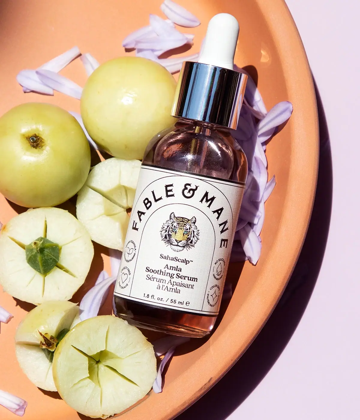
Fable & Mane
Arched serif maker, tiger portrait and amber dropper bottle
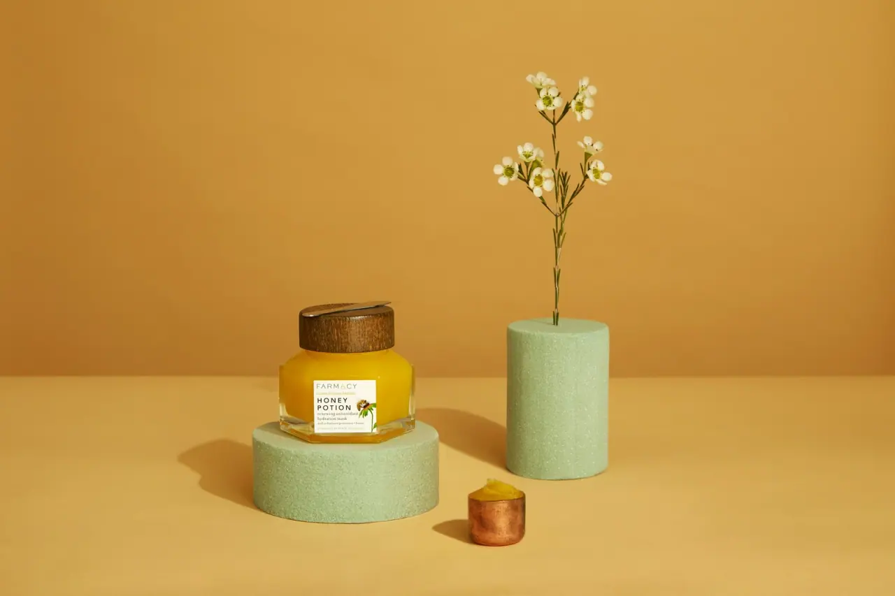
Farmacy
Golden contents in a faceted jar beneath a wood-toned lid
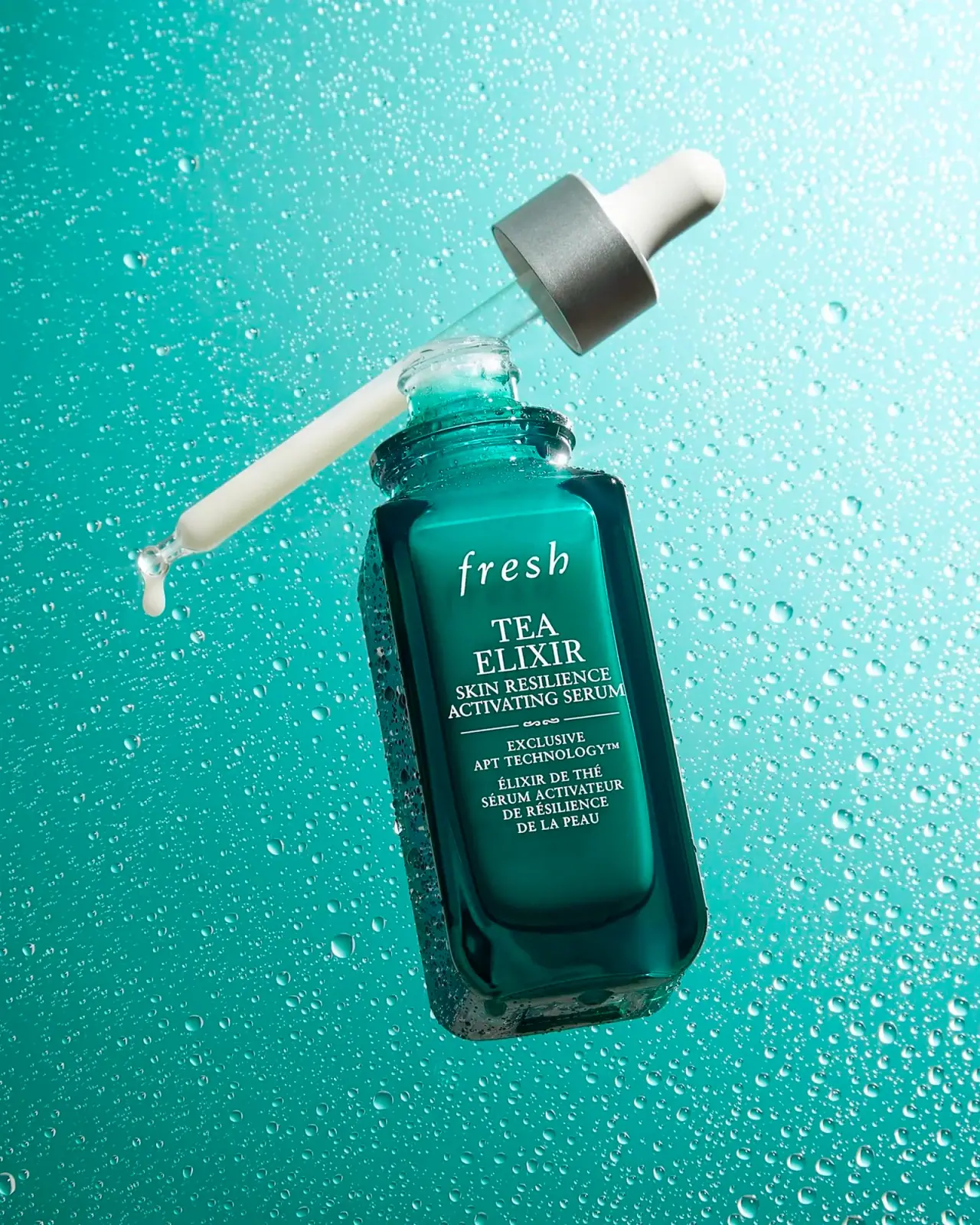
Fresh
Teal dropper bottle with white serif naming and silver collar
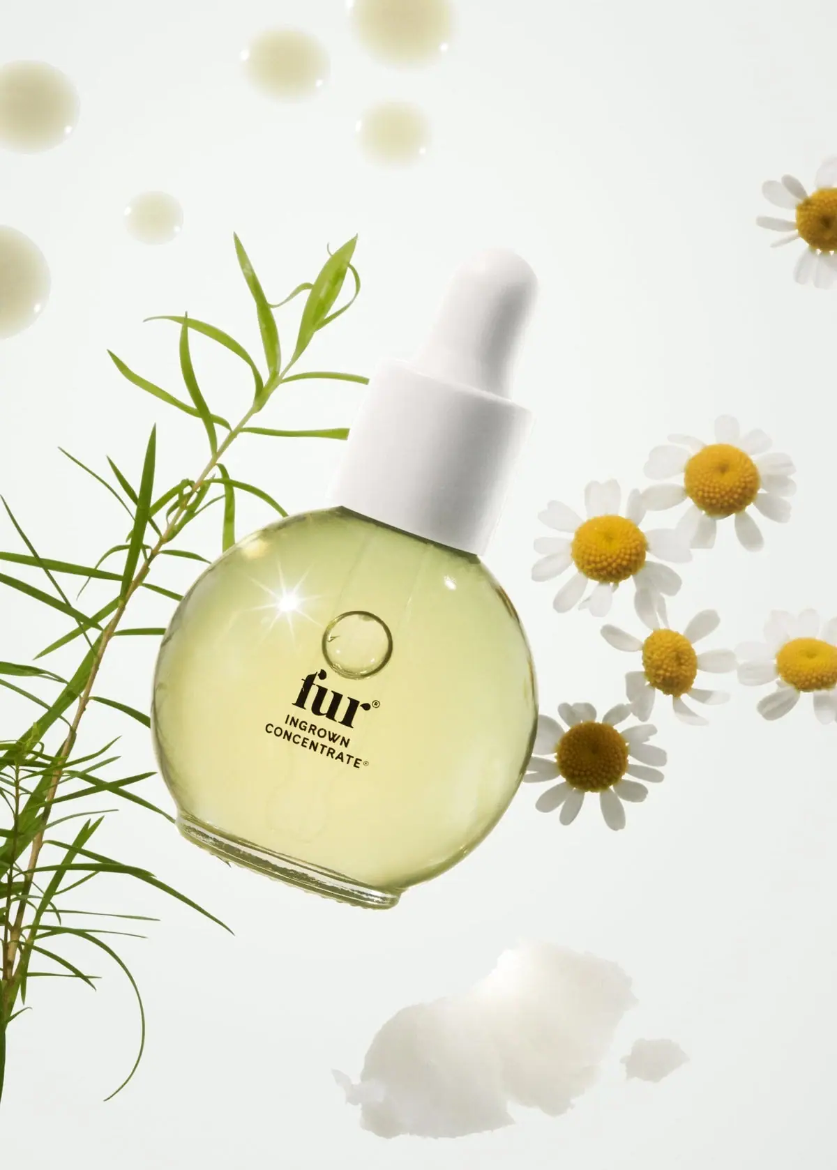
Fur
Pale oil and compact black type in a rounded dropper
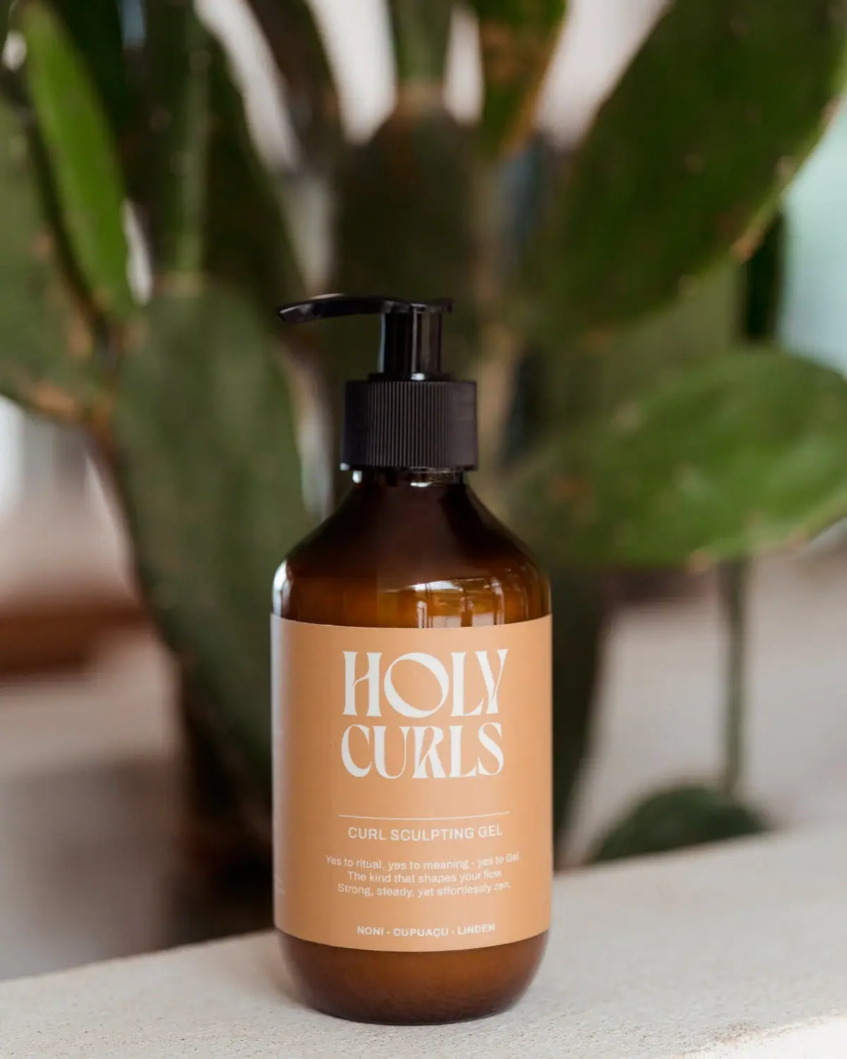
Holy Curls
Expressive white serifs on warm ochre with amber shoulders
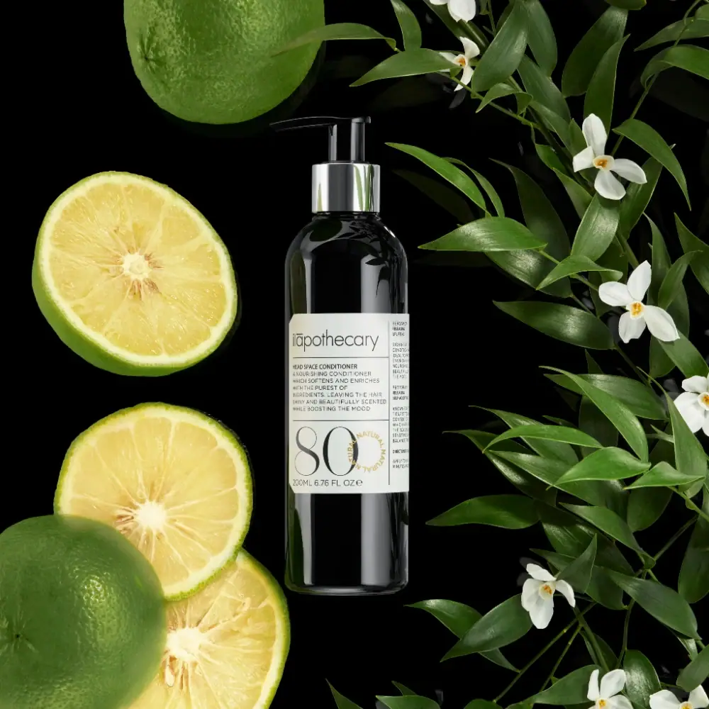
ilapothecary
Dark pump bottle with a ruled label and oversized 80
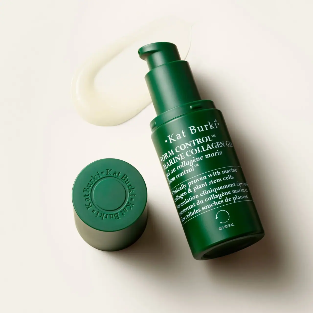
Kat Burki
Forest green, dense white serif text and sculpted cap