Photography: Lucas Zarebinski — product photography. Images belong to their respective owners.
Kat Burki

Forest green, dense white serif text and sculpted cap
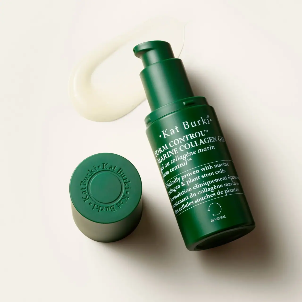
Form Control Marine Collagen Gel combines a dark green pump bottle with an unusually text-rich front. White serif lettering carries the maker, English product name, French translation and a bilingual claim block, while thin rules separate those sections. A small arrow device labelled REVERSAL occupies a quieter lower area. The detached cap adds a second kind of identity: a circular ring of relief lettering on its top. The selected photograph exposes both dispensing hardware and cap decoration, so the study distinguishes the pack's everyday closed silhouette from this deliberately opened presentation.
- Skincare
- Dark pack
- Apothecary
- Bold typographic
About this study
The selected green Form Control Marine Collagen Gel bottle photographed uncapped with its cap beside it. Current official product identity supplies context; this is not a full Kat Burki range or construction audit.
Sources & evidence · Reviewed 2026-10-19Color Palette
Approximate colours interpreted from photography. These are screen references, not official brand colours or print specifications.
Pack body
Deep forest green
#124D30
Approximate main bottle, pump and cap family. Lighting produces lighter bands and nearly black edges; these are not documented additional colourways.
Ink
Soft white
#EDEFE5
Approximate serif lettering, dividing rules and lower arrow. The warm scene can affect its perceived tint, so this is not a specified ink standard.
Typography
Suggested visual alternatives, not confirmed brand typefaces. Any scale below is an illustrative estimate.
The maker line is relatively open and prominent, with capital initials and a small square preceding it. Below, the English product name becomes a compact uppercase serif block, followed by a smaller French translation. The next compartment uses substantial mixed-case serif copy rather than tiny technical text. Its density makes the front read like a short editorial announcement. At the bottom, the REVERSAL label switches to a smaller sans-serif voice beneath its symbol. Hierarchy therefore depends on case, spacing, rules and placement as much as large changes in size.
Fonts
Original maker and product serif alternative
Libre Baskerville
- Looks like
- Sturdy traditional text serif
- Type
- Transitional serif
- Weight
- Regular, Bold
- Case
- Title case for maker; uppercase for product
- Tracking
- Airier maker, compact product lines
- Fallback
- Georgia, serif
Explore an original hierarchy that keeps the brand line distinct from a dense product block. Test the smallest reversed serifs on the actual curved surface instead of judging only a flat screen proof.
Small functional-marker alternative
Inter
- Looks like
- Plain compact sans
- Type
- Sans serif
- Weight
- Regular, Medium
- Case
- Uppercase
- Tracking
- Normal to slightly open
- Fallback
- Arial, sans-serif
Use for a short collection or routine label beneath an original symbol. Its simplicity should distinguish the marker from the main serif reading texture without adding another large headline.
Structure & Proportions
Visual proportions and finish previews are illustrative. Confirmed construction details and uncertainties are distinguished in the study notes.
Proportions
| Purpose | Value | Preview |
|---|---|---|
| Dense front reading area | Most visible bottle height is occupied by text and its separators; the lower symbol has a comparatively spacious isolated area. | — |
| Hardware as visible upper extension | Removing the cap exposes a tall collar and raised actuator. This adds stepped narrow cylinders above the broader reservoir rather than continuing one uninterrupted tube. | — |
| Independent cap-top canvas | The cap diameter creates a broad circular surface for repeated identity, visible here because it is set aside. These relationships are qualitative, not measured tooling dimensions. | — |
Shapes
| Element | Value | Preview |
|---|---|---|
| Bottle body | Upright cylinder with softly rounded base, shown diagonally in the image. | |
| Dispenser | Stepped collar and actuator with a short lateral opening. | |
| Cap-top identity | Circular central disc enclosed by a ring of dimensional maker lettering. | |
| Reversal device | Open circular arrow and small endpoint detail above a compact caption. |
Finishes
Soft reflective green appearance
Bottle, collar, actuator and detached cap · matte
Dimensional cap lettering; process unverified
Cap top around the circular centre · emboss
Formats and materials
| Formats | Cylindrical pump bottle with rounded lower edge, Broad removable overcap photographed separately, Official product listing identifies a 1 oz / 30 mL format |
| Materials | The photographed green surface does not establish whether the reservoir is glass, plastic or a coated composite., Pump and cap component materials, recycled content and barrier construction are not specified by the inspected source., The visible cap relief shows dimensional branding, but its manufacturing method and whether the colour is integral or applied remain unverified. |
| Closures | An exposed green actuator rises above a wide cylindrical collar. Its short lateral outlet is visible near the upper edge, making dispensing direction legible in this view. A separate broad cap lies beside the bottle with its top facing the camera. The underside and attachment mechanism are hidden; neither a threaded fit nor a snap fit is established. No internal pump components are visible, so the appearance alone does not justify an airless or metered-dose claim. |
| Decoration | White serif maker, product and bilingual descriptive copy, Thin horizontal separators between text compartments, Small lower circular-arrow motif with REVERSAL caption, Tone-on-tone cap-top identity following a circular path |
Front Panel
Schematic reading order. The diagram’s zone heights do not represent measured artwork proportions.
A continuous green field carries white copy without a contrasting paper rectangle. The product and claim blocks begin toward a common leftward edge and wrap visually around the cylinder; they should not be described as a uniformly centred stack. Thin rules divide identity from descriptive claims and those claims from the lower symbol. Whether the decoration is direct print or another application is not established. The label word here refers to information organisation, not a verified adhesive substrate.
| Zone | Content |
|---|---|
| Maker line | Kat Burki in title-case serif lettering with a small square and registration detail. |
| Product identification | FORM CONTROL and MARINE COLLAGEN GEL above the French product description. |
| Bilingual claim compartment | White serif statements between thin rules. Their presence is observed as communication, without independently validating efficacy. |
| Lower collection marker | Circular arrow above REVERSAL, separated from the dense words above by a larger breathing area. |
| Detached cap top | Repeated maker name around a circular centre, formed in the same green surface rather than high-contrast white lettering. |
Range System
The official site's navigation includes a Reversal collection, which supplies context for the lower REVERSAL marker visible on this bottle. That is narrower evidence than a complete range design audit. This selected product demonstrates how a common-looking maker line, a long bilingual name and a smaller family marker can coexist. No second package has been inspected here to establish whether other collections change colour, closure or symbol. An original extension would need explicit comparisons before deciding which elements should stay fixed.
- The product name supplies the specific identity while the lower marker supplies a second classification level.
- English and French versions occupy adjacent lines rather than opposite sides in the visible front composition.
- A hypothetical related product could reuse text compartments while changing its own name, but the photo does not prove actual range-wide layout rules.
Back of Pack & Shelf
The reverse, base underside, cap interior and any carton are absent. Dense front copy should not be mistaken for a fully inspected regulatory panel.
- No ingredient-list, barcode or batch-code position is established on the actual pack.
- The official product page contains usage and formula information, but its web order does not prove the printed reverse layout.
- For an original bilingual bottle, reserve readable space for necessary secondary information rather than compressing it to imitate this front's density.
On shelf
The cohesive green components would likely register before the detailed text at a distance. Close up, the repeated serif texture conveys a more traditional, information-led character than a sparse laboratory label. Its cost is reading density: long lines approach the curved edge, and bilingual claims compete for the same small front. The cap-top relief offers recognition from above without needing a second ink colour. These are visual interpretations rather than findings from shelf testing, and the uncapped photographic pose is not an assumed retail presentation.
Imagery
The bottle lies diagonally on a warm pale surface, with a translucent gel smear behind the exposed pump. The detached cap sits lower left and tilts enough to reveal both its circular top and sidewall. Soft directional light produces a broad green highlight, darker edges and grounded shadows. The scene presents texture, dispensing and cap decoration in one view. Its cream background and yellowish gel should remain outside the pack palette; neither is printed on the bottle. The source record attributes the photograph to Lucas Zarebinski, but the accessible portfolio text did not independently identify the exact commission.
Guidelines
Editorial principles for an original design brief, not official brand guidelines.
Do
- Separate long bilingual copy into meaningful compartments.
- Consider a secondary viewing angle such as the cap top.
- Test reversed serif detail on the actual curved component.
- Distinguish a collection symbol from environmental certification.
- Describe pump construction only to the extent supported by evidence.
Don't
- Do not infer an airless mechanism from the exposed pump.
- Do not identify the green reservoir material by appearance alone.
- Do not treat the reversal arrow as a recycling mark.
- Do not copy the circular cap wordmark or front claim language.
- Do not let a large campaign crop substitute for real-size legibility testing.
Sources & evidence
- Form Control Marine Collagen Gel — Kat Burkiproduct
- Lucas Zarebinski — photographer portfoliophotographer
How this study was built
edition · Sourced fact
The official product page identifies Form Control Marine Collagen Gel and the 1 oz / 30 mL format.Form Control Marine Collagen Gel — Kat Burkistructure · Visual observation
Approved local image shows exposed pump, stepped collar and detached broad cap, without internal construction.typography · Visual observation
Serif English and French blocks dominate the front; dense product and claim text is not uniformly centred.label · Visual observation
Cap-top circular relief and lower REVERSAL arrow provide two separate secondary identity treatments.range · Sourced fact
Official navigation includes a Reversal collection, supporting family-marker context without proving a universal colour code.Form Control Marine Collagen Gel — Kat Burkipalette · Visual observation
Green components and pale text are pack colours; warm background and gel smear belong to the scene.
What remains unverified
- Exact reservoir and cap materials, pump mechanism and decoration process are unverified.
- Photo attribution comes from the curated source record; accessible portfolio text did not name the exact commission.
- Fonts, physical colour standards and dimensions are unknown.
- Reverse, cap interior, underside and outer carton are not inspected.
Give your AI
packaging taste
Give your design or image tool a packaging study: palette, type, structure, front panel and principles for an original brief.
Export this styleFree with an email. PACK.md works in Claude, ChatGPT, Cursor and image tools.
More like this
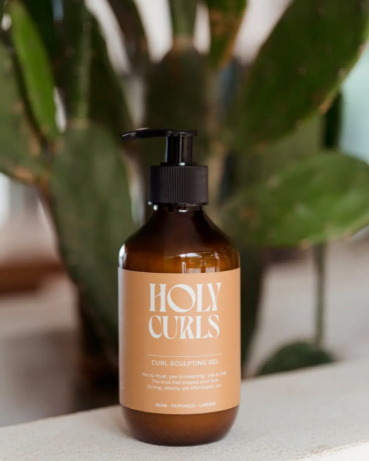
Holy Curls
Expressive white serifs on warm ochre with amber shoulders
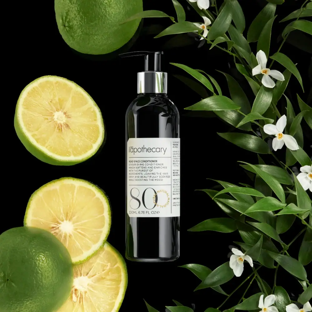
ilapothecary
Dark pump bottle with a ruled label and oversized 80
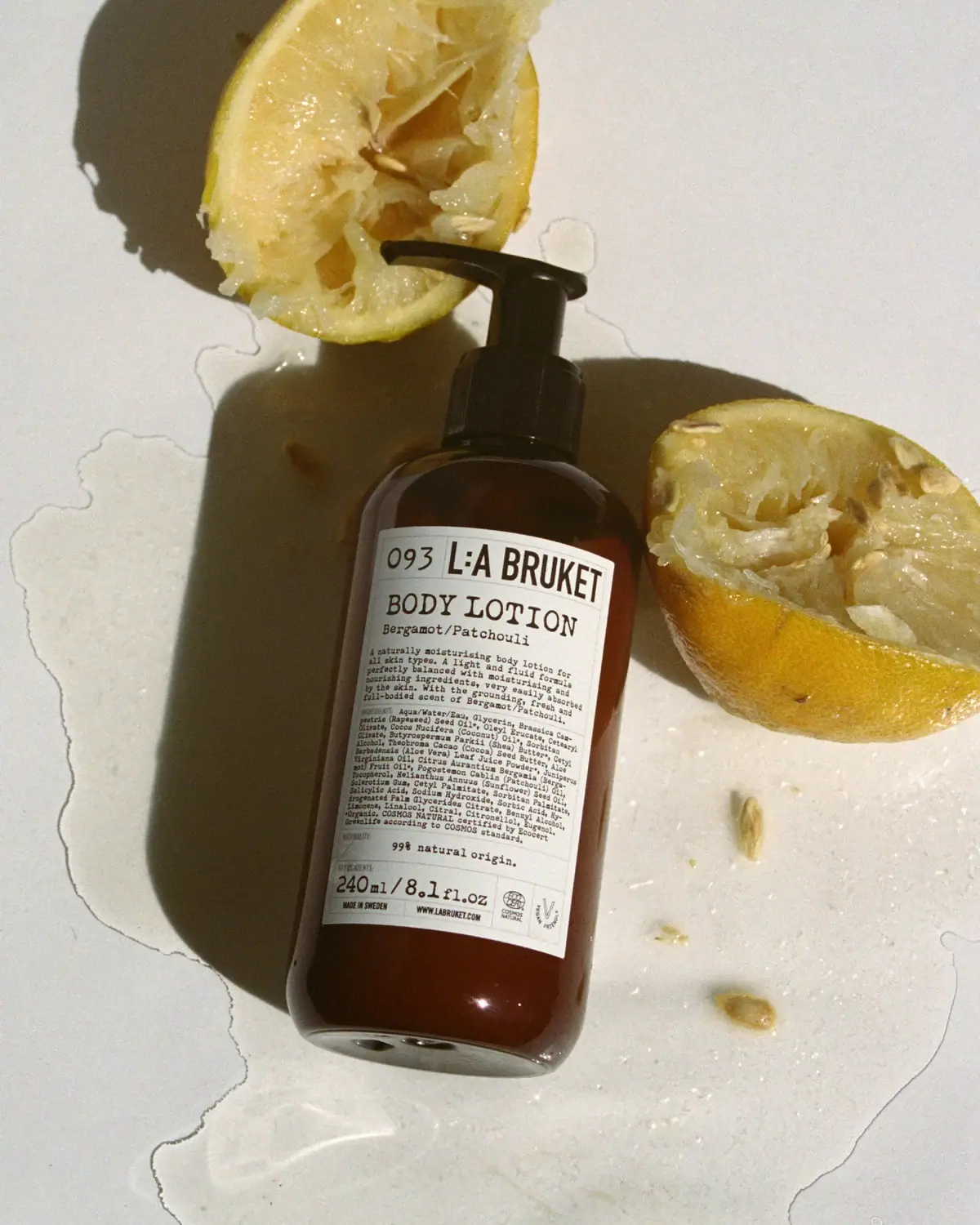
L:A Bruket
Amber pump bottle with a ruled typographic information label
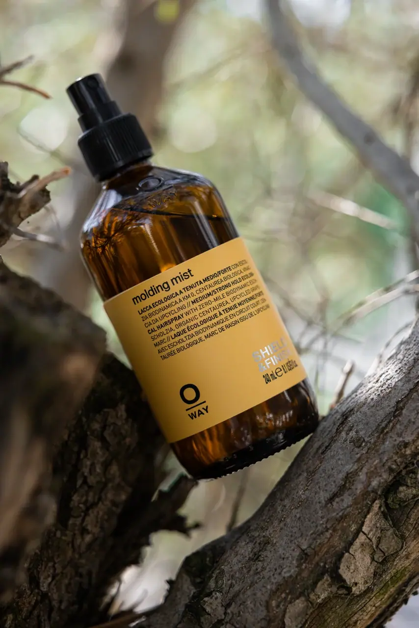
Oway
mustard wrap with split lower anchors on amber spray bottle

D.S. & Durga
deadpan grotesk names on parchment labels

ACURE
Iridescent spectacle with practical, tightly ordered type

Aesop
a botanical still life around a disciplined apothecary label

AKT
Lilac stage directions with a quiet metallic detail