Images from the packaging case study by Established · Campaign images © Rare Beauty, from rarebeauty.com
Rare Beauty

sculpted sphere caps in warm skin nudes
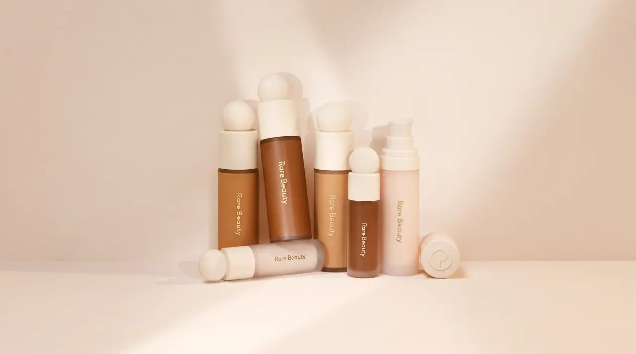
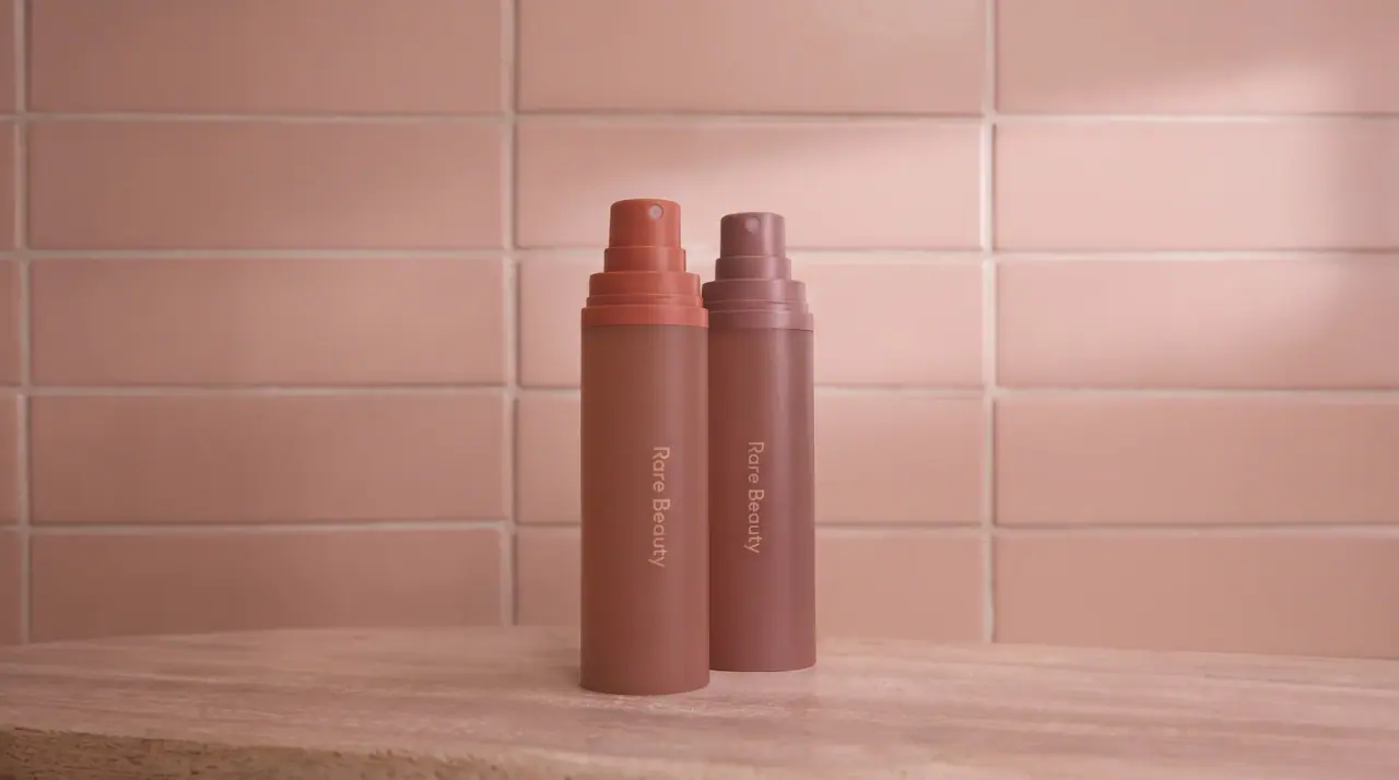
Rare Beauty gives its components one recognisable gesture: a short cylinder cap topped with a smooth sphere, finished in soft-touch blush nude (#ecc9bd) or polished gold (#cfae6e), which doubles as a comfortable grip. Bodies are slim frosted or tinted cylinders that take the colour of the formula, from pearly luminizer to rosewood lip cream and coral liquid blush, and carry only a small light title-case wordmark printed vertically. Cartons stay in the same warm nude-to-terracotta range and add a gentle serif product name stacked over several lines, a handwritten shade name and a soft photo of the component on a round plinth. The library sheet shows only the formula swatches, so the colour story is the shades themselves.
- Make-up
- Light pack
- Pastel soft-touch
- Clinical minimal
Color Palette
Approximate colours interpreted from photography. These are screen references, not official brand colours or print specifications.
Pack body
Blush Nude Cap
#ecc9bd
Soft-touch sphere caps on concealer, foundation and luminizer
Frosted Shell
#f1e9e0
Translucent frosted bottle body on concealers, foundations and pencils
Label
Terracotta Carton
#d99a8a
Outer carton ground on blush products
Ink
Cocoa Print
#6b3b34
Wordmark and carton text on light components and cartons
Pale Pearl Print
#f6eee6
Wordmark on darker tinted bodies
Accent
Polished Gold
#cfae6e
Mirror-gold sphere caps on liquid blush and the lip liner cap
Range coding
Pearl Luminizer
#ecdcc8
Pearly champagne formula and body tint of the liquid luminizer
Rosewood Fill
#a9665c
Tinted body colour on lip creams and glosses, matching the shade inside
Soft Pinch Coral
#d98a7e
Liquid blush bodies and cartons, varying by shade
Joy Pink
#f4566a
Bright pink shade of lip oil and blush, the most saturated in the range
Typography
Suggested visual alternatives, not confirmed brand typefaces. Any scale below is an illustrative estimate.
On the component the wordmark is the only text, small and running up the body. On cartons the wordmark sits top left, the product name is stacked large beneath it in a soft serif, the shade name follows in a handwritten script and a short sentence of copy closes the panel.
Type scale
Estimated cap size as a share of the panel · Front of the liquid blush carton, about 100 mm tall
product-name
9% · Light · Headline
Gentle Glow Liquid Blush
shade-name
7% · Regular · Script
Kindness
carton-wordmark
4% · Light · Display
Soft Days
component-wordmark
3% · Light · Display
Soft Days
copy-line
2% · Regular · Display
A weightless, long-lasting liquid blush.
volume
1.5% · Regular · Display
7.5 ml / 0.25 fl oz
Fonts
Display
Inter
- Looks like
- Neue Haas Unica Light, Graphik Light
- Type
- Neo-grotesque sans, light weight
- Weight
- Light, Regular
- Case
- Title case
- Tracking
- Slightly open, about +2%
- Fallback
- Helvetica Neue Light, Arial
Wordmark: printed vertically on cylinders, horizontally top left on cartons; also carton body copy.
Headline
Fraunces
- Looks like
- Canela Light, Gamma
- Type
- Soft transitional serif with gentle curves
- Weight
- Light
- Case
- Title case
- Tracking
- Tight, about -1%
- Fallback
- Georgia, Times New Roman
Product name stacked over three or four lines on the carton front.
Script
Caveat
- Looks like
- Brush-pen signature script
- Type
- Handwritten script
- Weight
- Regular
- Case
- Title case
- Tracking
- Normal
- Fallback
- Bradley Hand, cursive
Shade name, often a single word, written in a darker tone of the carton colour.
Structure & Proportions
Proportions
| Purpose | Value | Preview |
|---|---|---|
| Cap share | About 40% of component height, sphere included | |
| Sphere diameter | About 90% of cap width | |
| Wordmark length | About 30% of body height, vertical | |
| Print coverage (component) | Under 5% of the visible surface | |
| Carton text column | About 50% of carton width, left side | |
| Colours per component | Two: cap finish plus the formula-tinted body | — |
Shapes
| Element | Value | Preview |
|---|---|---|
| Cap | Short cylinder topped with a smooth sphere | |
| Body | Slim round cylinder | |
| Carton plinth | Round plinth under the component photo | |
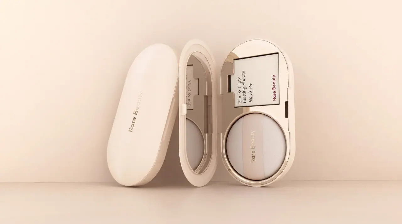
| Compact | Round compact with a domed lid |
Finishes
Soft-touch nude
Sphere caps on complexion products · soft-touch
Mirror gold
Sphere caps on blush and liner · metallic
Frosted translucent body
Concealer, foundation and pencil bodies · frosted
Matte paperboard
Cartons · matte
Formats and materials
| Formats | Doe-foot wand bottle, Pump bottle, Lip liner pencil, Lip gloss wand, Pressed blush compact, Stick, Folding carton |
| Materials | Frosted plastic, Tinted plastic, Metallised plastic caps, Paperboard |
| Closures | Short cylindrical caps topped with a sphere, in soft-touch nude or polished gold; slim pencil cap in gold |
| Decoration | Sphere-topped cap form, Vertical printed wordmark, Product photo on carton, Handwritten shade name |
Front Panel
Schematic reading order. The diagram’s zone heights do not represent measured artwork proportions.
Components carry a single vertical wordmark only; cartons use a left-aligned column of text beside a photo of the component on a shaded plinth.
| Zone | Content |
|---|---|
| Carton top left | Wordmark |
| Carton left column | Stacked serif product name, script shade name, one line of copy |
| Carton right | Photo of the component standing on a circular plinth |
| Carton base | Volume in fluid ounces and millilitres |
Range System
One cap shape across the line; the body takes the formula's shade, gold caps mark blush products and nude caps mark complexion, while cartons shift tone with the shade.
- Concealer and foundation = frosted body + blush-nude sphere cap
- Liquid blush = tinted coral body + gold sphere cap
- Lip cream = rosewood tinted wand + nude cap
- Luminizer = pearl body + nude sphere cap
Back of Pack & Shelf
Carton back and sides in the same warm tone with small cocoa type: description, how to apply, ingredients, and a short line about the brand's mental-health fund.
- Short product description and application steps
- Full ingredient list in small type
- Shade name and number repeated
- Brand impact line in one sentence
- Net weight, PAO symbol, barcode and recycling marks
On shelf
On a beauty wall the repeated sphere caps make a row of identical rounded tops, and the shade-tinted bodies below read as a warm nude-to-coral gradient.
Imagery
Soft product photography of the component itself on cartons, set on a terracotta plinth with warm shadow; no illustration or pattern.
Guidelines
Do
- Top every cap with a smooth sphere and keep it in blush nude (#ecc9bd) or polished gold (#cfae6e).
- Let the body show or take the shade of the formula inside.
- Print only a small light title-case wordmark, vertically on the component, under 5% of its surface.
- Keep cartons in warm nude, coral and terracotta tones.
- Stack the product name in a soft serif (Headline) and add the shade name in handwritten script.
- Shoot packs on warm sand-beige sets with long soft shadows.
Don't
- Don't use cool greys, black or neon colours.
- Don't set the wordmark in bold or uppercase.
- Don't add patterns, illustrations or busy claims to the front.
- Don't use sharp-edged or faceted caps; every top is rounded.
- Don't use clear transparent glass; bodies are frosted or tinted.
- Don't print shade names in the sans; they are always handwritten.
Give your AI
packaging taste
Give your design or image tool a packaging study: palette, type, structure, front panel and principles for an original brief.
Export this styleFree with an email. PACK.md works in Claude, ChatGPT, Cursor and image tools.
More like this

Cocokind
sideways lowercase on spa-water pastels

Herbivore
pastel tinted vessels with a white tag
ILIA
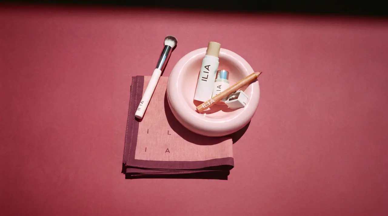
whispered capitals on skin-tone sleeves
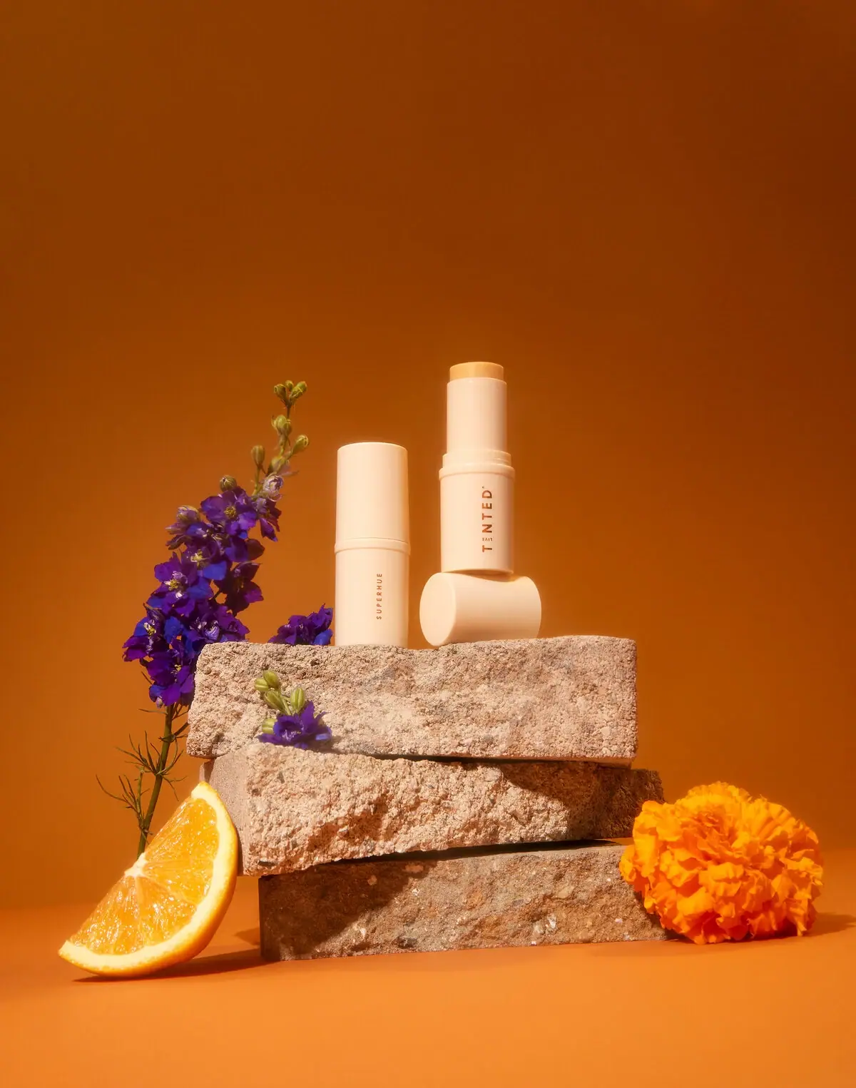
Live Tinted
Pale peach stick, vertical lettering and exposed golden balm
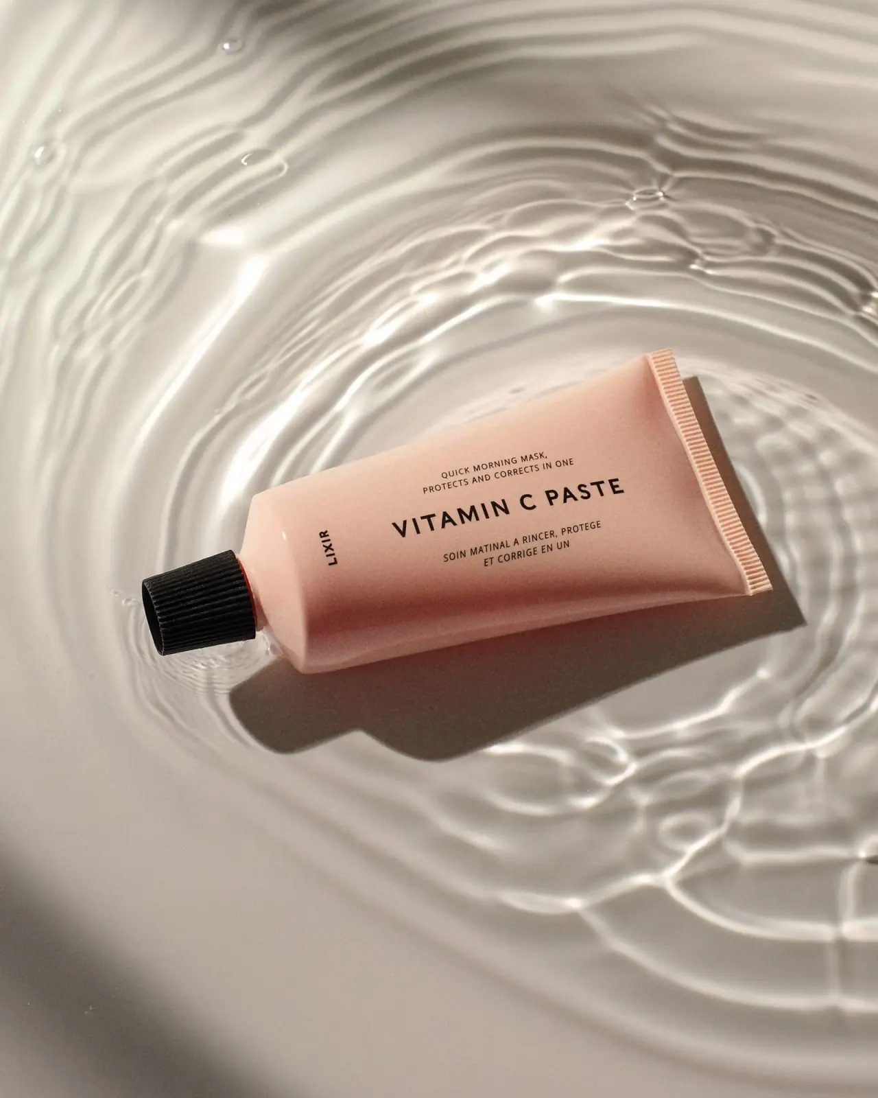
Lixirskin
Peach archival tube with centered title and perpendicular maker

OSEA
sea-glass frosted bottles and a tidal wordmark

OUAI
sheer tinted bottles, small black capitals
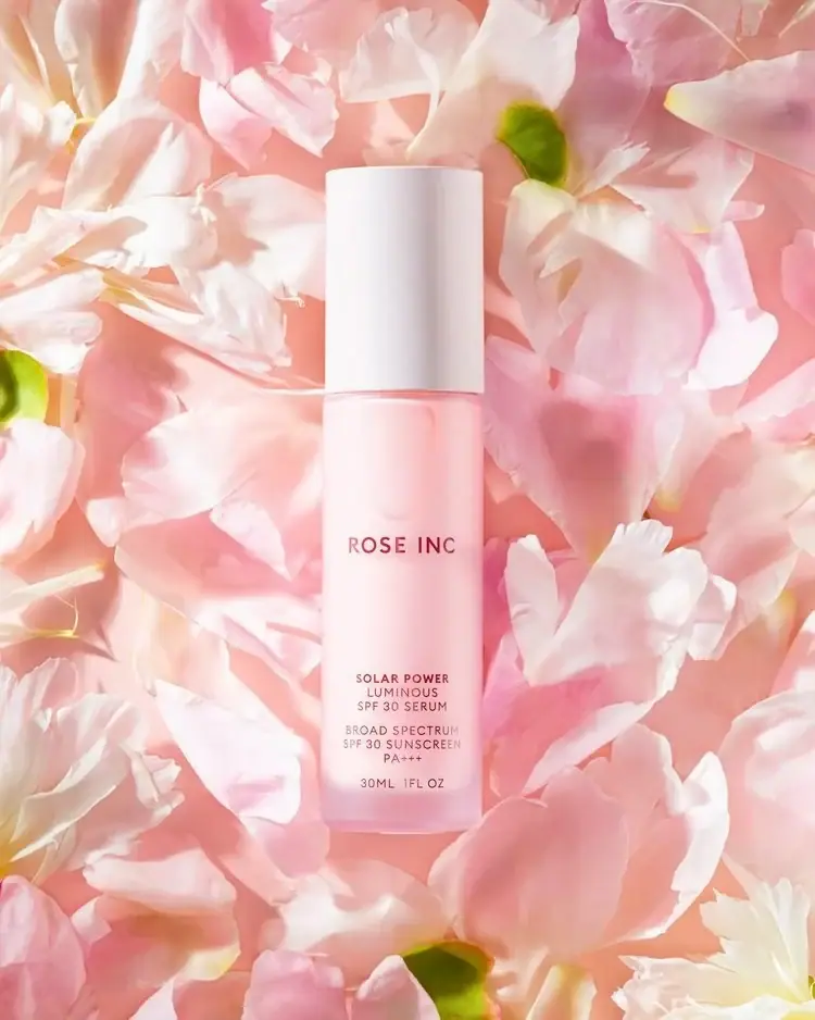
Rose Inc
Translucent blush serum with tall white cap and quiet typography